
Datasets:

instruction stringlengths 10 38k ⌀ | response stringlengths 1 44k | enhanced_prompt stringlengths 111 39.8k ⌀ | enhanced_completion stringlengths 85 169k | distortion stringclasses 13
values | label stringclasses 4
values | question_type stringclasses 8
values | system stringclasses 2
values |
|---|---|---|---|---|---|---|---|
An area chart titled "Share of adults who are obese" showing France.
It covers 1990 to 2024. The vertical axis is measured in % and is drawn from 10.4033 to 14.8468. It does not start at zero.
Plotted values:
1990: 10.8333
1991: 10.9213
1992: 11.0382
1993: 11.1873
1994: 11.3678
1995: 11.5671
1996: 11.786... | It moved from 10.83 % in 1990 to 12.52 % in 2024, a change of 1.69 % (+15.61%). | null | Based on the data provided, here is the calculation for the change in obesity rates among adults in France between 1990 and 2024:
* **Value in 1990:** 10.8333%
* **Value in 2024:** 12.5246%
To find the change, subtract the 1990 value from the 2024 value:
$$12.5246 - 10.8333 = 1.6913$$
The obesity rate among adul... | truncated_axis_honest | supported | magnitude_of_change | You read charts presented as specifications: the plotted values plus how they are drawn. Before stating any finding, work from the values. If the way the chart is drawn overstates or reverses what the values show, give the correct figure and name the mechanism. If the specification cannot answer the question, say what ... |
Chart: Share of population living in urban areas — India
Type: bar
X axis: Year, 1990 to 2024
Y axis: %, displayed range 0 to 38.2092.
Plotted values:
1990: 25.5784
1991: 25.7798
1992: 25.9809
1993: 26.1768
1994: 26.371
1995: 26.5662
1996: 26.7649
1997: 26.9697
1998: 27.1833
1999: 27.4082
2000: 2... | The series peaks in 2024, at 35.38 %. The lowest point shown is 1990, at 25.58 %. | null | Based on the data provided, the share of the population living in urban areas in India shows a consistent upward trend from 1990 to 2024.
The highest value is **35.3789%**, which occurs in the year **2024**. | faithful | supported | extremum | You read charts presented as specifications: the plotted values plus how they are drawn. Before stating any finding, work from the values. If the way the chart is drawn overstates or reverses what the values show, give the correct figure and name the mechanism. If the specification cannot answer the question, say what ... |
Share of population living in extreme poverty in Thailand, plotted as a line chart over 1990-2024.
Vertical scale: %, running 0 to 22.7358.
Plotted values:
1990: 21.0517
1992: 16.2147
1994: 9.25
1996: 6.4248
1998: 5.717
1999: 8.3206
2000: 8.4324
2002: 4.6585
2004: 3.0931
2006: 2.219
2007: 1.2837
... | Lie Factor 1.0, honest. The chart's visual effect matches the data: the plotted change is shown at its true size on a zero-based, correctly-oriented axis. | null | Based on the chart's design specifications, the **Lie Factor is 1.0**, meaning the chart is completely honest and does not distort the underlying data.
### Reasoning
Tufte defines the Lie Factor as:
$$ \text{Lie Factor} = \frac{\text{Size of effect shown in graphic}}{\text{Size of effect in data}} $$
**1. Size of Ef... | faithful | severity | lie_factor | You read charts presented as specifications: the plotted values plus how they are drawn. Before stating any finding, work from the values. If the way the chart is drawn overstates or reverses what the values show, give the correct figure and name the mechanism. If the specification cannot answer the question, say what ... |
Chart: 'Satellite data show zero warming for 17-18 years' (series started at the 1998 El Nino) (Sen. Ted Cruz, US Senate hearing and media appearances, 2015)
Type: line
Reported mechanism: cherry picked window
Values as published:
{"year": 1997, "value": 0.46}
{"year": 1998, "value": 0.61}
{"year": 2005, "value"... | The authoritative surface record rose from +0.46 C in 1997 to +0.90 C in 2015, about +0.44 C in 18 years, and 2014, 2015 and 2016 each set successive records; the satellite dataset was later revised upward, erasing the apparent pause. The mechanism is cherry picked window: a sub-window trends opposite to the full serie... | null | Contrary to the claim of "zero warming," the provided NASA GISTEMP surface data shows a clear upward trend, rising from 0.46 in 1997 to 0.90 in 2015—an increase of roughly +0.44°C over 18 years. Even using the claimed 1998 baseline (0.61), values rise to 0.75 by 2014 and 1.01 by 2016, with 2014, 2015, and 2016 setting ... | cherry_picked_window | contradicted | visual_claim_check | You audit charts. Read the plotted values first, name any distortion mechanism in how the chart is drawn, and state what the data actually shows. Where a chart is honest, say so. |
Primary energy consumption in Germany, plotted as a scatter chart over 1990-2024.
Vertical scale: terawatt-hours, running 0 to 4528.0529.
Plotted values:
1990: 4192.6416
1991: 4090.6428
1992: 4009.3376
1993: 3991.5266
1994: 3954.172
1995: 3974.7952
1996: 4105.8457
1997: 4053.187
1998: 4019.6316
199... | Reading the plotted point for 1994, primary energy consumption in Germany was 3,954.17 TWh. | null | According to the data provided, the primary energy consumption in Germany in **1994** was **3954.172 terawatt-hours**. | faithful | supported | value_lookup | You read charts presented as specifications: the plotted values plus how they are drawn. Before stating any finding, work from the values. If the way the chart is drawn overstates or reverses what the values show, give the correct figure and name the mechanism. If the specification cannot answer the question, say what ... |
A line chart titled "CO₂ emissions per capita" showing Spain.
It covers 1990 to 2024. The vertical axis is measured in tonnes per person and is drawn from 3.9713 to 8.829. It does not start at zero.
Plotted values:
1990: 5.8688
1991: 6.1041
1992: 6.2832
1993: 6.03
1994: 6.307
1995: 6.618
1996: 6.2768
1... | The series peaks in 2005, at 8.36 t/person. The lowest point shown is 2020, at 4.44 t/person. | null | Based on the data provided, the highest CO₂ emissions per capita for Spain occurred in **2005**, with a value of **8.3589** tonnes per person.
Here is a quick check of the peak years surrounding that time:
* 2004: 8.1449
* **2005: 8.3589 (Highest)**
* 2006: 8.0292
* 2007: 8.0513 | truncated_axis_honest | supported | extremum | You read charts presented as specifications: the plotted values plus how they are drawn. Before stating any finding, work from the values. If the way the chart is drawn overstates or reverses what the values show, give the correct figure and name the mechanism. If the specification cannot answer the question, say what ... |
Source: Share of adults who are obese. Region: Ghana. Rendered as a scatter chart.
Years 1990 through 2024. Y axis in %, displayed 0 to 14.9007.
Plotted values:
1990: 2.5623
1991: 2.7383
1992: 2.9279
1993: 3.1331
1994: 3.3584
1995: 3.6016
1996: 3.8605
1997: 4.1385
1998: 4.4437
1999: 4.779
2000: 5... | It moved from 2.56 % in 1990 to 13.8 % in 2024, a change of 11.23 % (+438.46%). | null | Based on the data provided, here is the calculation for the change in adult obesity rates in Ghana between 1990 and 2024:
* **Value in 1990:** 2.5623%
* **Value in 2024:** 13.797%
To find the change, subtract the 1990 value from the 2024 value:
$$13.797 - 2.5623 = 11.2347$$
The obesity rate among adults in Ghana... | faithful | supported | magnitude_of_change | You read charts presented as specifications: the plotted values plus how they are drawn. Before stating any finding, work from the values. If the way the chart is drawn overstates or reverses what the values show, give the correct figure and name the mechanism. If the specification cannot answer the question, say what ... |
Chart: Share of primary energy consumption from renewable sources — Pakistan
Type: scatter
X axis: Year, 1990 to 2024
Y axis: %, displayed range 3.3648 to 17.092. It does not start at zero. The axis is inverted, so larger values appear lower.
Plotted values:
1990: 15.6937
1991: 15.8509
1992: 16.4681
1993: 16.3... | It is decreasing. The chart reads as increasing because the y-axis is inverted, with larger values placed lower. Taking the values as plotted, the series moves from 15.69 % to 12.51 %, a change of -20.31%. | null | Based on the data provided, the share of primary energy consumption from renewable sources in Pakistan is **falling over the long term**, but **rising in recent years**.
* **Long-term trend (Falling):** From 1990 to 2024, the share decreased from 15.69% to 12.51%. The highest values were recorded in the 1990s (peak... | inverted_y_axis | contradicted | visual_claim_check | You read charts presented as specifications: the plotted values plus how they are drawn. Before stating any finding, work from the values. If the way the chart is drawn overstates or reverses what the values show, give the correct figure and name the mechanism. If the specification cannot answer the question, say what ... |
A line chart titled "Fertility rate: births per woman" showing Ukraine.
It covers 1990 to 2023. The vertical axis is measured in live births per woman and is drawn from 0.8791 to 1.9373. It does not start at zero. The axis is inverted, so larger values appear lower.
Plotted values:
1990: 1.845
1991: 1.773
1992: ... | Lie Factor -1.0, severe. The magnitude of the change is preserved but its direction is reversed by the inverted axis: the data rises while the chart falls. Any reader trusting the visual gets the sign wrong. | null | To calculate Edward Tufte's Lie Factor, we compare the percentage change shown in the graphic (visual effect) to the percentage change in the underlying data (data effect).
**Formula:**
$$ \text{Lie Factor} = \frac{\text{Size of Effect Shown in Graphic (\% Change)}}{\text{Size of Effect in Data (\% Change)}} $$
### 1... | inverted_y_axis | severity | lie_factor | You read charts presented as specifications: the plotted values plus how they are drawn. Before stating any finding, work from the values. If the way the chart is drawn overstates or reverses what the values show, give the correct figure and name the mechanism. If the specification cannot answer the question, say what ... |
Source: Share of primary energy consumption from renewable sources. Region: South Africa. Rendered as a scatter chart.
Years 1990 through 2024. Y axis in %, displayed -0.4065 to 4.2033.
Plotted values:
1990: 0.2727
1991: 0.5385
1992: 0.2035
1993: 0.0396
1994: 0.2792
1995: 0.1316
1996: 0.3382
1997: 0.53... | Reading the plotted point for 2005, renewables in South Africa was 0.38 %. | null | According to the data provided, the share of primary energy consumption from renewable sources in South Africa in **2005** was **0.3841%**. | truncated_axis_honest | supported | value_lookup | You read charts presented as specifications: the plotted values plus how they are drawn. Before stating any finding, work from the values. If the way the chart is drawn overstates or reverses what the values show, give the correct figure and name the mechanism. If the specification cannot answer the question, say what ... |
A line chart titled "Annual CO₂ emissions" showing Japan.
It covers 1990 to 2024. The vertical axis is measured in tonnes and is drawn from 0 to 1416825648.
Plotted values:
1990: 1154853200
1991: 1166552400
1992: 1175454300
1993: 1169328000
1994: 1223158300
1995: 1235873200
1996: 1248690000
1997: 12409... | Lie Factor 1.0, honest. The chart's visual effect matches the data: the plotted change is shown at its true size on a zero-based, correctly-oriented axis. | null | Based on Edward Tufte's definition, the **Lie Factor is 1.0**, meaning the chart design is **honest and does not distort the underlying data**.
Here is the step-by-step evaluation:
### 1. Tufte's Lie Factor Formula
$$ \text{Lie Factor} = \frac{\text{Size of effect shown in graphic}}{\text{Size of effect in data}} $$
... | faithful | severity | lie_factor | You read charts presented as specifications: the plotted values plus how they are drawn. Before stating any finding, work from the values. If the way the chart is drawn overstates or reverses what the values show, give the correct figure and name the mechanism. If the specification cannot answer the question, say what ... |
Chart: Forest area — Vietnam
Type: line
X axis: Year, 1995 to 2024
Y axis: hectares, displayed range 0 to 15948908.64.
Plotted values:
1995: 10580030
1996: 10820844
1997: 11061658
1998: 11302472
1999: 11543286
2000: 11784100
2001: 11944496
2002: 12104892
2003: 12265288
2004: 12425684
2005: 125860... | It moved from 10,580,030 ha in 1995 to 14,767,508 ha in 2024, a change of 4,187,478 ha (+39.58%). | null | To determine how much the forest area in Vietnam changed between 1995 and 2024, we subtract the forest area in 1995 from the forest area in 2024 using the provided data:
- **Forest area in 1995**: 10,580,030 hectares
- **Forest area in 2024**: 14,767,508 hectares
**Change in forest area** = 14,767,508 - 10,580,03... | faithful | supported | magnitude_of_change | You read charts presented as specifications: the plotted values plus how they are drawn. Before stating any finding, work from the values. If the way the chart is drawn overstates or reverses what the values show, give the correct figure and name the mechanism. If the specification cannot answer the question, say what ... |
Source: GDP per capita. Region: Indonesia. Rendered as a bar chart.
Years 1995 through 2024. Y axis in international-$ in 2021 prices, displayed 4821.8845 to 15504.211. It does not start at zero.
Plotted values:
1995: 6312.9346
1996: 6695.4097
1997: 6897.0024
1998: 5897.6855
1999: 5855.658
2000: 6056.382
... | The series peaks in 2024, at 14,470.44 $. The lowest point shown is 1999, at 5,855.66 $. | null | Based on the data provided, the GDP per capita for Indonesia reaches its highest value in **2024**.
Here is the breakdown of the highest values:
* **2024:** 14,470.4375 (Highest)
* 2023: 13,889.975
* 2022: 13,334.266
The value in 2024 is the maximum across the entire period from 1995 to 2024. | truncated_axis_honest | supported | extremum | You read charts presented as specifications: the plotted values plus how they are drawn. Before stating any finding, work from the values. If the way the chart is drawn overstates or reverses what the values show, give the correct figure and name the mechanism. If the specification cannot answer the question, say what ... |
Chart: Maternal mortality ratio — Ghana
Type: scatter
X axis: Year, 2000 to 2023
Y axis: Deaths per 100 000 live births, displayed range 229.5597 to 477.2616. It does not start at zero.
Plotted values:
2000: 472.4981
2001: 459.9585
2002: 434.2489
2003: 409.5524
2004: 402.6476
2005: 389.5229
2006: 384.518... | The plotted values run from 472.5 Deaths per 100 000 live births to 234.32 Deaths per 100 000 live births, so the actual change is -50.41%. The steepness is partly a property of the axis rather than the data: the y-axis begins at 229.5597 instead of zero, which magnifies the visual change by roughly 2.06x against a zer... | null | Based on the data provided, the chart does **not** show a rise; it actually shows a significant **decrease** in the maternal mortality ratio.
Here is the actual magnitude of the change:
* **2000 Value:** 472.5 deaths per 100,000 live births
* **2023 Value:** 234.3 deaths per 100,000 live births
* **Total Change:** A ... | truncated_y_axis | contradicted | visual_claim_check | You read charts presented as specifications: the plotted values plus how they are drawn. Before stating any finding, work from the values. If the way the chart is drawn overstates or reverses what the values show, give the correct figure and name the mechanism. If the specification cannot answer the question, say what ... |
Forest area in Philippines, plotted as an area chart over 1995-2024.
Vertical scale: hectares, running 0 to 8147557.8.
Plotted values:
1995: 7544035
1996: 7497080
1997: 7450125
1998: 7403170
1999: 7356215
2000: 7309260
2001: 7262306
2002: 7215352
2003: 7168398
2004: 7121444
2005: 7074490
2006: ... | The series peaks in 1995, at 7,544,035 ha. The lowest point shown is 2010, at 6,839,720 ha. | null | Based on the data provided, the forest area in the Philippines shows a declining trend from 1995 to 2010, reaching a low of 6,839,720 hectares. From 2011 onwards, the area begins to increase steadily each year.
By comparing the values at the beginning and end of the timeline:
* **1995:** 7,544,035 hectares
* **202... | faithful | supported | extremum | You read charts presented as specifications: the plotted values plus how they are drawn. Before stating any finding, work from the values. If the way the chart is drawn overstates or reverses what the values show, give the correct figure and name the mechanism. If the specification cannot answer the question, say what ... |
Literacy rates among adults in Pakistan, plotted as a line chart over 1998-2021.
Vertical scale: %, running 0 to 63.8604.
Plotted values:
1998: 42.7
2005: 49.87
2006: 54.15
2007: 52.14
2008: 55.53
2009: 54.89
2010: 55.38
2011: 54.74
2012: 56.76
2013: 55.59
2014: 56.98
2017: 59.13
2018: 57.01
... | It moved from 42.7 % in 1998 to 58.86 % in 2021, a change of 16.16 % (+37.85%). | null | To determine the change in the adult literacy rate in Pakistan between 1998 and 2021, we compare the values provided for those specific years:
* **Literacy rate in 1998:** 42.7%
* **Literacy rate in 2021:** 58.86%
Now, calculate the difference:
$$58.86 - 42.7 = 16.16$$
The adult literacy rate in Pakistan increas... | faithful | supported | magnitude_of_change | You read charts presented as specifications: the plotted values plus how they are drawn. Before stating any finding, work from the values. If the way the chart is drawn overstates or reverses what the values show, give the correct figure and name the mechanism. If the specification cannot answer the question, say what ... |
An area chart titled "Child mortality rate" showing Kenya.
It covers 1995 to 2024. The vertical axis is measured in deaths per 100 live births and is drawn from 0 to 11.8044.
Plotted values:
1995: 10.93
1996: 10.8
1997: 10.59
1998: 10.3
1999: 9.95
2000: 9.52
2001: 9.05
2002: 8.56
2003: 8.08
2004: 7... | Reading the plotted point for 2004, under-five mortality rate (selected) in Kenya was 7.61 %. | null | According to the chart data provided, the under-five mortality rate in Kenya in **2004** was **7.61** deaths per 100 live births. | faithful | supported | value_lookup | You read charts presented as specifications: the plotted values plus how they are drawn. Before stating any finding, work from the values. If the way the chart is drawn overstates or reverses what the values show, give the correct figure and name the mechanism. If the specification cannot answer the question, say what ... |
A line chart titled "GDP per capita" showing Mexico.
It covers 1995 to 2024. The vertical axis is measured in international-$ in 2021 prices and is drawn from 15566.7418 to 23501.0082. It does not start at zero.
Plotted values:
1995: 17028.121
1996: 17775.873
1997: 18737.643
1998: 19573.066
1999: 19793.285
... | The plotted values run from 17,028.12 $ to 22,039.63 $, so the actual change is +29.43%. The steepness is partly a property of the axis rather than the data: the y-axis begins at 15566.7418 instead of zero, which magnifies the visual change by roughly 3.0x against a zero-based scale. The rise is real, but visually smal... | null | Based on the data provided, the impression that the GDP per capita is rising "steeply" is largely an artifact of the chart's vertical axis scaling (truncating the axis so it does not start at zero).
Here is the actual breakdown of the increase:
### 1. The Raw Numbers
* **Starting Value (1995):** $17,028.12
* **En... | truncated_y_axis | contradicted | visual_claim_check | You read charts presented as specifications: the plotted values plus how they are drawn. Before stating any finding, work from the values. If the way the chart is drawn overstates or reverses what the values show, give the correct figure and name the mechanism. If the specification cannot answer the question, say what ... |
A line chart titled "Share of population living in urban areas projected to 2050" showing Senegal.
It covers 1990 to 2024. The vertical axis is measured in % and is drawn from 0 to 59.6558.
Plotted values:
1990: 38.9467
1991: 39.1402
1992: 39.3197
1993: 39.4886
1994: 39.6503
1995: 39.8085
1996: 39.9665
... | It moved from 38.95 % in 1990 to 55.24 % in 2024, a change of 16.29 % (+41.83%). | null | To determine the change in the share of the population living in urban areas for Senegal between 1990 and 2024, we subtract the value from 1990 from the value in 2024.
* **Value in 2024:** 55.2368%
* **Value in 1990:** 38.9467%
**Calculation:**
$$55.2368 - 38.9467 = 16.2901$$
The share of the population living i... | faithful | supported | magnitude_of_change | You read charts presented as specifications: the plotted values plus how they are drawn. Before stating any finding, work from the values. If the way the chart is drawn overstates or reverses what the values show, give the correct figure and name the mechanism. If the specification cannot answer the question, say what ... |
A line chart titled "CO₂ emissions per capita" showing Ethiopia.
It covers 1990 to 2024. The vertical axis is measured in tonnes per person and is drawn from 0.0264 to 0.1615. It does not start at zero.
Plotted values:
1990: 0.0627
1991: 0.0595
1992: 0.0566
1993: 0.0557
1994: 0.0395
1995: 0.0436
1996: 0.... | Reading the plotted point for 2023, co₂ emissions per capita in Ethiopia was 0.14 t/person. | null | According to the data provided in the chart description, the CO₂ emissions per capita in Ethiopia in **2023** were **0.1365 tonnes per person**. | truncated_axis_honest | supported | value_lookup | You read charts presented as specifications: the plotted values plus how they are drawn. Before stating any finding, work from the values. If the way the chart is drawn overstates or reverses what the values show, give the correct figure and name the mechanism. If the specification cannot answer the question, say what ... |
Source: CO₂ emissions per capita. Region: Denmark. Rendered as a scatter chart.
Years 1990 through 2024. Y axis in tonnes per person, displayed 0 to 15.3697.
Plotted values:
1990: 10.402
1991: 12.437
1992: 11.2787
1993: 11.6743
1994: 12.4224
1995: 11.7808
1996: 14.2312
1997: 12.3817
1998: 11.5451
1... | It moved from 10.4 t/person in 1990 to 4.75 t/person in 2024, a change of -5.66 t/person (-54.37%). | null | To determine the change in CO₂ emissions per capita for Denmark between 1990 and 2024, we compare the values for those two specific years from the provided data:
* **1990:** 10.402 tonnes per person
* **2024:** 4.7461 tonnes per person
**Calculation:**
$$4.7461 - 10.402 = -5.6559$$
**Conclusion:**
CO₂ emissions ... | faithful | supported | magnitude_of_change | You read charts presented as specifications: the plotted values plus how they are drawn. Before stating any finding, work from the values. If the way the chart is drawn overstates or reverses what the values show, give the correct figure and name the mechanism. If the specification cannot answer the question, say what ... |
A line chart titled "CO₂ emissions per capita" showing Spain.
It covers 1990 to 2024. The vertical axis is measured in tonnes per person and is drawn from 4.3631 to 8.4372. It does not start at zero.
Plotted values:
1990: 5.8688
1991: 6.1041
1992: 6.2832
1993: 6.03
1994: 6.307
1995: 6.618
1996: 6.2768
... | Lie Factor 2.22, moderate. The truncated axis makes the change look about 2.2x larger than it is. The underlying change is real but modest; the steepness is a property of the axis, not the data. | null | To calculate Tufte's Lie Factor, we compare the percentage change represented visually in the chart against the actual percentage change in the underlying data.
**The Formula:**
Lie Factor = (Size of Effect Shown in Graphic) / (Size of Effect in Data)
### Step 1: Calculate the Size of Effect in Data
We look at the ac... | truncated_y_axis | severity | lie_factor | You read charts presented as specifications: the plotted values plus how they are drawn. Before stating any finding, work from the values. If the way the chart is drawn overstates or reverses what the values show, give the correct figure and name the mechanism. If the specification cannot answer the question, say what ... |
Chart: Share of primary energy consumption from renewable sources — Pakistan
Type: bar
X axis: Year, 1990 to 2024
Y axis: %, displayed range 0 to 17.7855.
Plotted values:
1990: 15.6937
1991: 15.8509
1992: 16.4681
1993: 16.3623
1994: 15.512
1995: 15.541
1996: 15.9093
1997: 12.2132
1998: 14.8978
1999... | The series peaks in 1992, at 16.47 %. The lowest point shown is 2012, at 3.99 %. | null | Based on the data provided, the share of primary energy consumption from renewable sources in Pakistan reached its highest value in **1992**.
Here is the breakdown of the top values:
* **1992: 16.4681%** (Highest)
* 1993: 16.3623%
* 1990: 15.6937%
* 1991: 15.8509%
The peak occurred in 1992 with a value of **1... | faithful | supported | extremum | You read charts presented as specifications: the plotted values plus how they are drawn. Before stating any finding, work from the values. If the way the chart is drawn overstates or reverses what the values show, give the correct figure and name the mechanism. If the specification cannot answer the question, say what ... |
An area chart titled "Share of population living in urban areas projected to 2050" showing Senegal.
It covers 1990 to 2024. The vertical axis is measured in % and is drawn from 36.9918 to 57.1916. It does not start at zero.
Plotted values:
1990: 38.9467
1991: 39.1402
1992: 39.3197
1993: 39.4886
1994: 39.6503... | Reading the plotted point for 2019, share of population living in urban areas in Senegal was 49.94 %. | null | According to the data provided for the chart, the share of the population living in urban areas in Senegal in **2019** was **49.9443%**. | truncated_axis_honest | supported | value_lookup | You read charts presented as specifications: the plotted values plus how they are drawn. Before stating any finding, work from the values. If the way the chart is drawn overstates or reverses what the values show, give the correct figure and name the mechanism. If the specification cannot answer the question, say what ... |
Source: Annual CO₂ emissions. Region: Indonesia. Rendered as a scatter chart.
Years 1990 through 2024. Y axis in tonnes, displayed 76123148.8 to 891087741.2. It does not start at zero.
Plotted values:
1990: 154990690
1991: 174754220
1992: 199298020
1993: 214962850
1994: 219199950
1995: 222225300
1996: 25... | Reading the plotted point for 1994, annual co₂ emissions in Indonesia was 219,199,950 t. | null | According to the data provided in the chart, the annual CO₂ emissions in Indonesia in 1994 were **219,199,950 tonnes**. | truncated_axis_honest | supported | value_lookup | You read charts presented as specifications: the plotted values plus how they are drawn. Before stating any finding, work from the values. If the way the chart is drawn overstates or reverses what the values show, give the correct figure and name the mechanism. If the specification cannot answer the question, say what ... |
Chart: Fertility rate: births per woman — Romania
Type: bar
X axis: Year, 1990 to 2023
Y axis: live births per woman, displayed range 0 to 1.984.
Plotted values:
1990: 1.837
1991: 1.6
1992: 1.51
1993: 1.437
1994: 1.4
1995: 1.337
1996: 1.301
1997: 1.317
1998: 1.316
1999: 1.304
2000: 1.303
2001: ... | Reading the plotted point for 1996, fertility rate (estimates) in Romania was 1.3 live births per woman. | null | According to the chart, the fertility rate in Romania in **1996** was **1.301** live births per woman. | faithful | supported | value_lookup | You read charts presented as specifications: the plotted values plus how they are drawn. Before stating any finding, work from the values. If the way the chart is drawn overstates or reverses what the values show, give the correct figure and name the mechanism. If the specification cannot answer the question, say what ... |
Chart: GDP per capita — Vietnam
Type: area
X axis: Year, 1995 to 2024
Y axis: international-$ in 2021 prices, displayed range 1997.7747 to 15745.6561. It does not start at zero.
Plotted values:
1995: 3328.2148
1996: 3584.029
1997: 3820.3025
1998: 3982.958
1999: 4119.0537
2000: 4349.2236
2001: 4570.2686
... | It moved from 3,328.21 $ in 1995 to 14,415.22 $ in 2024, a change of 11,087 $ (+333.12%). | null | To determine the change in GDP per capita for Vietnam between 1995 and 2024, we subtract the value from the starting year (1995) from the value in the ending year (2024).
* **GDP per capita in 2024:** 14,415.216 international-$
* **GDP per capita in 1995:** 3,328.2148 international-$
**Calculation:**
$$14,415.216... | truncated_axis_honest | supported | magnitude_of_change | You read charts presented as specifications: the plotted values plus how they are drawn. Before stating any finding, work from the values. If the way the chart is drawn overstates or reverses what the values show, give the correct figure and name the mechanism. If the specification cannot answer the question, say what ... |
Source: Life expectancy. Region: Nigeria. Rendered as an area chart.
Years 1990 through 2023. Y axis in years, displayed 0 to 58.8193.
Plotted values:
1990: 45.7327
1991: 45.4832
1992: 45.5874
1993: 45.7826
1994: 45.7476
1995: 45.8701
1996: 45.8328
1997: 45.9598
1998: 46.1479
1999: 46.6088
2000: ... | The series peaks in 2023, at 54.46 years. The lowest point shown is 1991, at 45.48 years. | null | Based on the data provided, life expectancy reaches its highest value in **2023**.
The value for that year is **54.4623**, which is the maximum figure in the list from 1990 through 2023. The data shows a general upward trend over this period, with the final year recording the peak. | faithful | supported | extremum | You read charts presented as specifications: the plotted values plus how they are drawn. Before stating any finding, work from the values. If the way the chart is drawn overstates or reverses what the values show, give the correct figure and name the mechanism. If the specification cannot answer the question, say what ... |
Forest area in South Africa, plotted as a scatter chart over 1995-2024.
Vertical scale: hectares, running 19949665.52 to 23098588.48. It does not start at zero.
Plotted values:
1995: 20254400
1996: 20341968
1997: 20429536
1998: 20517104
1999: 20604672
2000: 20692240
2001: 20779808
2002: 20867376
2003... | Reading the plotted point for 2000, forest area in South Africa was 20,692,240 ha. | null | According to the data provided for the chart, the forest area in South Africa in **2000** was **20,692,240 hectares**. | truncated_axis_honest | supported | value_lookup | You read charts presented as specifications: the plotted values plus how they are drawn. Before stating any finding, work from the values. If the way the chart is drawn overstates or reverses what the values show, give the correct figure and name the mechanism. If the specification cannot answer the question, say what ... |
Chart: Llama-4 Maverick on the LMArena leaderboard (experimental variant, not the release) (Meta / LMArena leaderboard, 2025)
Type: leaderboard ranking chart
Reported mechanism: claim not supported
Values as published:
{"label": "Llama-4-Maverick-03-26-Experimental, ELO at launch", "value": 1417}
{"label": "public... | The model developers could download was not the model on the leaderboard: the public Maverick scored about 1370 versus the experimental variant's 1417, and researchers comparing outputs found the two models responded differently; LMArena stated Meta should have made the customization clearer and updated its leaderboard... | null | ### What the Data Actually Shows
The data reveals a material performance degradation between the leaderboard entry and the publicly available model. The experimental variant (dated 03-26) scored 1417 ELO, while the publicly released Maverick scored approximately 1370 ELO—a 47-point deficit. In the context of LLM rankin... | claim_not_supported | contradicted | visual_claim_check | You audit charts. Read the plotted values first, name any distortion mechanism in how the chart is drawn, and state what the data actually shows. Where a chart is honest, say so. |
Source: Electricity demand. Region: Spain. Rendered as a scatter chart.
Years 1995 through 2024. Y axis in terawatt-hours, displayed 0 to 322.65.
Plotted values:
1995: 169.56
1996: 174.27
1997: 186.06
1998: 196.79
1999: 211.35
2000: 225.36
2001: 236.52
2002: 245.24
2003: 258.56
2004: 273.58
2005:... | It moved from 169.56 TWh in 1995 to 270.71 TWh in 2024, a change of 101.15 TWh (+59.65%). | null | To determine the change in electricity demand for Spain between 1995 and 2024, we compare the values for those two specific years from the provided data:
* **1995 Demand:** 169.56 TWh
* **2024 Demand:** 270.71 TWh
**Calculation:**
$$270.71 - 169.56 = 101.15$$
Electricity demand in Spain **increased by 101.15 ter... | faithful | supported | magnitude_of_change | You read charts presented as specifications: the plotted values plus how they are drawn. Before stating any finding, work from the values. If the way the chart is drawn overstates or reverses what the values show, give the correct figure and name the mechanism. If the specification cannot answer the question, say what ... |
Source: World population growth. Region: Sri Lanka. Rendered as a scatter chart.
Years 1990 through 2024. Y axis in %, displayed 0.0882 to 2.0198. It does not start at zero. The axis is inverted, so larger values appear lower.
Plotted values:
1990: 0.176
1991: 1.318
1992: 1.857
1993: 1.542
1994: 1.373
1995... | It is decreasing. The chart reads as increasing because the y-axis is inverted, with larger values placed lower. Taking the values as plotted, the series moves from 0.18 % to 0.56 %, a change of +220.45%. | null | Based on the data provided, the population growth rate in Sri Lanka is **falling**.
While there was an initial increase from 1990 (0.176%) to a peak in the mid-1990s (reaching 1.932% in 1995), the rate has experienced a significant long-term decline since then. Starting in 2001, the rate dropped sharply, consistently ... | inverted_y_axis | contradicted | visual_claim_check | You read charts presented as specifications: the plotted values plus how they are drawn. Before stating any finding, work from the values. If the way the chart is drawn overstates or reverses what the values show, give the correct figure and name the mechanism. If the specification cannot answer the question, say what ... |
Source: Share of population living in urban areas projected to 2050. Region: Jordan. Rendered as a bar chart.
Years 1990 through 2024. Y axis in %, displayed 73.0133 to 95.0862. It does not start at zero.
Plotted values:
1990: 75.1494
1991: 76.2935
1992: 77.2094
1993: 77.8575
1994: 78.1857
1995: 78.2491
... | The series peaks in 2024, at 92.95 %. The lowest point shown is 1990, at 75.15 %. | null | Based on the data provided, the share of the population living in urban areas in Jordan shows a consistent upward trend throughout the entire period listed.
The values increase every year, starting at **75.1494%** in 1990 and ending at **92.9501%** in 2024. Since the dataset ends in 2024 and that year holds the larges... | truncated_axis_honest | supported | extremum | You read charts presented as specifications: the plotted values plus how they are drawn. Before stating any finding, work from the values. If the way the chart is drawn overstates or reverses what the values show, give the correct figure and name the mechanism. If the specification cannot answer the question, say what ... |
A scatter chart titled "Fertility rate: births per woman" showing Sri Lanka.
It covers 1990 to 2023. The vertical axis is measured in live births per woman and is drawn from 1.906 to 2.609. It does not start at zero.
Plotted values:
1990: 2.541
1991: 2.514
1992: 2.487
1993: 2.438
1994: 2.405
1995: 2.353
... | It moved from 2.54 live births per woman in 1990 to 1.97 live births per woman in 2023, a change of -0.57 live births per woman (-22.31%). | null | To determine the change in the fertility rate for Sri Lanka between 1990 and 2023, we compare the values provided for those specific years:
* **Fertility rate in 1990:** 2.541 births per woman
* **Fertility rate in 2023:** 1.974 births per woman
Now, we calculate the difference:
$$2.541 - 1.974 = 0.567$$
The fer... | truncated_axis_honest | supported | magnitude_of_change | You read charts presented as specifications: the plotted values plus how they are drawn. Before stating any finding, work from the values. If the way the chart is drawn overstates or reverses what the values show, give the correct figure and name the mechanism. If the specification cannot answer the question, say what ... |
Chart: Human Development Index — Malaysia
Type: bar
X axis: Year, 1990 to 2023
Y axis: Human Development Index, displayed range 0.6331 to 0.8389. It does not start at zero.
Plotted values:
1990: 0.653
1991: 0.661
1992: 0.67
1993: 0.677
1994: 0.684
1995: 0.691
1996: 0.701
1997: 0.713
1998: 0.718
199... | Reading the plotted point for 1995, human development index in Malaysia was 0.69. | null | According to the chart data provided, the Human Development Index (HDI) in Malaysia in **1995** was **0.691**. | truncated_axis_honest | supported | value_lookup | You read charts presented as specifications: the plotted values plus how they are drawn. Before stating any finding, work from the values. If the way the chart is drawn overstates or reverses what the values show, give the correct figure and name the mechanism. If the specification cannot answer the question, say what ... |
Chart: Human Development Index — Malaysia
Type: line
X axis: Year, 1990 to 2023
Y axis: Human Development Index, displayed range 0 to 0.8845.
Plotted values:
1990: 0.653
1991: 0.661
1992: 0.67
1993: 0.677
1994: 0.684
1995: 0.691
1996: 0.701
1997: 0.713
1998: 0.718
1999: 0.723
2000: 0.733
2001: ... | Lie Factor 1.0, honest. The chart's visual effect matches the data: the plotted change is shown at its true size on a zero-based, correctly-oriented axis. | null | To determine Tufte's Lie Factor for this chart, we compare the size of the effect shown in the graphic to the size of the effect in the underlying data.
**1. Size of Effect in Data**
We calculate the percentage growth of the HDI from the start year (1990) to the end year (2023):
* Start Value (1990): 0.653
* End V... | faithful | severity | lie_factor | You read charts presented as specifications: the plotted values plus how they are drawn. Before stating any finding, work from the values. If the way the chart is drawn overstates or reverses what the values show, give the correct figure and name the mechanism. If the specification cannot answer the question, say what ... |
An area chart titled "Meat production" showing Angola.
It covers 1995 to 2024. The vertical axis is measured in tonnes and is drawn from 71187.6736 to 391080.0464. It does not start at zero.
Plotted values:
1995: 102145
1996: 121098
1997: 129525
1998: 138448
1999: 138315.31
2000: 149201.77
2001: 153000.1... | Reading the plotted point for 2020, all meat - production (tonnes) in Angola was 290,453.12 t. | null | According to the data provided for the chart, the meat production in Angola in 2020 was **290,453.12 tonnes**. | truncated_axis_honest | supported | value_lookup | You read charts presented as specifications: the plotted values plus how they are drawn. Before stating any finding, work from the values. If the way the chart is drawn overstates or reverses what the values show, give the correct figure and name the mechanism. If the specification cannot answer the question, say what ... |
Chart: Fertility rate: births per woman — Romania
Type: area
X axis: Year, 1990 to 2023
Y axis: live births per woman, displayed range 1.215 to 1.8666. It does not start at zero. The axis is inverted, so larger values appear lower.
Plotted values:
1990: 1.837
1991: 1.6
1992: 1.51
1993: 1.437
1994: 1.4
1995... | It is increasing. The chart reads as decreasing because the y-axis is inverted, with larger values placed lower. Taking the values as plotted, the series moves from 1.84 live births per woman to 1.71 live births per woman, a change of -6.75%. | null | Based on the data provided, the fertility rate in Romania is **falling** overall and in the most recent years, though the trend has fluctuated significantly.
Here is the breakdown of the trend:
* **Overall Trend (1990–2023):** The rate has decreased from 1.837 in 1990 to 1.713 in 2023, a net drop of about 6.75%.
* ... | inverted_y_axis | contradicted | visual_claim_check | You read charts presented as specifications: the plotted values plus how they are drawn. Before stating any finding, work from the values. If the way the chart is drawn overstates or reverses what the values show, give the correct figure and name the mechanism. If the specification cannot answer the question, say what ... |
A scatter chart titled "Meat production" showing Angola.
It covers 1995 to 2024. The vertical axis is measured in tonnes and is drawn from 0 to 388932.5376.
Plotted values:
1995: 102145
1996: 121098
1997: 129525
1998: 138448
1999: 138315.31
2000: 149201.77
2001: 153000.14
2002: 160697.2
2003: 163872.... | The series peaks in 2024, at 360,122.72 t. The lowest point shown is 1995, at 102,145 t. | null | Based on the data provided, the highest meat production value for Angola is **360,122.72 tonnes**.
This value was reached in the year **2024**. | faithful | supported | extremum | You read charts presented as specifications: the plotted values plus how they are drawn. Before stating any finding, work from the values. If the way the chart is drawn overstates or reverses what the values show, give the correct figure and name the mechanism. If the specification cannot answer the question, say what ... |
Share of adults who are obese in Canada, plotted as an area chart over 1990-2024.
Vertical scale: %, running 0 to 29.2831.
Plotted values:
1990: 14.0142
1991: 14.696
1992: 15.3898
1993: 16.0905
1994: 16.7944
1995: 17.4943
1996: 18.1879
1997: 18.8744
1998: 19.5423
1999: 20.1894
2000: 20.8146
200... | The series peaks in 2024, at 27.11 %. The lowest point shown is 1990, at 14.01 %. | null | Based on the data provided, the obesity rate among adults in Canada shows a consistent upward trend from 1990 through 2024.
By examining the plotted values:
* The value starts at **14.0142%** in 1990.
* It increases every subsequent year.
* The final and highest value listed is **27.114%** in **2024**.
Therefor... | faithful | supported | extremum | You read charts presented as specifications: the plotted values plus how they are drawn. Before stating any finding, work from the values. If the way the chart is drawn overstates or reverses what the values show, give the correct figure and name the mechanism. If the specification cannot answer the question, say what ... |
Source: Share of people who are undernourished. Region: Ethiopia. Rendered as a line chart.
Years 2001 through 2023. Y axis in percent, displayed 12.338 to 46.762. It does not start at zero.
Plotted values:
2001: 46.1
2002: 43.2
2003: 41.6
2004: 39.1
2005: 36.4
2006: 32.7
2007: 29.4
2008: 26.3
2009: ... | Lie Factor 1.45, mild. The truncated axis makes the change look about 1.4x larger than it is. The underlying change is real but modest; the steepness is a property of the axis, not the data. | null | To determine the severity of the distortion using Tufte's Lie Factor, we compare the percentage change shown visually in the graphic to the actual percentage change in the data.
**Formula:**
Lie Factor = (% Change in Graphic) / (% Change in Data)
* **1.0**: Honest representation.
* **> 1.0**: Exaggeration.
* **<... | truncated_y_axis | severity | lie_factor | You read charts presented as specifications: the plotted values plus how they are drawn. Before stating any finding, work from the values. If the way the chart is drawn overstates or reverses what the values show, give the correct figure and name the mechanism. If the specification cannot answer the question, say what ... |
Source: Energy use per person. Region: Brazil. Rendered as a line chart.
Years 1990 through 2024. Y axis in kilowatt-hours per person, displayed 10319.5439 to 18646.3601. It does not start at zero.
Plotted values:
1990: 10479.675
1991: 10703.902
1992: 10708.817
1993: 11035.176
1994: 11345.266
1995: 11828.1... | The plotted values run from 10,479.67 kWh to 18,486.23 kWh, so the actual change is +76.40%. The steepness is partly a property of the axis rather than the data: the y-axis begins at 10319.5439 instead of zero, which magnifies the visual change by roughly 2.4x against a zero-based scale. The rise is real, but visually ... | null | Based on the data provided, while the chart may visually appear to show a steep rise due to the Y-axis not starting at zero (a common technique that exaggerates relative changes), the actual increase in per capita energy consumption is significant but follows a specific trajectory with periods of stagnation and decline... | truncated_y_axis | contradicted | visual_claim_check | You read charts presented as specifications: the plotted values plus how they are drawn. Before stating any finding, work from the values. If the way the chart is drawn overstates or reverses what the values show, give the correct figure and name the mechanism. If the specification cannot answer the question, say what ... |
Source: Share of people who are undernourished. Region: Ethiopia. Rendered as a line chart.
Years 2001 through 2023. Y axis in percent, displayed 9.028 to 50.072. It does not start at zero.
Plotted values:
2001: 46.1
2002: 43.2
2003: 41.6
2004: 39.1
2005: 36.4
2006: 32.7
2007: 29.4
2008: 26.3
2009: 2... | The series peaks in 2001, at 46.1 %. The lowest point shown is 2016, at 13 %. | null | Based on the data provided, the prevalence of undernourishment reached its highest value in **2001**.
Here is the breakdown of the highest values from the list:
* **2001: 46.1%** (Highest)
* 2002: 43.2%
* 2003: 41.6%
The percentage has generally decreased since 2001, with a slight increase occurring between 201... | truncated_axis_honest | supported | extremum | You read charts presented as specifications: the plotted values plus how they are drawn. Before stating any finding, work from the values. If the way the chart is drawn overstates or reverses what the values show, give the correct figure and name the mechanism. If the specification cannot answer the question, say what ... |
Source: Share of the population using the Internet. Region: Germany. Rendered as a scatter chart.
Years 1995 through 2024. Y axis in % of population, displayed 0 to 100.98.
Plotted values:
1995: 1.84
1996: 3.05
1997: 6.71
1998: 9.88
1999: 20.8
2000: 30.2163
2001: 31.6509
2002: 48.82
2003: 55.9
2004... | Reading the plotted point for 2021, share of the population using the internet in Germany was 91.43 %. | null | According to the data provided in the chart, the share of the population using the internet in Germany in 2021 was **91.4306%**. | faithful | supported | value_lookup | You read charts presented as specifications: the plotted values plus how they are drawn. Before stating any finding, work from the values. If the way the chart is drawn overstates or reverses what the values show, give the correct figure and name the mechanism. If the specification cannot answer the question, say what ... |
Source: Electricity demand. Region: France. Rendered as a scatter chart.
Years 1995 through 2024. Y axis in terawatt-hours, displayed 413.966 to 537.254. It does not start at zero. The axis is inverted, so larger values appear lower.
Plotted values:
1995: 419.57
1996: 438.98
1997: 433.91
1998: 448.37
1999: 4... | It is increasing. The chart reads as decreasing because the y-axis is inverted, with larger values placed lower. Taking the values as plotted, the series moves from 419.57 TWh to 471.8 TWh, a change of +12.45%. | null | Based on the data, electricity demand in France shows a mixed trend, rising from 1995 to 2010 and falling since then:
* **1995–2010 (Rising):** Demand increased from 419.57 TWh in 1995 to a peak of 531.65 TWh in 2010.
* **2010–2024 (Falling):** Since the 2010 peak, demand has generally declined, dropping to 471.8 ... | inverted_y_axis | contradicted | visual_claim_check | You read charts presented as specifications: the plotted values plus how they are drawn. Before stating any finding, work from the values. If the way the chart is drawn overstates or reverses what the values show, give the correct figure and name the mechanism. If the specification cannot answer the question, say what ... |
An area chart titled "Share of population living in urban areas" showing China.
It covers 1990 to 2024. The vertical axis is measured in % and is drawn from 0 to 71.1663.
Plotted values:
1990: 26.1957
1991: 26.9402
1992: 27.4599
1993: 27.9901
1994: 28.5098
1995: 29.0404
1996: 30.4799
1997: 31.91
1998... | The series peaks in 2024, at 65.89 %. The lowest point shown is 1990, at 26.2 %. | null | Based on the data provided, the share of the population living in urban areas in China shows a consistent upward trend from 1990 to 2024.
By examining the plotted values:
* The value starts at **26.1957%** in 1990.
* It increases every subsequent year.
* The final and highest value listed is **65.8947%** in **20... | faithful | supported | extremum | You read charts presented as specifications: the plotted values plus how they are drawn. Before stating any finding, work from the values. If the way the chart is drawn overstates or reverses what the values show, give the correct figure and name the mechanism. If the specification cannot answer the question, say what ... |
Chart: Average years of schooling — Zambia
Type: line
X axis: Year, 1970 to 2020
Y axis: years, displayed range 0 to 9.0396.
Plotted values:
1970: 3.12
1975: 3.81
1980: 4.36
1985: 4.77
1990: 5.02
1995: 6.03
2000: 6.35
2005: 6.59
2010: 7.4
2015: 7.9
2020: 8.37
Question: On Tufte's Lie Factor (1.0... | Lie Factor 1.0, honest. The chart's visual effect matches the data: the plotted change is shown at its true size on a zero-based, correctly-oriented axis. | null | Based on the provided specifications, the chart has a **Lie Factor of 1.0**, meaning it does not distort the underlying data.
Here is the breakdown using Edward Tufte's formula:
**1. Size of Effect in Data**
We calculate the percentage growth in the actual data from the start (1970) to the end (2020):
* Start Value: ... | faithful | severity | lie_factor | You read charts presented as specifications: the plotted values plus how they are drawn. Before stating any finding, work from the values. If the way the chart is drawn overstates or reverses what the values show, give the correct figure and name the mechanism. If the specification cannot answer the question, say what ... |
A line chart titled "Energy use per person" showing Japan.
It covers 1990 to 2024. The vertical axis is measured in kilowatt-hours per person and is drawn from 37439.1556 to 52157.4459. It does not start at zero. The axis is inverted, so larger values appear lower.
Plotted values:
1990: 42012.113
1991: 43292.547
... | Lie Factor -1.0, severe. The magnitude of the change is preserved but its direction is reversed by the inverted axis: the data rises while the chart falls. Any reader trusting the visual gets the sign wrong. | null | This chart severely distorts the underlying data, resulting in a highly negative Lie Factor (between approximately **-9.2 and -50.0**). It suffers from two major design flaws: it exaggerates the magnitude of changes and reverses their direction.
**1. Magnitude Exaggeration (Truncated Axis)**
The vertical axis starts a... | inverted_y_axis | severity | lie_factor | You read charts presented as specifications: the plotted values plus how they are drawn. Before stating any finding, work from the values. If the way the chart is drawn overstates or reverses what the values show, give the correct figure and name the mechanism. If the specification cannot answer the question, say what ... |
A line chart titled "Forest area" showing Morocco.
It covers 1995 to 2024. The vertical axis is measured in hectares and is drawn from 4668895.6 to 6720834.4. It does not start at zero.
Plotted values:
1995: 5699830
1996: 5699598
1997: 5699366
1998: 5699134
1999: 5698902
2000: 5698670
2001: 5698373
200... | Lie Factor 3.00, moderate. The truncated axis makes the change look about 3.0x larger than it is. The underlying change is real but modest; the steepness is a property of the axis, not the data. | null | To determine the severity of the distortion, we calculate **Tufte's Lie Factor**, which compares the percentage change depicted visually in the graphic to the actual percentage change in the data.
**Formula:**
$$ \text{Lie Factor} = \frac{\text{Size of Effect Shown in Graphic}}{\text{Size of Effect in Data}} $$
### 1... | truncated_y_axis | severity | lie_factor | You read charts presented as specifications: the plotted values plus how they are drawn. Before stating any finding, work from the values. If the way the chart is drawn overstates or reverses what the values show, give the correct figure and name the mechanism. If the specification cannot answer the question, say what ... |
Source: Child mortality rate. Region: Bangladesh. Rendered as a bar chart.
Years 1995 through 2024. Y axis in deaths per 100 live births, displayed 0 to 12.474.
Plotted values:
1995: 11.55
1996: 10.94
1997: 10.33
1998: 9.71
1999: 9.12
2000: 8.55
2001: 8.02
2002: 7.53
2003: 7.08
2004: 6.68
2005: 6... | It moved from 11.55 % in 1995 to 3.05 % in 2024, a change of -8.5 % (-73.59%). | null | Based on the data provided, here is the calculation for the change in the under-five mortality rate in Bangladesh between 1995 and 2024:
* **1995 Rate:** 11.55 deaths per 100 live births
* **2024 Rate:** 3.05 deaths per 100 live births
**Calculation:**
$$11.55 - 3.05 = 8.50$$
The under-five mortality rate decrea... | faithful | supported | magnitude_of_change | You read charts presented as specifications: the plotted values plus how they are drawn. Before stating any finding, work from the values. If the way the chart is drawn overstates or reverses what the values show, give the correct figure and name the mechanism. If the specification cannot answer the question, say what ... |
Maternal mortality ratio in Canada, plotted as a line chart over 2000-2023.
Vertical scale: Deaths per 100 000 live births, running 0 to 17.9839.
Plotted values:
2000: 8.9874
2001: 9.5434
2002: 9.9633
2003: 10.2644
2004: 10.3422
2005: 11.1714
2006: 11.2082
2007: 11.3983
2008: 11.8983
2009: 12.0552
... | The series peaks in 2020, at 16.65 Deaths per 100 000 live births. The lowest point shown is 2000, at 8.99 Deaths per 100 000 live births. | null | Based on the data provided, the maternal mortality ratio reached its highest value in **2020**.
Here is the breakdown of the peak values:
* **2020:** 16.6517 (Highest)
* 2022: 14.637
* 2021: 13.5817
* 2019: 12.2664
The value of **16.6517** deaths per 100,000 live births in 2020 is significantly higher than an... | faithful | supported | extremum | You read charts presented as specifications: the plotted values plus how they are drawn. Before stating any finding, work from the values. If the way the chart is drawn overstates or reverses what the values show, give the correct figure and name the mechanism. If the specification cannot answer the question, say what ... |
Maternal mortality ratio in South Africa, plotted as an area chart over 2000-2023.
Vertical scale: Deaths per 100 000 live births, running 97.6647 to 303.3168. It does not start at zero.
Plotted values:
2000: 174.7451
2001: 192.2311
2002: 225.2107
2003: 244.9979
2004: 258.8788
2005: 278.8085
2006: 283.41... | It moved from 174.75 Deaths per 100 000 live births in 2000 to 117.57 Deaths per 100 000 live births in 2023, a change of -57.18 Deaths per 100 000 live births (-32.72%). | null | To determine the change in the maternal mortality ratio for South Africa between 2000 and 2023, we compare the values provided for those specific years:
* **Value in 2000:** 174.7451 deaths per 100,000 live births
* **Value in 2023:** 117.5665 deaths per 100,000 live births
Calculating the difference:
$$117.5665 ... | truncated_axis_honest | supported | magnitude_of_change | You read charts presented as specifications: the plotted values plus how they are drawn. Before stating any finding, work from the values. If the way the chart is drawn overstates or reverses what the values show, give the correct figure and name the mechanism. If the specification cannot answer the question, say what ... |
Chart: Fertility rate: births per woman — Jordan
Type: line
X axis: Year, 1990 to 2023
Y axis: live births per woman, displayed range 2.5862 to 5.8212. It does not start at zero. The axis is inverted, so larger values appear lower.
Plotted values:
1990: 5.544
1991: 5.33
1992: 5.137
1993: 4.972
1994: 4.819
... | Lie Factor -1.0, severe. The magnitude of the change is preserved but its direction is reversed by the inverted axis: the data rises while the chart falls. Any reader trusting the visual gets the sign wrong. | null | To calculate Tufte's Lie Factor, we compare the percentage change in the actual data to the percentage change represented by the visual design of the graphic.
**1. Size of Effect in Data**
* **Start Value (1990):** 5.544
* **End Value (2023):** 2.639
* **Change:** $2.639 - 5.544 = -2.905$
* **Percentage Change... | inverted_y_axis | severity | lie_factor | You read charts presented as specifications: the plotted values plus how they are drawn. Before stating any finding, work from the values. If the way the chart is drawn overstates or reverses what the values show, give the correct figure and name the mechanism. If the specification cannot answer the question, say what ... |
Chart: Annual CO₂ emissions — Brazil
Type: line
X axis: Year, 1990 to 2024
Y axis: tonnes, displayed range 211900323.6 to 563282856.4. It does not start at zero.
Plotted values:
1990: 218657680
1991: 229393580
1992: 233600860
1993: 244305540
1994: 254002260
1995: 268677540
1996: 289310900
1997: 3069490... | Lie Factor 1.71, moderate. The truncated axis makes the change look about 1.7x larger than it is. The underlying change is real but modest; the steepness is a property of the axis, not the data. | null | To calculate Tufte's Lie Factor, we compare the percentage change represented visually in the chart to the actual percentage change in the data.
**Formula:**
$$ \text{Lie Factor} = \frac{\text{Size of Effect Shown in Graphic (\% Change)}}{\text{Size of Effect in Data (\% Change)}} $$
### 1. Size of Effect in Data
Thi... | truncated_y_axis | severity | lie_factor | You read charts presented as specifications: the plotted values plus how they are drawn. Before stating any finding, work from the values. If the way the chart is drawn overstates or reverses what the values show, give the correct figure and name the mechanism. If the specification cannot answer the question, say what ... |
Chart: Share of population living in extreme poverty — Ethiopia
Type: line
X axis: Year, 1995 to 2021
Y axis: %, displayed range 0 to 79.3967.
Plotted values:
1995: 73.5155
1999: 65.8885
2004: 41.3288
2010: 37.4092
2015: 32.999
2021: 38.6361
Question: What was share of population in poverty ($3 a day) for... | That year is outside this chart. The series runs 1995 to 2021, and 1980 falls before it begins, so there is no value to read. The earliest point available is 1995, at 73.52 %. | null | Based on the chart data provided, it is **not possible** to determine the share of the population living in poverty in Ethiopia for the year 1980.
The chart's X-axis only covers the period from **1995 to 2021**, and the earliest data point available is for 1995 (73.5155%). There is no information provided for any year... | faithful | unanswerable | out_of_range | You read charts presented as specifications: the plotted values plus how they are drawn. Before stating any finding, work from the values. If the way the chart is drawn overstates or reverses what the values show, give the correct figure and name the mechanism. If the specification cannot answer the question, say what ... |
A line chart titled "Primary energy consumption" showing Japan.
It covers 1990 to 2024. The vertical axis is measured in terawatt-hours and is drawn from 0 to 6862.2509.
Plotted values:
1990: 5184.285
1991: 5363.508
1992: 5426.2935
1993: 5516.9785
1994: 5718.397
1995: 5911.9053
1996: 6029.414
1997: 614... | Lie Factor 1.0, honest. The chart's visual effect matches the data: the plotted change is shown at its true size on a zero-based, correctly-oriented axis. | null | Tufte's Lie Factor for this chart is **1.0 (honest)**, meaning the design does not distort the underlying data.
**Calculation and Reasoning:**
Tufte's Lie Factor is the ratio of the size of the effect shown in the graphic to the size of the effect in the data:
$$ \text{Lie Factor} = \frac{\text{Size of effect shown i... | faithful | severity | lie_factor | You read charts presented as specifications: the plotted values plus how they are drawn. Before stating any finding, work from the values. If the way the chart is drawn overstates or reverses what the values show, give the correct figure and name the mechanism. If the specification cannot answer the question, say what ... |
Chart: Share of the population using the Internet — Vietnam
Type: line
X axis: Year, 1996 to 2024
Y axis: % of population, displayed range 0 to 90.882.
Plotted values:
1996: 0.0001
1997: 0.004
1998: 0.0131
1999: 0.129
2000: 0.2542
2001: 1.2656
2002: 1.855
2003: 3.7803
2004: 7.6424
2005: 12.7399
2... | Lie Factor 1.0, honest. The chart's visual effect matches the data: the plotted change is shown at its true size on a zero-based, correctly-oriented axis. | null | Based on the provided specifications, this chart's design does not distort the underlying data. Its Lie Factor is effectively **1.0 (honest)**.
Here is the evaluation based on Edward Tufte's principles for graphical integrity:
### 1. The Lie Factor Formula
Tufte defines the Lie Factor as:
$$ \text{Lie Factor} = \frac... | faithful | severity | lie_factor | You read charts presented as specifications: the plotted values plus how they are drawn. Before stating any finding, work from the values. If the way the chart is drawn overstates or reverses what the values show, give the correct figure and name the mechanism. If the specification cannot answer the question, say what ... |
Chart: Share of population living in urban areas — Honduras
Type: line
X axis: Year, 1990 to 2024
Y axis: %, displayed range 0 to 63.4879.
Plotted values:
1990: 40.4877
1991: 40.9748
1992: 41.4524
1993: 41.9238
1994: 42.3923
1995: 42.8611
1996: 43.3335
1997: 43.8126
1998: 44.3018
1999: 44.8043
20... | Lie Factor 1.0, honest. The chart's visual effect matches the data: the plotted change is shown at its true size on a zero-based, correctly-oriented axis. | null | Based on Edward Tufte's Lie Factor, this chart's design is **honest (Lie Factor = 1.0)** and does not distort the underlying data.
### 1. Tufte's Lie Factor Formula
$$ \text{Lie Factor} = \frac{\text{Size of effect shown in graphic}}{\text{Size of effect in data}} $$
* **1.0:** Honest representation.
* **> 1.0:** ... | faithful | severity | lie_factor | You read charts presented as specifications: the plotted values plus how they are drawn. Before stating any finding, work from the values. If the way the chart is drawn overstates or reverses what the values show, give the correct figure and name the mechanism. If the specification cannot answer the question, say what ... |
A scatter chart titled "Fertility rate: births per woman" showing Ukraine.
It covers 1990 to 2023. The vertical axis is measured in live births per woman and is drawn from 0.878 to 1.864. It does not start at zero.
Plotted values:
1990: 1.845
1991: 1.773
1992: 1.674
1993: 1.564
1994: 1.471
1995: 1.399
19... | The plotted values run from 1.84 live births per woman to 0.98 live births per woman, so the actual change is -47.05%. The steepness is partly a property of the axis rather than the data: the y-axis begins at 0.878 instead of zero, which magnifies the visual change by roughly 2.02x against a zero-based scale. The rise ... | null | The premise that the chart shows a "steeply rising" fertility rate is misleading. The overall trend is a significant decline, and the apparent rise is a minor fluctuation exaggerated by the chart's scaling.
**1. The Overall Trend is a Sharp Decline**
From 1990 to 2023, the fertility rate in Ukraine roughly halved:
* *... | truncated_y_axis | contradicted | visual_claim_check | You read charts presented as specifications: the plotted values plus how they are drawn. Before stating any finding, work from the values. If the way the chart is drawn overstates or reverses what the values show, give the correct figure and name the mechanism. If the specification cannot answer the question, say what ... |
Source: Carbon intensity: CO₂ emissions per dollar of GDP. Region: Chile. Rendered as a scatter chart.
Years 1990 through 2022. Y axis in kilograms per international-$, displayed 0 to 0.2951.
Plotted values:
1990: 0.2457
1991: 0.215
1992: 0.1997
1993: 0.2001
1994: 0.2122
1995: 0.2113
1996: 0.2298
1997:... | That year is outside this chart. The series runs 1990 to 2022, and 1975 falls before it begins, so there is no value to read. The earliest point available is 1990, at 0.25 kg/$. | null | Based on the data provided, it is **not possible** to determine the annual CO₂ emissions per GDP for Chile in 1975.
The dataset you supplied only covers the years **1990 through 2022**. There is no information listed for any year prior to 1990. | faithful | unanswerable | out_of_range | You read charts presented as specifications: the plotted values plus how they are drawn. Before stating any finding, work from the values. If the way the chart is drawn overstates or reverses what the values show, give the correct figure and name the mechanism. If the specification cannot answer the question, say what ... |
A scatter chart titled "Share of the population using the Internet" showing Mexico.
It covers 1995 to 2023. The vertical axis is measured in % of population and is drawn from 0 to 87.6779.
Plotted values:
1995: 0.103
1996: 0.2
1997: 0.627
1998: 1.27
1999: 1.86
2000: 5.0814
2001: 7.038
2002: 11.9
2003... | It moved from 0.1 % in 1995 to 81.18 % in 2023, a change of 81.08 %. | null | To determine how much the share of the population using the internet changed for Mexico between 1995 and 2023, we calculate the difference between the values for those two years based on the data provided.
* **Value in 2023:** 81.1832%
* **Value in 1995:** 0.103%
**Calculation:**
$$81.1832 - 0.103 = 81.0802$$
Th... | faithful | supported | magnitude_of_change | You read charts presented as specifications: the plotted values plus how they are drawn. Before stating any finding, work from the values. If the way the chart is drawn overstates or reverses what the values show, give the correct figure and name the mechanism. If the specification cannot answer the question, say what ... |
Source: Share of primary energy consumption from renewable sources. Region: South Africa. Rendered as a line chart.
Years 1990 through 2024. Y axis in %, displayed -0.1463 to 3.943. The axis is inverted, so larger values appear lower.
Plotted values:
1990: 0.2727
1991: 0.5385
1992: 0.2035
1993: 0.0396
1994: ... | It is increasing. The chart reads as decreasing because the y-axis is inverted, with larger values placed lower. Taking the values as plotted, the series moves from 0.27 % to 3.56 %, a change of +1204.49%. | null | Based on the data provided, the share of renewable energy in South Africa is **rising**.
Although the chart features an inverted Y-axis (meaning larger values appear lower visually, causing the line to trend downward on the screen), the actual numerical values show a clear upward trend over time:
* **1990:** 0.2727... | inverted_y_axis | contradicted | visual_claim_check | You read charts presented as specifications: the plotted values plus how they are drawn. Before stating any finding, work from the values. If the way the chart is drawn overstates or reverses what the values show, give the correct figure and name the mechanism. If the specification cannot answer the question, say what ... |
Chart: Share of the population using the Internet — Vietnam
Type: bar
X axis: Year, 1996 to 2024
Y axis: % of population, displayed range -10.0978 to 94.248.
Plotted values:
1996: 0.0001
1997: 0.004
1998: 0.0131
1999: 0.129
2000: 0.2542
2001: 1.2656
2002: 1.855
2003: 3.7803
2004: 7.6424
2005: 12.73... | Reading the plotted point for 2018, share of the population using the internet in Vietnam was 69.85 %. | null | According to the chart data provided, the share of the population using the internet in Vietnam in 2018 was **69.8479%**. | truncated_axis_honest | supported | value_lookup | You read charts presented as specifications: the plotted values plus how they are drawn. Before stating any finding, work from the values. If the way the chart is drawn overstates or reverses what the values show, give the correct figure and name the mechanism. If the specification cannot answer the question, say what ... |
Source: Share of people who are undernourished. Region: Ethiopia. Rendered as a scatter chart.
Years 2001 through 2023. Y axis in percent, displayed 0 to 49.788.
Plotted values:
2001: 46.1
2002: 43.2
2003: 41.6
2004: 39.1
2005: 36.4
2006: 32.7
2007: 29.4
2008: 26.3
2009: 23.9
2010: 22.4
2011: 21.... | Reading the plotted point for 2014, 2.1.1 prevalence of undernourishment - value (percent) in Ethiopia was 15.2 %. | null | According to the data provided, the prevalence of undernourishment in Ethiopia in **2014** was **15.2%**. | faithful | supported | value_lookup | You read charts presented as specifications: the plotted values plus how they are drawn. Before stating any finding, work from the values. If the way the chart is drawn overstates or reverses what the values show, give the correct figure and name the mechanism. If the specification cannot answer the question, say what ... |
Chart: Fertility rate: births per woman — Romania
Type: line
X axis: Year, 1990 to 2023
Y axis: live births per woman, displayed range 1.2228 to 1.8842. It does not start at zero.
Plotted values:
1990: 1.837
1991: 1.6
1992: 1.51
1993: 1.437
1994: 1.4
1995: 1.337
1996: 1.301
1997: 1.317
1998: 1.316
... | Lie Factor 3.00, moderate. The truncated axis makes the change look about 3.0x larger than it is. The underlying change is real but modest; the steepness is a property of the axis, not the data. | null | To determine the severity of the distortion using Edward Tufte's **Lie Factor**, we compare the percentage change depicted visually in the graphic to the actual percentage change in the data.
**The Formula:**
$$ \text{Lie Factor} = \frac{\text{Size of Effect Shown in Graphic}}{\text{Size of Effect in Data}} $$
### 1.... | truncated_y_axis | severity | lie_factor | You read charts presented as specifications: the plotted values plus how they are drawn. Before stating any finding, work from the values. If the way the chart is drawn overstates or reverses what the values show, give the correct figure and name the mechanism. If the specification cannot answer the question, say what ... |
Annual CO₂ emissions in Germany, plotted as a line chart over 1990-2024.
Vertical scale: tonnes, running 514421962.4 to 1112693107.6. It does not start at zero.
Plotted values:
1990: 1054795900
1991: 1016929540
1992: 969464450
1993: 959385860
1994: 943227650
1995: 939933600
1996: 959690100
1997: 931508... | Reading the plotted point for 2021, annual co₂ emissions in Germany was 677,997,700 t. | null | According to the data provided for the chart, the annual CO₂ emissions in Germany in 2021 were **677,997,700 tonnes**. | truncated_axis_honest | supported | value_lookup | You read charts presented as specifications: the plotted values plus how they are drawn. Before stating any finding, work from the values. If the way the chart is drawn overstates or reverses what the values show, give the correct figure and name the mechanism. If the specification cannot answer the question, say what ... |
Life expectancy in Japan, plotted as a line chart over 1990-2023.
Vertical scale: years, running 0 to 91.4893.
Plotted values:
1990: 78.9928
1991: 79.262
1992: 79.303
1993: 79.4461
1994: 79.8366
1995: 79.6837
1996: 80.3627
1997: 80.5836
1998: 80.6487
1999: 80.6129
2000: 81.1788
2001: 81.5101
... | The series peaks in 2023, at 84.71 years. The lowest point shown is 1990, at 78.99 years. | null | Based on the data provided, let's identify the highest life expectancy value:
1. Scanning through the list, the values generally increase over time.
2. The values in the final years are:
* 2020: 84.6703
* 2021: 84.55
* 2022: 84.0541
* **2023: 84.7123**
Comparing all the plotted values, **84.... | faithful | supported | extremum | You read charts presented as specifications: the plotted values plus how they are drawn. Before stating any finding, work from the values. If the way the chart is drawn overstates or reverses what the values show, give the correct figure and name the mechanism. If the specification cannot answer the question, say what ... |
Tuberculosis death rate in Bolivia, plotted as an area chart over 2000-2024.
Vertical scale: deaths per 100,000 people, running 0 to 43.2.
Plotted values:
2000: 40
2001: 35
2002: 32
2003: 29
2004: 27
2005: 25
2006: 24
2007: 23
2008: 21
2009: 20
2010: 18
2011: 17
2012: 15
2013: 14
2014: 14... | The chart shows that the change happened: estimated mortality from all forms of tuberculosis per 100,000 population moves to 35 deaths per 100,000 people in 2001. It does not carry any information about why. This is a single measured series with no covariates, policy dates, or events attached, so any cause I named woul... | null | Based on the provided data, the estimated tuberculosis mortality rate in Bolivia decreased from 40 deaths per 100,000 people in 2000 to 35 in 2001. However, the chart itself does not contain any information regarding the cause of this change; it is a single measured series without covariates or policy events attached.
... | faithful | unanswerable | causal_attribution | You read charts presented as specifications: the plotted values plus how they are drawn. Before stating any finding, work from the values. If the way the chart is drawn overstates or reverses what the values show, give the correct figure and name the mechanism. If the specification cannot answer the question, say what ... |
A bar chart titled "Fertility rate: births per woman" showing Ecuador.
It covers 1990 to 2023. The vertical axis is measured in live births per woman and is drawn from 0 to 3.9744.
Plotted values:
1990: 3.68
1991: 3.633
1992: 3.575
1993: 3.491
1994: 3.42
1995: 3.381
1996: 3.351
1997: 3.288
1998: 3.22... | It moved from 3.68 live births per woman in 1990 to 1.82 live births per woman in 2023, a change of -1.86 live births per woman (-50.46%). | null | To determine how much the fertility rate changed for Ecuador between 1990 and 2023, we compare the values at the start and end of the period:
* **1990 Fertility Rate:** 3.68 births per woman
* **2023 Fertility Rate:** 1.823 births per woman
Now, calculate the difference:
$$3.68 - 1.823 = 1.857$$
The fertility ra... | faithful | supported | magnitude_of_change | You read charts presented as specifications: the plotted values plus how they are drawn. Before stating any finding, work from the values. If the way the chart is drawn overstates or reverses what the values show, give the correct figure and name the mechanism. If the specification cannot answer the question, say what ... |
Source: Forest area. Region: Portugal. Rendered as an area chart.
Years 1995 through 2024. Y axis in hectares, displayed 3234886.2 to 3410488.8. It does not start at zero.
Plotted values:
1995: 3393495
1996: 3384510
1997: 3375525
1998: 3366540
1999: 3357555
2000: 3348570
2001: 3338901
2002: 3329232
2... | The series peaks in 1995, at 3,393,495 ha. The lowest point shown is 2010, at 3,251,880 ha. | null | Based on the data provided, the forest area in Portugal reaches its highest value in **1995**.
Here is the breakdown:
* **1995:** 3,393,495 hectares (Highest value)
* The values decrease steadily until 2010 (3,251,880 hectares).
* From 2011 to 2024, the values increase again, but the final value in **2024** (3,3... | truncated_axis_honest | supported | extremum | You read charts presented as specifications: the plotted values plus how they are drawn. Before stating any finding, work from the values. If the way the chart is drawn overstates or reverses what the values show, give the correct figure and name the mechanism. If the specification cannot answer the question, say what ... |
Share of population living in extreme poverty in Spain, plotted as a bar chart over 1990-2023.
Vertical scale: %, running 0.4338 to 1.725. It does not start at zero.
Plotted values:
1990: 0.6
1993: 1.4
1994: 1.3
1995: 1.6
1996: 1.6
1997: 1
1998: 1.1
1999: 0.7
2000: 0.9
2003: 0.9082
2004: 1.0159
... | Reading the plotted point for 2020, share of population in poverty ($3 a day) in Spain was 1.1 %. | null | According to the data provided for the chart, the share of the population living in extreme poverty in Spain in **2020** was **1.0968%**. | truncated_axis_honest | supported | value_lookup | You read charts presented as specifications: the plotted values plus how they are drawn. Before stating any finding, work from the values. If the way the chart is drawn overstates or reverses what the values show, give the correct figure and name the mechanism. If the specification cannot answer the question, say what ... |
Tuberculosis death rate in Cambodia, plotted as a line chart over 2000-2024.
Vertical scale: deaths per 100,000 people, running 16.74 to 82.26. It does not start at zero.
Plotted values:
2000: 81
2001: 75
2002: 69
2003: 63
2004: 57
2005: 52
2006: 47
2007: 42
2008: 39
2009: 35
2010: 33
2011: 30
... | Lie Factor 1.34, mild. The truncated axis makes the change look about 1.3x larger than it is. The underlying change is real but modest; the steepness is a property of the axis, not the data. | null | To determine the severity of the distortion, we calculate Edward Tufte's **Lie Factor**, which compares the size of the effect shown in the graphic to the size of the effect in the actual data.
### 1. The Formula
$$ \text{Lie Factor} = \frac{\text{Size of Effect Shown in Graphic}}{\text{Size of Effect in Data}} $$
* ... | truncated_y_axis | severity | lie_factor | You read charts presented as specifications: the plotted values plus how they are drawn. Before stating any finding, work from the values. If the way the chart is drawn overstates or reverses what the values show, give the correct figure and name the mechanism. If the specification cannot answer the question, say what ... |
Source: Electricity demand. Region: France. Rendered as a scatter chart.
Years 1995 through 2024. Y axis in terawatt-hours, displayed 0 to 574.182.
Plotted values:
1995: 419.57
1996: 438.98
1997: 433.91
1998: 448.37
1999: 456.4
2000: 463.08
2001: 474.21
2002: 474.21
2003: 492.72
2004: 504.39
2005... | It moved from 419.57 TWh in 1995 to 471.8 TWh in 2024, a change of 52.23 TWh (+12.45%). | null | To determine the change in electricity demand for France between 1995 and 2024, we compare the values for those two specific years:
* **1995 Demand:** 419.57 TWh
* **2024 Demand:** 471.8 TWh
**Calculation:**
$$471.8 - 419.57 = 52.23$$
Electricity demand in France **increased by 52.23 terawatt-hours** between 199... | faithful | supported | magnitude_of_change | You read charts presented as specifications: the plotted values plus how they are drawn. Before stating any finding, work from the values. If the way the chart is drawn overstates or reverses what the values show, give the correct figure and name the mechanism. If the specification cannot answer the question, say what ... |
Source: Carbon intensity: CO₂ emissions per dollar of GDP. Region: Egypt. Rendered as an area chart.
Years 1990 through 2022. Y axis in kilograms per international-$, displayed 0.1593 to 0.3449. It does not start at zero. The axis is inverted, so larger values appear lower.
Plotted values:
1990: 0.3197
1991: 0.308... | It is decreasing. The chart reads as increasing because the y-axis is inverted, with larger values placed lower. Taking the values as plotted, the series moves from 0.32 kg/$ to 0.17 kg/$, a change of -46.48%. | null | Based on the data provided, the annual CO₂ emissions per GDP (carbon intensity) in Egypt is **falling**.
Here is the breakdown of the trend:
* **Overall Trend:** There is a clear long-term downward trend. The value started at **0.3197** in 1990 and dropped to **0.1711** in 2022. This represents a decrease of approx... | inverted_y_axis | contradicted | visual_claim_check | You read charts presented as specifications: the plotted values plus how they are drawn. Before stating any finding, work from the values. If the way the chart is drawn overstates or reverses what the values show, give the correct figure and name the mechanism. If the specification cannot answer the question, say what ... |
Literacy rates among adults in Morocco, plotted as a bar chart over 1994-2014.
Vertical scale: %, running 0 to 74.6928.
Plotted values:
1994: 41.59
2004: 52.31
2008: 55.15
2009: 56.08
2011: 67.08
2012: 69.16
2014: 64.26
Question: What was literacy rate among adults for Morocco in 1979? | That year is outside this chart. The series runs 1994 to 2014, and 1979 falls before it begins, so there is no value to read. The earliest point available is 1994, at 41.59 %. | null | Based on the data provided, it is **not possible** to determine the literacy rate for Morocco in 1979.
The dataset you supplied only covers the years **1994 through 2014**. There is no information listed for any year prior to 1994, and extrapolating a specific value for 1979 from this later data would be inaccurate wi... | faithful | unanswerable | out_of_range | You read charts presented as specifications: the plotted values plus how they are drawn. Before stating any finding, work from the values. If the way the chart is drawn overstates or reverses what the values show, give the correct figure and name the mechanism. If the specification cannot answer the question, say what ... |
A line chart titled "Child mortality rate" showing Turkey.
It covers 1995 to 2024. The vertical axis is measured in deaths per 100 live births and is drawn from 0 to 5.7672.
Plotted values:
1995: 5.34
1996: 4.98
1997: 4.64
1998: 4.31
1999: 4.01
2000: 3.72
2001: 3.45
2002: 3.2
2003: 2.96
2004: 2.74
... | Reading the plotted point for 2022, under-five mortality rate (selected) in Turkey was 1.02 %. | null | According to the data provided for the line chart, the under-five mortality rate in Turkey in **2022** was **1.02** deaths per 100 live births. | faithful | supported | value_lookup | You read charts presented as specifications: the plotted values plus how they are drawn. Before stating any finding, work from the values. If the way the chart is drawn overstates or reverses what the values show, give the correct figure and name the mechanism. If the specification cannot answer the question, say what ... |
Chart: Share of the population using the Internet — Poland
Type: scatter
X axis: Year, 1995 to 2024
Y axis: % of population, displayed range -9.9044 to 99.1374.
Plotted values:
1995: 0.648
1996: 1.3
1997: 2.07
1998: 4.1
1999: 5.46
2000: 7.2854
2001: 9.9007
2002: 21.15
2003: 24.87
2004: 32.53
2005... | It moved from 0.65 % in 1995 to 88.58 % in 2024, a change of 87.94 %. | null | To determine how much the share of the population using the internet changed in Poland between 1995 and 2024, we subtract the value from 1995 from the value in 2024.
* **Value in 2024:** 88.585%
* **Value in 1995:** 0.648%
**Calculation:**
$$88.585 - 0.648 = 87.937$$
The share of the population using the interne... | truncated_axis_honest | supported | magnitude_of_change | You read charts presented as specifications: the plotted values plus how they are drawn. Before stating any finding, work from the values. If the way the chart is drawn overstates or reverses what the values show, give the correct figure and name the mechanism. If the specification cannot answer the question, say what ... |
Share of people who are undernourished in Egypt, plotted as a bar chart over 2001-2023.
Vertical scale: percent, running 0 to 10.152.
Plotted values:
2001: 4.8
2002: 5
2003: 5.5
2004: 5.8
2005: 5.8
2006: 5.4
2007: 5.1
2008: 5
2009: 4.9
2010: 5.1
2011: 5.2
2012: 5.7
2013: 6.1
2014: 6.4
201... | It moved from 4.8 % in 2001 to 9.4 % in 2023, a change of 4.6 % (+95.83%). | null | To determine the change in the prevalence of undernourishment in Egypt between 2001 and 2023, we compare the values for those two specific years:
* **Value in 2001:** 4.8%
* **Value in 2023:** 9.4%
**Calculation:**
$$9.4\% - 4.8\% = 4.6\%$$
The prevalence of undernourishment in Egypt **increased by 4.6 percentag... | faithful | supported | magnitude_of_change | You read charts presented as specifications: the plotted values plus how they are drawn. Before stating any finding, work from the values. If the way the chart is drawn overstates or reverses what the values show, give the correct figure and name the mechanism. If the specification cannot answer the question, say what ... |
Source: World population growth. Region: Jordan. Rendered as a line chart.
Years 1990 through 2024. Y axis in %, displayed 0.177 to 10.732. It does not start at zero.
Plotted values:
1990: 10.529
1991: 5.249
1992: 5.322
1993: 5.085
1994: 4.511
1995: 3.697
1996: 2.956
1997: 2.424
1998: 2.201
1999: 2... | Lie Factor 1.08, mild. The truncated axis makes the change look about 1.1x larger than it is. The underlying change is real but modest; the steepness is a property of the axis, not the data. | null | To determine Tufte's Lie Factor, we compare the **size of the effect shown in the graphic** (the visual ratio of the data points relative to the chart's baseline) to the **size of the effect in the data** (the actual numerical ratio).
A Lie Factor of **1.0** indicates an honest representation, while a factor signific... | truncated_y_axis | severity | lie_factor | You read charts presented as specifications: the plotted values plus how they are drawn. Before stating any finding, work from the values. If the way the chart is drawn overstates or reverses what the values show, give the correct figure and name the mechanism. If the specification cannot answer the question, say what ... |
Source: Share of electricity production from renewables. Region: Pakistan. Rendered as a scatter chart.
Years 1995 through 2024. Y axis in %, displayed 0 to 40.1728.
Plotted values:
1995: 35.681
1996: 36.7013
1997: 29.5235
1998: 36.3092
1999: 32.9313
2000: 25.8535
2001: 26.2654
2002: 29.4972
2003: 34... | The series peaks in 2024, at 37.2 %. The lowest point shown is 2017, at 25.04 %. | null | Based on the data provided, the share of electricity production from renewables in Pakistan reached its highest value in **2024**, with a value of **37.1971%**.
Here is the comparison of the top values:
* **2024: 37.1971%** (Highest)
* 1996: 36.7013%
* 1998: 36.3092%
* 1995: 35.681% | faithful | supported | extremum | You read charts presented as specifications: the plotted values plus how they are drawn. Before stating any finding, work from the values. If the way the chart is drawn overstates or reverses what the values show, give the correct figure and name the mechanism. If the specification cannot answer the question, say what ... |
Maternal mortality ratio in Canada, plotted as a bar chart over 2000-2023.
Vertical scale: Deaths per 100 000 live births, running 8.0676 to 17.5715. It does not start at zero.
Plotted values:
2000: 8.9874
2001: 9.5434
2002: 9.9633
2003: 10.2644
2004: 10.3422
2005: 11.1714
2006: 11.2082
2007: 11.3983
... | The series peaks in 2020, at 16.65 Deaths per 100 000 live births. The lowest point shown is 2000, at 8.99 Deaths per 100 000 live births. | null | Based on the data provided, the maternal mortality ratio reached its highest value in **2020**.
In that year, the ratio was **16.6517** deaths per 100,000 live births, which is significantly higher than the next highest value (14.637 in 2022) and the lowest value on the chart (8.9874 in 2000). | truncated_axis_honest | supported | extremum | You read charts presented as specifications: the plotted values plus how they are drawn. Before stating any finding, work from the values. If the way the chart is drawn overstates or reverses what the values show, give the correct figure and name the mechanism. If the specification cannot answer the question, say what ... |
Energy use per person in China, plotted as an area chart over 1990-2024.
Vertical scale: kilowatt-hours per person, running 0 to 37275.6136.
Plotted values:
1990: 6881.387
1991: 7121.3633
1992: 7406.6343
1993: 7899.078
1994: 8311.651
1995: 8484.854
1996: 8861.039
1997: 8847.622
1998: 8794.493
1999:... | The chart shows that the change happened: per capita energy consumption moves to 14,214.83 kWh in 2004. It does not carry any information about why. This is a single measured series with no covariates, policy dates, or events attached, so any cause I named would be supplied from outside the chart rather than read from ... | null | Based on the data provided, there is a noticeable acceleration in the growth rate of per capita energy consumption starting around 2002–2004. While growth from 1990 to 2002 was steady (e.g., an increase of roughly 800 kWh from 2001 to 2002), it jumped sharply afterward (e.g., an increase of roughly 2,000 kWh from 2003 ... | faithful | unanswerable | causal_attribution | You read charts presented as specifications: the plotted values plus how they are drawn. Before stating any finding, work from the values. If the way the chart is drawn overstates or reverses what the values show, give the correct figure and name the mechanism. If the specification cannot answer the question, say what ... |
Chart: Share of the population using the Internet — Poland
Type: line
X axis: Year, 1995 to 2024
Y axis: % of population, displayed range 0.635 to 93.0143. It does not start at zero. The axis is inverted, so larger values appear lower.
Plotted values:
1995: 0.648
1996: 1.3
1997: 2.07
1998: 4.1
1999: 5.46
2... | Lie Factor -1.0, severe. The magnitude of the change is preserved but its direction is reversed by the inverted axis: the data rises while the chart falls. Any reader trusting the visual gets the sign wrong. | null | To determine Tufte's Lie Factor, we compare the percentage change shown in the graphic to the percentage change in the actual data.
**1. Size of Effect in Data**
The actual percentage growth of internet usage in Poland from 1995 to 2024:
* **Start Value (1995):** 0.648%
* **End Value (2024):** 88.585%
* **Data C... | inverted_y_axis | severity | lie_factor | You read charts presented as specifications: the plotted values plus how they are drawn. Before stating any finding, work from the values. If the way the chart is drawn overstates or reverses what the values show, give the correct figure and name the mechanism. If the specification cannot answer the question, say what ... |
Tuberculosis death rate in Bolivia, plotted as a bar chart over 2000-2024.
Vertical scale: deaths per 100,000 people, running 8.64 to 43.36. It does not start at zero.
Plotted values:
2000: 40
2001: 35
2002: 32
2003: 29
2004: 27
2005: 25
2006: 24
2007: 23
2008: 21
2009: 20
2010: 18
2011: 17
2... | The series peaks in 2000, at 40 deaths per 100,000 people. The lowest point shown is 2018, at 12 deaths per 100,000 people. | null | Based on the data provided, the estimated mortality rate from tuberculosis per 100,000 population reaches its highest value in **2000**, with a rate of **40**.
The data shows a general downward trend from that peak, starting at 40 in 2000 and decreasing to 12 by 2024. | truncated_axis_honest | supported | extremum | You read charts presented as specifications: the plotted values plus how they are drawn. Before stating any finding, work from the values. If the way the chart is drawn overstates or reverses what the values show, give the correct figure and name the mechanism. If the specification cannot answer the question, say what ... |
End of preview. Expand in Data Studio

This dataset is a remastered version prepared using Adaption's Adaptive Data platform.
adaption-fertility_rate_qa_pairs
This dataset contains question-answer pairs derived from fertility rate statistics (births per woman) for various countries between 1990 and 2023. The samples include descriptions of line, bar, and area charts, some featuring misleading design elements like inverted or truncated axes. The questions test the ability to interpret trends, extract specific values, and identify visual distortions in data visualization.
Dataset size
There are 28,017 data points in this dataset. This is an instruction tuning dataset.
Quality of Remastered Dataset
The final quality is B, with a relative quality improvement of 5.0%.
Domain
- Data-analysis-visualization (94%)
- Geography (6%)
Language
- English (100%)
Tone
- Analytical (54%)
- Objective (24%)
- Informative (18%)
Evaluation Results
Quality Gains:
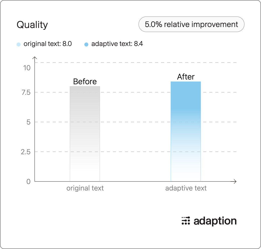
Grade Improvement:

Percentile Chart:
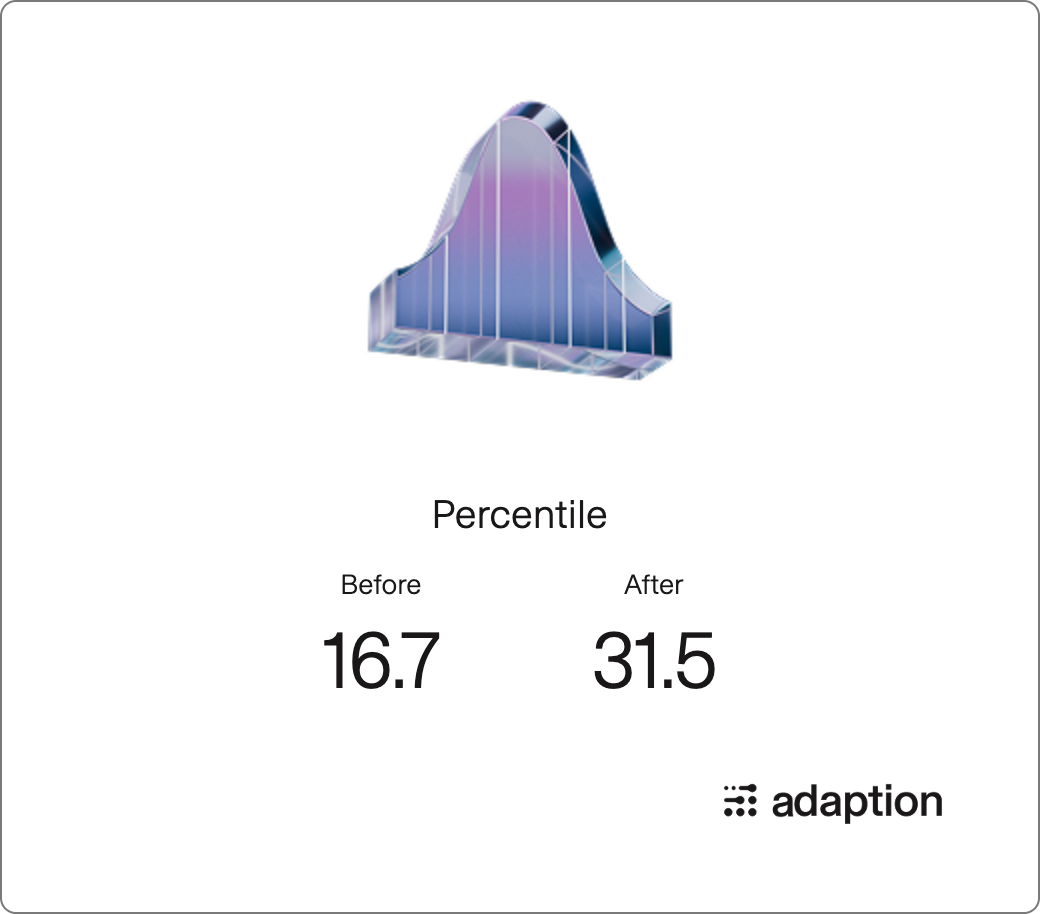
- Downloads last month
- 19