
Dataset Preview
Full Screen Viewer
Full Screen
The full dataset viewer is not available (click to read why). Only showing a preview of the rows.
The dataset generation failed because of a cast error
Error code:   DatasetGenerationCastError
Exception:    DatasetGenerationCastError
Message:      An error occurred while generating the dataset

All the data files must have the same columns, but at some point there are 3 new columns ({'check_flagged_words_criteria', 'check_stop_word_ratio_criteria', 'check_char_repetition_criteria'})

This happened while the json dataset builder was generating data using

hf://datasets/CarperAI/pile-v2-small-filtered/data/CodePileReddit2019/data.json (at revision e2f37e95cc5eb38359b6aefc2cbf98a50fd1b7e4)

Please either edit the data files to have matching columns, or separate them into different configurations (see docs at https://hf.co/docs/hub/datasets-manual-configuration#multiple-configurations)
Traceback:    Traceback (most recent call last):
                File "/src/services/worker/.venv/lib/python3.9/site-packages/datasets/builder.py", line 2011, in _prepare_split_single
                  writer.write_table(table)
                File "/src/services/worker/.venv/lib/python3.9/site-packages/datasets/arrow_writer.py", line 585, in write_table
                  pa_table = table_cast(pa_table, self._schema)
                File "/src/services/worker/.venv/lib/python3.9/site-packages/datasets/table.py", line 2302, in table_cast
                  return cast_table_to_schema(table, schema)
                File "/src/services/worker/.venv/lib/python3.9/site-packages/datasets/table.py", line 2256, in cast_table_to_schema
                  raise CastError(
              datasets.table.CastError: Couldn't cast
              text: string
              meta: string
              id: int64
              check_char_repetition_criteria: double
              check_flagged_words_criteria: double
              check_stop_word_ratio_criteria: double
              to
              {'id': Value(dtype='string', id=None), 'text': Value(dtype='string', id=None), 'meta': Value(dtype='string', id=None)}
              because column names don't match

              During handling of the above exception, another exception occurred:

              Traceback (most recent call last):
                File "/src/services/worker/src/worker/job_runners/config/parquet_and_info.py", line 1321, in compute_config_parquet_and_info_response
                  parquet_operations = convert_to_parquet(builder)
                File "/src/services/worker/src/worker/job_runners/config/parquet_and_info.py", line 935, in convert_to_parquet
                  builder.download_and_prepare(
                File "/src/services/worker/.venv/lib/python3.9/site-packages/datasets/builder.py", line 1027, in download_and_prepare
                  self._download_and_prepare(
                File "/src/services/worker/.venv/lib/python3.9/site-packages/datasets/builder.py", line 1122, in _download_and_prepare
                  self._prepare_split(split_generator, **prepare_split_kwargs)
                File "/src/services/worker/.venv/lib/python3.9/site-packages/datasets/builder.py", line 1882, in _prepare_split
                  for job_id, done, content in self._prepare_split_single(
                File "/src/services/worker/.venv/lib/python3.9/site-packages/datasets/builder.py", line 2013, in _prepare_split_single
                  raise DatasetGenerationCastError.from_cast_error(
              datasets.exceptions.DatasetGenerationCastError: An error occurred while generating the dataset

              All the data files must have the same columns, but at some point there are 3 new columns ({'check_flagged_words_criteria', 'check_stop_word_ratio_criteria', 'check_char_repetition_criteria'})

              This happened while the json dataset builder was generating data using

              hf://datasets/CarperAI/pile-v2-small-filtered/data/CodePileReddit2019/data.json (at revision e2f37e95cc5eb38359b6aefc2cbf98a50fd1b7e4)

              Please either edit the data files to have matching columns, or separate them into different configurations (see docs at https://hf.co/docs/hub/datasets-manual-configuration#multiple-configurations)
Need help to make the dataset viewer work? Make sure to review how to configure the dataset viewer, and open a discussion for direct support.
id
string | text
string | meta
string |
|---|---|---|
97090 | """
## Binary Classification using Graduate Admission Dataset
This notebook compares performance of various Machine Learning classifiers on the "Graduate Admission" data. I'm still just a naive student implementing Machine Learning techniques. You're most welcome to suggest me edits on this kernel, I am happy to learn.
"""
"""
## Setting up Google Colab
You can skip next 2 sections if you're not using Google Colab.
"""
## Uploading my kaggle.json (required for accessing Kaggle APIs)
from google.colab import files
files.upload()
## Install Kaggle API
!pip install -q kaggle
## Moving the json to appropriate place
!mkdir -p ~/.kaggle
!cp kaggle.json ~/.kaggle/
!chmod 600 /root/.kaggle/kaggle.json
"""
### Getting the data
I'll use Kaggle API for getting the data directly into this instead of pulling the data from Google Drive.
"""
!kaggle datasets download mohansacharya/graduate-admissions
!echo "========================================================="
!ls
!unzip graduate-admissions.zip
!echo "========================================================="
!ls
"""
### Imports
"""
import pandas as pd
import numpy as np
import matplotlib.pyplot as plt
import seaborn as sns
from sklearn.model_selection import train_test_split
pd.set_option('display.max_columns', 60)
%matplotlib inline
"""
### Data exploration
"""
FILE_NAME = "../input/Admission_Predict_Ver1.1.csv"
raw_data = pd.read_csv(FILE_NAME)
raw_data.head()
## Are any null values persent ?
raw_data.isnull().values.any()
## So no NaNs apparently
## Let's just quickly rename the dataframe columns to make easy references
## Notice the blankspace after the end of 'Chance of Admit' column name
raw_data.rename(columns = {
'Serial No.' : 'srn',
'GRE Score' : 'gre',
'TOEFL Score': 'toefl',
'University Rating' : 'unirating',
'SOP' : 'sop',
'LOR ' : 'lor',
'CGPA' : 'cgpa',
'Research' : 'research',
'Chance of Admit ': 'chance'
}, inplace=True)
raw_data.describe()
"""
### Analyzing the factors influencing the admission :
From what I've heard from my relatives, seniors, friends is that you need an excellent CGPA from a good university , let's verify that first.
"""
fig, ax = plt.subplots(ncols = 2)
sns.regplot(x='chance', y='cgpa', data=raw_data, ax=ax[0])
sns.regplot(x='chance', y='unirating', data=raw_data, ax=ax[1])
"""
### Effect of GRE/TOEFL :
Let's see if GRE/TOEFL score matters at all. From what I've heard from my seniors, relatives, friends; these exams don't matter if your score is above some threshold.
"""
fig, ax = plt.subplots(ncols = 2)
sns.regplot(x='chance', y='gre', data=raw_data, ax=ax[0])
sns.regplot(x='chance', y='toefl', data=raw_data, ax=ax[1])
"""
### Effect of SOP / LOR / Research :
I decided to analyze these separately since these are not academic related.and count mostly as an extra curricular skill / writing.
"""
fig, ax = plt.subplots(ncols = 3)
sns.regplot(x='chance', y='sop', data=raw_data, ax=ax[0])
sns.regplot(x='chance', y='lor', data=raw_data, ax=ax[1])
sns.regplot(x='chance', y='research', data=raw_data, ax=ax[2])
"""
### Conclusions :
CGPA, GRE and TOEFL are extremely important and they vary almost linearly. (TOEFL varies almost scaringly linearly to chance of admit). On other factors, you need to have _just enough_ score to get admission.
We will convert the 'Chance of Admission' column into 0 or 1 and then use binary classification algorithms to see if you can get an admission or not.
"""
THRESH = 0.6
# I think we can also drop srn as it is not doing absolutely anything
raw_data.drop('srn', axis=1, inplace=True)
raw_data['chance'] = np.where(raw_data['chance'] > THRESH, 1, 0)
raw_data.head()
raw_data.describe()
"""
### Train-Test split :
Since we have less data, I am goign to use traditional 70-30 train test split. May update this in future if author adds more data.
"""
X = raw_data.drop(columns='chance')
Y = raw_data['chance'].values.reshape(raw_data.shape[0], 1)
X_train, X_test, Y_train, Y_test = train_test_split(X, Y, test_size=0.3)
print("Training set ...")
print("X_train.shape = {}, Y_train.shape = is {}".format(X_train.shape,
Y_train.shape))
print("Test set ...")
print("X_test.shape = {}, Y_test.shape = is {}".format(X_test.shape,
Y_test.shape))
from sklearn.metrics import mean_absolute_error as mae
"""
### Trying out Logistic Regression :
Let's apply good old logistic regression to see if it acn classify the dataset properly
"""
from sklearn.linear_model import LogisticRegression
clf = LogisticRegression(penalty='l1', solver='liblinear', max_iter=3000000,
tol=1e-8)
clf.fit(X_train, Y_train)
Y_pred = clf.predict(X_test)
print("Mean Absolute Error = ", mae(Y_test, Y_pred))
"""
### Trying out LinearSVC :
Linearity of data with respect to 3 features suggest us to use Linear SVC.
"""
from sklearn.svm import LinearSVC
clf = LinearSVC(verbose=1, max_iter=3000000, tol=1e-8, C=1.25)
clf.fit(X_train, Y_train)
Y_pred = clf.predict(X_test)
print("Mean Absolute Error = ", mae(Y_test, Y_pred))
"""
### Trying out Bernoulli Naive Bayes
As described [here](https://towardsdatascience.com/naive-bayes-classifier-81d512f50a7c), Bernoulli Naive Bayes can be used for binary classification assuming all factors equally influence the output.
"""
from sklearn.naive_bayes import BernoulliNB
clf = BernoulliNB()
clf.fit(X_train, Y_train)
Y_pred = clf.predict(X_test)
print("Mean Absolute Error = ", mae(Y_test, Y_pred))
"""
### Trying out Decision Tree Classifier
"""
from sklearn.tree import DecisionTreeClassifier
clf = DecisionTreeClassifier(max_depth=10)
clf.fit(X_train, Y_train)
Y_pred = clf.predict(X_test)
print("Mean Absolute Error = ", mae(Y_test, Y_pred))
"""
### Conclusion :
Most of the classifiers don't work very well on the data with the currently chosen hyper-parameters. This maybe due to smaller size of dataset.
I'm still new to machine learning, if you think I've done something wrong and you want to correct me, you're most welcome.
""" | {'source': 'AI4Code', 'id': 'b24cf5394d60f5'} |
116041 | """
#### this notebook is part of the documentation on my HPA approach
-> main notebook: https://www.kaggle.com/philipjamessullivan/0-hpa-approach-summary
## 7: network training
-> https://www.kaggle.com/philipjamessullivan/7-train-effnetb0-version-a-part-1
-> https://www.kaggle.com/philipjamessullivan/7-train-effnetb1-version-a-part-1
-> https://www.kaggle.com/philipjamessullivan/7-train-effnetb2-version-a-part-1
-> https://www.kaggle.com/philipjamessullivan/7-train-effnetb3-version-a-part-1
##### Network Architecture: Efficientnet (B0 to B3) with a Dropout layer of 0.3
#### Goal: further refine model
##### INPUT:
**resized cropped RGB cell images**:
EfficientnetB0 -> 224x224
EfficientnetB1 -> 240x240
EfficientnetB2 -> 260x260
EfficientnetB3 -> 300x300
**specific subset of ground truth dataframe**:
Colums: img_id, Label, Cell#, bbox coords, path
##### OUTPUT:
**model checkpoints**:
one after each epoch
**training history**:
shown as printed array on screen with f1 loss and f1 score per step
"""
import pickle
import pandas as pd
hpa_df = pd.read_pickle("../input/gtdataframes/dataset_partial_300.pkl")
hpa_df
LABELS= {
0: "Nucleoplasm",
1: "Nuclear membrane",
2: "Nucleoli",
3: "Nucleoli fibrillar center",
4: "Nuclear speckles",
5: "Nuclear bodies",
6: "Endoplasmic reticulum",
7: "Golgi apparatus",
8: "Intermediate filaments",
9: "Actin filaments",
10: "Microtubules",
11: "Mitotic spindle",
12: "Centrosome",
13: "Plasma membrane",
14: "Mitochondria",
15: "Aggresome",
16: "Cytosol",
17: "Vesicles and punctate cytosolic patterns",
18: "Negative"
}
import tensorflow as tf
print(tf.__version__)
from tensorflow.keras.layers import *
from tensorflow.keras.models import *
import tensorflow_addons as tfa
import os
import re
import cv2
import glob
import numpy as np
import pandas as pd
import seaborn as sns
from functools import partial
import matplotlib.pyplot as plt
IMG_WIDTH = 300
IMG_HEIGHT = 300
BATCH_SIZE = 16
AUTOTUNE = tf.data.experimental.AUTOTUNE
#%%script echo skipping
#set an amount of folds to split dataframe into --> k-fold cross validation
# explanation: https://towardsdatascience.com/cross-validation-explained-evaluating-estimator-performance-e51e5430ff85
N_FOLDS=5
#choose which one of the 5 folds will be used as validation set this time
i_VAL_FOLD=1
hpa_df=np.array_split(hpa_df, N_FOLDS+1) #add one extra part for testing set
df_test_split=hpa_df[-1]
hpa_df=hpa_df[:-1]
i_training = [i for i in range(N_FOLDS)]
i_training.pop(i_VAL_FOLD-1)
i_validation=i_VAL_FOLD-1
df_train_split=list()
for i in i_training:
df_train_split.append(hpa_df[i])
df_train_split=pd.concat(df_train_split)
df_val_split=hpa_df[i_validation]
print(len(df_train_split))
print(len(df_val_split))
print(len(df_test_split))
#%%script echo skipping
#analyze class imbalance and set up class weights here
#https://www.analyticsvidhya.com/blog/2020/10/improve-class-imbalance-class-weights/
y_train=df_train_split["Label"].apply(lambda x:list(map(int, x.split("|"))))
y_train=y_train.values
y_train=np.concatenate(y_train)
from sklearn.utils import class_weight
class_weights = class_weight.compute_class_weight('balanced',
np.unique(y_train),
y_train)
#%%script echo skipping
tmp_dict={}
for i in range(len(LABELS)):
tmp_dict[i]=class_weights[i]
class_weights=tmp_dict
class_weights
#%%script echo skipping
# adapted from https://www.kaggle.com/ayuraj/hpa-multi-label-classification-with-tf-and-w-b
@tf.function
def multiple_one_hot(cat_tensor, depth_list):
"""Creates one-hot-encodings for multiple categorical attributes and
concatenates the resulting encodings
Args:
cat_tensor (tf.Tensor): tensor with mutiple columns containing categorical features
depth_list (list): list of the no. of values (depth) for each categorical
Returns:
one_hot_enc_tensor (tf.Tensor): concatenated one-hot-encodings of cat_tensor
"""
one_hot_enc_tensor = tf.one_hot(cat_int_tensor[:,0], depth_list[0], axis=1)
for col in range(1, len(depth_list)):
add = tf.one_hot(cat_int_tensor[:,col], depth_list[col], axis=1)
one_hot_enc_tensor = tf.concat([one_hot_enc_tensor, add], axis=1)
return one_hot_enc_tensor
@tf.function
def load_image(df_dict):
# Load image
rgb = tf.io.read_file(df_dict['path'])
image = tf.image.decode_png(rgb, channels=3)
#https://medium.com/@kyawsawhtoon/a-tutorial-to-histogram-equalization-497600f270e2
image=tf.image.per_image_standardization(image)
# Parse label
label = tf.strings.split(df_dict['Label'], sep='|')
label = tf.strings.to_number(label, out_type=tf.int32)
label = tf.reduce_sum(tf.one_hot(indices=label, depth=19), axis=0)
return image, label
#%%script echo skipping
train_ds = tf.data.Dataset.from_tensor_slices(dict(df_train_split))
val_ds = tf.data.Dataset.from_tensor_slices(dict(df_val_split))
# Training Dataset
train_ds = (
train_ds
.shuffle(1024)
.map(load_image, num_parallel_calls=AUTOTUNE)
.batch(BATCH_SIZE)
.prefetch(tf.data.experimental.AUTOTUNE)
)
# Validation Dataset
val_ds = (
val_ds
.shuffle(1024)
.map(load_image, num_parallel_calls=AUTOTUNE)
.batch(BATCH_SIZE)
.prefetch(tf.data.experimental.AUTOTUNE)
)
#%%script echo skipping
def get_label_name(labels):
l = np.where(labels == 1.)[0]
label_names = []
for label in l:
label_names.append(LABELS[label])
return '-'.join(str(label_name) for label_name in label_names)
def show_batch(image_batch, label_batch):
plt.figure(figsize=(20,20))
for n in range(10):
ax = plt.subplot(5,5,n+1)
plt.imshow(image_batch[n])
plt.title(get_label_name(label_batch[n].numpy()))
plt.axis('off')
#%%script echo skipping
# Training batch
image_batch, label_batch = next(iter(train_ds))
show_batch(image_batch, label_batch)
#print(label_batch)
#%%script echo skipping
def get_model():
base_model = tf.keras.applications.EfficientNetB3(include_top=False, weights='imagenet')
base_model.trainable = True
inputs = Input((IMG_HEIGHT, IMG_WIDTH, 3))
x = base_model(inputs, training=True)
x = GlobalAveragePooling2D()(x)
x = Dropout(0.3)(x)
outputs = Dense(len(LABELS), activation='sigmoid')(x)
return Model(inputs, outputs)
tf.keras.backend.clear_session()
model = get_model()
model.summary()
#%%script echo skipping
time_stopping_callback = tfa.callbacks.TimeStopping(seconds=int(round(60*60*8)), verbose=1) #8h to not exceed allowance
earlystopper = tf.keras.callbacks.EarlyStopping(
monitor='val_loss', patience=10, verbose=0, mode='min',
restore_best_weights=True
)
lronplateau = tf.keras.callbacks.ReduceLROnPlateau(
monitor='val_loss', factor=0.5, patience=5, verbose=0,
mode='auto', min_delta=0.0001, cooldown=0, min_lr=0
)
#%%script echo skipping
#set up checkpoint save
#source:https://www.tensorflow.org/tutorials/keras/save_and_load
!pip install -q pyyaml h5py
import os
checkpoint_path_input = "../input/traineffnetb3versionapart1/cp.ckpt"
checkpoint_path = "./cp.ckpt"
checkpoint_dir = os.path.dirname(checkpoint_path)
# Create a callback that saves the model's weights
cp_callback = tf.keras.callbacks.ModelCheckpoint(filepath=checkpoint_path,
save_weights_only=True,
verbose=1)
#%%script echo skipping
import keras.backend as K
K_epsilon = K.epsilon()
def f1(y_true, y_pred):
#y_pred = K.round(y_pred)
y_pred = K.cast(K.greater(K.clip(y_pred, 0, 1), 0.5), K.floatx())
tp = K.sum(K.cast(y_true*y_pred, 'float'), axis=0)
tn = K.sum(K.cast((1-y_true)*(1-y_pred), 'float'), axis=0)
fp = K.sum(K.cast((1-y_true)*y_pred, 'float'), axis=0)
fn = K.sum(K.cast(y_true*(1-y_pred), 'float'), axis=0)
p = tp / (tp + fp + K_epsilon)
r = tp / (tp + fn + K_epsilon)
f1 = 2*p*r / (p+r+K_epsilon)
f1 = tf.where(tf.math.is_nan(f1), tf.zeros_like(f1), f1)
return K.mean(f1)
def f1_loss(y_true, y_pred):
#y_pred = K.cast(K.greater(K.clip(y_pred, 0, 1), THRESHOLD), K.floatx())
tp = K.sum(K.cast(y_true*y_pred, 'float'), axis=0)
tn = K.sum(K.cast((1-y_true)*(1-y_pred), 'float'), axis=0)
fp = K.sum(K.cast((1-y_true)*y_pred, 'float'), axis=0)
fn = K.sum(K.cast(y_true*(1-y_pred), 'float'), axis=0)
p = tp / (tp + fp + K_epsilon)
r = tp / (tp + fn + K_epsilon)
f1 = 2*p*r / (p+r+K_epsilon)
f1 = tf.where(tf.math.is_nan(f1), tf.zeros_like(f1), f1)
return 1-K.mean(f1)
#%%script echo skipping
import tensorflow as tf
import timeit
device_name = tf.test.gpu_device_name()
if "GPU" not in device_name:
print("GPU device not found")
print('Found GPU at: {}'.format(device_name))
#https://stackoverflow.com/questions/47490834/how-can-i-print-the-learning-rate-at-each-epoch-with-adam-optimizer-in-keras
import keras
def get_lr_metric(optimizer):
def lr(y_true, y_pred):
return optimizer._decayed_lr(tf.float32)
return lr
optimizer = keras.optimizers.Adam()
lr_metric = get_lr_metric(optimizer)
#%%script echo skipping
# Initialize model
tf.keras.backend.clear_session()
#model = get_model()
model.load_weights(checkpoint_path_input)
# Compile model
model.compile(
optimizer=optimizer,
loss=f1_loss,
metrics=[f1, lr_metric])
# Train
history=model.fit(
train_ds,
epochs=1000,
validation_data=val_ds,
class_weight=class_weights,
callbacks=[cp_callback,earlystopper,time_stopping_callback])
#%%script echo skipping
history.history
#%%script echo skipping
#source: https://machinelearningmastery.com/display-deep-learning-model-training-history-in-keras/
# list all data in history
print(history.history.keys())
# summarize history for f1
plt.plot(history.history['f1'])
plt.plot(history.history['val_f1'])
plt.title('f1')
plt.ylabel('f1')
plt.xlabel('epoch')
plt.legend(['train', 'val'], loc='upper left')
plt.show()
# summarize history for loss
plt.plot(history.history['loss'])
plt.plot(history.history['val_loss'])
plt.title('loss')
plt.ylabel('loss')
plt.xlabel('epoch')
plt.legend(['train', 'val'], loc='upper left')
plt.show()
# summarize history for lr
plt.plot(history.history['lr'])
plt.title('learning rate')
plt.ylabel('learning rate')
plt.xlabel('epoch')
plt.legend('train', loc='upper left')
plt.show()
with open('./historyhistory.pkl', 'wb') as handle:
pickle.dump(history.history, handle, protocol=pickle.HIGHEST_PROTOCOL)
with open('./history.pkl', 'wb') as handle:
pickle.dump(history, handle, protocol=pickle.HIGHEST_PROTOCOL) | {'source': 'AI4Code', 'id': 'd5668563d2cdd3'} |
37319 | """
* V14: train with tri grams and generate new vocab, num feat = 15000
"""
# This Python 3 environment comes with many helpful analytics libraries installed
# It is defined by the kaggle/python docker image: https://github.com/kaggle/docker-python
# For example, here's several helpful packages to load in
import numpy as np # linear algebra
import pandas as pd # data processing, CSV file I/O (e.g. pd.read_csv)
# Input data files are available in the "../input/" directory.
# For example, running this (by clicking run or pressing Shift+Enter) will list all files under the input directory
import os
for dirname, _, filenames in os.walk('/kaggle/input'):
for filename in filenames:
print(os.path.join(dirname, filename))
# Any results you write to the current directory are saved as output.
! pip install underthesea
import numpy as np
import pandas as pd
import pylab as plt
import matplotlib.pyplot as plt
import plotly.offline as py
import plotly.graph_objs as go
py.init_notebook_mode(connected=True)
from sklearn.linear_model import LogisticRegression
from sklearn.model_selection import train_test_split
from sklearn.metrics import accuracy_score, precision_score, recall_score, f1_score
from sklearn.model_selection import KFold, cross_val_score
from sklearn.metrics import cohen_kappa_score
from tensorflow.python.keras.models import Sequential, load_model
from tensorflow.python.keras.layers import Dense, Dropout
from tensorflow.python.keras import optimizers
from sklearn.feature_extraction.text import TfidfVectorizer
from sklearn.feature_extraction.text import CountVectorizer
from sklearn.preprocessing import OneHotEncoder, LabelEncoder
import pickle
import seaborn as sns
from imblearn.over_sampling import SMOTE
from nltk.corpus import stopwords
import keras
import io
import requests
import nltk
nltk.download('punkt')
nltk.download('stopwords')
from underthesea import word_tokenize
from tensorflow.python.client import device_lib
print(device_lib.list_local_devices())
from keras import backend as K
K.tensorflow_backend._get_available_gpus()
import codecs
def create_stopwordlist():
f = codecs.open('/kaggle/input/vietnamese-stopwords/vietnamese-stopwords.txt', encoding='utf-8')
data = []
null_data = []
for i, line in enumerate(f):
line = repr(line)
line = line[1:len(line)-3]
data.append(line)
return data
stopword_vn = create_stopwordlist()
import string
def tokenize(text):
text = text.translate(str.maketrans('', '', string.punctuation))
return [word for word in word_tokenize(text.lower()) if word not in stopword_vn]
def choose_vectorizer(option, name='tf_idf'):
if option == 'generate':
if name == 'tf_idf':
vectorizer = TfidfVectorizer(tokenizer = tokenize,ngram_range=(1,4), min_df=5, max_df= 0.8, max_features= 5000, sublinear_tf=True)
else:
vectorizer = CountVectorizer(tokenizer = tokenize, ngram_range=(1,4), max_df=0.8, min_df=5, max_features = 5000, sublinear_tf=True)
elif option == 'load':
if name == 'tf_idf':
vectorizer = TfidfVectorizer(vocabulary = pickle.load(open('../input/kpdl-data/vocabulary_2.pkl', 'rb')), ngram_range=(1,3), min_df=5, max_df= 0.8, max_features=15000, sublinear_tf=True)
else:
vectorizer = CountVectorizer(vocabulary = pickle.load(open('../input/kpdl-data/vocabulary_2.pkl', 'rb')), ngram_range=(1,3), max_df=0.8, min_df=5, max_features = 15000, sublinear_tf=True)
return vectorizer
# data = pd.read_csv('../input/kpdl-data/train_v1.csv')
data = pd.read_csv('../input/vietnamese-sentiment-analyst/data - data.csv')
data.head(2)
df = data.loc[data['comment'] == None]
df
category = data['rate'].unique()
category_to_id = {cate: idx for idx, cate in enumerate(category)}
id_to_category = {idx: cate for idx, cate in enumerate(category)}
print(category_to_id)
print(id_to_category)
"""
### Distribution of label
"""
data_label = data['rate']
data_label = pd.DataFrame(data_label, columns=['rate']).groupby('rate').size()
data_label.plot.pie(figsize=(15, 15), autopct="%.2f%%", fontsize=12)
X_train, X_test, y_train, y_test = train_test_split(data['comment'], data['rate'], test_size = .15, shuffle = True, stratify=data['rate'])
X_train, X_valid, y_train, y_valid = train_test_split(X_train, y_train, test_size = .2, shuffle = True, stratify=y_train)
X_train.shape
X_train_df = pd.DataFrame(X_train, columns=['comment'])
X_valid_df = pd.DataFrame(X_valid, columns=['comment'])
X_test_df = pd.DataFrame(X_test, columns=['comment'])
print(X_train_df.head(10))
print(X_valid_df.head(10))
print(X_test_df.head(10))
y_train
"""
### Check distribution of train, valid and test set
"""
%%time
options = ['generate', 'load']
# 0 to generate, 1 to load (choose wisely, your life depends on it!)
option = options[0]
vectorizer = choose_vectorizer(option)
X_train = vectorizer.fit_transform(X_train).toarray()
X_valid = vectorizer.transform(X_valid).toarray()
X_test = vectorizer.transform(X_test).toarray()
if option == 'generate':
pickle.dump(vectorizer.vocabulary_, open('vocabulary_3.pkl', 'wb'))
print(X_train.shape, X_valid.shape, X_test.shape)
X_train.shape
y_ = y_train.map(category_to_id).values
y_train = np.zeros((len(y_), y_.max()+1))
y_train[np.arange(len(y_)), y_] = 1
# y_train = y_
y_ = y_test.map(category_to_id).values
y_test = np.zeros((len(y_), y_.max()+1))
y_test[np.arange(len(y_)), y_] = 1
# y_test = y_
y_ = y_valid.map(category_to_id).values
y_valid = np.zeros((len(y_), y_.max()+1))
y_valid[np.arange(len(y_)), y_] = 1
# y_valid = y_
print(y_train.sum(1))
print(y_valid.sum(1))
print(y_test.sum(1))
print(y_train.shape, y_valid.shape, y_test.shape)
from keras.callbacks import EarlyStopping, ReduceLROnPlateau, ModelCheckpoint
DROPOUT = 0.3
ACTIVATION = "relu"
model = Sequential([
Dense(1000, activation=ACTIVATION, input_dim=X_train.shape[1]),
Dropout(DROPOUT),
Dense(500, activation=ACTIVATION),
Dropout(DROPOUT),
Dense(300, activation=ACTIVATION),
Dropout(DROPOUT),
# Dense(200, activation=ACTIVATION),
# Dropout(DROPOUT),
# Dense(100, activation=ACTIVATION),
# Dropout(DROPOUT),
# Dense(50, activation=ACTIVATION),
# Dropout(DROPOUT),
Dense(5, activation='softmax'),
])
def recall_m(y_true, y_pred):
true_positives = K.sum(K.round(K.clip(y_true * y_pred, 0, 1)))
possible_positives = K.sum(K.round(K.clip(y_true, 0, 1)))
recall = true_positives / (possible_positives + K.epsilon())
return recall
def precision_m(y_true, y_pred):
true_positives = K.sum(K.round(K.clip(y_true * y_pred, 0, 1)))
predicted_positives = K.sum(K.round(K.clip(y_pred, 0, 1)))
precision = true_positives / (predicted_positives + K.epsilon())
return precision
def f1_m(y_true, y_pred):
precision = precision_m(y_true, y_pred)
recall = recall_m(y_true, y_pred)
return 2*((precision*recall)/(precision+recall+K.epsilon()))
model.compile(optimizer=optimizers.Adam(0.001), loss='categorical_crossentropy', metrics=['acc', f1_m,precision_m, recall_m])
model.summary()
es = EarlyStopping(monitor='val_f1_m', mode='max', verbose=1, patience=5)
reduce_lr = ReduceLROnPlateau(monitor='val_f1_m', factor=0.2, patience=8, min_lr=1e7)
checkpoint = ModelCheckpoint('best_full.h5', monitor='val_f1_m', verbose=0, save_best_only=False, save_weights_only=False, mode='auto', period=1)
EPOCHS = 25
BATCHSIZE = 4
model.fit(X_train, y_train, epochs=EPOCHS, batch_size=BATCHSIZE, validation_data=(X_valid, y_valid), callbacks=[es, reduce_lr, checkpoint])
x = np.arange(EPOCHS)
history = model.history.history
# import tensorflow as tf
# model = tf.keras.models.load_model('../input/kpdl-base/my_model.h5')
from keras.models import Sequential
from keras.layers import Dense
from keras.models import model_from_json
model.save('my_model.h5')
"""
### Predict in train, valid and test set
"""
predict_train = model.predict(X_train)
predict_valid = model.predict(X_valid)
predict_test = model.predict(X_test)
print(predict_train.shape, predict_valid.shape, predict_test.shape)
predict_train_label = predict_train.argmax(-1)
predict_valid_label = predict_valid.argmax(-1)
predict_test_label = predict_test.argmax(-1)
# predict_train_label
predict_train_label = [id_to_category[predict_train_label[idx]] for idx in range(len(predict_train))]
predict_valid_label = [id_to_category[predict_valid_label[idx]] for idx in range(len(predict_valid))]
predict_test_label = [id_to_category[predict_test_label[idx]] for idx in range(len(predict_test))]
# predict_train_label
y_train_true = y_train.argmax(-1)
y_valid_true = y_valid.argmax(-1)
y_test_true = y_test.argmax(-1)
# y_train_true = y_train
# y_valid_true = y_valid
# y_test_true = y_test
# y_train_true
# y_train_true
y_train_label = [id_to_category[y_train_true[idx]] for idx in range(len(y_train_true))]
y_valid_label = [id_to_category[y_valid_true[idx]] for idx in range(len(y_valid_true))]
y_test_label = [id_to_category[y_test_true[idx]] for idx in range(len(y_test_true))]
train_concat = np.concatenate((np.array(X_train_df['comment'].values).reshape(-1, 1), np.array(y_train_label).reshape(-1, 1), np.array(predict_train_label).reshape(-1, 1)), axis=-1)
valid_concat = np.concatenate((np.array(X_valid_df['comment'].values).reshape(-1, 1), np.array(y_valid_label).reshape(-1, 1), np.array(predict_valid_label).reshape(-1, 1)), axis=-1)
test_concat = np.concatenate((np.array(X_test_df['comment'].values).reshape(-1, 1), np.array(y_test_label).reshape(-1, 1), np.array(predict_test_label).reshape(-1, 1)), axis=-1)
# train_concat = np.concatenate((np.array(X_train_df['Content'].values).reshape(-1, 1), np.array(y_train_label).reshape(-1, 1)), axis=-1)
# valid_concat = np.concatenate((np.array(X_valid_df['Content'].values).reshape(-1, 1), np.array(y_valid_label).reshape(-1, 1)), axis=-1)
# test_concat = np.concatenate((np.array(X_test_df['Content'].values).reshape(-1, 1), np.array(y_test_label).reshape(-1, 1)), axis=-1)
# train_concat_predict_df = pd.DataFrame(train_concat, columns=['Content', 'True_Label'])
# valid_concat_predict_df = pd.DataFrame(valid_concat, columns=['Content', 'True_Label'])
# test_concat_predict_df = pd.DataFrame(test_concat, columns=['Content', 'True_Label'])
train_concat_predict_df = pd.DataFrame(train_concat, columns=['comment', 'True_Label', 'Predict'])
valid_concat_predict_df = pd.DataFrame(valid_concat, columns=['comment', 'True_Label', 'Predict'])
test_concat_predict_df = pd.DataFrame(test_concat, columns=['comment', 'True_Label', 'Predict'])
train_concat_predict_df.head(20)
valid_concat_predict_df.head(20)
test_concat_predict_df.head(20)
"""
### Save predict to csv file
"""
train_concat_predict_df.to_csv('train_concat_predict_df.csv', index=False)
valid_concat_predict_df.to_csv('valid_concat_predict_df.csv', index=False)
test_concat_predict_df.to_csv('test_concat_predict_df.csv', index=False)
predict_test
from sklearn.metrics import confusion_matrix
import seaborn as sns
plt.figure(figsize=(8, 8))
conf_mat = confusion_matrix(y_test_true, predict_test.argmax(-1))
sns.heatmap(conf_mat, annot=True, fmt='d',
xticklabels=id_to_category.values(), yticklabels=id_to_category.values())
plt.ylabel('Actual')
plt.xlabel('Predicted')
# y_test_true
predict_test = predict_test.argmax(-1)
from sklearn.metrics import f1_score
score = f1_score(y_test_true, predict_test, average='weighted')
score
"""
### List Content that model predicted false
"""
labels = data['rate'].unique()
for label in labels:
wrong = []
df = test_concat_predict_df.loc[test_concat_predict_df['True_Label'] == label]
df_content = df.values
for row in df_content:
if np.abs(int(row[1])- int(row[2])):
wrong.append(row)
df_wrong = pd.DataFrame(wrong, columns=['rate', 'true', 'predict'])
df_wrong.to_csv(f'{label}_test.csv')
print(label, df_wrong)
for label in labels:
wrong = []
df = valid_concat_predict_df.loc[valid_concat_predict_df['True_Label'] == label]
df_content = df.values
for row in df_content:
if np.abs(int(row[1])- int(row[2])):
wrong.append(row)
df_wrong = pd.DataFrame(wrong, columns=['rate', 'true', 'predict'])
df_wrong.to_csv(f'{label}_valid.csv')
print(label, df_wrong.head())
for label in labels:
wrong = []
df = train_concat_predict_df.loc[train_concat_predict_df['True_Label'] == label]
df_content = df.values
for row in df_content:
if np.abs(int(row[1])- int(row[2])):
wrong.append(row)
df_wrong = pd.DataFrame(wrong, columns=['rate', 'true', 'predict'])
df_wrong.to_csv(f'{label}_train.csv')
print(label, df_wrong.head()) | {'source': 'AI4Code', 'id': '44b1ea84dff48e'} |
48500 | """
# NGBoost やってみたメモ
* modelのチューニングはきちんとやっていません。なのでどちらが性能がいいかはわかりませんが、えいやっと使った感触ではこれくらいのデータなら遜色なかったです。
* 分布が算出できるのは使いどころがあるかもですね。
"""
!pip install ngboost
# basic libraries
import pandas as pd
import numpy as np
import numpy.random as rd
import gc
import multiprocessing as mp
import os
import sys
import pickle
from glob import glob
import math
from datetime import datetime as dt
from pathlib import Path
import scipy.stats as st
import re
import shutil
from tqdm import tqdm_notebook as tqdm
import datetime
ts_conv = np.vectorize(datetime.datetime.fromtimestamp) # 秒ut(10桁) ⇒ 日付
# グラフ描画系
import matplotlib
from matplotlib import font_manager
import matplotlib.pyplot as plt
import matplotlib.cm as cm
from matplotlib import rc
from matplotlib import animation as ani
from IPython.display import Image
plt.rcParams["patch.force_edgecolor"] = True
#rc('text', usetex=True)
from IPython.display import display # Allows the use of display() for DataFrames
import seaborn as sns
sns.set(style="whitegrid", palette="muted", color_codes=True)
sns.set_style("whitegrid", {'grid.linestyle': '--'})
red = sns.xkcd_rgb["light red"]
green = sns.xkcd_rgb["medium green"]
blue = sns.xkcd_rgb["denim blue"]
# pandas formatting
pd.set_option("display.max_colwidth", 100)
pd.set_option("display.max_rows", None)
pd.set_option("display.max_columns", None)
pd.options.display.float_format = '{:,.5f}'.format
%matplotlib inline
%config InlineBackend.figure_format='retina'
# ngboost
from ngboost.ngboost import NGBoost
from ngboost.learners import default_tree_learner
from ngboost.scores import MLE
from ngboost.distns import Normal, LogNormal
# skleran
from sklearn.datasets import load_boston
from sklearn.model_selection import train_test_split
from sklearn.metrics import mean_squared_error
# lightgbm
import lightgbm as lgb
"""
## Data preparation
"""
X, y = load_boston(True)
rd.seed(71)
X_train, X_valid, y_train, y_valid = train_test_split(X, y, test_size=0.2)
"""
# LightGBM model
"""
%%time
lgb_train = lgb.Dataset(X_train, y_train)
lgb_valid = lgb.Dataset(X_valid, y_valid, reference=lgb_train)
model = lgb.train({'objective': 'regression',
'metric': "mse",
'learning_rate': 0.01,
'seed': 71},
lgb_train,
num_boost_round=99999,
valid_sets=[lgb_valid],
early_stopping_rounds=100,
verbose_eval=500)
y_pred_lgb = model.predict(data=X_valid)
"""
# NGBoost model
"""
%%time
rd.seed(71)
ngb = NGBoost(Base=default_tree_learner, Dist=Normal, #Normal, LogNormal
Score=MLE(), natural_gradient=True, verbose=False, )
ngb.fit(X_train, y_train, X_val=X_valid, Y_val=y_valid)
y_preds = ngb.predict(X_valid)
y_dists = ngb.pred_dist(X_valid)
# test Mean Squared Error
test_MSE = mean_squared_error(y_preds, y_valid)
print('ngb Test MSE', test_MSE)
#test Negative Log Likelihood
test_NLL = -y_dists.logpdf(y_valid.flatten()).mean()
print('ngb Test NLL', test_NLL)
"""
# Draw result graph
**point**
* NGBoostは分布を表示できる(今回は正規分布)
* グラフを目視で見た感想としてはLightGBMがgtに近いものもあれば、NGBoostがgtに近いケースもあり、五分五分?
"""
offset = np.ptp(y_preds)*0.1
y_range = np.linspace(min(y_valid)-offset, max(y_valid)+offset, 200).reshape((-1, 1))
dist_values = y_dists.pdf(y_range).transpose()
plt.figure(figsize=(25, 120))
for idx in tqdm(np.arange(X_valid.shape[0])):
plt.subplot(35, 3, idx+1)
plt.plot(y_range, dist_values[idx])
plt.vlines(y_preds[idx], 0, max(dist_values[idx]), "r", label="ngb pred")
plt.vlines(y_pred_lgb[idx], 0, max(dist_values[idx]), "purple", label="lgb pred")
plt.vlines(y_valid[idx], 0, max(dist_values[idx]), "pink", label="ground truth")
plt.legend(loc="best")
plt.title(f"idx: {idx}")
plt.xlim(y_range[0], y_range[-1])
plt.tight_layout()
plt.show()
plt.figure(figsize=(8,6))
plt.scatter(x=y_preds, y=y_pred_lgb, s=20)
plt.plot([8,50], [8,50], color="gray", ls="--")
plt.xlabel("NGBoost")
plt.ylabel("LightGBM")
plt.title("NGBoost vs LightGBM")
plt.show()
plt.figure(figsize=(8,6))
plt.scatter(y=y_preds, x=y_valid, s=20)
plt.plot([8,50], [8,50], color="gray", ls="--")
plt.ylabel("NGBoost")
plt.xlabel("Ground truth")
plt.title("NGBoost vs Ground truth")
plt.show()
plt.figure(figsize=(8,6))
plt.scatter(y=y_pred_lgb, x=y_valid, s=20)
plt.plot([8,50], [8,50], color="gray", ls="--")
plt.ylabel("LightGBM")
plt.xlabel("Ground truth")
plt.title("LightGBM vs Ground truth")
plt.show() | {'source': 'AI4Code', 'id': '5947bd9ad5be6f'} |
106369 | """
## Attention
I'm not good at English. If you find a mistake, let me know, please.
## 0. Abstract
Interestingly, it's a very interesting phenomenon that global transformation by a the Moon's tide stress seems to be a trigger of occurrence for a disastrous earthquake (M>=5.5).
It is found out that some statistically considered research papers geared to past earthquakes, there is no one which show about Lunar Age or Lunar Phase Angle clearly.The one of possibility reason is tidal phase angle on the Earth depends on the lunar age. However, many people can not calculate the tidal phase angle.
This report's objective is that many people are able to imagine at time of high potential of earthquake occurrence intuitively by using visualization of **the position of the Moon and the Sun when earthquake was occurred**.
## 1. Introduction
Schuster (1987) [1] is first article which discuss the influence of the tide from the moon.
Some Studies, such as Tanaka (2012) [2] and Ide et al. (2016) [3], are studied the relationship between the earth tides and earthquakes with targeting specific seismic sources (groups).
Tsuruoka and Ohtake (1995) [4] discussed the relationship with the global tides for earthquakes that occurred in the world.
However, it is too difficult to calclulate tidal stress and to understand it for non-academia ordinary people.
Therefore, I show some figures of relationship between earthquakes and lunar age in order to imagine the timing of earthquake occurrence.
## 2. Data
## 2.1 Data Source
I selected the "[Significant Earthquakes, 1965-2016](https://www.kaggle.com/usgs/earthquake-database)" as the earthquake catalog to visualize target which is probably presented by USGS (United States Geological Survey) on Kaggle platform.
Some earthquake catalogs (or past event lists) are opend on official sites of public organizations, such as USGS, Meteorological Institute of Japan, Disaster-Reduction Research of Japan. These catalogs are not useful because it is not simple list.
Almost earthquakes are caused by plate tectonics at each location, regional characteristics exists. This article target for wide-area seismic activity on the whole earth, regional characteristics are not considered at all. Because it makes hard to discuss the actual mechanism of earthquake occurrence, this may be cause a feeling of strangeness to researcher.
## 2.2 Data Overview
Let's confirm a few head data after reading catalog.
"""
import math
import datetime
import os, sys
import numpy as np
import pandas as pd
DATA_DIR = "/kaggle/input/earthquake-database" + os.sep
# read data file
earthquake = pd.read_csv(
DATA_DIR+"database.csv",
sep=",",
parse_dates={'datetime':['Date', 'Time']},
encoding="utf-8",
error_bad_lines=False,
)
# treating irregular data
for idx in [3378,7512,20650]:
earthquake.at[idx, "datetime"] = earthquake.at[idx, "datetime"].split(" ")[0]
earthquake["datetime"] = pd.to_datetime(earthquake["datetime"], utc=True)
earthquake.set_index(["datetime"], inplace=True)
earthquake.head()
"""
## 2.3 World Map
Confirming the distribution of Earthquakes:
"""
import matplotlib.pyplot as plt
plt.style.use('dark_background')
plt.grid(False)
from mpl_toolkits.basemap import Basemap
%matplotlib inline
ti = "Map of Earthquake's epicenter duaring 1965-2016"
fig, ax = plt.subplots(figsize=(18, 18), dpi=96)
fig.patch.set_facecolor('black')
plt.rcParams["font.size"] = 24
m = Basemap(projection='robin', lat_0=0, lon_0=-170, resolution='c')
m.drawcoastlines()
#m.drawcountries()
m.fillcontinents(color='#606060', zorder = 1)
#m.bluemarble()
#m.drawmapboundary(fill_color='lightblue')
for i in range(5,10,1):
#print(i)
tmp = earthquake[(earthquake["Magnitude"]>=i)&(earthquake["Magnitude"]<i+1)&(earthquake["Type"]=="Earthquake")]
x, y = m(list(tmp.Longitude), list(tmp.Latitude))
points = m.plot(x, y, "o", label=f"Mag.: {i}.x", markersize=0.02*float(i)**3.2, alpha=0.55+0.1*float(i-5))
plt.title(f"{ti}", fontsize=22)
plt.legend(bbox_to_anchor=(1.01, 1), loc='upper left', borderaxespad=0, fontsize=18)
ax_pos = ax.get_position()
fig.text(ax_pos.x1-0.1, ax_pos.y0, "created by boomin", fontsize=16)
plt.show()
"""
We can find **the Ring of Fire** on the Pacific Sea.
Japan is one of the most concentlated country area of earthquake.
## 2.4 Distribution of the Depth
Let's confirm the distribution of the Depth of seismic sources.
"""
ti = "Distribution of Earthquake's Depth"
fig, ax = plt.subplots(figsize=(16, 9), dpi=96)
fig.patch.set_facecolor('black')
plt.rcParams["font.size"] = 24
for i in range(5,8,1):
tmp = earthquake[(earthquake["Magnitude"]>=i)&(earthquake["Magnitude"]<i+1)&(earthquake["Type"]=="Earthquake")]
plt.hist(tmp["Depth"], bins=60, density=True, histtype='step', linewidth=2.5, label=f"Mag.: {i}.x")
tmp = earthquake[(earthquake["Magnitude"]>=8)]
plt.hist(tmp["Depth"], bins=60, density=True, histtype='step', linewidth=1.5, label=f"Mag.: >8.x")
plt.legend(bbox_to_anchor=(1.02, 1), loc='upper left', borderaxespad=0, fontsize=18)
plt.xlabel("Depth, km")
plt.ylabel("Count of Earthquake \n (Normarized at Total surface=1)")
plt.title(f"{ti}")
ax_pos = ax.get_position()
fig.text(ax_pos.x1+0.01, ax_pos.y0, "created by boomin", fontsize=16)
plt.show()
"""
We notice following facts:
* concentlating in shallower area than 100km
* there is also a concentlated areas between 550km and 650km
We are not able to confirm from this figure, epicenters of the earthquakes which are occureed below 550km depth may be locate at center area of continental, not at plate boundary.
The depth of seismic source due to tidal stress or ocean tide is approximately 70-80 km, considering the occuerrence mechanism.
From now on, **we use the data shallower than 80km to visualize**.
"""
earthquake = earthquake[earthquake["Depth"]<80]
earthquake = earthquake[earthquake["Type"]=="Earthquake"]
"""
## 2.5 Distribution of Latitude
Showing the distribution of latitude of epicenter because tidal stress depends on the latitude of the earth.
"""
plt.clf()
ti = "Distribution of Earthquake's Latitude with Magnitude"
fig, ax = plt.subplots(figsize=(16, 9), dpi=96)
fig.patch.set_facecolor('black')
plt.rcParams["font.size"] = 24
#
for i in range(5,8,1):
tmp = earthquake[(earthquake["Magnitude"]>=i)&(earthquake["Magnitude"]<i+1)&(earthquake["Type"]=="Earthquake")]
plt.hist(tmp["Latitude"], bins=60, density=True, histtype='step', linewidth=1.5, label=f"Mag.: {i}.x")
tmp = earthquake[(earthquake["Magnitude"]>=8)]
plt.hist(tmp["Latitude"], bins=60, density=True, histtype='step', linewidth=1.5, label=f"Mag.: >8.x")
#
plt.legend(bbox_to_anchor=(1.02, 1), loc='upper left', borderaxespad=0, fontsize=18)
plt.xlabel("Latitude, deg")
plt.ylabel("Count of Earthquake \n (Normarized at Total surface=1)")
plt.title(f"{ti}")
ax_pos = ax.get_position()
fig.text(ax_pos.x1+0.01, ax_pos.y0, "created by boomin", fontsize=16)
plt.show()
"""
There are some peaks, such as at -10 deg or 50 deg, however distribution of latitude depends on the location of plate boundary.
This figure do not show the correlation between the tidal stress from the Moon and occuracy of earthquake.
This is described later in [section 4.2](#4.2-Relationship-between-the-epicenter-and-Phase-Angle).
"""
"""
## 3. Orbit calculation of the Moon and the Sun from the Earth
The tidal stress at the superficial area of the Earth become large at the following:
* when the Moon come close to the Earth
* tidal stress is inversely proportional to the cube of distance
* influence from the Sun is aproximatry 45% of the Moon because the distanse is effective
* when New Moon or Full Moon
* the face in the same direction of gravitation from the Moon and the Sun
* when high tide or low tide
* change in sea level affects oceanic plate as load
Therefore, I calculate following values at each time of occurrence of earthquake:
1. distance between the Moon and the Earth
2. phase angle between the Moon and the Sun at epicenter
3. Altitude and Azimuth Direction of the Moon at each epicenter
### 3.1 Library
[Astoropy](https://github.com/astropy/astropy) is used for calculation of the Solar System object's position.
### 3.2 Eephemeris for Astronomical position calculation
The ephemeris data is neccesery to calculate the object's position. The DE432s, [the latest data published by JPL](https://ssd.jpl.nasa.gov/?planet_eph_export), is applied for our calculation because DE432s is stored in a smaller, ~10 MB, file than DE432. If you would like to get more precise positions, or longer term over 1950 to 2050, [you should to select DE432 or other data.](https://docs.astropy.org/en/stable/coordinates/solarsystem.html).
If you would like to get more precise positions, or longer term over 1950 to 2050, [you should to select DE430](https://docs.astropy.org/en/stable/coordinates/solarsystem.html).
To retrieve JPL ephemeris of Solar System objects, we need to install following package:
"""
# install ephemeris provided by NASA JPL
!pip install jplephem
"""
### 3.3 Obtaining of Phase Angle between the Sun and the Moon
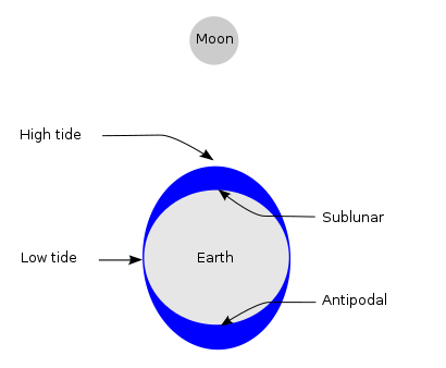
We need to determine lunar age in order to obtain the day of Full Moon and New Moon because tidal force become the storongest at Full Moon or New Moon. When the Moon is new, the direction from the Earth to the Moon coincides with to the Sun, and each gravity force vectors faces in the same direction. When the Moon is full, both the directions and gravity force vectors are in an opposite way.

Thee angle between the Moon and the Sun is defined as [Phase Angle](https://en.wikipedia.org/wiki/Phase_angle_(astronomy)) as following figure.

"""
from numpy import linalg as LA
from astropy.coordinates import EarthLocation, get_body, AltAz, Longitude, Latitude, Angle
from astropy.time import Time, TimezoneInfo
from astropy import units as u
from astropy.coordinates import solar_system_ephemeris
solar_system_ephemeris.set('de432s')
# epcenter of each earthquake
pos = EarthLocation(Longitude(earthquake["Longitude"], unit="deg"), Latitude(earthquake["Latitude"], unit="deg"))
# time list of occerrd earthquake
dts = Time(earthquake.index, format="datetime64")
# position of the Moon and transforming from equatorial coordinate system to horizontal coordinate system
Mpos = get_body("moon", dts).transform_to(AltAz(location=pos))
# position of the Sun and transforming from equatorial coordinate system to horizontal coordinate system
Spos = get_body("sun", dts).transform_to(AltAz(location=pos))
# phase angle between the Sun and the Moon (rad)
SM_angle = Mpos.position_angle(Spos)
# phase angle from 0 (New Moon) to 180 (Full Moon) in degree
earthquake["p_angle"] = [ deg if deg<180 else 360-deg for deg in SM_angle.degree ]
earthquake["moon_dist"] = Mpos.distance.value/3.8e8
earthquake["sun_dist"] = Spos.distance.value/1.5e11
earthquake["moon_az"] = Mpos.az.degree
earthquake["moon_alt"] = Mpos.alt.degree
earthquake.head(5)
"""
Tidal force is maximized at the phase angle is 0 or 180 deg, however, the influence from the moon and the Sun on the Earth's surface layer cannot be ignored due to the movement of the ocean, and the Earth's behavior as elastic body. It means that tidal effect delays about 0 - 8 hours from tidal force change.
"""
"""
## 4. Data Visualization
### 4.1 Time Series of Earthquakes with its Magnitude
"""
plt.clf()
ti = "Earthquakes with Phase Angle"
fig, ax = plt.subplots(figsize=(18, 12), dpi=96)
plt.rcParams["font.size"] = 24
fig.patch.set_facecolor('black')
for i in range(5,10,1):
tmp = earthquake[(earthquake["Magnitude"]>=i)&(earthquake["Magnitude"]<i+1)]
plt.scatter(tmp.index, tmp["p_angle"], label=f"Mag.: {i}.x", s=0.02*float(i)**4.5, alpha=0.2+0.2*float(i-5))
plt.xlabel("Occuerd Year")
plt.ylabel("Phase Angle (0:New Moon, 180:Full Moon), deg")
plt.legend(bbox_to_anchor=(1.02, 1), loc='upper left', borderaxespad=0, fontsize=18)
plt.title(f"{ti}")
ax_pos = ax.get_position()
fig.text(ax_pos.x1+0.01, ax_pos.y0, "created by boomin", fontsize=16)
plt.grid(False)
plt.show()
"""
Data points are dispersed around 90 degrees in Phase Angle, Let's confirm the distribution by drawing histogram.
"""
plt.clf()
ti = "Phase Angle Histogram"
fig, ax = plt.subplots(figsize=(18, 12), dpi=96)
plt.rcParams["font.size"] = 24
fig.patch.set_facecolor('black')
for i in range(5,8,1):
tmp = earthquake[(earthquake["Magnitude"]>=i)&(earthquake["Magnitude"]<i+1)]
plt.hist(tmp["p_angle"], bins=60, density=True, histtype='step', linewidth=2.0, label=f"Mag.: {i}.x")
i=8
tmp = earthquake[(earthquake["Magnitude"]>=8)]
plt.hist(tmp["p_angle"], bins=60, density=True, histtype='step', linewidth=1.5, label=f"Mag.: >8.x")
plt.legend(bbox_to_anchor=(1.02, 1), loc='upper left', borderaxespad=0, fontsize=18)
plt.xlabel("Phase Angle (0:New Moon, 180:Full Moon), deg")
plt.ylabel("Count of Earthquake after 1965 (Normarized)")
plt.title(f"{ti}")
ax_pos = ax.get_position()
fig.text(ax_pos.x1+0.01, ax_pos.y0, "created by boomin", fontsize=16)
plt.grid(False)
plt.show()
"""
This figure indicates that large (especially M>8) earthquakes tend to increase around the New Moon and the Full Moon.
### 4.2 Relationship between the epicenter and Phase Angle
A simple distribution figure has already been shown in [section 2.1](#2.4-distribution-of-the-depth).
Here we visualize a little more detail.
"""
plt.clf()
ti = "Map of Earthquake's epicenter with lunar pahse angle"
fig, ax = plt.subplots(figsize=(18, 10), dpi=96)
fig.patch.set_facecolor('black')
plt.rcParams["font.size"] = 24
import matplotlib.cm as cm
from matplotlib.colors import Normalize
for i in range(5,10,1):
tmp = earthquake[(earthquake["Magnitude"]>=i)&(earthquake["Magnitude"]<i+1)]
m=plt.scatter(
tmp.Longitude, tmp.Latitude, c=tmp.p_angle, s=0.02*float(i)**4.5,
linewidths=0.4, alpha=0.4+0.12*float(i-5), cmap=cm.jet, label=f"Mag.: {i}.x",
norm=Normalize(vmin=0, vmax=180)
)
plt.title(f"{ti}", fontsize=22)
plt.legend(bbox_to_anchor=(1.01, 1), loc='upper left', borderaxespad=0, fontsize=18)
ax_pos = ax.get_position()
fig.text(ax_pos.x1+0.01, ax_pos.y0, "created by boomin", fontsize=16)
m.set_array(tmp.p_angle)
pp = plt.colorbar(m, cax=fig.add_axes([0.92, 0.17, 0.02, 0.48]), ticks=[0,45,90,135,180] )
pp.set_label("Phase Angle, deg", fontsize=18)
pp.set_clim(0,180)
plt.show()
"""
This distribution appears to be biased.
The earthquakes around terrestrial equator occur when phase angle is about 0 deg or 180 deg, which means the Moon is full or new.
"""
plt.clf()
ti = "Distribution of Earthquake's Latitude with Phase Angle"
fig, ax = plt.subplots(figsize=(16, 10), dpi=96)
fig.patch.set_facecolor('black')
plt.rcParams["font.size"] = 24
plt.hist(earthquake["Latitude"], bins=60, density=True, histtype='step', linewidth=6, label=f"Average", color="w")
for deg in range(0,180,10):
tmp = earthquake[(earthquake["p_angle"]>=deg)&(earthquake["p_angle"]<deg+10)]
plt.hist(
tmp["Latitude"], bins=60, density=True, histtype='step', linewidth=1.5,
label=f"{deg}-{deg+10}", color=cm.jet(deg/180), alpha=0.8
)
plt.legend(bbox_to_anchor=(1.02, 0.97), loc='upper left', borderaxespad=0, fontsize=16)
plt.xlabel("Latitude, deg")
plt.ylabel("Count of Earthquake \n (Normarized at Total surface=1)")
plt.title(f"{ti}")
ax_pos = ax.get_position()
fig.text(ax_pos.x1+0.03, ax_pos.y1-0.01, "phase angle", fontsize=16)
fig.text(ax_pos.x1+0.01, ax_pos.y0, "created by boomin", fontsize=16)
plt.show()
"""
At least, this figure indicates followings:
* Phase angle between the Sun and the Moon impacts each position (latitude) differently
* There are seismic sources which easily are influenced by the phase angle
### 4.3 Phase Angle and the Distance
Relationship between Magnitude and Distances of the Sun and the Moon.
"""
ti="Relationship between Magnitue and Distances of the Sun and the Moon"
fig, ax = plt.subplots(figsize=(18, 12), dpi=96)
plt.rcParams["font.size"] = 24
fig.patch.set_facecolor('black')
for i in range(5,10,1):
tmp = earthquake[(earthquake["Magnitude"]>=i)&(earthquake["Magnitude"]<i+1)]
plt.scatter(tmp["moon_dist"], tmp["sun_dist"], label=f"Mag.: {i}.x", s=0.02*float(i)**4.4, alpha=0.2+0.2*float(i-5))
plt.xlabel("distance between the Moon and the Earth (Normarized)")
plt.ylabel("distance between the Sun and the Earth (Normarized)")
plt.legend(bbox_to_anchor=(1.02, 1), loc='upper left', borderaxespad=0, fontsize=18)
plt.title(f"{ti}")
ax_pos = ax.get_position()
fig.text(ax_pos.x1+0.01, ax_pos.y0, "created by boomin", fontsize=16)
plt.grid(False)
plt.show()
"""
It seems that data points are concentrated about 0.97 and 1.05 in distance.
It's checked distance dependency respectively about Phase Angle and Magnitude.
"""
ti = 'Distribution of Distance to the Moon with Phase Angle'
fig, ax = plt.subplots(figsize=(18, 12), dpi=96)
fig.patch.set_facecolor('black')
plt.rcParams["font.size"] = 24
plt.hist(earthquake["moon_dist"], bins=60, density=True, histtype='step', linewidth=6, label=f"Average", color="w")
for deg in range(0,180,20):
tmp = earthquake[(earthquake["p_angle"]>=deg)&(earthquake["p_angle"]<deg+20)]
plt.hist(
tmp["moon_dist"], bins=60, density=True, histtype='step', linewidth=1.5,
label=f"{deg}-{deg+20}", color=cm.jet(deg/180), alpha=0.8
)
plt.legend(bbox_to_anchor=(1.02, 0.97), loc='upper left', borderaxespad=0, fontsize=18)
plt.xlabel("Distance to the Moon (Normalized)")
plt.ylabel("Count of Earthquake \n (Normarized at Total surface=1)")
plt.title(f"{ti}")
ax_pos = ax.get_position()
fig.text(ax_pos.x1+0.03, ax_pos.y1-0.01, "phase angle", fontsize=16)
fig.text(ax_pos.x1+0.01, ax_pos.y0, "created by boomin", fontsize=16)
plt.grid(False)
plt.show()
ti = 'Distribution of Distance to the Moon with Magnitude'
fig, ax = plt.subplots(figsize=(18, 12), dpi=96)
fig.patch.set_facecolor('black')
plt.rcParams["font.size"] = 24
plt.hist(earthquake["moon_dist"], bins=60, density=True, histtype='step', linewidth=6.0, label=f"Average")
for i in range(5,8,1):
tmp = earthquake[(earthquake["Magnitude"]>=i)&(earthquake["Magnitude"]<i+1)]
plt.hist(tmp["moon_dist"], bins=60, density=True, histtype='step', linewidth=1.5, label=f"Mag.: {i}.x")
i=8
tmp = earthquake[(earthquake["Magnitude"]>=i)]
plt.hist(tmp["moon_dist"], bins=60, density=True, histtype='step', linewidth=1.5, label=f"Mag.: >={i}")
plt.legend(bbox_to_anchor=(1.02, 1), loc='upper left', borderaxespad=0, fontsize=18)
plt.xlabel("Distance to the Moon (Normalized)")
plt.ylabel("Count of Earthquake \n (Normarized at Total surface=1)")
plt.title(f"{ti}")
ax_pos = ax.get_position()
fig.text(ax_pos.x1+0.01, ax_pos.y0, "created by boomin", fontsize=16)
plt.grid(False)
plt.show()
"""
**However, this may be misinformation** because this distribution is almost the same as the one of the Earth-Month distance in the lunar orbit.
Upper fugure shows that there is no dependency of the distance to the Moon.
Lunar tidal stress affects by gain of amplitude of tidal stress, not magnitude of force (Tsuruoka and Ohtake (1995)[4], Elizabeth et al. (2014)[5]).
It is safe to say that there facts are consistant.
"""
"""
### 4.4 Distribution of Moon's azimuth
The lunar gravity differential field at the Earth's surface is known as the tide-generating force. This is the primary mechanism that drives tidal action and explains two equipotential tidal bulges, accounting for two daily high waters.
(Reference: https://en.wikipedia.org/wiki/Tide)
If it is strongly affected by tidal stress from the Moon, it is expected that many earthquakes will occur at the time when the Moon goes south or after 12 hours (opposite) from it.
However, the time taken for the wave to travel around the ocean also means that there is a delay between the phases of the Moon and their effect on the tide.
Distribution of azimuth of the Moon when earthquake is occurred is shown following.
"""
ti = "Distribution of azimuth of the Moon"
fig, ax = plt.subplots(figsize=(18, 12), dpi=96)
fig.patch.set_facecolor('black')
plt.rcParams["font.size"] = 24
for i in range(5,8,1):
tmp = earthquake[(earthquake["Magnitude"]>=i)&(earthquake["Magnitude"]<i+1)]
plt.hist(tmp["moon_az"], bins=60, density=True, histtype='step', linewidth=1.5, label=f"Mag.: {i}.x")
i=8
tmp = earthquake[(earthquake["Magnitude"]>=i)]
plt.hist(tmp["moon_az"], bins=60, density=True, histtype='step', linewidth=1.5, label=f"Mag.: >={i}")
plt.legend(bbox_to_anchor=(1.02, 1), loc='upper left', borderaxespad=0, fontsize=18)
plt.xlabel("azimuth of the Moon (South:180)")
plt.ylabel("Count of Earthquake \n (Normarized at Total surface=1)")
ax_pos = ax.get_position()
fig.text(ax_pos.x1+0.01, ax_pos.y0, "created by boomin", fontsize=16)
plt.title(f"{ti}")
plt.grid(False)
plt.show()
"""
There are two peaks at 90deg (East:moonrise) and 270deg (West:moonset), and it does not seem that there is no difference between Magnitudes.
Tidal stress itself has a local maximum at culmination of the Moon (azimuth:180deg), the change rate per unit time (speed of change) is local minimal at the time.
The change rate is delayed 90deg (about 6 hours: this means that if you differentiate sin, it becomes cos).
In addition, depending on the location, ocean sea level changes due to tides are delayed by approximately 0-8 hours.
These phenomena are consistent with upper figures.
However, it is difficult because the azimuth of the Moon is depended on Latitude.
Therefore, distribution of azimuth with some phase angles are shown as follow:
"""
ti = "Distribution of azimuth of the Moon with Phase Angle"
fig, ax = plt.subplots(figsize=(18, 12), dpi=96)
fig.patch.set_facecolor('black')
plt.rcParams["font.size"] = 24
plt.hist(earthquake["moon_az"], bins=60, density=True, histtype='step', linewidth=6, label=f"Average", color="w")
w=10
for deg in range(0,180,w):
tmp = earthquake[(earthquake["p_angle"]>=deg)&(earthquake["p_angle"]<deg+w)]
plt.hist(
tmp["moon_az"], bins=60, density=True, histtype='step', linewidth=1.5,
label=f"{deg}-{deg+w}", color=cm.jet(deg/180), alpha=0.8
)
plt.legend(bbox_to_anchor=(1.02, 1), loc='upper left', borderaxespad=0, fontsize=18)
plt.xlabel("azimuth of the Moon (South:180)")
plt.ylabel("Count of Earthquake \n (Normarized at Total surface=1)")
ax_pos = ax.get_position()
fig.text(ax_pos.x1+0.01, ax_pos.y0, "created by boomin", fontsize=16)
plt.title(f"{ti}")
plt.grid(False)
plt.show()
"""
When azimuths are 90deg and 270deg, it means the Full Moon and a New Moon, the earthquake occur more frequently.
This means that you should pay attention at moonrise and moonset.
### 4.5 Distribution of Moon's Altitude
Let's confirm the relationship between Lunar Altitude and Phase Angle.
"""
ti = "Distribution of Moon's Altitude with Phase Angle"
fig, ax = plt.subplots(figsize=(18, 12), dpi=96)
fig.patch.set_facecolor('black')
plt.rcParams["font.size"] = 24
plt.hist(earthquake["moon_alt"], bins=60, density=True, histtype='step', linewidth=6, label=f"Average", color="w")
w=10
for deg in range(0,180,w):
tmp = earthquake[(earthquake["p_angle"]>=deg)&(earthquake["p_angle"]<deg+w)]
plt.hist(
tmp["moon_alt"], bins=60, density=True, histtype='step', linewidth=1.5,
label=f"{deg}-{deg+w}", color=cm.jet(deg/180), alpha=0.8
)
plt.legend(bbox_to_anchor=(1.02, 1), loc='upper left', borderaxespad=0, fontsize=18)
plt.xlabel("Altitude of the Moon")
plt.ylabel("Count of Earthquake after 1965 \n (Normarized at Total surface=1)")
ax_pos = ax.get_position()
fig.text(ax_pos.x1+0.01, ax_pos.y0, "created by boomin", fontsize=16)
plt.title(f"{ti}")
plt.grid(False)
plt.show()
"""
The culmination altitude (the highest altitude) of thde Moon is depend on observater's latitude.
This means that vertical axis of this figure makes the sense that the relative value is more important.
It can be confirmed that the distribution with altitude around 0 degrees,
and the phase angle close to 0 degrees or 180 degrees in the above figure is larger than the distribution of the phase angle near 90 degrees.
This is consistent with the discussed about azimuth distribution in section 4.4.
It's to be noted that a fault orientation is one of key point to consider,
I should also focus on each region under ordinary circumstances.
### 4.6 Seasonal Trend
Earthquake occurrence frequency of each month are shown as following.
Many earthquakes in March 2011 were occurred by Tohoku‐Oki earthquake (Mw 9.1) in Japan, I devide the dataset 2011 and except 2011.
"""
import calendar
df = earthquake[earthquake["Type"]=="Earthquake"]
df2 = pd.pivot_table(df[df.index.year!=2011], index=df[df.index.year!=2011].index.month, aggfunc="count")["ID"]
df2 = df2/calendar.monthrange(2019,i)[1]/(max(df.index.year)-min(df.index.year)+1)
df = df[df.index.year==2011]
df3 = pd.pivot_table(df, index=df.index.month, aggfunc="count")["ID"]
df3 = df3/calendar.monthrange(2011,i)[1]
df4 = pd.concat([df2,df3], axis=1)
df4.columns=["except 2011","2011"]
df4.index=[ calendar.month_abbr[i] for i in range(1,13,1)]
left = np.arange(12)
labels = [ calendar.month_abbr[i] for i in range(1,13,1)]
width = 0.3
ti = "Seasonal Trend"
fig, ax = plt.subplots(figsize=(16, 8), dpi=96)
fig.patch.set_facecolor('black')
plt.rcParams["font.size"] = 24
for i,col in enumerate(df4.columns):
plt.bar(left+width*i, df4[col], width=0.3, label=col)
plt.xticks(left + width/2, labels)
plt.ylabel("Count of Earthquake per day")
plt.legend(bbox_to_anchor=(1.02, 1), loc='upper left', borderaxespad=0, fontsize=18)
ax_pos = ax.get_position()
fig.text(ax_pos.x1+0.01, ax_pos.y0, "created by boomin", fontsize=16)
fig.text(ax_pos.x1-0.25, ax_pos.y1-0.04, f"Mean of except 2011: {df4.mean()[0]:1.3f}", fontsize=18)
fig.text(ax_pos.x1-0.25, ax_pos.y1-0.08, f"Std. of except 2011 : {df4.std()[0]:1.3f}", fontsize=18)
plt.title(f"{ti}")
plt.grid(False)
plt.show()
#
df4 = pd.concat([
df4.T,
pd.DataFrame(df4.mean(),columns=["MEAN"]),
pd.DataFrame(df4.std(),columns=["STD"])
], axis=1)
print(df4.T)
"""
The mean and standard deviation of daily occurrence of earthquake of dataset except 2011 is calculated as 1.164 and 0.040, respectively.
It seems to conclude that there is no seasonal variation since the 2$\sigma$ range is not exceeded for all months.
It is also important to remember that some article point out regional characteristic features (Heki, 2003)[6]).
This indicates that a specific seismic source or fault may have strongly seasonal variation.
"""
"""
## 5. Summary
I investigated and visualized the relationship between earthquakes (magnitude >5.5) and the position of both the Moon and the Sun. These results are following:
1. The Moon affects on earthquakes on the Earth strongly like Moonquakes are influenced by the Earth's tidal stress.
2. The earthquake occurrence increases or decreases according to the phase angle of the Moon and the Sun (lunar age), rather than the distance to the Moon or the Sun.
3. Earthquakes that are occurred near the equator are more strongly related to phase angle than polar regions.
4. Annual cycle (seasonal variation) could not be confirmed.
In addition, following are indicated:
5. Date of earthquake (especially magnitude is higher than 8.0) occurrence tend to full moon or new moon.
6. Time of earthquake occurrence tend to along about moon rise or moon set (when full moon or new moon, especially)
This article confines to visualize and mention of trend.
"""
"""
## 6. Future Work
I would like to try a targeted visualization on selected regional area.
## Reference
\[1\] [Schuster, A., *On lunar and solar periodicities of earthquakes*, Proc. R. Soc. Lond., Vol.61, pp. 455–465 (1897).]()
\[2\] [S. Tanaka, *Tidal triggering of earthquakes prior to the 2011 Tohoku‐Oki earthquake (Mw 9.1)*, Geophys. Res. Lett.,
39, 2012](https://agupubs.onlinelibrary.wiley.com/doi/pdf/10.1029/2012GL051179)
\[3\] [S. Ide, S. Yabe & Y. Tanaka, *Earthquake potential revealed by tidal influence on earthquake size–frequency statistics*, Nature Geoscience vol. 9, pp. 834–837, 2016](https://www.nature.com/articles/ngeo2796)
\[4\] [H. Tsuruoka, M. Ohtake, H. Sato,, *Statistical test of the tidal triggering of earthquakes: contribution of the ocean tide loading effect*, Geophysical Journal International, vol. 122, Issue 1, pp.183–194, 1995.](https://academic.oup.com/gji/article/122/1/183/577065)
\[5\] [ELIZABETH S. COCHRAN, JOHN E. VIDALE, S. TANAKA, *Earth Tides Can Trigger Shallow Thrust Fault Earthquakes*, Science, Vol. 306, Issue 5699, pp. 1164-1166, 2004](https://science.sciencemag.org/content/306/5699/1164)
\[6\] [K. Heki, *Snow load and seasonal variation of earthquake occurrence in Japan*, Earth and Planetary Science Letters, Vol. 207, Issues 1–4, Pages 159-164, 2003](https://www.sci.hokudai.ac.jp/grp/geodesy/top/research/files/heki/year03/Heki_EPSL2003.pdf)
""" | {'source': 'AI4Code', 'id': 'c367d886e07c8d'} |
124491 | """
<div align='center'><font size="5" color='#353B47'>A Notebook dedicated to Stacking/Ensemble methods</font></div>
<div align='center'><font size="4" color="#353B47">Unity is strength</font></div>
<br>
<hr>
"""
"""
In this notebook, i'm going to cover various Prediction Averaging/Blending Techniques:
1. Simple Averaging: Most participants are using just a simple mean of predictions generated by different models
2. Rank Averaging: Use the "rank" of an input image instead it's prediction value. See public notebook Improve blending using Rankdata
3. Weighted Averaging: Specify weights, say 0.5 each in case of two models WeightedAverage(p) = (wt1 x Pred1 + wt2 x Pred2 + … + wtn x Predn) where, n is the number of models, and sum of weights wt1+wt2+…+wtn = 1
4. Stretch Averaging: Stretch predictions using min and max values first, before averaging Pred = (Pred - min(Pred)) / (max(Pred) - min(Pred))
5. Power Averaging: Choose a power p = 2, 4, 8, 16 PowerAverage(p) = (Pred1^p + Pred2^p + … + Predn^p) / n Note: Power Averaging to be used only when all the models are highly correlated, otherwise your score may become worse.
6. Power Averaging with weights: PowerAverageWithWeights(p) = (wt1 x Pred1^p + wt2 x Pred2^p + … + wtn x Predn^p)
"""
"""
# How to use
* Create a dataset containing a folder with the models to be stacked
* Add data in this notebook
* Use the functions
"""
"""
# Import libraries
"""
import numpy as np
import pandas as pd
from scipy.stats import rankdata
import os
import re
"""
# Stacking
"""
def Stacking(input_folder,
best_base,
output_path,
column_names,
cutoff_lo,
cutoff_hi):
'''
To be tried on:
- a same model that is not deterministic (with randomness)
- a same model with folds (will need to define a meta model)
'''
sub_base = pd.read_csv(best_base)
all_files = os.listdir(input_folder)
nb_files = len(all_files)
# Test compliancy of arguments
assert type(input_folder) == str, "Wrong type"
assert type(best_base) == str, "Wrong type"
assert type(output_path) == str, "Wrong type"
assert type(cutoff_lo) in [float, int], "Wrong type"
assert type(cutoff_hi) in [float, int], "Wrong type"
assert (cutoff_lo >= 0) & (cutoff_lo <= 1) & (cutoff_hi >= 0) & (cutoff_hi <= 1), "cutoff_lo and cutoff_hi must be between 0 and 1"
assert len(column_names) == 2, "Only two columns must be in column_names"
assert type(column_names[0]) == str, "Wrong type"
assert type(column_names[1]) == str, "Wrong type"
# Read and concatenate submissions
concat_sub = pd.DataFrame()
concat_sub[column_names[0]] = sub_base[column_names[0]]
for index, f in enumerate(all_files):
concat_sub[column_names[1]+str(index)] = pd.read_csv(input_folder + f)[column_names[1]]
print(" ***** 1/4 Read and concatenate submissions SUCCESSFUL *****")
# Get the data fields ready for stacking
concat_sub['target_max'] = concat_sub.iloc[:, 1:].max(axis=1)
concat_sub['target_min'] = concat_sub.iloc[:, 1:].min(axis=1)
concat_sub['target_mean'] = concat_sub.iloc[:, 1:].mean(axis=1) # Not used but available if needed
concat_sub['target_median'] = concat_sub.iloc[:, 1:].median(axis=1) # Not used but available if needed
print(" ***** 2/4 Get the data fields ready for stacking SUCCESSFUL *****")
# Set up cutoff threshold for lower and upper bounds
concat_sub['target_base'] = sub_base[column_names[1]]
concat_sub[column_names[1]] = np.where(np.all(concat_sub.iloc[:, 1:] > cutoff_lo, axis=1),
concat_sub['target_max'],
np.where(np.all(concat_sub.iloc[:, 1:] < cutoff_hi, axis=1),
concat_sub['target_min'],
concat_sub['target_base']))
print(" ***** 3/4 Set up cutoff threshold for lower and upper bounds SUCCESSFUL *****")
# Generating Stacked dataframe
concat_sub[column_names].to_csv(output_path, index=False, float_format='%.12f')
print(" ***** 4/4 Generating Stacked dataframe SUCCESSFUL *****")
print(" ***** COMPLETED *****")
Stacking(input_folder = '../input/siim-isic-baseline-models/',
best_base = '../input/siim-isic-baseline-models/RESNET_0946.csv',
output_path = 'stacking.csv',
column_names = ['image_name', 'target'],
cutoff_lo = 0.85,
cutoff_hi = 0.17)
"""
# Ensemble
"""
def Ensemble(input_folder,
output_path,
method,
column_names,
sorted_files,
reverse = False):
'''
To be tried on:
- different weak learners (models)
- several models for manual weightings
'''
all_files = os.listdir(input_folder)
nb_files = len(all_files)
# Warning
print("***** WARNING *****\n")
print("Your files must be written this way: model_score.csv:")
print(" - Model without underscore, for example if you use EfficientNet do not write Eff_Net_075.csv but rather EffNet_075.csv")
print(" - Score without comma, for example if you score 0.95 on XGB, the name can be XGB_095.csv\n")
print("About the score:")
print(" - If the score has to be the lowest as possible, set reverse=True as argument\n")
if (sorted_files == False) & (method in ['sum_of_integers', 'sum_of_squares']):
print("Arguments 'sum_of_integers' and 'sum_of_squares' might perform poorly as your files are not sorted")
print(" - To sort them, change 'sorted_files' argument to 'True'\n")
# Test compliancy of arguments
assert type(input_folder) == str, "Wrong type"
assert type(output_path) == str, "Wrong type"
assert len(column_names) == 2, "Only two columns must be in column_names"
assert type(column_names[0]) == str, "Wrong type"
assert type(column_names[1]) == str, "Wrong type"
assert method in ['mean', 'geometric_mean', 'sum_of_integers', 'sum_of_squares', 'weights'], 'Select a method among : mean, geometric_mean, sum_of_integers, sum_of_squares, weights.'
assert type(sorted_files) == bool, "Wrong type"
assert type(reverse) == bool, "Wrong type"
assert nb_files >= 1, 'Need at least two models for ensembling.'
# Sorting models by performance
if sorted_files == True:
# Sort files based on performance
ranking = [int(re.findall(r'\_(\d*)', file)[0]) for file in all_files]
dict_files = dict(zip(all_files, ranking))
sorted_dict = sorted(dict_files.items(), key=lambda x: x[1], reverse = reverse)
assert len(all_files) == len([file[0] for file in sorted_dict]), "Something went wrong with regex filtering"
all_files = [file[0] for file in sorted_dict]
print(" ***** Sorting models by performance SUCCESSFUL *****")
# Create list of dataframes
DATAFRAMES = [pd.read_csv(input_folder + file) for file in all_files]
print(" ***** 1/4 Create list of dataframes SUCCESSFUL *****")
# Create the submission datdaframe initialized with first column
sub = pd.DataFrame()
sub[column_names[0]] = DATAFRAMES[0][column_names[0]]
print(" ***** 2/4 Create the submission datdaframe SUCCESSFUL *****")
# Apply ensembling according to the method
if method == 'mean':
sub[column_names[1]] = np.mean([rankdata(df[column_names[1]], method='min') for df in DATAFRAMES], axis = 0)
elif method == 'geometric_mean':
sub[column_names[1]] = np.exp(np.mean([rankdata(df[column_names[1]].apply(lambda x: np.log2(x)), method='min') for df in DATAFRAMES], axis = 0))
elif method == 'sum_of_integers':
constant = 1/(nb_files*(nb_files+1)/2)
sub[column_names[1]] = np.sum([(i+1)*rankdata(DATAFRAMES[i][column_names[1]], method='min') for i in range(nb_files)], axis = 0) * constant
elif method == 'sum_of_squares':
constant = 1/((nb_files*(nb_files+1)*(2*nb_files+1))/6)
sub[column_names[1]] = np.sum([(i+1)*(i+1)*rankdata(DATAFRAMES[i][column_names[1]], method='min') for i in range(nb_files)], axis = 0) * constant
elif method == 'weights':
# Type manually here your own weights
#print(all_files)
weights = [0.2, 0.35, 0.45]
assert len(weights) == nb_files, "Length of weights doesn't fit with number of models to be ensembled"
assert sum(weights) == 1, 'Sum of weights must be equal to 1'
sub[column_names[1]] = np.sum([weights[i]*rankdata(DATAFRAMES[i][column_names[1]], method='min') for i in range(nb_files)], axis = 0)
print('\n')
for i in range(len(weights)):
print(f' - Applied weight {weights[i]} to file {all_files[i]}')
print('\n')
print(" ***** 3/4 Apply ensembling according to the method SUCCESSFUL *****")
sub.to_csv(output_path, index=False, float_format='%.12f')
print(" ***** 4/4 Generating Ensembled dataframe SUCCESSFUL *****")
print(" ***** COMPLETED *****")
Ensemble(input_folder = '../input/siim-isic-baseline-models/',
output_path = 'ensemble.csv',
method = 'weights',
column_names = ['image_name', 'target'],
sorted_files = True,
reverse = False)
"""
# References
* https://towardsdatascience.com/ensemble-methods-bagging-boosting-and-stacking-c9214a10a205#:~:text=Combine%20weak%20learners&text=The%20ensemble%20model%20we%20obtain,said%20to%20be%20%E2%80%9Chomogeneous%E2%80%9D.&text=stacking%2C%20that%20often%20considers%20heterogeneous,the%20different%20weak%20models%20predictions
* https://machinelearningmastery.com/stacking-ensemble-machine-learning-with-python/
* https://www.youtube.com/watch?v=sBrQnqwMpvA
"""
"""
<hr>
<br>
<div align='justify'><font color="#353B47" size="4">Thank you for taking the time to read this notebook. I hope that I was able to answer your questions or your curiosity and that it was quite understandable. <u>any constructive comments are welcome</u>. They help me progress and motivate me to share better quality content. I am above all a passionate person who tries to advance my knowledge but also that of others. If you liked it, feel free to <u>upvote and share my work.</u> </font></div>
<br>
<div align='center'><font color="#353B47" size="3">Thank you and may passion guide you.</font></div>
""" | {'source': 'AI4Code', 'id': 'e4f4a0ec2c64df'} |
21198 | from sklearn.ensemble import GradientBoostingClassifier
from sklearn.ensemble import RandomForestClassifier
from sklearn.tree import DecisionTreeClassifier
from sklearn.model_selection import train_test_split
from sklearn import linear_model
from sklearn.metrics import classification_report
from sklearn.metrics import accuracy_score
from sklearn.metrics import confusion_matrix
from sklearn.datasets import make_classification
from sklearn.linear_model import Lasso
from sklearn.feature_selection import SelectFromModel
from xgboost import XGBClassifier
import matplotlib.pyplot as plt
import seaborn as sns
import numpy as np
import pandas as pd
import os
for dirname, _, filenames in os.walk('/kaggle/input'):
for filename in filenames:
print(os.path.join(dirname, filename))
data = pd.read_csv('/kaggle/input/breast-cancer-wisconsin-data/data.csv')
data.head()
data.shape
data.info()
data.describe()
"""
## Exploratory Data Analysis
"""
data.isnull().sum()
data.drop(['id', 'Unnamed: 32'], inplace=True, axis=1)
data[['diagnosis']].value_counts()
ax = data[['diagnosis']].value_counts().plot(kind='bar', figsize=(8, 6), title="Diagnosis Counts")
ax.set_xlabel("Benign & Malignant")
ax.set_ylabel("Frequency")
data['diagnosis'] = data['diagnosis'].map( {'B': 1, 'M': 0} )
plt.figure(figsize=(16,9))
sns.heatmap(data.corr(), annot=True)
plt.title("Correlation between Features", fontsize=23)
plt.show()
data[data.columns[0:]].corr()['diagnosis'][:].sort_values(ascending=False)
fig, axs = plt.subplots( figsize=(15,8))
data.hist(ax=axs)
plt.tight_layout()
"""
## POPING OUT 19 ROWS FROM THE DATAFRAME
"""
def pop(df, values, axis=1):
if axis == 0:
if isinstance(values, (list, tuple)):
popped_rows = df.loc[values]
df.drop(values, axis=0, inplace=True)
return popped_rows
elif isinstance(values, (int)):
popped_row = df.loc[values].to_frame().T
df.drop(values, axis=0, inplace=True)
return popped_row
else:
print('values parameter needs to be a list, tuple or int.')
elif axis == 1:
# current df.pop(values) logic here
return df.pop(values)
poped_values = pop(data, [0,1,2,3,4,5,6,7,8,9,10,12,13,14,15,16,17,18,19], axis=0)
poped_values
"""
## Feature Selection - Dimentionality Reduction
"""
feature_cols = [c for c in data.columns if c not in ['diagnosis']]
X = data[feature_cols]
y = data['diagnosis']
test_sample = poped_values[feature_cols]
test_result = poped_values['diagnosis']
# to visualise al the columns in the dataframe
pd.pandas.set_option('display.max_columns', None)
feature_sel_model = SelectFromModel(Lasso(alpha=0.005, random_state=23, max_iter=3000,tol=30.295954819192826))
feature_sel_model.fit(data[feature_cols], data['diagnosis'])
feature_sel_model.get_support()
# let's print the number of total and selected features
# this is how we can make a list of the selected features
selected_feat = data[feature_cols].columns[(feature_sel_model.get_support())]
# let's print some stats
print('total features: {}'.format((data[feature_cols].shape[1])))
print('selected features: {}'.format(len(selected_feat)))
print(selected_feat)
#print('features with coefficients shrank to zero: {}'.format(np.sum(sel_.estimator_.coef_ == 0)))
X = X[selected_feat]
y = data['diagnosis']
test_sample = poped_values[selected_feat]
test_result = poped_values['diagnosis']
"""
### Modelling
"""
X_train, X_test, y_train, y_test = train_test_split(X, y, test_size=0.3)
first_model = RandomForestClassifier(n_estimators = 10, criterion = 'entropy',
random_state = 42)
first_model.fit(X_train, y_train)
pred_y = first_model.predict(X_test)
preds = first_model.predict(X_train)
print("Accuracy:", accuracy_score(y_test, pred_y))
"""
# Testing our Popped Data on Our Model
"""
new_preds = first_model.predict(test_sample)
print("Accuracy:", accuracy_score(test_result, new_preds))
gbrt = GradientBoostingClassifier(random_state = 0, max_depth = 1)
gbrt.fit(X_train, y_train)
print("Accuracy on training set:", gbrt.score(X_train, y_train))
print("Accuracy on test set:", gbrt.score(X_test, y_test))
"""
## Model 2
"""
second_model = DecisionTreeClassifier(max_depth=3, random_state=42)
second_model.fit(X_train, y_train)
pred_n = second_model.predict(X_test)
print(accuracy_score(y_test, pred_n))
#Test 2
next_preds = first_model.predict(test_sample)
print("Accuracy:", accuracy_score(test_result, next_preds))
"""
# Model_3
"""
#X_train, X_test, y_train, y_test = train_test_split(X, y, random_state = 0)
first_model = RandomForestClassifier(n_estimators = 10, criterion = 'entropy',
random_state = 42)
first_model.fit(X_train, y_train)
pred_y = first_model.predict(X_test)
preds = first_model.predict(X_train)
print("Accuracy:", accuracy_score(y_test, pred_y))
"""
## Model 4
"""
#Using normalization
Xx = (X - np.min(X))/(np.max(X)-np.min(X)).values
X_train, X_test, y_train, y_test = train_test_split(Xx, y, test_size=0.3)
logreg = linear_model.LogisticRegression(random_state = 42,max_iter= 200)
print("test accuracy: {}% ".format((logreg.fit(X_train, y_train).score(X_test, y_test))*100))
print("train accuracy: {}%".format((logreg.fit(X_train, y_train).score(X_train, y_train))*100)) | {'source': 'AI4Code', 'id': '26e50916853f51'} |
11111 | """
Used methods:
* Convolutional Neural Network
* Data Augmentation
"""
"""
**Scientists want an automatic system to recognize whale species when monitoring their activities with a surveillance system. Thus, in this competition, numerous pictures of whales’ tales are given to identify whales species.
In the train set, there are 9850 images with 4251 classes, so the data set is highly class imbalance. For example, up to 2220 classes only have one samples in each class. Thus, data augmentation and different class weights in loss function are applied to mitigate the effect of class imbalance.**
In addition, all of images in train set are larger than common CNN input size, 224 x 224. For instance, the size of 11% of data are 1050 x 600. Therefore, Auto Encoder is applied to encode image from larger size to common CNN input size. Nevertheless, even though the performance of Auto Encoder is not bad, the improvement in all process is not obvious because of series class imbalance.
In the test set, there are 15610 images. In this competition, the method can predict 5 labels. The submission is evaluated with the Mean Average Precision.
"""
# This Python 3 environment comes with many helpful analytics libraries installed
# It is defined by the kaggle/python docker image: https://github.com/kaggle/docker-python
# For example, here's several helpful packages to load in
import numpy as np # linear algebra
import pandas as pd # data processing, CSV file I/O (e.g. pd.read_csv)
# Input data files are available in the "../input/" directory.
# For example, running this (by clicking run or pressing Shift+Enter) will list the files in the input directory
import os
print(os.listdir("../input"))
# Any results you write to the current directory are saved as output.
"""
> create a data frame named by df and store the image names and it's ID which we will be using it as our label later
"""
df = pd.read_csv('../input/train.csv')
df.head()
"""
Adding a column to our data frame named by imagepath and specify the exact image path in order to read the images through it as seen
if you are not familiar with lambda fn here http://book.pythontips.com/en/latest/lambdas.html
"""
df['imagepath'] = df["Image"].map(lambda x:'../input/train/'+x)
labels=df.Id #using the ids of whale as labels to our model
"""
> What is Categorical Data?
> Categorical data are variables that contain label values rather than numeric values.
The number of possible values is often limited to a fixed set.
Categorical variables are often called nominal.
Some examples include:
A “pet” variable with the values: “dog” and “cat“.
A “color” variable with the values: “red“, “green” and “blue“.
A “place” variable with the values: “first”, “second” and “third“.
Each value represents a different category.
Some categories may have a natural relationship to each other, such as a natural ordering.
The “place” variable above does have a natural ordering of values. This type of categorical variable is called an ordinal variable.
What is the Problem with Categorical Data?
Some algorithms can work with categorical data directly.
For example, a decision tree can be learned directly from categorical data with no data transform required (this depends on the specific implementation).
Many machine learning algorithms cannot operate on label data directly. They require all input variables and output variables to be numeric.
In general, this is mostly a constraint of the efficient implementation of machine learning algorithms rather than hard limitations on the algorithms themselves.
This means that categorical data must be converted to a numerical form. If the categorical variable is an output variable, you may also want to convert predictions by the model back into a categorical form in order to present them or use them in some application.
How to Convert Categorical Data to Numerical Data?
This involves two steps:
Integer Encoding
One-Hot Encoding
**1. Integer Encoding
**As a first step, each unique category value is assigned an integer value.
For example, “red” is 1, “green” is 2, and “blue” is 3.
This is called a label encoding or an integer encoding and is easily reversible.
For some variables, this may be enough.
The integer values have a natural ordered relationship between each other and machine learning algorithms may be able to understand and harness this relationship.
For example, ordinal variables like the “place” example above would be a good example where a label encoding would be sufficient.
**2. One-Hot Encoding
**For categorical variables where no such ordinal relationship exists, the integer encoding is not enough.
In fact, using this encoding and allowing the model to assume a natural ordering between categories may result in poor performance or unexpected results (predictions halfway between categories).
In this case, a one-hot encoding can be applied to the integer representation. This is where the integer encoded variable is removed and a new binary variable is added for each unique integer value.
In the “color” variable example, there are 3 categories and therefore 3 binary variables are needed. A “1” value is placed in the binary variable for the color and “0” values for the other colors.
For example:
------------------------------
red, green, blue
1, 0, 0
0, 1, 0
0, 0, 1
1
2
3
4
red, green, blue
1, 0, 0
0, 1, 0
0, 0, 1
"""
from sklearn import preprocessing
from keras.utils import np_utils
labels1= preprocessing.LabelEncoder()
labels1.fit(labels)
encodedlabels = labels1.transform(labels) #integer encoding
clearalllabels = np_utils.to_categorical(encodedlabels) #one hot encoding
df.head()
"""
**Here fun begins ,
**
we are creating a function with 2 arguments (imagepath and the image name) and this fn will read the image , check if the channels is more than 1 i.e the pictured is colored for the value 3 and convert it back to gray scale for the sake of memory , put it as float in order to normalize it in step 3,4
**Normalization
**
the most commonly used normalization — making the data zero mean and unit variance along each feature. That is, given the data matrix X, where rows represent training instances and columns represent features, you compute the normalized matrix Xnorm with element (i,j) given by
Xnorm,(i,j)=X(i,j)−mean(Xj)std(Xj)
where Xj is the jth column of matrix X.
There are several advantages of doing that, many of which are interrelated:
Makes training less sensitive to the scale of features: Consider a regression problem where you’re given features of an apartment and are required to predict the price of the apartment. Let’s say there are 2 features — no. of bedrooms and the area of the apartment. Now, the no. of bedrooms will be in the range 1–4 typically, while the area will be in the range 100–200m2. If you’re modelling the task as linear regression, you want to solve for coefficients w1 and w2 corresponding to no. of bedrooms and area. Now, because of the scale of the features, a small change in w2 will change the prediction by a lot compared to the same change in w1, to the point that setting w2 correctly might dominate the optimization process.
Regularization behaves differently for different scaling: Suppose you have an ℓ2 regularization on the problem above. It is easy to see that ℓ2 regularization pushes larger weights towards zero more strongly than smaller weights. So consider that you obtain some optimal values of w1 and w2 using your given unnormalized data matrix X. Now instead of using m2 as the unit of area, if I change the data to represent area in ft2, the corresponding column of X will get multiplied by a factor of ~10. Therefore, you would expect the corresponding optimal coefficient w2 to go down by a factor of 10 to maintain the value of y. But, as stated before, the ℓ2 regularization now has a smaller effect because of the smaller value of the coefficient. So you will end up getting a larger value of w2 than you would have expected. This does not make sense — you did not change the information content of the data, and therefore, your optimal coefficients should not have changed.
Consistency for comparing results across models: As covered in point 2, scaling of features affects performance. So, if there are scientists developing new methods, and compare previous state-of-the-art methods with their new methods, which uses more carefully chosen scaling, then the results will not be reliable.
Makes optimization well-conditioned: Most machine learning optimizations are solved using gradient descent, or a variant thereof. And the speed of convergence depends on the scaling of features (or more precisely, the eigenvalues of XTX). Normalization makes the problem better conditioned, improving the convergence rate of gradient descent. I give an intuition of this using a simple example below.
Consider the simplest case where A is a 2 x 2 diagonal matrix, say A=diag([a1,a2]). Then, the contours of the objective function ∥Ax−b∥2 will be axis-aligned ellipses as shown in the figure below:
Suppose you start at the point marked in red. Observe that to reach the optimal point, you need to take a very large step in the horizontal direction but a small step in the vertical direction. The descent direction is given by the green arrow. If you go along this direction, then you will move larger distance in the vertical direction and smaller distance in the horizontal direction, which is the opposite of what you want to do!
If you take a small step along the gradient, covering the large horizontal distance to the optimal is going to take a large number of steps. If you take a large step along the gradient, you will overshoot the optimal in the vertical direction.
This behavior is due to the shape of the contours. The more circular the contours are, the faster you will converge to the optimal. The elongation of the ellipses is given by the ratio of the largest and the smallest eigenvalues of the matrix A. In general, the convergence of an optimization problem is measured by its condition number, which in this case is the ratio of the two extreme eigenvalues.
(Prasoon Goyal's answer to Why is the Speed Of Convergence of gradient descent depends on the maximal and minimal eigenvalues of A in solving AX=b through least squares.)
Finally, I should mention that normalization does not always help, as far as performance is concerned. Here's a simple example : consider a problem with only one feature with variance 1. Now suppose I add a dummy feature with variance 0.01. If you regularize your model correctly, the solution will not change much because of this dummy dimension. But if you now normalize it to have unit variance, it might hurt the performance.
----------------------------------------------------------------------------------------------
then creating a list and loop through a loop with the length of training images saving these images to the list we have created
"""
import cv2
def imageProcessing(imagepath,name):
img=cv2.imread(imagepath)
height,width,channels=img.shape
if channels !=1:
img = cv2.cvtColor(img,cv2.COLOR_RGB2GRAY)
img=img.astype(np.float)
img = cv2.resize(img,(70,70))
img = img-img.min()//img.max()-img.min()#step 3
img=img*255#step 4
return img
t=[]
for i in range(0,9850):
t.append(imageProcessing(df.imagepath[i],df.Image[i]))
"""
Put t in the form of an array to be able to reshape it so we can feed it to the ImageGenerator that we will be discussing later
"""
t = np.asarray(t)
t=t.reshape(-1,70,70,1)
t.shape
#Same for test images
from glob import glob
path_to_images = '../input/test/*.jpg'
images=glob(path_to_images)
test=[]
for i in images:
img = cv2.imread(i)
height,width,channels=img.shape
if channels !=1:
img = cv2.cvtColor(img,cv2.COLOR_RGB2GRAY)
img=img.astype(np.float)
img = cv2.resize(img,(70,70))
img = img-img.min()//img.max()-img.min()
img=img*255
test.append(cv2.resize(img,(70,70)))
# Get image label (folder name)
t.shape
test=np.asarray(test)
test.shape
"""
* **Data Augmentation**
Overfitting is caused by having too few samples to learn from, rendering you unable to train a model that can generalize to new data. Given infinite data, your model would be exposed to every possible aspect of the data distribution at hand: you would
never overfit. Data augmentation takes the approach of generating more training data
from existing training samples, by augmenting the samples via a number of random transformations that yield believable-looking images. The goal is that at training time,
your model will never see the exact same picture twice. This helps expose the model
to more aspects of the data and generalize better.
In Keras, this can be done by configuring a number of random transformations to
be performed on the images read by the ImageDataGenerator instance. Let’s get
started with an this example
--------------------------------------------------------
*These are just a few of the options available (for more, see the Keras documentation).
*Let’s quickly go over this code:
rotation_range is a value in degrees (0–180), a range within which to randomly
rotate pictures.
width_shift and height_shift are ranges (as a fraction of total width or
height) within which to randomly translate pictures vertically or horizontally.
shear_range is for randomly applying shearing transformations.
zoom_range is for randomly zooming inside pictures.
horizontal_flip is for randomly flipping half the images horizontally—relevant
when there are no assumptions of horizontal asymmetry (for example,
real-world pictures).
fill_mode is the strategy used for filling in newly created pixels, which can
appear after a rotation or a width/height shift.
"""
from keras.preprocessing.image import ImageDataGenerator
image_gen = ImageDataGenerator(
#featurewise_center=True,
#featurewise_std_normalization=True,
rescale=1./255,
rotation_range=15,
width_shift_range=.15,
height_shift_range=.15,
horizontal_flip=True)
#training the image preprocessing
image_gen.fit(t) # fit t to the imageGenerator to let the magic happen
t.shape
clearalllabels.shape
test.shape
"""
This is the model we used for the classification process and it's inspired from VGG16 architecture , for more info i recommend reading deep learning with keras-packt by Antonio Gulli and for any info about the model i recommend visiting https://keras.io/
"""
from keras.models import Sequential
from keras.layers import Dense, Dropout, Flatten,ZeroPadding2D
from keras.layers import Conv2D, MaxPooling2D,BatchNormalization,Activation
from keras import optimizers
model = Sequential()
model.add(ZeroPadding2D((1,1),input_shape=(70,70,1)))
model.add(Conv2D(64,(3,3),activation='relu'))
model.add(ZeroPadding2D((1,1)))
model.add(Conv2D(64,(3,3),activation='relu'))
model.add(MaxPooling2D((2,2),strides=(2,2)))
model.add(ZeroPadding2D((1,1)))
model.add(Conv2D(128,(3,3),activation='relu'))
model.add(ZeroPadding2D((1,1)))
model.add(Conv2D(128,(3,3),activation='relu'))
model.add(MaxPooling2D((2,2),strides=(2,2)))
model.add(ZeroPadding2D((1,1)))
model.add(Conv2D(256,(3,3),activation='relu'))
model.add(ZeroPadding2D((1,1)))
model.add(Conv2D(256,(3,3),activation='relu'))
model.add(ZeroPadding2D((1,1)))
model.add(Conv2D(256,(3,3),activation='relu'))
model.add(MaxPooling2D((2,2),strides=(2,2)))
model.add(ZeroPadding2D((1,1)))
model.add(Conv2D(512,(3,3),activation='relu'))
model.add(ZeroPadding2D((1,1)))
model.add(Conv2D(512,(3,3),activation='relu'))
model.add(ZeroPadding2D((1,1)))
model.add(Conv2D(512,(3,3),activation='relu'))
model.add(MaxPooling2D((2,2),strides=(2,2)))
model.add(ZeroPadding2D((1,1)))
model.add(Conv2D(512,(3,3),activation='relu'))
model.add(ZeroPadding2D((1,1)))
model.add(Conv2D(512,(3,3),activation='relu'))
model.add(ZeroPadding2D((1,1)))
model.add(Conv2D(512,(3,3),activation='relu'))
model.add(MaxPooling2D((2,2),strides=(2,2)))
model.add(Flatten())
model.add(Dense(4096,activation='relu'))
model.add(Dropout(0.5))
model.add(Dense(4096,activation='relu'))
model.add(Dropout(0.5))
model.add(Dense(4251,activation='softmax'))
optimizer=optimizers.SGD()
model.compile(loss='categorical_crossentropy',
optimizer=optimizer,
metrics=['accuracy'])
model.summary()
"""
Fitting the training data with it's labels , batch size is the number of instance computed at once before the weights are updated , steps per epochs=9850 because it's the data length so we have to pass over all the data for each epoch to see every possible combination , by 10th epoch it reaches like 94% accuracy on training data
"""
#model.fit_generator(image_gen.flow(t,clearalllabels, batch_size=128),steps_per_epoch= 9850,epochs=10,verbose=1)
"""
Downsides : time of course it took hours to run
**thoughts**
for data augmentation i could have used flow_from_directory but it would have taken time to mkdirs with all the labels inside the training directory ,see https://keras.io/preprocessing/image/
-------------------------------------------------------------------------
for model selection i could have used a pretrained model but it failed because of memory restrictions on kernels, see https://keras.io/applications/#resnet50
--------------------------------------------------------------------------
i couldn't use train_test_split and aside a validation data to check the performance of the model on it but because of our imbalanced data i couldn't as for some classes there is only 1 sample for
**next step to predict on test data and submit to kaggle**
I hope i benefited you by walking you through my journey which i found amazing and full of knowledge , if you found this kernel useful please upvote , i will be doing some kernels on every idea i learn and find amazing
*************thanks******************
""" | {'source': 'AI4Code', 'id': '14691788621618'} |
85257 | """
To enable autocomplete in kaggel just run this in consol
%config Completer.use_jedi = False
"""
# This Python 3 environment comes with many helpful analytics libraries installed
# It is defined by the kaggle/python Docker image: https://github.com/kaggle/docker-python
# For example, here's several helpful packages to load
import numpy as np # linear algebra
import pandas as pd # data processing, CSV file I/O (e.g. pd.read_csv)
# Input data files are available in the read-only "../input/" directory
# For example, running this (by clicking run or pressing Shift+Enter) will list all files under the input directory
import os
for dirname, _, filenames in os.walk('/kaggle/input'):
for filename in filenames:
print(os.path.join(dirname, filename))
# You can write up to 20GB to the current directory (/kaggle/working/) that gets preserved as output when you create a version using "Save & Run All"
# You can also write temporary files to /kaggle/temp/, but they won't be saved outside of the current session
import matplotlib.pyplot as plt
import seaborn as sns
"""
Read and see the first five rows of the train dataset.
"""
df= pd.read_csv('/kaggle/input/health-insurance-cross-sell-prediction/train.csv')
df.head()
"""
check shape of the dataset.
"""
df.shape
df.info()
"""
# For EDA I have used Dtale but soon update the notebook with EDA and visulizations
"""
"""
let's undrstand the data.
Id :column is unique identifier hence it has no role in prediction
Gender: Male 206089, female 175020
Age: understand the distribution
Driving_license: represent weather the owner posses the lincence or not. My undestanding of the domain says for insurance driving license is required. only 812 observations do not posses driving license else do.
Region_code: Although looks like integer but it is a categorical data consisting of 53 unique values.
Vehicle age: categorical data 1-2 Year 200316, < 1 Year 164786,> 2 Years 16007
vehicle damage: categorical data Yes 192413, No 188696
"""
df.Gender.value_counts()
sns.displot(df.Age)
df.Driving_License.value_counts()
df.Region_Code.nunique()
df.Previously_Insured.value_counts()
df.Vehicle_Age.value_counts()
df.Vehicle_Damage.value_counts()
df.Annual_Premium.describe()
df.Policy_Sales_Channel.nunique()
df.Response.value_counts()
"""
# It is an imbalanced problem.Will use oversampling/undersampling for balancing the data.
> Data Preprocessing.
"""
"""
Drop id, policy sales channel and vintage,Region code
One hot encode gender,vehical damage,driving license,previously insured.
ordinal encode vehical_age.
bin and encode Annual premium and Age.
response is a target.
"""
df1= df.copy()
def data_prep(df):
df= df.drop(columns=['id','Policy_Sales_Channel','Vintage'])
df=pd.get_dummies(df,columns=['Gender'] ,prefix='Gender')
df=pd.get_dummies(df,columns=['Vehicle_Damage'] ,prefix='Damage')
df=pd.get_dummies(df,columns=['Driving_License'] ,prefix='License')
df=pd.get_dummies(df,columns=['Previously_Insured'] ,prefix='prev_insured')
df["Age"] = pd.cut(df['Age'], bins=[0, 29, 35, 50, 100])
df['Age']= df['Age'].cat.codes
df['Annual_Premium'] = pd.cut(df['Annual_Premium'], bins=[0, 30000, 35000,40000, 45000, 50000, np.inf])
df['Annual_Premium']= df['Annual_Premium'].cat.codes
df['Vehicle_Age'] =df['Vehicle_Age'].map({'< 1 Year': 0, '1-2 Year': 1, '> 2 Years': 2})
df.drop(columns=['Region_Code'],inplace= True)
return df
df1=data_prep(df1)
df1.head()
"""
# Features to be used in modelling
"""
Features= ['Age','Vehicle_Age','Annual_Premium',"Gender_Female","Gender_Male","Damage_No","Damage_Yes","License_0","License_1" ,"prev_insured_0", "prev_insured_1"]
"""
# use train_test split when not using pycaret
"""
from sklearn.model_selection import train_test_split
X_train, X_test, Y_train, Y_test = train_test_split(df1[Features],df1['Response'], test_size = 0.3, random_state = 101)
X_train.shape,X_test.shape
"""
# Handle Imbalance using imblearn undersampling
"""
!pip install imblearn
from imblearn.under_sampling import RandomUnderSampler
RUS = RandomUnderSampler(sampling_strategy=.5,random_state=3,)
X_train,Y_train = RUS.fit_resample(df1[Features],df1['Response'])
X_train.head()
Y_train.value_counts()
"""
# Accuracy metrices
"""
def performance_met(model,X_train,Y_train,X_test,Y_test):
acc_train=accuracy_score(Y_train, model.predict(X_train))
f1_train=f1_score(Y_train, model.predict(X_train))
acc_test=accuracy_score(Y_test, model.predict(X_test))
f1_test=f1_score(Y_test, model.predict(X_test))
print("train score: accuracy:{} f1:{}".format(acc_train,f1_train))
print("test score: accuracy:{} f1:{}".format(acc_test,f1_test))
from sklearn.metrics import accuracy_score, f1_score,auc
from sklearn.linear_model import LogisticRegression
model = LogisticRegression()
model.fit(X_train,Y_train)
performance_met(model,X_train,Y_train,X_test,Y_test)
from sklearn.tree import DecisionTreeClassifier
model_DT=DecisionTreeClassifier(random_state=1)
model_DT.fit(X_train,Y_train)
performance_met(model_DT,X_train,Y_train,X_test,Y_test)
from sklearn.ensemble import RandomForestClassifier
Forest= RandomForestClassifier(random_state=1)
Forest.fit(X_train,Y_train)
performance_met(Forest,X_train,Y_train,X_test,Y_test)
from sklearn.model_selection import GridSearchCV
rf= RandomForestClassifier(random_state=1)
parameters = {
'bootstrap': [True],
'max_depth': [10, 20],
'min_samples_leaf': [3, 4],
'min_samples_split': [4, 6],
'n_estimators': [100, 200],
}
grid_search_1 = GridSearchCV(rf, parameters, cv=3, verbose=2, n_jobs=-1)
grid_search_1.fit(X_train, Y_train)
performance_met(grid_search_1,X_train,Y_train,X_test,Y_test)
X_train['Response']=Y_train
"""
# Let's use pycaret
"""
pip install pycaret
from pycaret.classification import *
clf1= setup(data=X_train,target='Response',data_split_stratify=True)
compare_models(exclude=['xgboost'])
"""
# Gradient Boosting classifier is the best performer, let's further work with it.
"""
gbm= create_model('gbc')
predict_model(gbm,probability_threshold=.65)
plot_model(gbm)
plot_model(gbm,'confusion_matrix')
plot_model(gbm,'feature')
"""
Instead of plotting everything. Just evaluate the model.
"""
evaluate_model(gbm)
"""
# Now let's have the test data and do the preprocessing to make it a fit for our model.
"""
test_df= pd.read_csv('../input/health-insurance-cross-sell-prediction/test.csv')
test_df.info()
test_df2=data_prep(test_df)
prediction=predict_model(gbm,data=test_df2)
submission=pd.read_csv('../input/health-insurance-cross-sell-prediction/sample_submission.csv')
submission['Response']=prediction['Label']
submission.Response.value_counts()
submission.to_csv('final_submission.csv')
submission.head(10)
"""
# work in progress...
""" | {'source': 'AI4Code', 'id': '9c762b92119e2d'} |
60268 | """
## HOG, or Histogram of Oriented Gradients, is a feature descriptor that is often used to extract features from image data. It is widely used in computer vision tasks for object detection**
"""
import numpy as np # linear algebra
import pandas as pd # data processing, CSV file I/O (e.g. pd.read_csv)
import matplotlib.pyplot as plt
import cv2
import math
import os
for dirname, _, filenames in os.walk('/kaggle/input'):
for filename in filenames:
pass
#print(os.path.join(dirname, filename))
# You can write up to 5GB to the current directory (/kaggle/working/) that gets preserved as output when you create a version using "Save & Run All"
# You can also write temporary files to /kaggle/temp/, but they won't be saved outside of the current session
def global_gradient(img):
gradient_values_x = cv2.Sobel(img, cv2.CV_64F, 1, 0, ksize=5)
gradient_values_y = cv2.Sobel(img, cv2.CV_64F, 0, 1, ksize=5)
gradient_magnitude = cv2.addWeighted(gradient_values_x, 0.5, gradient_values_y, 0.5, 0)
gradient_angle = cv2.phase(gradient_values_x, gradient_values_y, angleInDegrees=True)
return gradient_magnitude,gradient_angle
def cell_gradient(cell_magnitude, cell_angle):
orientation_centers = [0] * bin_size
for i in range(cell_magnitude.shape[0]):
for j in range(cell_magnitude.shape[1]):
gradient_strength = cell_magnitude[i][j]
gradient_angle = cell_angle[i][j]
#print("gradient_strength",gradient_strength)
#print("gradient_angle",gradient_angle)
min_angle, max_angle, mod = get_closest_bins(gradient_angle)
#print("min_angle",min_angle)
#print("max_angle",max_angle)
#print("mod",mod)
orientation_centers[min_angle] += (gradient_strength * (1 - (mod / angle_unit)))
orientation_centers[max_angle] += (gradient_strength * (mod / angle_unit))
#print(orientation_centers)
return orientation_centers
def get_closest_bins(gradient_angle):
idx = int(gradient_angle / angle_unit)
mod = gradient_angle % angle_unit
#print("idx",idx)
#print("mod",mod)
if idx == bin_size:
return idx - 1, (idx) % bin_size, mod
return idx, (idx + 1) % bin_size, mod
def extract(img):
height, width = img.shape
print("Image height :- ",height)
print("Image width :- ",width)
print("cell_size :- ",cell_size)
print("bin_size :- ",bin_size)
print("angle_unit :- ",angle_unit)
gradient_magnitude, gradient_angle = global_gradient(img)
gradient_magnitude = abs(gradient_magnitude)
cell_gradient_vector = np.zeros((int(height / cell_size), int(width / cell_size), bin_size))
print("cell_gradient_vector shape :- ",cell_gradient_vector.shape)
for i in range(cell_gradient_vector.shape[0]):
for j in range(cell_gradient_vector.shape[1]):
cell_magnitude = gradient_magnitude[i * cell_size:(i + 1) * cell_size,
j * cell_size:(j + 1) * cell_size]
cell_angle = gradient_angle[i * cell_size:(i + 1) * cell_size,
j * cell_size:(j + 1) * cell_size]
cell_gradient_vector[i][j] = cell_gradient(cell_magnitude, cell_angle)
hog_image = render_gradient(np.zeros([height, width]), cell_gradient_vector)
hog_vector = []
for i in range(cell_gradient_vector.shape[0] - 1):
for j in range(cell_gradient_vector.shape[1] - 1):
block_vector = []
block_vector.extend(cell_gradient_vector[i][j])
block_vector.extend(cell_gradient_vector[i][j + 1])
block_vector.extend(cell_gradient_vector[i + 1][j])
block_vector.extend(cell_gradient_vector[i + 1][j + 1])
mag = lambda vector: math.sqrt(sum(i ** 2 for i in vector))
magnitude = mag(block_vector)
if magnitude != 0:
normalize = lambda block_vector, magnitude: [element / magnitude for element in block_vector]
block_vector = normalize(block_vector, magnitude)
hog_vector.append(block_vector)
return hog_vector, hog_image
def render_gradient(image, cell_gradient):
cell_width = cell_size / 2
max_mag = np.array(cell_gradient).max()
for x in range(cell_gradient.shape[0]):
for y in range(cell_gradient.shape[1]):
cell_grad = cell_gradient[x][y]
cell_grad /= max_mag
angle = 0
angle_gap = angle_unit
for magnitude in cell_grad:
angle_radian = math.radians(angle)
x1 = int(x * cell_size + magnitude * cell_width * math.cos(angle_radian))
y1 = int(y * cell_size + magnitude * cell_width * math.sin(angle_radian))
x2 = int(x * cell_size - magnitude * cell_width * math.cos(angle_radian))
y2 = int(y * cell_size - magnitude * cell_width * math.sin(angle_radian))
cv2.line(image, (y1, x1), (y2, x2), int(255 * math.sqrt(magnitude)))
angle += angle_gap
return image
img = cv2.imread('../input/hogfeatures/man-walking.jpg', cv2.IMREAD_GRAYSCALE)
img=np.sqrt(img/float(np.max(img)))
img=img*255
cell_size=8
bin_size=9
angle_unit =360/bin_size
#hog = Hog_descriptor(img, cell_size=8, bin_size=8)
vector, image = extract(img)
plt.figure(figsize=(15,15))
plt.imshow(img, cmap=plt.cm.gray)
plt.show()
plt.figure(figsize=(15,15))
plt.imshow(image, cmap=plt.cm.gray)
plt.show()
vector=np.array(vector)
vector.shape | {'source': 'AI4Code', 'id': '6f155818a7cfec'} |
87716 | """
# <Center>Premier League Player Analysis<Center>
"""
"""
# Importing the Libraries
"""
import matplotlib.pyplot as plt
import pandas as pd
import seaborn as sns
import plotly.figure_factory as ff
import plotly.graph_objects as go
import numpy as np
import plotly.express as px
import os
for dirname, _, filenames in os.walk('/kaggle/input'):
for filename in filenames:
print(os.path.join(dirname, filename))
# You can write up to 20GB to the current directory (/kaggle/working/) that gets preserved as output when you create a version using "Save & Run All"
# You can also write temporary files to /kaggle/temp/, but they won't be saved outside of the current session
"""
# Dataset
**Dataset inludes the Statistics of the Premier League Players. As seen from the below, the dataset includes these features.**
"""
data= pd.read_csv('../input/english-premier-league202021/EPL_20_21.csv')
data.head()
"""
# Top 10 Goal Kings
"""
fig_bar = px.bar(data_frame=data.nlargest(10, 'Goals')[['Name', 'Goals']],
x='Name', y='Goals', color='Goals', text='Goals')
fig_bar.update_traces(marker=dict(line=dict(color='#000000', width=2)))
fig_bar.update_layout(title_text='Top 10 Goal Kings of the League', # Main title for the project
title_x=0.5, title_font=dict(size=30)) # Location and the font size of the main title
fig_bar.update_traces(texttemplate='%{text:.2s}', textposition='outside')
fig_bar.show()
"""
**According to graph above, the Goal King of the season is Harry Kane with 23 goals. Mohamed Salah followed him with 22 goals and so on.**
"""
"""
# Top 10 Assist Kings
"""
fig_bar = px.bar(data_frame=data.nlargest(10, 'Assists')[['Name', 'Assists']],
x='Name', y='Assists', color='Assists', text='Assists')
fig_bar.update_traces(marker=dict(line=dict(color='#000000', width=2)))
fig_bar.update_layout(title_text='Top 10 Assist Kings of the League', # Main title for the project
title_x=0.5, title_font=dict(size=30)) # Location and the font size of the main title
fig_bar.update_traces(texttemplate='%{text:.2s}', textposition='outside')
fig_bar.show()
"""
**According to graph above, the Assist King of the season is Harry Kane with 14 assists. Kevin De Bruyne followed him with 12 assists and, Bruno Fernandes also has 12 assists.**
**Harry Kane is both the Goal King and Assist King of this season. Congrats for his success!**
"""
"""
# Top 10 DF Players that have the most Red Card
"""
DF_players = data[data['Position'].str.contains("DF")]
DF_players_red = DF_players.nlargest(10, 'Red_Cards')[['Name', 'Red_Cards', 'Yellow_Cards']]
fig = px.bar(DF_players_red, x="Name", y=["Red_Cards", "Yellow_Cards"],
color_discrete_map={
"Red_Cards": "red",
"Yellow_Cards": "yellow"}
)
fig.update_layout(title_text='Top 10 DF Players who have the most Red Card',
title_x=0.5, title_font=dict(size=30))
fig.update_traces(marker=dict(line=dict(color='#000000', width=2)))
fig.show()
"""
**Lewis Dunk is the top DF player who has the most red cards of this season.**
"""
"""
# Top 10 DF Players that have the most Yellow Card
"""
DF_players_yellow = DF_players.nlargest(10, 'Yellow_Cards')[['Name', 'Red_Cards', 'Yellow_Cards']]
fig = px.bar(DF_players_yellow, x="Name", y=["Red_Cards", "Yellow_Cards"],
color_discrete_map={
"Red_Cards": "red",
"Yellow_Cards": "yellow"}
)
fig.update_layout(title_text='Top 10 DF Players who have the most Yellow Card',
title_x=0.5, title_font=dict(size=30))
fig.update_traces(marker=dict(line=dict(color='#000000', width=2)))
fig.show()
"""
**Harry Maguire is the top DF player who has the most yellow cards of this season.**
"""
"""
# Top 10 Players due to Ages
"""
fig_bar = px.bar(data_frame=data.nlargest(10, 'Age')[['Name', 'Age']],
x='Name', y='Age', color='Age', text='Age')
fig_bar.update_traces(marker=dict(line=dict(color='#000000', width=2)))
fig_bar.update_layout(title_text='Top 10 Players due to Ages', # Main title for the project
title_x=0.5, title_font=dict(size=30)) # Location and the font size of the main title
fig_bar.update_traces(texttemplate='%{text:.2s}', textposition='outside')
fig_bar.show()
"""
**Willy Cabarello was the oldest player of this season.**
"""
"""
# Density Plot of the Ages
"""
plt.figure(figsize=(15, 8))
sns.distplot(data['Age'], hist=True, color='red')
plt.xlabel("Ages", fontsize=12)
plt.ylabel('Density', fontsize=12)
plt.title("Density Plot of the Ages", fontsize=16)
"""
# Top 10 Players due to Passes Attempted
"""
fig_bar = px.bar(data_frame=data.nlargest(10, 'Passes_Attempted')[['Name', 'Passes_Attempted']],
x='Name', y='Passes_Attempted', color='Passes_Attempted', text='Passes_Attempted')
fig_bar.update_traces(marker=dict(line=dict(color='#000000', width=2)))
fig_bar.update_layout(title_text='Top 10 Players due to Passes Attempted', # Main title for the project
title_x=0.5, title_font=dict(size=30)) # Location and the font size of the main title
fig_bar.update_traces(texttemplate='%{text:.2s}', textposition='outside')
fig_bar.show()
"""
# Top 10 Average Red and Yellow Cards due to Nationality
"""
Nat_Card_avr = data.groupby(by=['Nationality']).mean()
Nat_Card_avr_top = Nat_Card_avr.nlargest(10, 'Red_Cards')[['Red_Cards', 'Yellow_Cards']]
fig = px.bar(Nat_Card_avr_top, x=Nat_Card_avr_top.index, y=["Red_Cards", "Yellow_Cards"],
color_discrete_map={
"Red_Cards": "red",
"Yellow_Cards": "yellow"}
)
fig.update_layout(title_text='Top 10 Average Red and Yellow Cards due to Nationality',
title_x=0.5, title_font=dict(size=30))
fig.update_traces(marker=dict(line=dict(color='#000000', width=2)))
fig.show()
"""
# Nationalities of the League
"""
Nationality = data.groupby(pd.Grouper(key='Nationality')).size().reset_index(name='count')
fig = px.treemap(Nationality, path=['Nationality'], values='count')
fig.update_layout(title_text='Nationalities of the League',
title_x=0.5, title_font=dict(size=30)
)
fig.update_traces(textinfo="label+value")
fig.show()
"""
# Number of Players for each Club
"""
NumberofPlayers = data.groupby(pd.Grouper(key='Club')).size().reset_index(name='count')
fig = px.treemap(NumberofPlayers, path=['Club'], values='count')
fig.update_layout(title_text='Number of Players for each Club',
title_x=0.5, title_font=dict(size=30)
)
fig.update_traces(textinfo="label+value")
fig.show()
"""
# Goals by the Teams
"""
goalsbyteam = data['Goals'].groupby(data['Club']).sum().sort_values(ascending=False).to_frame()
fig = px.bar(data_frame=goalsbyteam, x=goalsbyteam.index, y='Goals', color='Goals')
fig.update_layout(title_text='Number of Goals by the Teams',
title_x=0.5, title_font=dict(size=30))
fig.update_layout(xaxis={'categoryorder': 'total descending'})
fig.update_traces(marker=dict(line=dict(color='#000000', width=2)))
fig.show()
"""
# Number of Assists by the Teams
"""
assistsbyteam = data['Assists'].groupby(data['Club']).sum().sort_values(ascending=False).to_frame()
fig = px.bar(data_frame=assistsbyteam, x=assistsbyteam.index, y='Assists', color='Assists')
fig.update_layout(title_text='Number of Assists by the Teams',
title_x=0.5, title_font=dict(size=30))
fig.update_layout(xaxis={'categoryorder': 'total descending'})
fig.update_traces(marker=dict(line=dict(color='#000000', width=2)))
fig.show()
"""
# Number of Red Cards by the Teams
"""
redcardbyteam = data['Red_Cards'].groupby(data['Club']).sum().sort_values(ascending=False).to_frame()
fig = px.bar(data_frame=redcardbyteam, x=redcardbyteam.index, y='Red_Cards', color='Red_Cards')
fig.update_layout(title_text='Number of Red Cards by the Teams',
title_x=0.5, title_font=dict(size=30))
fig.update_layout(xaxis={'categoryorder': 'total descending'})
fig.update_traces(marker=dict(line=dict(color='#000000', width=2)))
fig.show()
"""
# Number of Yellow Cards by the Teams
"""
yellowcardbyteam = data['Yellow_Cards'].groupby(data['Club']).sum().sort_values(ascending=False).to_frame()
fig = px.bar(data_frame=yellowcardbyteam, x=yellowcardbyteam.index, y='Yellow_Cards', color='Yellow_Cards')
fig.update_layout(title_text='Number of Yellow Cards by the Teams',
title_x=0.5, title_font=dict(size=30))
fig.update_layout(xaxis={'categoryorder': 'total descending'})
fig.update_traces(marker=dict(line=dict(color='#000000', width=2)))
fig.show()
"""
# Density Plot of the Matches and Starts
"""
plt.figure(figsize=(15, 8))
sns.distplot(data['Matches'], color='red')
sns.distplot(data['Starts'], color='blue')
plt.xlabel("Matches and Starts", fontsize=12)
plt.ylabel('Density', fontsize=12)
plt.legend(['Matches', 'Starts'], loc='upper right')
plt.title("Density Plot of the Matches and Starts", fontsize=16)
"""
# Distribution of the Goals
"""
Grouped_NumofGoals = data.groupby(pd.Grouper(key='Goals')).size().reset_index(name='count')
labels = Grouped_NumofGoals['Goals'].values
values = Grouped_NumofGoals['count'].values
fig = go.Figure(data=[go.Pie(labels=labels, values=values, opacity=0.8)])
fig.update_traces(textinfo='percent+label', marker=dict(line=dict(color='#000000', width=2)))
fig.update_layout(title_text='Distribution of the Goals', title_x=0.5, title_font=dict(size=32))
fig.show()
"""
# All Scored DF Players
"""
DF_players_scored = data[data['Position'].str.contains("DF")]
DF_players_scored = DF_players_scored.drop(DF_players_scored.index[DF_players_scored['Goals'] == 0])
fig = px.bar(data_frame=DF_players_scored, x='Name', y='Goals', color='Goals')
fig.update_layout(title_text='Defenders with most goals!! (Wow!)',
title_x=0.5, title_font=dict(size=30))
fig.update_layout(xaxis={'categoryorder': 'total descending'})
fig.update_traces(marker=dict(line=dict(color='#000000', width=2)))
fig.show()
"""
# Scored and Assisted GK Players
"""
GK_players = data[data['Position'].str.contains("GK")]
GK_players_top = GK_players.nlargest(10, 'Goals')[['Name', 'Goals', 'Assists']]
fig = px.bar(GK_players_top, x="Name", y=["Goals", "Assists"],
color_discrete_map={
"Red_Cards": "red",
"Yellow_Cards": "yellow"}
)
fig.update_layout(title_text='Scored and Assisted GK Players',
title_x=0.5, title_font=dict(size=30))
fig.update_layout(xaxis={'categoryorder': 'total descending'})
fig.update_traces(marker=dict(line=dict(color='#000000', width=2)))
fig.show()
"""
# Graph of Players who have the highest Penalty_Goals/Penalty_Attempted Ratio
"""
PenaltyPerAttempted = pd.concat([data['Name'], 1/(data['Penalty_Attempted']/data['Penalty_Goals'])], axis=1)
PenaltyPerAttempted = PenaltyPerAttempted.replace([np.inf], np.nan).dropna(axis=0)
fig = px.bar(data_frame=PenaltyPerAttempted, x='Name', y=0, color=0)
fig.update_layout(title_text='Graph of Players who have the highest Penalty_Goals/Penalty_Attempted Ratio',
title_x=0.5, title_font=dict(size=20))
fig.update_layout(xaxis={'categoryorder': 'total descending'})
fig.update_traces(marker=dict(line=dict(color='#000000', width=2)))
fig.show()
"""
# Top 25 Players due to Percentage of Passes Completed
"""
fig_bar = px.bar(data_frame=data.nlargest(25, 'Perc_Passes_Completed')[['Name', 'Perc_Passes_Completed']],
x='Name', y='Perc_Passes_Completed', color='Perc_Passes_Completed', text='Perc_Passes_Completed')
fig_bar.update_traces(marker=dict(line=dict(color='#000000', width=2)))
fig_bar.update_layout(title_text='Top 25 Players due to Percentage of Passes Completed',
title_x=0.5, title_font=dict(size=30))
fig_bar.update_traces(texttemplate='%{text:.2s}', textposition='outside')
fig_bar.show()
"""
# Correlation Graph
"""
plt.figure(figsize=(15, 8))
correlation = sns.heatmap(data.corr(), vmin=-1, vmax=1, annot=True, linewidths=1, linecolor='black')
correlation.set_title('Correlation Graph of the Dataset', fontdict={'fontsize': 24}) | {'source': 'AI4Code', 'id': 'a0da8db1b2bc00'} |
119119 | # This Python 3 environment comes with many helpful analytics libraries installed # It is defined by the kaggle/python Docker image: https://github.com/kaggle/docker-python # For example, here's several helpful packages to load import numpy as np # linear algebra import pandas as pd # data processing, CSV file I/O (e.g. pd.read_csv) # Input data files are available in the read-only "../input/" directory`````````` # For example, running this (by clicking run or pressing Shift+Enter) will list all files under the input directory import os for dirname, _, filenames in os.walk('/kaggle/input'): for filename in filenames: print(os.path.join(dirname, filename)) # You can write up to 20GB to the current directory (/kaggle/working/) that gets preserved as output when you create a version using "Save & Run All" # You can also write temporary files to /kaggle/temp/, but they won't be saved outside of the current session """ ___ """ """ **House Price prediction:**<br> I'm attempting this competition a second time here, my first attempt was 4 months ago, with a public score of 0.16806, when I didn't analyse the data extensively and feature selection was based on assumptions. My goal this time is to get better at my **EXPLORATORY DATA ANALYSIS-EDA** and overall process and not just to improvise the score. We will be analysing data extensively based on statistics and not on assumptions<br><br> **Update:** EDA and Feature Engineered data in this notebook coupled with a basic Linear Regression model got an improvement in the score(rmse: 0.14285) compared to my previous notebook attempt using Hyperparameter tuned Lasso Regression(rmse: 0.16806), I think that implies deeper Data Analysis alone can greatly improve the performance without the need for using complex models for training. May be that's why we hear lot of Data Scientists stressing on the importance of preparing and working on the data rather than fancy models.<br><br>Please upvote if you find the notebook useful """ """ *** """ """ Our goal is to predict the SalePrice of a house by training our model on a given set of data.<br> In this dataset, we have 81 columns and 1460 rows.<br> SalePrice column is the **target/dependant variable** whose value, the model should be able to predict <br> Remaining 80 columns are the **features/independent variables** whose values will affect the value of the target. <br> This is a regression problem since the prediciton variable is a continuous variable (Price value of a house) """ """ ___ """ """ ## Index #### Exploratory Data Analysis & Feature Selection 1. [Inspect data](#1.-Inspect-Data) 2. [Handle missing values](#2.-Handle-missing-values) 2.1 [Missing values in Numerical features](#2.1-Missing-values-in-Numerical-features)<br> 2.2 [Missing values in Categorical features](#2.2-Missing-values-in-Categorical-features) 3. [Data analysis & Feature selection - Numerical](#3.-Data-analysis-&-Feature-selection---Numerical) 3.1 [Pairwise Correlation](#3.1-Pairwise-Correlation) 3.2 [Correlation matrix & Heatmap](#3.2-Correlation-matrix-&-Heatmap) 3.3 [Feature Analysis based on Correlation](#3.3.-Feature-Analysis-based-on-Correlation) 4. [Data analysis & Feature selection - Categorical](#4.-Data-analysis-&-Feature-selection---Categorical) #### Data Pre-Processing 5. [Skewness and Normalisation](#5.-Skewness-and-Normalisation) 6. [Training set-Validation set split, Pre-processing steps: OneHotEncoding, Standardisation](#6.-Training-set-Validation-set-split,-Pre-processing-steps:-OneHotEncoding,-Standardisation) #### Model Training, Evaluation & Validation 7. [Extreme Gradient Boosting(XGB) Regressor](#7.-Extreme-Gradient-Boosting(XGB)-Regressor) 7.1 [Hyperparameter Tuning](#7.1-Hyperparameter-Tuning) 7.2 [Plotting Decision trees](#7.2-Plotting-Decision-trees) 7.3 [Feature importance](#7.3-Feature-importance) 7.4 [Predicted vs Actual plot](#7.4-Predicted-vs-Actual-plot) 7.5 [Residual plot](#7.5-Residual-plot) 7.6 [Learning Curve-Bias/variance Tradeoff](#7.6-Learning-Curve-Bias/variance-Tradeoff) #### Target Prediction 8. [Predict target for Test Data](#8.-Predict-target-for-Test-Data)<br><br> References: - [Inspiration from Gabriel Atkin's ML process pipeline video](https://www.youtube.com/watch?v=zwYHloLXH0c&t=5885s) - [Kaggle notebook by Abu Bakar](https://www.kaggle.com/bakar31/eda-house-price-prediction) - [My earlier attempt of this problem](https://www.kaggle.com/iravad/house-price-advanced-regression-techniques-lasso) """ """ We import the library requirements here """ # import libraries pd.options.display.max_columns=None pd.options.display.max_rows=85 import pandas as pd import numpy as np import seaborn as sns import matplotlib.pyplot as plt from sklearn.preprocessing import StandardScaler from sklearn.model_selection import train_test_split from sklearn.compose import ColumnTransformer from sklearn.pipeline import Pipeline from sklearn.preprocessing import OneHotEncoder import xgboost as xgb from xgboost import plot_tree, plot_importance from sklearn.model_selection import GridSearchCV from sklearn.metrics import mean_absolute_error, mean_squared_error from sklearn.model_selection import learning_curve """ Then we read in the Train, Test and sample_submission datasets """ # read training and testing CSV data to dataframes train & test respectively train = pd.read_csv("../input/house-prices-advanced-regression-techniques/train.csv") test = pd.read_csv("../input/house-prices-advanced-regression-techniques/test.csv") sample_submission = pd.read_csv("/kaggle/input/house-prices-advanced-regression-techniques/sample_submission.csv") """ ## 1. Inspect Data """ """ We start inspecting the Training data, let's take a visual look at the features and Target and let's try to understand the given set of properties of a house. We may not understand the data in-depth for now, that's okay. Let's just get to know about the data first. We will do a full exploratory analysis later to get into the technicalities of each feature """ # inspect the shape of the train & test dataframes print(train.shape) print(test.shape) """ **Train** has 1460 data observations, 80 features + 1 target(SalePrice column)<br> **Test** has 1459 data observations, 80 features<br> We have to train a model using the given train data and predict SalePrice for the test data<br> The **EDA findings from train data will be used for preparing and pre-processing the test data** """ """ Most datasets for predicitons have both *Numerical* and *Categorical* data<br>Features like __LotFrontage, LotArea__ have numerical data giving details of area in square feet<br>Features like __Lotshape, Utilities__ denote categories like Reg(Regular)/AllPub(All public Utilities (E,G,W,& S)) """ # inspect train train """ Looking at the datatypes, non-null count of all the features, we will roughly have an idea about the columns and their missing values in general """ # dataframe information train.info() """ Let's observe the satistical details for __all numerical features__ like count, minimun value, maximum value, mean value, standard deviation etc. <br> This will help us to understand the data more statistically <br> For example, <br> In the entire dataset which is the oldest year of construction and latest year of construction of house?<br>Also, observe the columns __MSSubClass, OverallQual__ & __OverallCond__, could you spot anything different in these columns? """ # statistics of train train.describe() """ The __YearBuilt__ - *Original construction date*, statistics shows min value of original construction as 1872 and max values as 2010!<br> Please note that __MSSubClass, OverallQual__ & __OverallCond__ have **numerical data** but on a closer inspection of min, 25%, 50%, 75% & max values, they are **Categorical variables** indicating categories & **ratings** as numbers! We can confirm this by looking at the data description of these features """ """ MSSubClass: Identifies the type of dwelling involved in the sale. 20 1-STORY 1946 & NEWER ALL STYLES 30 1-STORY 1945 & OLDER 40 1-STORY W/FINISHED ATTIC ALL AGES 45 1-1/2 STORY - UNFINISHED ALL AGES 50 1-1/2 STORY FINISHED ALL AGES 60 2-STORY 1946 & NEWER 70 2-STORY 1945 & OLDER 75 2-1/2 STORY ALL AGES 80 SPLIT OR MULTI-LEVEL 85 SPLIT FOYER 90 DUPLEX - ALL STYLES AND AGES 120 1-STORY PUD (Planned Unit Development) - 1946 & NEWER 150 1-1/2 STORY PUD - ALL AGES 160 2-STORY PUD - 1946 & NEWER 180 PUD - MULTILEVEL - INCL SPLIT LEV/FOYER 190 2 FAMILY CONVERSION - ALL STYLES AND AGES OverallQual: Rates the overall material and finish of the house 10 Very Excellent 9 Excellent 8 Very Good 7 Good 6 Above Average 5 Average 4 Below Average 3 Fair 2 Poor 1 Very Poor OverallCond: Rates the overall condition of the house 10 Very Excellent 9 Excellent 8 Very Good 7 Good 6 Above Average 5 Average 4 Below Average 3 Fair 2 Poor 1 Very Poor """ """ let's convert them into **Categorical datatypes** """ # converting 'int' datatype to 'object' datatype for train data train["MSSubClass"] = train["MSSubClass"].astype(str) train["OverallQual"] = train["OverallQual"].astype(str) train["OverallCond"] = train["OverallCond"].astype(str) # converting 'int' datatype to 'object' datatype for test data test["MSSubClass"] = test["MSSubClass"].astype(str) test["OverallQual"] = test["OverallQual"].astype(str) test["OverallCond"] = test["OverallCond"].astype(str) """ Let's see **the list of Numerical and Categorical features** in the dataset """ # categorical columns include "object" datatypes cat_cols = train.select_dtypes(include="object").columns cat_cols # numerical columns exclude "object" datatypes num_cols = train.select_dtypes(exclude="object").columns num_cols """ Let's take a look at the **target** """ # SalePrice column train["SalePrice"] # SalePrice histogram plt.figure(figsize=(10, 8)) sns.histplot(train["SalePrice"], kde=True) """ The SalePrice for maximum number of houses in the data is in between the price range 100000 and 200000. The data is **skewed** with more houses in the price range upto $ 300000 and on the right side of the histogram, there are very less number of houses with more SalePrice """ """ #### [Go to Index](#Index) """ """ *** """ """ ## 2. Handle missing values """ """ It's always good to analyse for any missing values in a dataset and clean the dataset before training our model """ """ Now, it's time for **datacleaning**<br>There are many ways to deal with null values: - drop the rows with null values(we're not choosing this method here since information will be lost if rows are dropped) - **drop** the entire column with null values - if the data is missing at random, - if column becomes redundant & - if we don't have a reason to have that column for training - **impute** missing values - if the data is not missing at random, - if we can find why the values are missing & - we have a reason to keep the column for training Before deciding on the method(dropping or imputing), list out all the Null/missing values from the entire dataset """ # missing value in train data missing_values = train.isna().sum().sort_values(ascending=False) missing_values # visualising null values in train sns.heatmap(train.isnull(), cbar=False) """ There are missing values in both categorical and numerical features, each of them need separate treatment for dealing with missing values<br> First, let's see the missing values in __Numerical features__ """ """ #### [Go to Index](#Index) """ """ *** """ """ ## 2.1 Missing values in Numerical features """ # missing values in numerical features of train (train.select_dtypes(exclude='object')).isnull().sum().sort_values(ascending=False).head(10) """ For numerical variables, we will **impute** missing values with the mean/median of the column data (depending on the type of value column<br> for example, for area values we can impute using mean and for age/year values we can impute using median values) """ """ __LotFrontage__ has 259 null values<br>LotFrontage: Linear feet of street connected to property """ # getting unique values and their counts in LotFrontage column train["LotFrontage"].value_counts() """ Let's observe this feature's relationship with target """ #plot feature LotFrontage vs target SalePrice plt.figure(figsize=(8,4)) ax=sns.regplot(y="LotFrontage", x="SalePrice", data=train) plt.setp(ax.get_xticklabels(), rotation=90) plt.show() """ *LotFrontage* has a linear relationship with *SalePrice*<br>let's impute the missing values using the mean value of the column """ # impute mean for missing values train["LotFrontage"].fillna(train["LotFrontage"].mean(), inplace=True) # impute missing values in test data test["LotFrontage"].fillna(train["LotFrontage"].mean(), inplace=True) """ **GarageYrBlt** is the next numerical feature with 81 missing values<br>GarageYrBlt: Year garage was built <br>Let's analyse if the year the garage was built is the same as the *YearBuilt*(the year the house was built). <br> Garages *might* have been built along with the house at the same time, let's look into the statistcs<br>If they're the same, we can drop the *GarageYrBuilt* feature since it may be regarded as duplicate information """ train[["GarageYrBlt", "YearBuilt"]] # plotting GarageYrBlt and YearBuilt vs SalePrice plt.figure(figsize=(8,4)) sns.scatterplot(x="GarageYrBlt", y="SalePrice", data=train, color = 'r', alpha=0.4) sns.scatterplot(x="YearBuilt", y="SalePrice", data=train, color='b', alpha=0.4) plt.legend(labels = ["GarageYrBlt", "YearBuilt"]) """ The values look same except for few, many data points overlap<br>Statistics can help to get the real numbers! """ # comparing if the row values are same for the features compare = np.where(train["GarageYrBlt"] == train["YearBuilt"], True, False) comparison = np.array(compare) np.unique(comparison, return_counts=True) """ The values are same for 1089 data points(75% of data)<br>so we cannot drop the *GarageYrBlt* feature, for 25% of houses, Garage built year is different.<br> Let's locate the null values in the dataframe and investigate further how to impute those missing 81 values """ # some of the null value rows in GarageYrBlt train.loc[train["GarageYrBlt"].isnull()].head() """ Looking in the dataframe, we have null values in all columns related to Garage(GarageType, GarageYrBlt, GarageFinish, GarageCars, GarageArea, GarageQual, GarageCond) for those 81 rows. That implies **those houses don't have a garage, so we cannot impute mean value here for *GarageYrBlt*, impute '0' for the null values** """ # impute mean for missing values train["GarageYrBlt"].fillna(0, inplace=True) # impute missing values in test data test["GarageYrBlt"].fillna(0, inplace=True) """ Now, we've managed the missing values for Numerical Features. Let's analyse the missing values in __Categorical features__ """ """ #### [Go to Index](#Index) """ """ *** """ """ ## 2.2 Missing values in Categorical features """ # missing values in categorical features of train (train.select_dtypes(include='object')).isnull().sum().sort_values(ascending=False).head(20) """ We're having more null values in these columns:<br> **PoolQC 1453<br> MiscFeature 1406<br> Alley 1369<br> Fence 1179**<br><br>They are **more than 80% of missing values** in each of the above columns, if missing values are more than 30% of total data we can drop the columns assuming that they don't contribute to overall performance. Imputing them with mean/median/mode without proper analysis will lead to bias in the model<br>Let's **analyse the reason** for the large percentage of missing data in certain features. Sometimes, missing values are not because of entry error/at random, they may be missing intentionally because the data is not applicable/intended to be in any of the categories """ """ Exploring __PoolQC__ feature: """ """ Why do you think *PoolQC* has 1453 null values? Investigate...<br>PoolQC: Pool quality Ex Excellent Gd Good TA Average/Typical Fa Fair NA No Pool """ train["PoolQC"].value_counts() """ PoolArea: Pool area in square feet <br>is a feature related to *PoolQC*, inspect """ # get unique PoolArea value counts train["PoolArea"].value_counts() """ Now, it's clear that **PoolArea is 0** for same 1453 datapoints, that means 1453 houses in data **don't have pool**<br>Clearly *PoolArea* & *PoolQC* have **very low variance/nearly zero variance**, they won't help in improving the model performance, so we can drop *PoolArea & PoolQC* """ """ #### Variance is the measure of spread between the unique values/categories in a column. If more than 95% of the values in the column belong to a specific category then we say the column has low variance. The 5% of values in other categories cannot help in prediction and the column is considered to be a constant. The column will not improve the model performance in predicting the target, so we can drop the column """ # drop PoolArea & PoolQC columns train.drop(columns=["PoolArea", "PoolQC"], axis=1, inplace=True) # drop PoolArea & PoolQC columns in test data test.drop(columns=["PoolArea", "PoolQC"], axis=1, inplace=True) """ Next column with more null values is __MiscFeature__, let's investigate the reason<br> MiscFeature: Miscellaneous feature not covered in other categories Elev Elevator Gar2 2nd Garage (if not described in garage section) Othr Other Shed Shed (over 100 SF) TenC Tennis Court NA None """ # getting unique values and their counts in MiscFeature column train["MiscFeature"].value_counts() """ *MiscFeature* has 54 datapoints in 4 categories, we suspect missing 1406 datapoints may belong to the 'NA-None' category<br>Even if we impute the 1406(96%) datapoints with 'NA', the overall **variance** for the column will be **very low** & it will not contribute to the performance of the model. So drop the column """ # drop MiscFeature column train.drop(columns=["MiscFeature"], axis=1, inplace=True) # drop MiscFeature column in test data test.drop(columns=["MiscFeature"], axis=1, inplace=True) """ Next feature to have more missing values is **Alley**, it has 1369 null values<br> Alley: Type of alley access to property Grvl Gravel Pave Paved NA No alley access """ # getting unique value count for Alley train["Alley"].value_counts() """ *Alley* has only 2 categories with 91 values<br> Missing 1369 values contribute to 93.7% of total data(threshold for low variance is 95%), so cannot be considered low variance & we cannot drop the column<br>Missing values must belong to 3rd category *NA - No alley access*<br>Let's impute 'NA' for missing values """ # impute 'NA' for null values in Alley train["Alley"].fillna('NA', inplace=True) # impute null values for Alley in test data test["Alley"].fillna('NA', inplace=True) """ Next feature with missing values is **Fence**, 1179 values are missing, let's analyse:<br> Fence: Fence quality GdPrv Good Privacy MnPrv Minimum Privacy GdWo Good Wood MnWw Minimum Wood/Wire NA No Fence """ # getting counts of unique values in Fence train["Fence"].value_counts() """ By analysing at the count values in categories, the 1179 missing values beong to the missing category *NA - No Fence*, let's impute 'NA' """ # impute 'NA' for null values in Fence train["Fence"].fillna('NA', inplace=True) # impute null values for Fence in test data test["Fence"].fillna('NA', inplace=True) """ **FireplaceQu** has 690 missing values<br> FireplaceQu: Fireplace quality Ex Excellent - Exceptional Masonry Fireplace Gd Good - Masonry Fireplace in main level TA Average - Prefabricated Fireplace in main living area or Masonry Fireplace in basement Fa Fair - Prefabricated Fireplace in basement Po Poor - Ben Franklin Stove NA No Fireplace """ # getting counts of unique values in FireplaceQu train["FireplaceQu"].value_counts() """ Missing values may be *NA-No fireplce*. we have another feature __Fireplaces__ that shows the number of fireplaces in the house, let's analyse this feature """ # getting counts of unique values in Fireplaces train["Fireplaces"].value_counts() """ There are 690 counts of zero fireplaces, that matches with our 690 missing values in *FirelaceQu*, so impute them as 'NA - No Fireplace' """ # impute 'NA' for missing values in FireplaceQu train["FireplaceQu"].fillna("NA", inplace=True) # impute for missing values in FireplaceQu in test data test["FireplaceQu"].fillna("NA", inplace=True) """ **GarageType, GarageFinish, GarageQual, GarageCond** all describing the properties of Garage, have 81 values missing<br>The 81 missing values are from **same rows** (we confirmed this when analysing the **GarageYrBlt** column) """ """ GarageType: Garage location 2Types More than one type of garage Attchd Attached to home Basment Basement Garage BuiltIn Built-In (Garage part of house - typically has room above garage) CarPort Car Port Detchd Detached from home NA No Garage GarageFinish: Interior finish of the garage Fin Finished RFn Rough Finished Unf Unfinished NA No Garage GarageQual: Garage quality Ex Excellent Gd Good TA Typical/Average Fa Fair Po Poor NA No Garage GarageCond: Garage condition Ex Excellent Gd Good TA Typical/Average Fa Fair Po Poor NA No Garage """ """ All these features have a category 'NA' for 'No garage', the missing 81 values belong to 'NA'<br>Impute missing values as 'NA' """ # imputing 'NA' for missing values train["GarageType"].fillna('NA', inplace=True) train["GarageFinish"].fillna('NA', inplace=True) train["GarageQual"].fillna('NA', inplace=True) train["GarageCond"].fillna('NA', inplace=True) # imputing 'NA' for missing values in test data test["GarageType"].fillna('NA', inplace=True) test["GarageFinish"].fillna('NA', inplace=True) test["GarageQual"].fillna('NA', inplace=True) test["GarageCond"].fillna('NA', inplace=True) """ __BsmtExposure, BsmtFinType2__ both features have 38 missing values, let's see if the missing values are from the same rows<br> BsmtExposure: Refers to walkout or garden level walls Gd Good Exposure Av Average Exposure (split levels or foyers typically score average or above) Mn Mimimum Exposure No No Exposure NA No Basement BsmtFinType2: Rating of basement finished area (if multiple types) GLQ Good Living Quarters ALQ Average Living Quarters BLQ Below Average Living Quarters Rec Average Rec Room LwQ Low Quality Unf Unfinshed NA No Basement """ # getting uniuqe value counts for BsmtExposure train["BsmtExposure"].value_counts() # getting uniuq value counts for BsmtFinType2 train["BsmtFinType2"].value_counts() train.loc[train["BsmtExposure"].isnull()].head() """ The missing 38 values are from **same rows** and category *NA - No Basement* is missing from both columns<br> Impute the missing values as 'NA' """ # filling 'NA' for missing values train["BsmtExposure"].fillna('NA', inplace=True) train["BsmtFinType2"].fillna('NA', inplace=True) # filling 'NA' for missing values in test data test["BsmtExposure"].fillna('NA', inplace=True) test["BsmtFinType2"].fillna('NA', inplace=True) """ __BsmtCond, BsmtFinType1, BsmtQual__ features have 37 missing values, let's see if the missing values are from the same rows<br> BsmtQual: Evaluates the height of the basement Ex Excellent (100+ inches) Gd Good (90-99 inches) TA Typical (80-89 inches) Fa Fair (70-79 inches) Po Poor (<70 inches NA No Basement BsmtCond: Evaluates the general condition of the basement Ex Excellent Gd Good TA Typical - slight dampness allowed Fa Fair - dampness or some cracking or settling Po Poor - Severe cracking, settling, or wetness NA No Basement BsmtFinType1: Rating of basement finished area GLQ Good Living Quarters ALQ Average Living Quarters BLQ Below Average Living Quarters Rec Average Rec Room LwQ Low Quality Unf Unfinshed NA No Basement """ # unique value counts for BsmtQual train["BsmtQual"].value_counts() # unique value counts for BsmtCond train["BsmtCond"].value_counts() # unique value counts for BsmtFinType1 train["BsmtFinType1"].value_counts() train.loc[train["BsmtQual"].isnull()].head() """ The missing 37 values are *NA-No Basement*, they are from same rows as 'NA' is missing from above 3 features """ # impute 'NA' for null values train["BsmtQual"].fillna('NA', inplace=True) train["BsmtCond"].fillna('NA', inplace=True) train["BsmtFinType1"].fillna('NA', inplace=True) # impute 'NA' for null values in test data test["BsmtQual"].fillna('NA', inplace=True) test["BsmtCond"].fillna('NA', inplace=True) test["BsmtFinType1"].fillna('NA', inplace=True) """ Checking for missing values in train again """ # null values in train train.isnull().sum().sort_values(ascending=False).head(5) """ 3 more Categorical features having missing values, let's analyse __MasVnrType & MasVnrArea__ together since they both represent the same property & both have 8 missing values MasVnrType: Masonry veneer type BrkCmn Brick Common BrkFace Brick Face CBlock Cinder Block None None Stone Stone MasVnrArea: Masonry veneer area in square feet """ # getting unique value count for MasVnrArea train["MasVnrArea"].value_counts() # getting unique value count for MasVnrType train["MasVnrType"].value_counts() """ In *MasVnrType*, "CBlock(Cinder Block)" category is missing, however without statistics confirmation, we cannot impute 'CBlock' for the 8 missing values, so we impute most frequent values in both columns: - Impute **0** for missing values in *MasVnrArea* - Impute **mode**('None' category) for *MasVnrType* """ # impute most frequent values for MasVnrArea & MasVnrType train["MasVnrArea"].fillna(0, inplace=True) train["MasVnrType"].fillna(train["MasVnrType"].mode()[0], inplace=True) # impute most frequent values for MasVnrArea & MasVnrType in test data test["MasVnrArea"].fillna(0, inplace=True) test["MasVnrType"].fillna(train["MasVnrType"].mode()[0], inplace=True) """ Last feature with missing value is __Electrical__, with 1 missing value Electrical: Electrical system SBrkr Standard Circuit Breakers & Romex FuseA Fuse Box over 60 AMP and all Romex wiring (Average) FuseF 60 AMP Fuse Box and mostly Romex wiring (Fair) FuseP 60 AMP Fuse Box and mostly knob & tube wiring (poor) Mix Mixed """ # getting unique value counts for Electrical train["Electrical"].value_counts() """ Let's impute the most frequent category for the missing value """ # impute most frequent category for null value train["Electrical"].fillna(train["Electrical"].mode()[0], inplace=True) # impute most frequent category for null value in test data test["Electrical"].fillna(train["Electrical"].mode()[0], inplace=True) """ We have successfully imputed missing values in numerical & categorical features! **No null values** in the train dataset now<br>Along the way we analysed the related features and removed 3 redundant features!! """ # check for null values in train sns.heatmap(train.isnull(), cbar=False) # checking null values in test data test.isnull().sum() """ **Test data has null values in more columns** than train data, we have to clean the test data by **imputing mean** for numerical columns and **mode** for categorical columns. We cannot drop the columns with missing values, since it will lead to shape mismatch later during the model training stage """ # impute mean for numerical columns and mode for categorical columns in test data test["MSZoning"].fillna(test["MSZoning"].mode()[0], inplace=True) test["Exterior1st"].fillna(test["Exterior1st"].mode()[0], inplace=True) test["Exterior2nd"].fillna(test["Exterior2nd"].mode()[0], inplace=True) test["BsmtFinSF1"].fillna(test["BsmtFinSF1"].mean(), inplace=True) test["TotalBsmtSF"].fillna(test["TotalBsmtSF"].mean(), inplace=True) test["KitchenQual"].fillna(test["KitchenQual"].mode()[0], inplace=True) test["Functional"].fillna(test["Functional"].mode()[0], inplace=True) test["GarageCars"].fillna(test["GarageCars"].mean(), inplace=True) test["SaleType"].fillna(test["SaleType"].mode()[0], inplace=True) # check the shape of train and test after data cleaning print(train.shape) print(test.shape) """ #### [Go to Index](#Index) """ """ *** """ """ ## 3. Data analysis & Feature selection - Numerical """ """ Now that we took care of all missing values in the train data, let's first analyse Numerical features by selecting relevant features & dropping redundant features using statistics.<br> **Correlation matrix & heatmap** can be used to explore numerical features and their correlation values """ # numerical features in train train.select_dtypes(exclude='object') """ ## 3.1 Pairwise Correlation """ """ Exploring the relationships between features is crucial in data analysis in order to select the best set of features. A pairplot helps to analyse each numerical feature in relation to every other numerical feature in a dataset<br> Since we have a lot of numerical features in train data, a single pairplot with all numerical columns becomes complex and takes a long time to execute. Let's plot 3 separate pairplots for better visualisation """ sns.pairplot(train, diag_kind='kde', vars = ["SalePrice", 'LotFrontage', 'LotArea', 'YearBuilt', 'YearRemodAdd', 'MasVnrArea', 'BsmtFinSF1', 'BsmtFinSF2', 'BsmtUnfSF', 'TotalBsmtSF', '1stFlrSF', '2ndFlrSF'], corner=True) """ The diagonal histograms in the pairplot show the distributions of individual columns along the axes and each scatter plot shows the relationship between columns along the x and y axes. For example, - We can see strong positive linear relationship between columns **SalePrice and 1stFlrSF(1st floor area)** where the plot is a upward diagonal. - But we can infer that **LotArea and YrBuilt** don't have a linear relationship. - Pairplot can tell us about very few datapoints that are far away from the clusters, they are outliers that have extreme values deviating from the normal distribution. - There can be **univariate**(that deviate from other datapoints in an individual feature) and **bivariate outliers**(that have abnormal readings/values when 2 features are taken in account)<br> Similar insights can be derived from the below pairplots too """ sns.pairplot(train, diag_kind='kde', vars = ["SalePrice", 'LowQualFinSF', 'GrLivArea', 'BsmtFullBath', 'BsmtHalfBath', 'FullBath', 'HalfBath', 'BedroomAbvGr', 'KitchenAbvGr', 'TotRmsAbvGrd', 'Fireplaces'], corner=True) """ **GrLivArea, TotRmsAbvGrd and BedroomAbvGr** have strong positive correlation with SalePrice """ sns.pairplot(train, diag_kind='kde', vars = ["SalePrice", 'GarageYrBlt', 'GarageCars', 'GarageArea', 'WoodDeckSF', 'OpenPorchSF', 'EnclosedPorch', '3SsnPorch', 'ScreenPorch', 'MiscVal', 'MoSold', 'YrSold'], corner=True) """ **GarageArea** will be an important feature in determining *SalePrice* """ """ So far we have visually analysed the features and their relationships. To make better decisions on selecting the best features, let's look at the statistics """ """ ## 3.2 Correlation matrix & Heatmap """ """ Correlation values are statistical readings of relationships among numerical features<br> Correlation matrix gives the relationship between each variable with respect to every other variable in the dataset, the correlation can be: - **positive** - when a variable responds to change in other variable in a positive way - **negative** - when a variable responds to change in other variable in a negative way - **zero** - no relationship between the 2 variables """ # correlation matrix of train data train.corr() """ A **Correlation Matrix** gives the statistical relationship between every column to every other other column in a dataframe. The diagonal values are 1 as they are correlation values of column with itself. We can also see how each column is related to target. The correlation matrix can be **visualised using a heatmap** """ # visualising correaltion using a heatmap plt.figure(figsize=(12,12)) sns.heatmap(train.corr(), cmap="rocket") """ In the above heatmap, lighter the hue, more the correlation & darker the hue, lesser the correlation between variables along X & Y axis<br>We can see the highly correlated features with target (*SalePrice* in Y-axis bottom)as lighter colors in the bottom of the plot """ """ Below features have high correlation with target as observed from the heatmap: * OverallQual * GeLivArea * GarageCArs * GArageArea * TotalBcmtSF * 1stFlrSF * YearBuilt * YearRemodAdd etc. """ """ Let's look at the statistics of correlation value of each variable vs target<br> Calculate the **correlation of every numerical feature against SalePrice** and sort them from max to min values """ # calculating correaltion with SalePrice from max to min num_cols_corr = train.corrwith(train["SalePrice"]).sort_values(ascending=False) num_cols_corr """ - A value of 1 is correlation with itself, so *SalePrice* has 1 - We have values starting from 0.79 for *OverallQual* to 0.04 for *3SsnPorch* and then we have negative correaltion for some features - Correlation **above 0.3 can be taken as high positive correlation and below -0.3 as high negative correlation** - Negatively correlation also affects target prediction, so consider both +ve, -ve highly correlated features - Also, if the correlation between 2 features are **similar**, we can drop one of the features as similarly correlated features will add to the complexity of the model and don't necessarily improve the performance """ """ In Train data, we have correlation from 0.74 to 0.04 in positive value and from -0.01 to -0.13 in negative value. Any value above 0.3 can be considered as strong correlation in positive and negative side. We don't have strong negative correlation here, so let's consider only positive correlation values<br> Let's **retain the features with threshold > 0.3** and drop features with threshold < 0.3 """ # filtering columns with < 0.3 correlation with target numcols_to_drop = num_cols_corr[num_cols_corr < 0.3].index numcols_to_drop # drop columns with weak correlation from train data train.drop(numcols_to_drop, axis=1, inplace=True) # drop columns with weak correlation from test data test.drop(numcols_to_drop, axis=1, inplace=True) """ ## 3.3. Feature Analysis based on Correlation """ """ Let's explore the features based on their correlation values<br> #### 3.3.1 Analysing features having high correlation(>0.3) with target - GrLivArea: Above grade (ground) living area square feet - 1stFlrSF: First Floor square feet - 2ndFlrSF: Second floor square feet - __GrLivArea__ has 0.708624 correlation with *SalePrice*, when we analyse this feature in the dataframe, this shows the *living area above ground* and this column is the sum of __1stFlrSF & 2ndFlrSF__, so we can simplify our training data by dropping the 1stFlrSF & 2ndFlrSF which are already included in *GrLivArea* """ train.head() # drop 1stFlrSF, 2ndFlrSF from train train.drop(columns=["1stFlrSF", "2ndFlrSF"], axis=1, inplace=True) # drop 1stFlrSF, 2ndFlrSF from test data test.drop(columns=["1stFlrSF", "2ndFlrSF"], axis=1, inplace=True) """ #### 3.3.2 Analysing features with similar correlation values - GarageCars: Size of garage in car capacity - GarageArea: Size of garage in square feet - __GarageArea & GarageCars__ both explain Garage size in different metrics, so we can drop *GarageArea* & retain *GarageCars* which has high correlation with *Saleprice* compared to *GarageArea* """ # drop GarageArea from train train.drop(columns=["GarageArea"], axis=1, inplace=True) # drop GarageArea from test data test.drop(columns=["GarageArea"], axis=1, inplace=True) """ #### 3.3.3 Irrelevant Features - Since we dropped columns having very low correlation, the features that are related to these dropped columns would become irrelevant or have no contribution to the training data, we can identify those features and remove them form train data """ # columns dropped earlier due to low correlation with SalePrice numcols_to_drop """ The feature *BsmtFinSF2*(Type 2 finished square feet) has been dropped now, so the feature explaining about the rating of BsmtFinSF2 will become redundant, so let's drop the feature *BsmtFinType2* """ """ BsmtFinSF2: Type 2 finished square feet BsmtFinType2: Rating of basement finished area (if multiple types) GLQ Good Living Quarters ALQ Average Living Quarters BLQ Below Average Living Quarters Rec Average Rec Room LwQ Low Quality Unf Unfinshed NA No Basement """ # drop BsmtFinType2 from train train.drop(columns=["BsmtFinType2"], axis=1, inplace=True) # drop BsmtFinType2 from test data test.drop(columns=["BsmtFinType2"], axis=1, inplace=True) """ #### [Go to Index](#Index) """ """ *** """ """ ## 4. Data analysis & Feature selection - Categorical """ """ Until now, we have analysed only the numeric features and their correlation using heatmap & correlation matrix. The dataset has numerous categorical features. Let's analyse the categorical data, select relevant features & drop redundant features using statistics """ # categorical features in train train.select_dtypes(include='object') """ Let's plot all the categorical variables against our target *SalePrice* and analyse their relationship. The **variance** on the *SalePrice* for each unique category of a cloumn is shown as a box plot. The plots will give a lot of insights into the data. This will be our initial step in deciding which variables are important in predicting the target and which variables would not be crucial """ # plotting categorical columns vs Saleprice fig, ax = plt.subplots(11,4, figsize=(30, 70)) for col, subplot in zip(train.select_dtypes(include='object'), ax.flatten()): sns.boxplot(x=train[col], y="SalePrice", data=train, ax=subplot) for label in subplot.get_xticklabels(): label.set_rotation(90) """ Some of the insights from the above plots: - **Utilities** column has only 1 category *AllPub* affecting the *SalePrice*, the entire column could be redundant - **Exterior1st & Exterior2nd** columns have very similar correlation with *SalePrice* for almost all categories, they may be duplicates - Mean value of *SalePrice* for all categories in **Functional** column is almost same """ """ To confirm the above points, let's do a thorough statistical exploration of the columns before acting upon the features<br> What to lookout for in categorical columns? - As we go through the dataframe, observe the values for each column. If we find suspicious distribution of values, analyse them statistically - We can observe more than 1 feature explaining same/similar properties of the house, we could analyse and drop one of them - If a column has same category mostly, analyse the variance of the column. Drop if the column has a very low variance """ """ #### - Street appears to have same category *Paved* for most of the datapoints, let's verify it's variance by analysing the unique category counts Street: Type of road access to property Grvl Gravel Pave Paved """ # unique value count of categories in Street train["Street"].value_counts() """ 99.6% of rows have *paved* category, only 0.4% of total data has *Grvl* category, this column has **very low variance** and will not help in predicting the target, we can drop this feature """ # drop Street column from train train.drop(columns=["Street"], axis=1, inplace=True) # drop Street column from test data test.drop(columns=["Street"], axis=1, inplace=True) """ #### - Similar/identical categorical features *LandContour & LandSlope* **both explain flatness** of the property in 2 different ways """ """ LandContour: Flatness of the property Lvl Near Flat/Level Bnk Banked - Quick and significant rise from street grade to building HLS Hillside - Significant slope from side to side Low Depression LandSlope: Slope of property Gtl Gentle slope Mod Moderate Slope Sev Severe Slope """ # LandContour, LandSlope columns in train train[["LandContour", "LandSlope"]].head(20) # getting unique value counts of LandContour, LandSlope print(train["LandContour"].value_counts()) print(train["LandSlope"].value_counts()) # plotting LandContour, LandSlope vs SalePrice fig, axes = plt.subplots(1, 2, figsize=(12, 4)) sns.histplot(ax=axes[0], x="LandContour", y="SalePrice", data=train) sns.histplot(ax=axes[1], x="LandSlope", y="SalePrice", data=train) """ *LandSlope* has simplified categories compared to *LandContour*, so let's drop *LandContour* """ # drop LandContour from train train.drop(columns=["LandContour"], axis=1, inplace=True) train.shape # drop LandContour from test data test.drop(columns=["LandContour"], axis=1, inplace=True) """ #### - Utilities appears to have same category value for many datapoints, let's check it's variance Utilities: Type of utilities available AllPub All public Utilities (E,G,W,& S) NoSewr Electricity, Gas, and Water (Septic Tank) NoSeWa Electricity and Gas Only ELO Electricity only """ # getting value count of categories in utilities train["Utilities"].value_counts() """ Clearly *Utilities* won't help to improve the performance of the model, it has **very low variance** in data, since all the houses fall into 1 category(well, except for only 1), so drop *Utilities* feature """ # drop Utilities column from train train.drop(columns=["Utilities"], axis=1, inplace=True) # drop Utilities column from test test.drop(columns=["Utilities"], axis=1, inplace=True) """ #### - Other 2 similar features that explain proximity are: Condition1: Proximity to various conditions Artery Adjacent to arterial street Feedr Adjacent to feeder street Norm Normal RRNn Within 200' of North-South Railroad RRAn Adjacent to North-South Railroad PosN Near positive off-site feature--park, greenbelt, etc. PosA Adjacent to postive off-site feature RRNe Within 200' of East-West Railroad RRAe Adjacent to East-West Railroad Condition2: Proximity to various conditions (if more than one is present) Artery Adjacent to arterial street Feedr Adjacent to feeder street Norm Normal RRNn Within 200' of North-South Railroad RRAn Adjacent to North-South Railroad PosN Near positive off-site feature--park, greenbelt, etc. PosA Adjacent to postive off-site feature RRNe Within 200' of East-West Railroad RRAe Adjacent to East-West Railroad """ # count of unique values in Condition1, Condition2 print(train["Condition1"].value_counts()) print(train["Condition2"].value_counts()) """ Drop **Condition2** since almost all(1445) houses have 'Norm' category and this column has low variance """ # drop Condition2 from train train.drop(columns=["Condition2"], axis=1, inplace=True) # drop Condition2 from test test.drop(columns=["Condition2"], axis=1, inplace=True) """ #### - BldgType & HouseStyle are entirely different features, as we observe from the descriptions and datapoints, so they don't need any action BldgType: Type of dwelling 1Fam Single-family Detached 2FmCon Two-family Conversion; originally built as one-family dwelling Duplx Duplex TwnhsE Townhouse End Unit TwnhsI Townhouse Inside Unit HouseStyle: Style of dwelling 1Story One story 1.5Fin One and one-half story: 2nd level finished 1.5Unf One and one-half story: 2nd level unfinished 2Story Two story 2.5Fin Two and one-half story: 2nd level finished 2.5Unf Two and one-half story: 2nd level unfinished SFoyer Split Foyer SLvl Split Level """ """ #### - OverallQual & OverallCond are different properties. On a visual inspection of the data, the ratings are different in the 2 columns for each datapoint. So no action is needed OverallQual: Rates the overall material and finish of the house 10 Very Excellent 9 Excellent 8 Very Good 7 Good 6 Above Average 5 Average 4 Below Average 3 Fair 2 Poor 1 Very Poor OverallCond: Rates the overall condition of the house 10 Very Excellent 9 Excellent 8 Very Good 7 Good 6 Above Average 5 Average 4 Below Average 3 Fair 2 Poor 1 Very Poor """ """ #### - Let's analyse RoofStyle & RoofMatl both explaining about roof structure, they seem to have same values when we observe in the dataframe: RoofStyle: Type of roof Flat Flat Gable Gable Gambrel Gabrel (Barn) Hip Hip Mansard Mansard Shed Shed RoofMatl: Roof material ClyTile Clay or Tile CompShg Standard (Composite) Shingle Membran Membrane Metal Metal Roll Roll Tar&Grv Gravel & Tar WdShake Wood Shakes WdShngl Wood Shingles """ """ Both clearly explain different properties, let's observe the category counts """ # plot the category count for RoofStyle, RoofMatl fig, axes = plt.subplots(1, 2, figsize=(12,4)) sns.countplot(ax=axes[0], x="RoofStyle", data=train) sns.countplot(ax=axes[1], x="RoofMatl", data=train) ax=plt.xticks(rotation=90) print(train["RoofStyle"].value_counts()) print(train["RoofMatl"].value_counts()) """ In *RoofMatl* 98% of datapoints fall under 1 category *CompShg*, so this feature won't be of importance in prediciting the target<br>Since it's **variance is less**, let's drop RoofMatl """ # drop RoofMatl from train train.drop(columns=["RoofMatl"], axis=1, inplace=True) # drop RoofMatl from test test.drop(columns=["RoofMatl"], axis=1, inplace=True) """ #### 5.5 Exterior2nd is the exterior covering of house, if more than 1 material is used other than in Exterior1st, let's analyse them Exterior1st: Exterior covering on house AsbShng Asbestos Shingles AsphShn Asphalt Shingles BrkComm Brick Common BrkFace Brick Face CBlock Cinder Block CemntBd Cement Board HdBoard Hard Board ImStucc Imitation Stucco MetalSd Metal Siding Other Other Plywood Plywood PreCast PreCast Stone Stone Stucco Stucco VinylSd Vinyl Siding Wd Sdng Wood Siding WdShing Wood Shingles Exterior2nd: Exterior covering on house (if more than one material) AsbShng Asbestos Shingles AsphShn Asphalt Shingles BrkComm Brick Common BrkFace Brick Face CBlock Cinder Block CemntBd Cement Board HdBoard Hard Board ImStucc Imitation Stucco MetalSd Metal Siding Other Other Plywood Plywood PreCast PreCast Stone Stone Stucco Stucco VinylSd Vinyl Siding Wd Sdng Wood Siding WdShing Wood Shingles """ # getting value counts in categories of Exterior1st, Exterior2nd print(train["Exterior1st"].value_counts()) print(train["Exterior2nd"].value_counts()) # observe the 2 features in dataframe train[["Exterior1st", "Exterior2nd"]].head(20) # comparing the values for all datapoints across the entire dataframe compare = np.where(train["Exterior2nd"] == train["Exterior1st"], True, False) comparison = np.array(compare) np.unique(comparison, return_counts=True) # plotting Exterior1st, Exterior2nd vs SalePrice fig, axes = plt.subplots(1, 2, figsize=(24, 4)) sns.boxplot(ax=axes[0], x="Exterior1st", y="SalePrice", data=train) sns.boxplot(ax=axes[1], x="Exterior2nd", y="SalePrice", data=train) """ Though visually it seems both columns have similar categories and similar correlation with target, 15% of values differ for both columns, only 85% have the same material used for both exterior covering of the house<br>So we cannot drop *Exterior2nd*</mark> """ """ #### 5.6 ExterQual & ExterCond seem to explain about the quality and condition of the exterior, are they same? ExterQual: Evaluates the quality of the material on the exterior Ex Excellent Gd Good TA Average/Typical Fa Fair Po Poor ExterCond: Evaluates the present condition of the material on the exterior Ex Excellent Gd Good TA Average/Typical Fa Fair Po Poor """ # category counts in ExterQual, ExterCond print(train["ExterQual"].value_counts()) print(train["ExterCond"].value_counts()) fig, axes = plt.subplots(1, 2, figsize=(14,6)) sns.boxplot(ax=axes[0], x="ExterQual", y="SalePrice", data=train) sns.boxplot(ax=axes[1], x="ExterCond", y="SalePrice", data=train) """ Both are entirely different, *ExterQual* reflects the quality of exterior whereas *ExterCond* reflects the present condition of the exterior irrespective of quality, let's retain these features for training """ """ #### - BsmtQual & BsmtCond explain the height and general condition of the basement respectively BsmtQual: Evaluates the height of the basement Ex Excellent (100+ inches) Gd Good (90-99 inches) TA Typical (80-89 inches) Fa Fair (70-79 inches) Po Poor (<70 inches NA No Basement BsmtCond: Evaluates the general condition of the basement Ex Excellent Gd Good TA Typical - slight dampness allowed Fa Fair - dampness or some cracking or settling Po Poor - Severe cracking, settling, or wetness NA No Basement """ # getting value count for categories in BsmtQual, BsmtCond print(train["BsmtQual"].value_counts()) print(train["BsmtCond"].value_counts()) """ The category count is significant, we cannot drop any of the feature here, let's retain both """ """ #### - Heating column seems to have same category for most datapoint, let's analyse Heating: Type of heating Floor Floor Furnace GasA Gas forced warm air furnace GasW Gas hot water or steam heat Grav Gravity furnace OthW Hot water or steam heat other than gas Wall Wall furnace """ train["Heating"].value_counts() """ 98% of houses in the data use same type of heating(GasA), so it's **variance negligible**, drop the *Heating* feature """ # drop Heating from train train.drop(columns=["Heating"], axis=1, inplace=True) # drop Heating from test test.drop(columns=["Heating"], axis=1, inplace=True) """ #### - The related column *Heating QC: Heating quality and condition* - even if the type of heating is same throughout, the quality of heating may vary and it may be correlated with target. Let's analyse HeatingQC: Heating quality and condition Ex Excellent Gd Good TA Average/Typical Fa Fair Po Poor """ # category count for HeatingQC train["HeatingQC"].value_counts() # plot HeatingQC vs SalePrice plt.figure(figsize=(8,4)) sns.boxplot(x="HeatingQC", y="SalePrice", data=train) """ We have all 5 categories of heating quality from Excellent to poor, as shown in the plot greatly correlates with the target. So this feature is important """ """ #### - When going through the *CentralAir*, it looks like, it has the same category *Y* throughout. If the category is same for all the datapoints, then we can drop the column. Let's analyse for counts CentralAir: Central air conditioning N No Y Yes """ # getting value count for CentralAir train["CentralAir"].value_counts() """ We have 95(6.5% of total data) houses without central air conditioning. The variance is high enough to retain this feature in our train data """ """ #### - GarageQual & GarageCond on visual inspection have same categories, let's explore them together GarageQual: Garage quality Ex Excellent Gd Good TA Typical/Average Fa Fair Po Poor NA No Garage GarageCond: Garage condition Ex Excellent Gd Good TA Typical/Average Fa Fair Po Poor NA No Garage """ print(train["GarageQual"].value_counts()) print(train["GarageCond"].value_counts()) fig, axes = plt.subplots(1, 2, figsize=(14,6)) sns.stripplot(ax=axes[0], x="GarageQual", y="SalePrice", data=train) sns.stripplot(ax=axes[1], x="GarageCond", y="SalePrice", data=train) """ *GarageQual* represents the Garage quality but *GarageCond* represents the condition of Garage. Except for few datapoints, 2 **columns are very similar in the category count and their correlation with *SalePrice***, let's drop *GarageCond* """ # drop GarageCond from train train.drop(columns=["GarageCond"], axis=1, inplace=True) # drop GarageCond from test test.drop(columns=["GarageCond"], axis=1, inplace=True) """ #### - PavedDrive feature has same category *'Y'* in visual check, let's analyse the variance PavedDrive: Paved driveway Y Paved P Partial Pavement N Dirt/Gravel """ train["PavedDrive"].value_counts() """ Only 91% of data have category *'Y'*, so the column cannot be dropped """ """ #### - Finally let's analyse *SaleType* or *SaleCondition* features SaleType: Type of sale WD Warranty Deed - Conventional CWD Warranty Deed - Cash VWD Warranty Deed - VA Loan New Home just constructed and sold COD Court Officer Deed/Estate Con Contract 15% Down payment regular terms ConLw Contract Low Down payment and low interest ConLI Contract Low Interest ConLD Contract Low Down Oth Other SaleCondition: Condition of sale Normal Normal Sale Abnorml Abnormal Sale - trade, foreclosure, short sale AdjLand Adjoining Land Purchase Alloca Allocation - two linked properties with separate deeds, typically condo with a garage unit Family Sale between family members Partial Home was not completed when last assessed (associated with New Homes) """ train["SaleType"].value_counts() train["SaleCondition"].value_counts() """ *SaleType or SaleCondition* columns have no abnormality in their category values, so no change is needed here """ # check the shape of train and test after feature selection print(train.shape) print(test.shape) """ We have analysed all the features(both Numerical & Categorical) and based on the statistics, we dropped some features that are redundant, duplicate and those don't contribute in improving the performance of the model. The number of features have been **reduced from 80 to 50**, a **simplified model** will help in better prediciton of target """ """ #### [Go to Index](#Index) """ """ *** """ """ ## 5. Skewness and Normalisation """ """ As we analysed the data, the distribution plots in the pairplot show that target variable *SalePrice* and some features are **highly skewed**. Data should follow normal distribution for the model to successfully predict target, because regression based models assume **normally distributed data for good predcition results** """ """ #### Skewness refers to the asymmetrical/distorted distribution of data along the mean. A normal distribution resembles a bell curve with data equally distributed on either side of the mean value of the data. Skewed data has most of the values either to the right or left of the mean. Log Transformation is one of the methods used to approximate skewed data to normal distrbution """ # skewness of target, Saleprice plt.figure(figsize=(8,6)) sns.histplot(train["SalePrice"]) # skewness of numerical columns in train data train.hist(bins=20, figsize=(20, 10)) plt.show() """ As we can see here, most of the columns have skewed to the right side. **Right skewed data** model can be good in predicting only lower value ranges but predcition will be poor in higher value ranges due to less data in higher value range. The data has to be normalised before training it on an algorithm """ # calculate skewness of numerical columns and sort values from maximun to minimum skew = (train.select_dtypes(exclude='object').skew(axis=0).sort_values(ascending=False)) skew """ **Skewness value** of < -1 and > 1 is considered that the data is highly skewed<br> Features with skewness >1 are positively skewed and features with skewness < -1 are negatively skewed. we don't have highly negatively skewed data in train dataset<br>**Filter** features having highly positively skewed data, **skewness > 1**<br>Drop *SalePrice* from the list, we'll deal with target skew later """ # columns in train data with skewness > 1 skew_train = skew[skew > 1].index # only skewed features skew_cols = skew_train.drop(["SalePrice"]) # columns to be normalised skew_cols # applying log transformation to features in train data for cols in skew_cols: train[cols] = np.log1p(train[cols]) train # applying log transformation to features in test data for cols in skew_cols: test[cols] = np.log1p(test[cols]) # applying log transformation to target train["SalePrice"] = np.log1p(train["SalePrice"]) train["SalePrice"] # visualising normalised train data train.hist(bins=20, figsize=(20, 10)) plt.show() """ After log transformation, the data has been approximated to a normal distribution """ # visualising normalised target sns.histplot(train["SalePrice"]) """ #### [Go to Index](#Index) """ """ *** """ """ ## 6. Training set-Validation set split, Pre-processing steps: OneHotEncoding, Standardisation """ """ Separate the target *SalePrice* from the train data, the **features** are stored in the variable **X** and the **target** in **y** """ X = train.drop(["SalePrice"], axis=1) y = train["SalePrice"] print("Shape of X:", X.shape) print("Shape of y:", y.shape) # filter the categorical columns from X cat_cols = X.select_dtypes(include="object").columns cat_cols """ The model should be trained on a set of data and **validated on another new set of data**. Here we split the features and target in the ratio of 70% training data and 30% validation data. A validation dataset is needed to validate the results of a trained model. We will train a model using X_train, y_train and use our model on X_val to predict y values """ # train test split - split X, y into X_train, X_val, y_train, y_val X_train, X_val, y_train, y_val = train_test_split(X, y, test_size=0.30, random_state=42) print("Shape of X_train:", X_train.shape) print("Shape of y_train:", y_train.shape) print("Shape of X_val:", X_val.shape) print("Shape of y_val:", y_val.shape) """ Machine learning algorithms can only take numerical inputs, so we need to **encode the categories** in categorical columns into numerical values<br> **One hot encoding** is one of the methods to encode categories. We will build a pipeline below using **ColumnTransformer** to do this task, where it will encode the categorical columns but will 'passthrough' the numerical columns without any change """ # define column transformer pipeline categorical_transformer = Pipeline(steps=[("onehot", OneHotEncoder(handle_unknown="ignore"))]) col_transform = ColumnTransformer( transformers=[("categorical", categorical_transformer,cat_cols)], remainder='passthrough' ) # fit-transform column transformer on the training set X_train and based on the parameters, transform the validation set X_val X_train_encoded = col_transform.fit_transform(X_train) X_val_encoded = col_transform.transform(X_val) print("Shape of X_train after encoding:", X_train_encoded.shape) print("Shape of X_val after encoding:", X_val_encoded.shape) # apply column transformer and transform the test data test_encoded = col_transform.transform(test) print("Shape of test data after encoding:", test_encoded.shape) """ One hot encoding method will increase the number of columns since it encodes and transforms each category in a column into a new column. It also change the names of the categorical features into numericals, we need our **original column names** for evaluating our model, so get the original feature names form encoded data. after encoding, the column names have their respective category """ # this code will get the original feature names along with their categories onehot_cols = col_transform.named_transformers_["categorical"].named_steps["onehot"].get_feature_names(cat_cols) """ We have extracted only the categorical column names after encoding, to get all the column names from the training data, append the numerical columns to the list """ # append the numerical columns with the encoded columns original_feature_names = list(onehot_cols) + list(train.select_dtypes(exclude="object").columns.drop(["SalePrice"])) original_feature_names """ The data on which our model is to be trained has all the different ranges of values and different metrics in data such as area in square feet, years, ratings from 1 to 10 etc., to get a uniformity in values, we need to **scale the data**. **StandardScaler** is one method of standardisation of data """ # fit-transform StandardScale on the training set X_train and based on the parameters, transform the validation set X_val scaler = StandardScaler(with_mean=False) X_train_scaled = scaler.fit_transform(X_train_encoded) X_val_scaled = scaler.transform(X_val_encoded) # apply StandardScaler and standardise the test data test_scaled = scaler.transform(test_encoded) """ #### [Go to Index](#Index) """ """ *** """ """ ## 7. Extreme Gradient Boosting(XGB) Regressor """ """ We have completed the pre-processing of training and validation datasets. Now, we are ready to train the data on our model.<br>We are training the data on an XGBoost model. **Extreme Gradient(XG) Boosting** is an improvisation of an **ensemble algorithm** called Gradient Boosting and is known for great accuracy and speed """ """ Here is a complete reference to XGBoost Classification & Regression models (https://medium.com/sfu-cspmp/xgboost-a-deep-dive-into-boosting-f06c9c41349) """ # | {'source': 'AI4Code', 'id': 'db24f9fd5ba6bb'} |
End of preview.
Dataset Description
A small subset in each dataset of pile-v2(~1000 samples) of pile-v2 dataset, each has 1,000 random samples from the original dataset. The dataset has 255MB of text (code and english).
Languages
The dataset contains technical text on programming languages and natural language with the following subsets,
- Bible
- TED2020
- PileOfLaw
- StackExchange
- GithubIssues
- Opensubtitles
- USPTO
- S2ORC
- DevDocs
- CodePileReddit2022
- USENET
- GNOME
- ASFPublicMail
- PileV2Reddit2020
- CodePilePosts
- Discourse
- Tanzil
- arXiv
- UbuntuIRC
- PubMed
- CodePileReddit2020
- CodePileReddit2021
- GlobalVoices
- FreeLaw_Options
- PileV2Posts
Dataset Structure
from datasets import load_dataset
load_dataset("CarperAI/pile-v2-small")
How to use it
You can either load the whole dataset like above, or load a specific subset such as arxiv by specifying the folder directory:
load_dataset("CarperAI/pile-v2-small", data_dir="data/arxiv")
- Downloads last month
- 138