
Dataset Preview
Full Screen Viewer
Full Screen
The full dataset viewer is not available (click to read why). Only showing a preview of the rows.
The dataset generation failed because of a cast error
Error code:   DatasetGenerationCastError
Exception:    DatasetGenerationCastError
Message:      An error occurred while generating the dataset

All the data files must have the same columns, but at some point there are 3 new columns ({'check_char_repetition_criteria', 'check_flagged_words_criteria', 'check_stop_word_ratio_criteria'})

This happened while the json dataset builder was generating data using

hf://datasets/CarperAI/pile-v2-local-dedup-small/data/ASFPublicMail_ver2/data.json (at revision eef37e4714df72c84fa26dd1fa6877bf75224706)

Please either edit the data files to have matching columns, or separate them into different configurations (see docs at https://hf.co/docs/hub/datasets-manual-configuration#multiple-configurations)
Traceback:    Traceback (most recent call last):
                File "/src/services/worker/.venv/lib/python3.9/site-packages/datasets/builder.py", line 2011, in _prepare_split_single
                  writer.write_table(table)
                File "/src/services/worker/.venv/lib/python3.9/site-packages/datasets/arrow_writer.py", line 585, in write_table
                  pa_table = table_cast(pa_table, self._schema)
                File "/src/services/worker/.venv/lib/python3.9/site-packages/datasets/table.py", line 2302, in table_cast
                  return cast_table_to_schema(table, schema)
                File "/src/services/worker/.venv/lib/python3.9/site-packages/datasets/table.py", line 2256, in cast_table_to_schema
                  raise CastError(
              datasets.table.CastError: Couldn't cast
              text: string
              meta: string
              id: string
              check_char_repetition_criteria: double
              check_flagged_words_criteria: double
              check_stop_word_ratio_criteria: double
              to
              {'id': Value(dtype='string', id=None), 'text': Value(dtype='string', id=None), 'meta': Value(dtype='string', id=None)}
              because column names don't match

              During handling of the above exception, another exception occurred:

              Traceback (most recent call last):
                File "/src/services/worker/src/worker/job_runners/config/parquet_and_info.py", line 1321, in compute_config_parquet_and_info_response
                  parquet_operations = convert_to_parquet(builder)
                File "/src/services/worker/src/worker/job_runners/config/parquet_and_info.py", line 935, in convert_to_parquet
                  builder.download_and_prepare(
                File "/src/services/worker/.venv/lib/python3.9/site-packages/datasets/builder.py", line 1027, in download_and_prepare
                  self._download_and_prepare(
                File "/src/services/worker/.venv/lib/python3.9/site-packages/datasets/builder.py", line 1122, in _download_and_prepare
                  self._prepare_split(split_generator, **prepare_split_kwargs)
                File "/src/services/worker/.venv/lib/python3.9/site-packages/datasets/builder.py", line 1882, in _prepare_split
                  for job_id, done, content in self._prepare_split_single(
                File "/src/services/worker/.venv/lib/python3.9/site-packages/datasets/builder.py", line 2013, in _prepare_split_single
                  raise DatasetGenerationCastError.from_cast_error(
              datasets.exceptions.DatasetGenerationCastError: An error occurred while generating the dataset

              All the data files must have the same columns, but at some point there are 3 new columns ({'check_char_repetition_criteria', 'check_flagged_words_criteria', 'check_stop_word_ratio_criteria'})

              This happened while the json dataset builder was generating data using

              hf://datasets/CarperAI/pile-v2-local-dedup-small/data/ASFPublicMail_ver2/data.json (at revision eef37e4714df72c84fa26dd1fa6877bf75224706)

              Please either edit the data files to have matching columns, or separate them into different configurations (see docs at https://hf.co/docs/hub/datasets-manual-configuration#multiple-configurations)
Need help to make the dataset viewer work? Make sure to review how to configure the dataset viewer, and open a discussion for direct support.
id
string | text
string | meta
string |
|---|---|---|
5111 | """
# Getting Started
"""
import numpy as np
import pandas as pd
import matplotlib.pyplot as plt
import re
from sklearn.preprocessing import LabelEncoder
from sklearn.preprocessing import MinMaxScaler
from sklearn.model_selection import train_test_split
import tensorflow as tf
data = pd.read_csv('../input/all-space-missions-from-1957/Space_Corrected.csv')
data
"""
# Preprocessing
"""
data.drop([data.columns[0], data.columns[1], 'Location', 'Detail'], axis=1, inplace=True)
data
data.columns
data.columns = ['Company Name', 'Datum', 'Status Rocket', 'Rocket', 'Status Mission']
"""
## Missing Values
"""
data.isnull().sum()
data['Rocket'].unique()
for value in data['Rocket']:
print(type(value))
data['Rocket'] = data['Rocket'].astype(str).apply(lambda x: x.replace(',', '')).astype(np.float32)
data['Rocket'] = data['Rocket'].fillna(data['Rocket'].mean())
data.isnull().sum()
"""
## Encoding
"""
data
def get_year_from_date(date):
year = re.search(r'[^,]*$', date).group(0)
year = re.search(r'^\s[^\s]*', year).group(0)
return np.int16(year)
def get_month_from_date(date):
month = re.search(r'^[^0-9]*', date).group(0)
month = re.search(r'\s.*$', month).group(0)
return month.strip()
data['Year'] = data['Datum'].apply(get_year_from_date)
data['Month'] = data['Datum'].apply(get_month_from_date)
data.drop('Datum', axis=1, inplace=True)
data
data['Status Mission'].unique()
data['Status Mission'] = data['Status Mission'].apply(lambda x: x if x == 'Success' else 'Failure')
encoder = LabelEncoder()
data['Status Mission'] = encoder.fit_transform(data['Status Mission'])
data
month_ordering = ['Jan', 'Feb', 'Mar', 'Apr', 'May', 'Jun', 'Jul', 'Aug', 'Sep', 'Oct', 'Nov', 'Dec']
data['Status Rocket'].unique()
status_ordering = ['StatusRetired', 'StatusActive']
# Given some data, a column of that data, and an ordering of the values in that column,
# perform ordinal encoding on the column and return the result.
def ordinal_encode(data, column, ordering):
return data[column].apply(lambda x: ordering.index(x))
data['Month'] = ordinal_encode(data, 'Month', month_ordering)
data['Status Rocket'] = ordinal_encode(data, 'Status Rocket', status_ordering)
data
def onehot_encode(data, column):
dummies = pd.get_dummies(data[column])
data = pd.concat([data, dummies], axis=1)
data.drop(column, axis=1, inplace=True)
return data
data = onehot_encode(data, 'Company Name')
data
"""
## Scaling
"""
y = data['Status Mission']
X = data.drop('Status Mission', axis=1)
scaler = MinMaxScaler()
X = pd.DataFrame(scaler.fit_transform(X), columns=X.columns)
X
"""
# Training
"""
X_train, X_test, y_train, y_test = train_test_split(X, y, train_size=0.7)
y.sum() / len(y)
inputs = tf.keras.Input(shape=(60,))
x = tf.keras.layers.Dense(16, activation='relu')(inputs)
x = tf.keras.layers.Dense(16, activation='relu')(x)
outputs = tf.keras.layers.Dense(1, activation='sigmoid')(x)
model = tf.keras.Model(inputs=inputs, outputs=outputs)
model.compile(
optimizer='adam',
loss='binary_crossentropy',
metrics=[tf.keras.metrics.AUC(name='auc')]
)
batch_size=32
epochs=35
history = model.fit(
X_train,
y_train,
validation_split=0.2,
batch_size=batch_size,
epochs=epochs
)
plt.figure(figsize=(14, 10))
epochs_range = range(1, epochs + 1)
train_loss = history.history['loss']
val_loss = history.history['val_loss']
plt.plot(epochs_range, train_loss, label="Training Loss")
plt.plot(epochs_range, val_loss, label="Validation Loss")
plt.xlabel("Epoch")
plt.ylabel("Loss")
plt.legend('upper right')
plt.show()
np.argmin(val_loss)
model.evaluate(X_test, y_test) | {'source': 'AI4Code', 'id': '09775e224936f6'} |
36911 | """
# 1- Linear Regression
"""
#Imports
import torch
import torch.nn as nn
import numpy as np
from sklearn import datasets
import matplotlib.pyplot as plt
# Data prep
X_numpy, y_numpy = datasets.make_regression(n_samples=100, n_features=1, noise=20, random_state=4)
# cast to float Tensor
X = torch.from_numpy(X_numpy.astype(np.float32))
y = torch.from_numpy(y_numpy.astype(np.float32))
y = y.view(y.shape[0], 1) #to make it column
n_samples, n_features = X.shape
# Create the model
model = nn.Linear(n_features, 1)
# Calculate loss and define the optimizer
learning_rate = 0.01
criterion = nn.MSELoss()
optimizer = torch.optim.SGD(model.parameters(), lr=learning_rate)
# Training
num_epochs = 100
for epoch in range(num_epochs):
# Forward pass and loss
y_predicted = model(X)
loss = criterion(y_predicted, y)
# Backward pass and update
loss.backward()
optimizer.step()
# zero grad before new step
optimizer.zero_grad()
if (epoch+1) % 10 == 0:
print(f'epoch: {epoch+1}, loss = {loss.item():.4f}')
# Plot
predicted = model(X).detach().numpy()
plt.plot(X_numpy, y_numpy, 'ro')
plt.plot(X_numpy, predicted, 'b')
plt.show()
"""
# 2- Logistic Regression
"""
# Imports
import torch
import torch.nn as nn
import numpy as np
from sklearn import datasets
from sklearn.preprocessing import StandardScaler
from sklearn.model_selection import train_test_split
# Data prep
bc = datasets.load_breast_cancer()
X, y = bc.data, bc.target
n_samples, n_features = X.shape
X_train, X_test, y_train, y_test = train_test_split(X, y, test_size=0.2, random_state=1234)
# scale
sc = StandardScaler()
X_train = sc.fit_transform(X_train)
X_test = sc.transform(X_test)
X_train = torch.from_numpy(X_train.astype(np.float32))
X_test = torch.from_numpy(X_test.astype(np.float32))
y_train = torch.from_numpy(y_train.astype(np.float32))
y_test = torch.from_numpy(y_test.astype(np.float32))
y_train = y_train.view(y_train.shape[0], 1)
y_test = y_test.view(y_test.shape[0], 1)
# Create custom model
# Linear model f = wx + b , sigmoid at the end
class Model(nn.Module):
def __init__(self, n_input_features):
super(Model, self).__init__()
self.linear = nn.Linear(n_input_features, 1)
def forward(self, x):
y_pred = torch.sigmoid(self.linear(x))
return y_pred
model = Model(n_features)
# Calculate loss and define the optimizer
num_epochs = 100
learning_rate = 0.01
criterion = nn.BCELoss()
optimizer = torch.optim.SGD(model.parameters(), lr=learning_rate)
# Training
for epoch in range(num_epochs):
# Forward pass and loss
y_pred = model(X_train)
loss = criterion(y_pred, y_train)
# Backward pass and update
loss.backward()
optimizer.step()
# zero grad before new step
optimizer.zero_grad()
if (epoch+1) % 10 == 0:
print(f'epoch: {epoch+1}, loss = {loss.item():.4f}')
# Test
with torch.no_grad():
y_predicted = model(X_test)
y_predicted_cls = y_predicted.round()
acc = y_predicted_cls.eq(y_test).sum() / float(y_test.shape[0])
print(f'accuracy: {acc.item():.4f}') | {'source': 'AI4Code', 'id': '43f52404cd99c9'} |
82907 | """
#### This is fork of https://www.kaggle.com/code1110/janestreet-faster-inference-by-xgb-with-treelite beautifull notebook on how to make faster prediction with xgb!! <br>
#### I'm using PurgedGroupTimeSeriesSplit for validation with multitarget.
"""
"""
# Install treelite
"""
!pip --quiet install ../input/treelite/treelite-0.93-py3-none-manylinux2010_x86_64.whl
!pip --quiet install ../input/treelite/treelite_runtime-0.93-py3-none-manylinux2010_x86_64.whl
"""
# Imports 🛬
"""
import numpy as np
import pandas as pd
import os, sys
import gc
import math
import random
import pathlib
from tqdm import tqdm
from typing import List, NoReturn, Union, Tuple, Optional, Text, Generic, Callable, Dict
from sklearn.preprocessing import MinMaxScaler, StandardScaler, QuantileTransformer
from sklearn.decomposition import PCA
from sklearn import linear_model
import operator
import xgboost as xgb
import lightgbm as lgb
from tqdm import tqdm
# treelite
import treelite
import treelite_runtime
# visualize
import matplotlib.pyplot as plt
import matplotlib.style as style
import seaborn as sns
from matplotlib_venn import venn2
from matplotlib import pyplot
from matplotlib.ticker import ScalarFormatter
sns.set_context("talk")
style.use('fivethirtyeight')
pd.options.display.max_columns = None
import warnings
warnings.filterwarnings('ignore')
"""
# PurgedGroupTimeSeriesSplit
"""
from sklearn.metrics import roc_auc_score
from sklearn.model_selection import KFold
from sklearn.model_selection._split import _BaseKFold, indexable, _num_samples
from sklearn.utils.validation import _deprecate_positional_args
class PurgedGroupTimeSeriesSplit(_BaseKFold):
"""Time Series cross-validator variant with non-overlapping groups.
Allows for a gap in groups to avoid potentially leaking info from
train into test if the model has windowed or lag features.
Provides train/test indices to split time series data samples
that are observed at fixed time intervals according to a
third-party provided group.
In each split, test indices must be higher than before, and thus shuffling
in cross validator is inappropriate.
This cross-validation object is a variation of :class:`KFold`.
In the kth split, it returns first k folds as train set and the
(k+1)th fold as test set.
The same group will not appear in two different folds (the number of
distinct groups has to be at least equal to the number of folds).
Note that unlike standard cross-validation methods, successive
training sets are supersets of those that come before them.
Read more in the :ref:`User Guide <cross_validation>`.
Parameters
----------
n_splits : int, default=5
Number of splits. Must be at least 2.
max_train_group_size : int, default=Inf
Maximum group size for a single training set.
group_gap : int, default=None
Gap between train and test
max_test_group_size : int, default=Inf
We discard this number of groups from the end of each train split
"""
@_deprecate_positional_args
def __init__(self,
n_splits=5,
*,
max_train_group_size=np.inf,
max_test_group_size=np.inf,
group_gap=None,
verbose=False
):
super().__init__(n_splits, shuffle=False, random_state=None)
self.max_train_group_size = max_train_group_size
self.group_gap = group_gap
self.max_test_group_size = max_test_group_size
self.verbose = verbose
def split(self, X, y=None, groups=None):
"""Generate indices to split data into training and test set.
Parameters
----------
X : array-like of shape (n_samples, n_features)
Training data, where n_samples is the number of samples
and n_features is the number of features.
y : array-like of shape (n_samples,)
Always ignored, exists for compatibility.
groups : array-like of shape (n_samples,)
Group labels for the samples used while splitting the dataset into
train/test set.
Yields
------
train : ndarray
The training set indices for that split.
test : ndarray
The testing set indices for that split.
"""
if groups is None:
raise ValueError(
"The 'groups' parameter should not be None")
X, y, groups = indexable(X, y, groups)
n_samples = _num_samples(X)
n_splits = self.n_splits
group_gap = self.group_gap
max_test_group_size = self.max_test_group_size
max_train_group_size = self.max_train_group_size
n_folds = n_splits + 1
group_dict = {}
u, ind = np.unique(groups, return_index=True)
unique_groups = u[np.argsort(ind)]
n_samples = _num_samples(X)
n_groups = _num_samples(unique_groups)
for idx in np.arange(n_samples):
if (groups[idx] in group_dict):
group_dict[groups[idx]].append(idx)
else:
group_dict[groups[idx]] = [idx]
if n_folds > n_groups:
raise ValueError(
("Cannot have number of folds={0} greater than"
" the number of groups={1}").format(n_folds,
n_groups))
group_test_size = min(n_groups // n_folds, max_test_group_size)
group_test_starts = range(n_groups - n_splits * group_test_size,
n_groups, group_test_size)
for group_test_start in group_test_starts:
train_array = []
test_array = []
group_st = max(0, group_test_start - group_gap - max_train_group_size)
for train_group_idx in unique_groups[group_st:(group_test_start - group_gap)]:
train_array_tmp = group_dict[train_group_idx]
train_array = np.sort(np.unique(
np.concatenate((train_array,
train_array_tmp)),
axis=None), axis=None)
train_end = train_array.size
for test_group_idx in unique_groups[group_test_start:
group_test_start +
group_test_size]:
test_array_tmp = group_dict[test_group_idx]
test_array = np.sort(np.unique(
np.concatenate((test_array,
test_array_tmp)),
axis=None), axis=None)
test_array = test_array[group_gap:]
if self.verbose > 0:
pass
yield [int(i) for i in train_array], [int(i) for i in test_array]
"""
# Config 🔧
"""
SEED = 42 # Happy new year!
# INPUT_DIR = '../input/jane-street-market-prediction/'
START_DATE = 85
INPUT_DIR = '../input/janestreet-save-as-feather/'
TRADING_THRESHOLD = 0.502 # 0 ~ 1: The smaller, the more aggressive
"""
# Load Data and Data Preprocessing
"""
os.listdir(INPUT_DIR)
%%time
def load_data(input_dir=INPUT_DIR):
train = pd.read_feather(pathlib.Path(input_dir + 'train.feather'))
#features = pd.read_feather(pathlib.Path(input_dir + 'features.feather'))
#example_test = pd.read_feather(pathlib.Path(input_dir + 'example_test.feather'))
#ss = pd.read_feather(pathlib.Path(input_dir + 'example_sample_submission.feather'))
return train
train = load_data(INPUT_DIR)
# reduce train
train = train.query(f'date > {START_DATE}')
train.fillna(train.mean(),inplace=True)
train = train[train['weight'] != 0]
# features
features = train.columns[train.columns.str.startswith('feature')].values.tolist()
print('{} features used'.format(len(features)))
# target
train['action'] = (train['resp'] > 0).astype('int')
f_mean = np.mean(train[features[1:]].values,axis=0)
"""
# Model💪
"""
params = {'n_estimators': 473, 'max_depth': 7, 'min_child_weight': 6,
'learning_rate': 0.015944928866056352, 'subsample': 0.608128483148888,
'gamma': 0, 'colsample_bytree': 0.643875232059528,'objective':'binary:logistic',
'eval_metric': 'auc','tree_method': 'gpu_hist', 'random_state': 42,}
params_1 = {'n_estimators': 494, 'max_depth': 8, 'min_child_weight': 6, 'learning_rate': 0.009624384025871735,
'subsample': 0.8328412036014541, 'gamma': 0, 'colsample_bytree': 0.715303237773365,
'objective':'binary:logistic', 'eval_metric': 'auc','tree_method': 'gpu_hist', 'random_state': 42,}
training = True
import pickle
if training:
import time
import gc
resp_cols = ['resp_1', 'resp_2', 'resp_3', 'resp', 'resp_4']
X = train[features].values
#y = train['action'].values
y = np.stack([(train[c] > 0).astype('int') for c in resp_cols]).T #Multitarget
groups = train['date'].values
models = []
scores = []
cv = PurgedGroupTimeSeriesSplit(
n_splits=4,
group_gap=20,
)
for t in tqdm(range(y.shape[1])):
yy = y[:,t]
for i, (train_index, valid_index) in enumerate(cv.split(
X,
yy,
groups=groups)):
print(f'Target {t} Fold {i} started at {time.ctime()}')
X_train, X_valid = X[train_index], X[valid_index]
y_train, y_valid = yy[train_index], yy[valid_index]
model = xgb.XGBClassifier(**params_1, n_jobs = -1)
model.fit(X_train, y_train,
eval_set=[(X_valid, y_valid)], eval_metric='auc',
verbose=100, callbacks = [xgb.callback.EarlyStopping(rounds=300,save_best=True)])
pred = model.predict(X_valid)
score = roc_auc_score(y_valid,pred)
model.save_model(f'my_model_{t}_{i}.model')
pickle.dump(model, open(f'my_model_{t}_{i}.pkl', "wb"))
models.append(model)
scores.append(score)
del score, model
print(scores)
del X_train, X_valid, y_train, y_valid
rubbish = gc.collect()
"""
# Compile with Treelite
Simply follow the tutorial: https://treelite.readthedocs.io/en/latest/tutorials/first.html
"""
# pass to treelite
if training:
model_0 = treelite.Model.load('my_model_0_3.model', model_format='xgboost')
model_1 = treelite.Model.load('my_model_1_3.model', model_format='xgboost')
model_2 = treelite.Model.load('my_model_2_3.model', model_format='xgboost')
model_3 = treelite.Model.load('my_model_3_3.model', model_format='xgboost')
model_4 = treelite.Model.load('my_model_4_3.model', model_format='xgboost')
if training:
m = [model_0,model_1,model_2,model_3,model_4]
for j,i in enumerate(m):
toolchain = 'gcc'
i.export_lib(toolchain=toolchain, libpath=f'./mymodel_{j}.so',
params={'parallel_comp': 32}, verbose=True)
# predictor from treelite
if training:
predictor_0 = treelite_runtime.Predictor(f'./mymodel_{0}.so', verbose=True)
predictor_1 = treelite_runtime.Predictor(f'./mymodel_{1}.so', verbose=True)
predictor_2 = treelite_runtime.Predictor(f'./mymodel_{2}.so', verbose=True)
predictor_3 = treelite_runtime.Predictor(f'./mymodel_{3}.so', verbose=True)
predictor_4 = treelite_runtime.Predictor(f'./mymodel_{4}.so', verbose=True)
"""
# 🏹Submission🎯
"""
import janestreet
env = janestreet.make_env() # initialize the environment
iter_test = env.iter_test() # an iterator which loops over the test set
f = np.median
index_features = [n for n in range(1,(len(features) + 1))]
for (test_df, pred_df) in tqdm(iter_test):
if test_df['weight'].item() > 0:
x_tt = test_df.values[0][index_features].reshape(1,-1)
if np.isnan(x_tt[:, 1:].sum()):
x_tt[:, 1:] = np.nan_to_num(x_tt[:, 1:]) + np.isnan(x_tt[:, 1:]) * f_mean
# inference with treelite
batch = treelite_runtime.Batch.from_npy2d(x_tt)
pred_0 = predictor_0.predict(batch)
pred_1 = predictor_1.predict(batch)
pred_2 = predictor_2.predict(batch)
pred_3 = predictor_3.predict(batch)
pred_4 = predictor_4.predict(batch)
# Prediction
pred = np.stack([pred_0,pred_1,pred_2,pred_3,pred_4],axis=0).T
pred = f(pred)
pred_df.action = int(pred >= TRADING_THRESHOLD)
else:
pred_df['action'].values[0] = 0
env.predict(pred_df)
"""
# If this notebook helped Please do Upvote 💘💙✅
## Part 2 getting ready with feature selction!!!
""" | {'source': 'AI4Code', 'id': '983be5f1810ce2'} |
69916 | import os
import pandas as pd
import numpy as np
for dirname, _, filenames in os.walk('/kaggle/input'):
for filename in filenames:
print(os.path.join(dirname, filename))
import matplotlib.pyplot as plt
import seaborn as sns
import contextily as ctx
from mpl_toolkits.basemap import Basemap
"""
Hello!
I am going to analyze this Autrailian fire dataset that was obtained by a satellite to visually see how the deadly fires have evlolved mainly using the matplotlib library.
Let's first load the dataset.
"""
df1=pd.read_csv('../input/fires-from-space-australia-and-new-zeland/fire_nrt_M6_96619.csv')
"""
A quick peek at the dataset shows that the severity of the fires was represented as "brightness" and each point has latitude and longitude tagged with the times that the datasets were acquired. The 'hours' when the data points were acquired also can be differentiated by looking at the "daynight" column (D represent daytime and N represents nighttime). We are going to visually plot the brightness data on the 'actual' map of Austrailia.
"""
df1.head()
df1.dtypes
"""
We’re going to import the image sub-package of matplotlib, which handles matplotlib’s image manipulations.
I also uploaded the Austrailian map image file to this kernel.
"""
import matplotlib.image as mpimg
aus_img=mpimg.imread('/kaggle/input/mappng/map.png')
"""
To map brightness values in the map, I first converted latitude, longitude and brightness datatypes to "values" to use them with "Basemap" toolkit.
Lat_0 and lon_0 arguments in the "Basemap" represent the OZMIDLAT and OZMIDLON values respectively for Austrailia.
"""
lat = df1['latitude'].values
lon = df1['longitude'].values
brg = df1['brightness'].values
fig = plt.figure(figsize = (10, 10))
m = Basemap(projection = 'lcc', resolution='c', lat_0 =-27.6, lon_0 = 134.35,width=5E6, height=4E6)
m.shadedrelief()
m.drawcoastlines(color='gray')
m.drawcountries(color='gray')
m.drawstates(color='gray')
m.scatter(lon, lat, c= brg,latlon=True,cmap='Reds', alpha=0.6)
plt.colorbar(label=r'$Brightness$')
"""
This is a nice looking map with the brightness level represented as shown in the colorbar.
However, this is the whole data set that has no time information (no time specific)
"""
"""
To get some time specific information, let's differentiate daytime and nighttime brightness data. To do that we apply "isin" function to the pandas dataframe.
"""
df1_night=df1.loc[df1['daynight'].isin(['N'])]
df1_day=df1.loc[df1['daynight'].isin(['D'])]
"""
Then, the same mapping proceudre as above. The red and blue points on the map represent the daytime and nighttime brightness datasets, respectively.
"""
lat_d = df1_day['latitude'].values
lon_d = df1_day['longitude'].values
brg_d = df1_day['brightness'].values
lat_n = df1_night['latitude'].values
lon_n = df1_night['longitude'].values
brg_n = df1_night['brightness'].values
fig = plt.figure(figsize = (10, 10))
m = Basemap(projection = 'lcc', resolution='c', lat_0 =-27.6, lon_0 = 134.35,width=5E6, height=4E6)
m.shadedrelief()
m.drawcoastlines(color='gray')
m.drawcountries(color='gray')
m.drawstates(color='gray')
m.scatter(lon_d, lat_d, c= brg_d, latlon=True,cmap='Reds', alpha=0.6)
plt.colorbar(label='Daytime Brightness')
m.scatter(lon_n, lat_n, c= np.array(brg_n),latlon=True,cmap='Blues', alpha=0.6)
plt.colorbar(label='Nighttime Brightness')
"""
It is not easy to see with the two colors overlapped with each other, but we can see that there are points with either red or blue colors.
"""
"""
Before we jump into looking at the data as a function of 'data acquisition time" , let's take a look at the "high brightness" data points to see which area had been affected with intense fires. I made "450" as a thresold for the brightness level to decide if the fire was intense or not.
"""
df1_hot=df1[df1['brightness']>450]
lat_hot=df1_hot['latitude'].values
lon_hot=df1_hot['longitude'].values
brg_hot=c=df1_hot['brightness'].values
fig = plt.figure(figsize = (10, 10))
m = Basemap(projection = 'lcc', resolution='c', lat_0 =-27.6, lon_0 = 134.35,width=5E6, height=4E6)
m.shadedrelief()
m.drawcoastlines(color='gray')
m.drawcountries(color='gray')
m.drawstates(color='gray')
m.scatter(lon_hot,lat_hot,c=brg_hot, latlon=True,cmap='Reds', alpha=0.6)
plt.colorbar(label='Daytime Brightness')
"""
From this, we can see that the South-east part of Austrailia (around Sydney) had experienced very intense fires.
"""
"""
Now, time to look at the data in a time domain. We will use "matplotlib.animation" for the animation. Becuase looking at each date will take failry long, I will only look at datasets with a 10 day interval.
"""
import matplotlib
from matplotlib.animation import FuncAnimation
from matplotlib import animation, rc
time=df1['acq_date'].values
#Putting basemap as a frame
fig = plt.figure(figsize=(10, 10))
m = Basemap(projection = 'lcc', resolution='c', lat_0 =-27.6, lon_0 = 134.35,width=5E6, height=4E6)
m.shadedrelief()
m.drawcoastlines(color='gray')
m.drawcountries(color='gray')
m.drawstates(color='gray')
#Getting unique data values as we have multiple rows assoicated with each date
uniq_time=np.unique(time)
#showing the start date
date_text = plt.text(-170, 80, uniq_time[0],fontsize=15)
#very first data to show-brigtness data sets that were obatined on the first acquisition date
data=df1[df1['acq_date'].str.contains(uniq_time[0])]
cmap = plt.get_cmap('Reds')
xs, ys = data['longitude'].values, data['latitude'].values
scat=m.scatter(xs,ys,c=data['brightness'].values,cmap=cmap, latlon=True, alpha=0.6)
plt.colorbar(label='Fire Brightness')
#We will get numbers starting from 0 to the size of the dataframe spaced by "10" as it will take very long to generate animation for all data points.
#Basically we will look at the datasets with a 10-day interval.
empty_index=[]
for i in range(1,len(uniq_time),10):
empty_index.append(i)
def update(i):
current_date = uniq_time[i]
data=df1[df1['acq_date'].str.contains(uniq_time[i])]
xs, ys = m(data['longitude'].values, data['latitude'].values)
X=np.c_[xs,ys]
scat.set_offsets(X)
date_text.set_text(current_date)
ani = matplotlib.animation.FuncAnimation(fig, update, interval=50,frames=empty_index)
#trying to diplay animation with HTML
from IPython.display import HTML
import warnings
warnings.filterwarnings('ignore')
#Exporting the animation to show up correctly on Kaggle kernel. However, this creates an additional unwanted figure at the bottom.
#Let's ignore for this time
import io
import base64
filename = 'animation.gif'
ani.save('animation.gif', writer='imagemagick', fps=1)
video = io.open(filename, 'r+b').read()
encoded = base64.b64encode(video)
HTML(data='''<img src="data:image/gif;base64,{0}" type="gif" />'''.format(encoded.decode('ascii')))
"""
There is no clear trend in these fires but at least as we approached the new year (2020) the fires are mostly contained along the east coast of Austrailia.
Unfortuantely the intensity of the fires do not seem to have been suppressed as time progresses.
""" | {'source': 'AI4Code', 'id': '80983462780669'} |
26829 | """
**INTRODUCTION TO PYTHON: I WILL SHARE MY OWN EXPERIENCE HERE TO LEARN TOGETHER AND TEACH OTHER POEPLE.
**
"""
# This Python 3 environment comes with many helpful analytics libraries installed
# It is defined by the kaggle/python Docker image: https://github.com/kaggle/docker-python
# For example, here's several helpful packages to load
import numpy as np # linear algebra
import pandas as pd # data processing, CSV file I/O (e.g. pd.read_csv)
import matplotlib.pyplot as plt
import seaborn as sns #data visualization
# Input data files are available in the read-only "../input/" directory
# For example, running this (by clicking run or pressing Shift+Enter) will list all files under the input directory
import os
for dirname, _, filenames in os.walk('/kaggle/input'):
for filename in filenames:
print(os.path.join(dirname, filename))
# You can write up to 5GB to the current directory (/kaggle/working/) that gets preserved as output when you create a version using "Save & Run All"
# You can also write temporary files to /kaggle/temp/, but they won't be saved outside of the current session
data = pd.read_csv("../input/pokemon-project/pokemon.csv") #we used pandas library here to read dataset from csv file
data.info() # to see information about data
#correlation map
# to see and find relations between features in data we use correlation map
#we will use seaborn library here to see on "heatmap"
data.corr() # to see correlation between features in data
#correlation map
f,ax = plt.subplots(figsize=(18, 18))
sns.heatmap(data.corr(), annot=True, linewidths=.5, fmt= '.1f',ax=ax)
plt.show()
#we used "heatmap" feature from seaborn library here to make previous table heatmap here
#check python seaborn library basics if you dont know how it works
data.head(10)
#if you leave empty inside of pharantheses its gonna be first 5 data as default
"""
**1. INTRODUCTION TO PYTHON**
"""
"""
In this project i will explain subject and then i will use that explaned subject with the example.
MATPLOTLIB
Matplot is a python library that help us to plot data. The easiest and most basic plots are line, scatter and histogram plots.
Line plot is better when x axis is time.
Scatter is better when there is correlation between two variables
Histogram is better when we need to see distribution of numerical data.
Customization: Colors,labels,thickness of line, title, opacity, grid, figsize, ticks of axis and linestyle
"""
# Lets start with the line plot in this instance
# Line Plot
# color = color, label = label, linewidth = width of line, alpha = opacity, grid = grid, linestyle = sytle of line
data.Speed.plot(kind = 'line', color = 'g',label = 'Speed',linewidth=1,alpha = 0.5,grid = True,linestyle = ':')
data.Defense.plot(color = 'r',label = 'Defense',linewidth=1, alpha = 0.5,grid = True,linestyle = '-.')
plt.legend(loc='upper right') # legend = puts label into plot
plt.xlabel('x axis') # label = name of label
plt.ylabel('y axis')
plt.title('Line Plot') # title = title of plot
plt.show()
#Lets use scatter plot in this example
# Scatter Plot
# x = attack, y = defense
data.plot(kind='scatter', x='Attack', y='Defense',alpha = 0.5,color = 'red')
plt.xlabel('Attack') # label = name of label
plt.ylabel('Defense')
plt.title('Attack Defense Scatter Plot') # title = title of plot
plt.show()
#if you dont use "plt.show()" end of the code you will also get this output: 'Text(0.5, 1.0, 'Attack Defense Scatter Plot')'
#And now lets use histogram plot in this example
# Histogram
# bins = number of bar in figure
data.Speed.plot(kind = 'hist',bins = 50,figsize = (12,12))
plt.show()
# clf() = cleans it up again you can start a fresh
data.Speed.plot(kind = 'hist',bins = 50)
plt.clf()
# We cannot see plot due to clf()
"""
**DICTIONARY**
Why do we need dictionary?
* It has 'key' and 'value'
* Faster than lists
* What is key and value. Example:
* dictionary = {'spain' : 'madrid'}
* Key is spain.
* Values is madrid.
It's that easy.
Lets practice some other properties like keys(), values(), update, add, check, remove key, remove all entries and remove dicrionary.
"""
#create dictionary and look its keys and values
dictionary = {'spain' : 'madrid','usa' : 'vegas'}
print(dictionary.keys())
print(dictionary.values())
# Keys have to be immutable(duragan) objects like string, boolean, float, integer or tubles
# List is not immutable
# Keys are unique
dictionary['spain'] = "barcelona" # how to update existing entry
print(dictionary)
dictionary['france'] = "paris" # how to Add new entry
print(dictionary)
del dictionary['spain'] # how to remove entry with key 'spain'
print(dictionary)
print('france' in dictionary) # how to check include or not
dictionary.clear() # how to remove all entries in dict
print(dictionary)
# In order to run all code you need to take comment this line
del dictionary # delete entire dictionary
print(dictionary) # it gives error because dictionary is deleted
"""
**PANDAS
**
What do we need to know about pandas?
CSV: comma - separated values
"""
data = pd.read_csv("../input/pokemon-project/pokemon.csv")
series = data['Defense'] # data['Defense'] = series
print(type(series))
data_frame = data[['Defense']] # data[['Defense']] = data frame
print(type(data_frame))
#pandas 2 cesit data turunden olusuyor 1. si series 2. si data_frame(aslinda bir tane daha var ama kullanilmiyor o.)
print(data_frame)
print(series)
"""
**DIFFERENCE BETWEEN SERIES AND DATA FRAME
**
Series is a type of list in pandas which can take integer values, string values, double values and more. ... Series can only contain single list with index, whereas dataframe can be made of more than one series or we can say that a dataframe is a collection of series that can be used to analyse the data.
"""
"""
Before continuing with pandas, we need to learn logic, control flow and filtering.
* Comparison operator: ==, <, >, <=
* Boolean operators: and, or ,not
* Filtering pandas
"""
# Comparison operator
print(3 > 2)
print(3!=2)
# Boolean operators
print(True and False)# When you use "and" output will be false
print(True or False)# if you use "or" output will be the True
# 1 - Filtering Pandas data frame
x = data['Defense']>200 # There are only 3 pokemons who have higher defense value than 200
#if you wanna se as dataframe
data[x]#this gives you only true indexes
# 2 - Filtering pandas with logical_and
# There are only 2 pokemons who have higher defence value than 200 and higher attack value than 100
data[np.logical_and(data['Defense']>200, data['Attack']>100 )]
"""
**WHILE and FOR LOOPS
**
Lets learn the most basic while and for loops together.
"""
# Stay in loop if condition( i is not equal 5) is true
i = 0
while i != 5 :# until i is not equal to 5 increase the i("!= it means not equal")
print('i is: ',i)
i +=1
print(i,' is equal to 5')
# Stay in loop if condition( i is not equal 5) is true
lis = [1,2,3,4,5]
for i in lis:
print('i is: ',i)
print('')#alt alta yazdigimiz icin kodlar karismasin diye arala bosluk birakiyoruz(Turkish explanation)
#we leave a blank between codes to make view clean(English explanation)
# Enumerate index and value of list(yani burada listenin indekslerine ulasmak istiyoruz enumurate o demek.)(0. index 1. index...)
# index : value = 0:1, 1:2, 2:3, 3:4, 4:5
for index, value in enumerate(lis):
print(index," : ",value)
print('')
# For dictionaries
# We can use for loop to achive key and value of dictionary. We learnt key and value at dictionary part.
dictionary = {'spain':'madrid','france':'paris'}
for key,value in dictionary.items():#dictionary_item bize hem key hem de value yi veriyor
print(key," : ",value) #dictionary_item gives us key and value together
print('')
# For pandas we can achieve index and value
for index,value in data[['Attack']][0:1].iterrows(): #[0:1] ile ilk elemani aliyoruz data icindeki 0 ile 1. index arasindaki yani
#[0:1] it means youre taking firs value from data
print(index," : ",value)
"""
In this part, we learned:
* how to import csv file
* plotting line,scatter and histogram
* basic dictionary features
* basic pandas features like filtering that is actually something always used and main for being data scientist
* While and for loops
"""
"""
**2. PYTHON DATA SCIENCE TOOLBOX**
"""
"""
USER DEFINED FUNCTION
What we need to know about functions:
docstrings: documentation for functions. Example:
for f():
"""This is docstring for documentation of function f"""
tuble: sequence of immutable python objects.
cant modify values
tuble uses paranthesis like tuble = (1,2,3)
unpack tuble into several variables like a,b,c = tuble
"""
# example of what we learn above
def tuble_ex():
""" return defined t tuble"""
t = (1,2,3)
return t
a,b,c = tuble_ex()
print(a,b,c)
"""
SCOPE
What we need to know about scope:
global: defined main body in script
local: defined in a function
built in scope: names in predefined built in scope module such as print, len
Lets make some basic examples
"""
# guess print what
x = 2
def f():
x = 3
return x
print(x) # x = 2 global scope
print(f()) # x = 3 local scope
# What if there is no local scope
x = 5
def f():
y = 2*x # there is no local scope x
return y
print(f()) # it uses global scope x
# First local scopesearched, then global scope searched, if two of them cannot be found lastly built in scope searched.
# How can we learn what is built in scope
import builtins
dir(builtins)
"""
NESTED FUNCTION
function inside function.
There is a LEGB rule that is search local scope, enclosing function, global and built in scopes, respectively.
"""
#nested function
def square():
""" return square of value """
def add():
""" add two local variable """
x = 2
y = 3
z = x + y
return z
return add()**2
print(square())
"""
DEFAULT and FLEXIBLE ARGUMENTS
Default argument example:
def f(a, b=1):
""" b = 1 is default argument"""
# default arguments
def f(a, b = 1, c = 2):
y = a + b + c
return y
print(f(5))
# what if we want to change default arguments
print(f(5,4,3))Flexible argument example:
def f(*args):
""" *args can be one or more"""
def f(** kwargs)
""" **kwargs is a dictionary"""
lets write some code to practice
"""
# default arguments
def f(a, b = 1, c = 2):
y = a + b + c
return y
print(f(5))
# what if we want to change default arguments
print(f(5,4,3))
# flexible arguments *args
def f(*args):
for i in args:
print(i)
f(1)
print("")
f(1,2,3,4)
# flexible arguments **kwargs that is dictionary
def f(**kwargs):
""" print key and value of dictionary"""
for key, value in kwargs.items(): # If you do not understand this part turn for loop part and look at dictionary in for loop
print(key, " ", value)
f(country = 'spain', capital = 'madrid', population = 123456)
"""
LAMBDA FUNCTION
Faster way of writing function
"""
# lambda function
square = lambda x: x**2 # where x is name of argument
print(square(4))
tot = lambda x,y,z: x+y+z # where x,y,z are names of arguments
print(tot(1,2,3))
"""
ANONYMOUS FUNCTİON
Like lambda function but it can take more than one arguments.
* map(func,seq) : applies a function to all the items in a list
"""
number_list = [1,2,3]
y = map(lambda x:x**2,number_list)
print(list(y))
"""
ITERATORS
iterable is an object that can return an iterator
iterable: an object with an associated iter() method
example: list, strings and dictionaries
iterator: produces next value with next() method
"""
# iteration example
name = "ronaldo"
it = iter(name)
print(next(it)) # print next iteration
print(*it) # print remaining iteration
# zip example
list1 = [1,2,3,4]
list2 = [5,6,7,8]
z = zip(list1,list2)
print(z)
z_list = list(z)
print(z_list)
un_zip = zip(*z_list)
un_list1,un_list2 = list(un_zip) # unzip returns tuble
print(un_list1)
print(un_list2)
print(type(un_list2))
"""
LIST COMPREHENSİON
One of the most important topic of this kernel
We use list comprehension for data analysis often.
list comprehension: collapse for loops for building lists into a single line
Ex: num1 = [1,2,3] and we want to make it num2 = [2,3,4]. This can be done with for loop. However it is unnecessarily long. We can make it one line code that is list comprehension.
"""
# Example of list comprehension
num1 = [1,2,3]
num2 = [i + 1 for i in num1 ]
print(num2)
"""
[i + 1 for i in num1 ]: list of comprehension
i +1: list comprehension syntax
for i in num1: for loop syntax
i: iterator
num1: iterable object
"""
# Conditionals on iterable
num1 = [5,10,15]
num2 = [i**2 if i == 10 else i-5 if i < 7 else i+5 for i in num1]
print(num2)
# lets return pokemon csv and make one more list comprehension example
# lets classify pokemons whether they have high or low speed. Our threshold is average speed.
threshold = sum(data.Speed)/len(data.Speed)
data["speed_level"] = ["high" if i > threshold else "low" for i in data.Speed]
data.loc[:10,["speed_level","Speed"]] # we will learn loc more detailed later
"""
Up to now, we learned
* User defined function
* Scope
* Nested function
* Default and flexible arguments
* Lambda function
* Anonymous function
* Iterators
* List comprehension
"""
"""
**3.CLEANING DATA**
"""
"""
DIAGNOSE DATA for CLEANING
We need to diagnose and clean data before exploring.
Unclean data:
* Column name inconsistency like upper-lower case letter or space between words
* missing data
* different language
"""
#We will use head, tail, columns, shape and info methods to diagnose data
data = pd.read_csv('../input/pokemon-project/pokemon.csv')
data.head() # head shows first 5 rows
# tail shows last 5 rows
data.tail()
# columns gives column names of features
data.columns
# shape gives number of rows and columns in a tuble
data.shape
# info gives data type like dataframe, number of sample or row, number of feature or column, feature types and memory usage
data.info()
"""
**EXPLORATORY DATA ANALYSIS
**
value_counts(): Frequency counts
outliers: the value that is considerably higher or lower from rest of the data
* Lets say value at 75% is Q3 and value at 25% is Q1.
* Outlier are smaller than Q1 - 1.5(Q3-Q1) and bigger than Q3 + 1.5(Q3-Q1). (Q3-Q1) = IQR
* We will use describe() method. Describe method includes:
* count: number of entries
* mean: average of entries
* std: standart deviation
* min: minimum entry
* 25%: first quantile
* 50%: median or second quantile
* 75%: third quantile
* max: maximum entry
What is quantile?
* 1,4,5,6,8,9,11,12,13,14,15,16,17
* The median is the number that is in middle of the sequence. In this case it would be 11.
* The lower quartile is the median in between the smallest number and the median i.e. in between 1 and 11, which is 6.
* The upper quartile, you find the median between the median and the largest number i.e. between 11 and 17, which will be 14 according to the question above.
"""
# For example lets look frequency of pokemom types
print(data['Type 1'].value_counts(dropna =False)) # if there are nan values that also be counted
# As it can be seen below there are 112 water pokemon or 70 grass pokemon
# For example max HP is 255 or min defense is 5
data.describe() #ignore null entries
"""
**VISUAL EXPLORATORY DATA ANALYSIS
**
* Box plots: visualize basic statistics like outliers, min/max or quantiles
"""
# For example: compare attack of pokemons that are legendary or not
# Black line at top is max
# Blue line at top is 75%
# Red line is median (50%)
# Blue line at bottom is 25%
# Black line at bottom is min
# There are no outliers
data.boxplot(column='Attack',by = 'Legendary')
"""
**TIDY DATA**
We tidy data with melt(). Describing melt is confusing. Therefore lets make example to understand it.
"""
# Firstly I create new data from pokemons data to explain melt nore easily.
data_new = data.head() # I only take 5 rows into new data
data_new
# lets melt
# id_vars = what we do not wish to melt
# value_vars = what we want to melt
melted = pd.melt(frame=data_new,id_vars = 'Name', value_vars= ['Attack','Defense'])
melted
"""
**PIVOTING DATA
**
Reverse of melting.
"""
# Index is name
# I want to make that columns are variable
# Finally values in columns are value
melted.pivot(index = 'Name', columns = 'variable',values='value')
"""
**CONCATENATING DATA
**
We can concatenate two dataframe
"""
# Firstly lets create 2 data frame
data1 = data.head()
data2= data.tail()
conc_data_row = pd.concat([data1,data2],axis =0,ignore_index =True) # axis = 0 : adds dataframes in row
conc_data_row
data1 = data['Attack'].head()
data2= data['Defense'].head()
conc_data_col = pd.concat([data1,data2],axis =1) # axis = 0 : adds dataframes in row
conc_data_col
"""
**DATA TYPES
**
There are 5 basic data types: object(string),booleab, integer, float and categorical.
We can make conversion data types like from str to categorical or from int to float
Why is category important:
* make dataframe smaller in memory
* can be utilized for anlaysis especially for sklear(we will learn later)
"""
data.dtypes
# lets convert object(str) to categorical and int to float.
data['Type 1'] = data['Type 1'].astype('category')
data['Speed'] = data['Speed'].astype('float')
# As you can see Type 1 is converted from object to categorical
# And Speed ,s converted from int to float
data.dtypes
"""
**MISSING DATA and TESTING WITH ASSERT
**
If we encounter with missing data, what we can do:
* leave as is
* drop them with dropna()
* fill missing value with fillna()
* fill missing values with test statistics like mean
* Assert statement: check that you can turn on or turn off when you are done with your testing of the program
"""
# Lets look at does pokemon data have nan value
# As you can see there are 800 entries. However Type 2 has 414 non-null object so it has 386 null object.
data.info()
# Lets chech Type 2
data["Type 2"].value_counts(dropna =False)
# As you can see, there are 386 NAN value
# Lets drop nan values
data1=data # also we will use data to fill missing value so I assign it to data1 variable
data1["Type 2"].dropna(inplace = True) # inplace = True means we do not assign it to new variable. Changes automatically assigned to data
# So does it work ?
# Lets check with assert statement
# Assert statement:
assert 1==1 # return nothing because it is true
# In order to run all code, we need to make this line comment
# assert 1==2 # return error because it is false
assert data['Type 2'].notnull().all() # returns nothing because we drop nan values
data["Type 2"].fillna('empty',inplace = True)
assert data['Type 2'].notnull().all() # returns nothing because we do not have nan values
# # With assert statement we can check a lot of thing. For example
# assert data.columns[1] == 'Name'
# assert data.Speed.dtypes == np.int
"""
In this part, we learn:
* Diagnose data for cleaning
* Exploratory data analysis
* Visual exploratory data analysis
* Tidy data
* Pivoting data
* Concatenating data
* Data types
* Missing data and testing with assert
"""
"""
**4. PANDAS FOUNDATION**
**REVIEW of PANDAS
**
As you notice, I do not give all idea in a same time. Although, we learn some basics of pandas, we will go deeper in pandas.
single column = series
NaN = not a number
dataframe.values = numpy
**BUILDING DATA FRAMES FROM SCRATCH
**
* We can build data frames from csv as we did earlier.
* Also we can build dataframe from dictionaries
* zip() method: This function returns a list of tuples, where the i-th tuple contains the i-th element from each of the argument sequences or iterables.
* Adding new column
* Broadcasting: Create new column and assign a value to entire column
"""
# data frames from dictionary
country = ["Spain","France"]
population = ["11","12"]
list_label = ["country","population"]
list_col = [country,population]
zipped = list(zip(list_label,list_col))
data_dict = dict(zipped)
df = pd.DataFrame(data_dict)
df
# Add new columns
df["capital"] = ["madrid","paris"]
df
# Broadcasting
df["income"] = 0 #Broadcasting entire column
df
"""
**VISUAL EXPLORATORY DATA ANALYSIS
**
* Plot
* Subplot
* Histogram:
*bins: number of bins
*range(tuble): min and max values of bins
*normed(boolean): normalize or not
*cumulative(boolean): compute cumulative distribution
"""
# Plotting all data
data1 = data.loc[:,["Attack","Defense","Speed"]]
data1.plot()
# it is confusing
# subplots
data1.plot(subplots = True)
plt.show()
# scatter plot
data1.plot(kind = "scatter",x="Attack",y = "Defense")
plt.show()
# hist plot
data1.plot(kind = "hist",y = "Defense",bins = 50,range= (0,250),normed = True)
# histogram subplot with non cumulative and cumulative
fig, axes = plt.subplots(nrows=2,ncols=1)
data1.plot(kind = "hist",y = "Defense",bins = 50,range= (0,250),normed = True,ax = axes[0])
data1.plot(kind = "hist",y = "Defense",bins = 50,range= (0,250),normed = True,ax = axes[1],cumulative = True)
plt.savefig('graph.png')
plt
"""
**STATISTICAL EXPLORATORY DATA ANALYSIS
**
I already explained it at previous parts. However lets look at one more time.
* count: number of entries
* mean: average of entries
* std: standart deviation
* min: minimum entry
* 25%: first quantile
* 50%: median or second quantile
* 75%: third quantile
* max: maximum entry
"""
data.describe()
"""
**INDEXING PANDAS TIME SERIES
**
* datetime = object
* parse_dates(boolean): Transform date to ISO 8601 (yyyy-mm-dd hh:mm:ss ) format
"""
time_list = ["1992-03-08","1992-04-12"]
print(type(time_list[1])) # As you can see date is string
# however we want it to be datetime object
datetime_object = pd.to_datetime(time_list)
print(type(datetime_object))
# close warning
import warnings
warnings.filterwarnings("ignore")
# In order to practice lets take head of pokemon data and add it a time list
data2 = data.head()
date_list = ["1992-01-10","1992-02-10","1992-03-10","1993-03-15","1993-03-16"]
datetime_object = pd.to_datetime(date_list)
data2["date"] = datetime_object
# lets make date as index
data2= data2.set_index("date")
data2
# Now we can select according to our date index
print(data2.loc["1993-03-16"])
print(data2.loc["1992-03-10":"1993-03-16"])
"""
**RESAMPLING PANDAS TIME SERIES
**
Resampling: statistical method over different time intervals
Needs string to specify frequency like "M" = month or "A" = year
Downsampling: reduce date time rows to slower frequency like from daily to weekly
Upsampling: increase date time rows to faster frequency like from daily to hourly
Interpolate: Interpolate values according to different methods like ‘linear’, ‘time’ or index’
https://pandas.pydata.org/pandas-docs/stable/generated/pandas.Series.interpolate.html
"""
# We will use data2 that we create at previous part
data2.resample("A").mean()
# Lets resample with month
data2.resample("M").mean()
# As you can see there are a lot of nan because data2 does not include all months
# In real life (data is real. Not created from us like data2) we can solve this problem with interpolate
# We can interpolete from first value
data2.resample("M").first().interpolate("linear")
# Or we can interpolate with mean()
data2.resample("M").mean().interpolate("linear")
"""
**MANIPULATING DATA FRAMES WITH PANDAS
**
**INDEXING DATA FRAMES**
* Indexing using square brackets
* Using column attribute and row label
* Using loc accessor
* Selecting only some columns
*
"""
# read data
data = pd.read_csv('../input/pokemon-project/pokemon.csv')
data= data.set_index("#")
data.head()
# indexing using square brackets
data["HP"][1]
# using column attribute and row label
data.HP[1]
# using loc accessor
data.loc[1,["HP"]]
# Selecting only some columns
data[["HP","Attack"]]
"""
**SLICING DATA FRAME
**
* Difference between selecting columns
* Series and data frames
* Slicing and indexing series
* Reverse slicing
* From something to end
"""
# Difference between selecting columns: series and dataframes
print(type(data["HP"])) # series
print(type(data[["HP"]])) # data frames
# Slicing and indexing series
data.loc[1:10,"HP":"Defense"] # 10 and "Defense" are inclusive
# Reverse slicing
data.loc[10:1:-1,"HP":"Defense"]
# From something to end
data.loc[1:10,"Speed":]
"""
**FILTERING DATA FRAMES
**
Creating boolean series Combining filters Filtering column based others
"""
# Creating boolean series
boolean = data.HP > 200
data[boolean]
# Combining filters
first_filter = data.HP > 150
second_filter = data.Speed > 35
data[first_filter & second_filter]
# Filtering column based others
data.HP[data.Speed<15]
"""
**TRANSFORMING DATA
**
* Plain python functions
* Lambda function: to apply arbitrary python function to every element
* Defining column using other columns
"""
# Plain python functions
def div(n):
return n/2
data.HP.apply(div)
# Or we can use lambda function
data.HP.apply(lambda n : n/2)
# Defining column using other columns
data["total_power"] = data.Attack + data.Defense
data.head()
"""
**INDEX OBJECTS AND LABELED DATA
**
index: sequence of label
"""
# our index name is this:
print(data.index.name)
# lets change it
data.index.name = "index_name"
data.head()
# Overwrite index
# if we want to modify index we need to change all of them.
data.head()
# first copy of our data to data3 then change index
data3 = data.copy()
# lets make index start from 100. It is not remarkable change but it is just example
data3.index = range(100,900,1)
data3.head()
# We can make one of the column as index. I actually did it at the beginning of manipulating data frames with pandas section
# It was like this
# data= data.set_index("#")
# also you can use
# data.index = data["#"]
"""
**HIERARCHICAL INDEXING
**
Setting indexing
"""
# lets read data frame one more time to start from beginning
data = pd.read_csv("../input/pokemon-project/pokemon.csv")
data.head()
# As you can see there is index. However we want to set one or more column to be index
# Setting index : type 1 is outer type 2 is inner index
data1 = data.set_index(["Type 1","Type 2"])
data1.head(100)
# data1.loc["Fire","Flying"] # howw to use indexes
"""
**PIVOTING DATA FRAMES
**
pivoting: reshape tool
"""
dic = {"treatment":["A","A","B","B"],"gender":["F","M","F","M"],"response":[10,45,5,9],"age":[15,4,72,65]}
df = pd.DataFrame(dic)
df
# pivoting
df.pivot(index="treatment",columns = "gender",values="response")
"""
STACKING and UNSTACKING DATAFRAME
* deal with multi label indexes
* level: position of unstacked index
* swaplevel: change inner and outer level index position
"""
df1 = df.set_index(["treatment","gender"])
df1
# lets unstack it
# level determines indexes
df1.unstack(level=0)
df1.unstack(level=1)
# change inner and outer level index position
df2 = df1.swaplevel(0,1)
df2
"""
**MELTING DATA FRAMES
**
* Reverse of pivoting
"""
df
# df.pivot(index="treatment",columns = "gender",values="response")
pd.melt(df,id_vars="treatment",value_vars=["age","response"])
"""
**ATEGORICALS AND GROUPBY**
"""
# We will use df
df
# according to treatment take means of other features
df.groupby("treatment").mean() # mean is aggregation / reduction method
# there are other methods like sum, std,max or min
# we can only choose one of the feature
df.groupby("treatment").age.max()
# Or we can choose multiple features
df.groupby("treatment")[["age","response"]].min()
df.info()
# as you can see gender is object
# However if we use groupby, we can convert it categorical data.
# Because categorical data uses less memory, speed up operations like groupby
#df["gender"] = df["gender"].astype("category")
#df["treatment"] = df["treatment"].astype("category")
#df.info() | {'source': 'AI4Code', 'id': '315effe6373b56'} |
974 | import numpy as np # linear algebra
import pandas as pd # data processing, CSV file I/O (e.g. pd.read_csv)
%matplotlib inline
import matplotlib.pyplot as plt # visualization
!pip install seaborn as sns -q # visualization with seaborn v0.11.1
import seaborn as sns # visualization
import missingno as msno # missing values pattern visualization
import warnings # supress warnings
warnings.filterwarnings('always')
warnings.filterwarnings('ignore')
import math
plt.style.use('bmh')
# set pandas display option
pd.set_option('display.max_columns',None)
pd.set_option('display.max_rows',None)
# Load the data
Books_df = pd.read_csv('../input/book-recommendation-dataset/Books.csv')
Ratings_df = pd.read_csv('../input/book-recommendation-dataset/Ratings.csv')
Users_df = pd.read_csv('../input/book-recommendation-dataset/Users.csv')
# display the dataset
Ratings_df.head().style.set_caption('Sample of Ratings data')
"""
# Summarize the dataset
"""
# dimension of dataset
print(f'''\t Book_df shape is {Books_df.shape}
Ratings_df shape is {Ratings_df.shape}
Users_df shape is {Users_df.shape}''')
def missing_zero_values_table(df):
mis_val=df.isnull().sum()
mis_val_percent=round(df.isnull().mean().mul(100),2)
mz_table=pd.concat([mis_val,mis_val_percent],axis=1)
mz_table=mz_table.rename(
columns={df.index.name:'col_name',0:'Missing Values',1:'% of Total Values'})
mz_table['Data_type']=df.dtypes
mz_table=mz_table.sort_values('% of Total Values',ascending=False)
print(f"Your selected dataframe has "+str(df.shape[1])+" columns and "+str(df.shape[0])+" Rows.\n"
"There are "+str(mz_table[mz_table.iloc[:,1] != 0].shape[0])+
" columns that have missing values.")
return mz_table.reset_index()
missing_zero_values_table(Users_df)
missing_zero_values_table(Ratings_df)
missing_zero_values_table(Books_df)
"""
Check outlier data in **Age** and **Book-Rating** column
"""
f,ax=plt.subplots(1,2,figsize=(18,8))
sns.boxplot(y='Book-Rating', data=Ratings_df,ax=ax[0])
ax[0].set_title('Find outlier data in Rating Book column')
sns.boxplot(y='Age', data=Users_df,ax=ax[1])
ax[1].set_title('Find outlier data in Age column')
print(sorted(Users_df.Age.unique()))
"""
Age : 244 :))
"""
"""
Ok we have Outlier data in Age
so must be fixed it
"""
"""
OK let's find our unique value in Location column
"""
Users_df.Location.unique()
len(Users_df.Location.unique())
"""
57339 unique Value it's really hard to understand
so use regex and create column country
"""
Books_df['Book-Author'].describe()
"""
Say us Miss [Agatha Christie](https://www.biography.com/writer/agatha-christie) is top in Books data frame
"""
print(Books_df['Year-Of-Publication'].unique().tolist())
"""
Year of publication **2037** !!
'**Gallimard**' , '**DK Publishing Inc**' , type of sum year is **string**
"""
1.0 - (np.count_nonzero(Ratings_df)/float(Ratings_df.size))
"""
15 percent sparse
"""
sorted(Ratings_df['Book-Rating'].unique())
"""
0 is an invalid number in the rated books
and rating value must be 1 to 10
"""
Ratings_df.shape[0]
usersCount=Users_df.shape[0]
booksCount=Books_df.shape[0]
print(f'Users : {usersCount}')
print(f'Books : {booksCount}')
print(f'Total : {usersCount*booksCount}')
"""
Users rated **1149780** books, but there are **271360** books
so users did not rate all books
and users participation that rated make two question
1. Are the books they rated part of the book's data frame ?
2. Are the users they rated part of the user's data frame ?
"""
ratings_new = Ratings_df[Ratings_df.ISBN.isin(Books_df.ISBN)]
ratings_new = ratings_new[Ratings_df['User-ID'].isin(Users_df['User-ID'])]
print("Users or books aren't in dataset")
print(f'Total : {Ratings_df.shape[0] - ratings_new.shape[0]}')
sparsity = round(1.0 - len(ratings_new)/float(usersCount*booksCount),6)
sparsity
"""
Age column has 39 percent null data
and age column has outlier data
and I can don't use Cosine Similarity
so let's do it together
if any things it's not correct I'm really become happy to tell me
"""
"""
# Visualization and Modeling
"""
"""
**Steps**
1. rename columns names :))
2. Create country column to analyze better
3. Fill Na value in Country column
4. Some data in Country Column has Misspellings
5. Create rating_Avg and number_of_rating to analyze better
6. users more in which countries
7. Age column has outlier data
8. Fill Na value in Age column
9. Fill Na value in Book data frame's Author column
10. Fill Na value in Book data frame's Publisher column
11. Book data frame's Year of Publication column has two string value and some integer value type is string
12. Book data frame's Year of Publication has outlier data
13. Fill Na value in Book data frame's Year of Publication
14. join three data frames together
15. Delete user and book columns they rated but aren't in the dataset
16. Rating_book value must be 1 to 10
17. drop three unhelpful columns 'Image-URL-S', 'Image-URL-M', 'Image-URL-L'
"""
Ratings_df.rename(columns={'User-ID':'user_id','Book-Rating':'book_rating'},inplace=True)
Users_df.rename(columns={'User-ID':'user_id'},inplace=True)
Books_df.rename(columns={'Book-Title':'Book_Title','Book-Author':'Book_Author',
'Year-Of-Publication':'Year_Of_Publication'},inplace=True)
"""
**Country Column**
"""
Users_df['Country']='Iran'
for i in Users_df:
Users_df['Country']=Users_df.Location.str.extract(r'\,+\s?(\w*\s?\w*)\"*$')
len(Users_df.Country.unique())
Users_df.isnull().sum()
"""
368 of users Country column is Nan so must be fill it
"""
Users_df.loc[Users_df.Country.isnull(),'Country']='other'
"""
So I don't have any idea Location column has 57339 unique value
for this I use Regex and create country column
but we have [195 Countries in the World !!](https://www.worldometers.info/geography/how-many-countries-are-there-in-the-world/)
But it's better than 57339 unique Location value :))
"""
pd.crosstab(Users_df.Country,Ratings_df.book_rating).T.style.background_gradient()
"""
Some data has Misspellings
"""
Users_df['Country'].replace(['','alachua','america','austria','autralia','cananda','geermany','italia','united kindgonm','united sates','united staes','united state','united states','us'],
['other','usa','usa','australia','australia','canada','germany','italy','united kingdom','usa','usa','usa','usa','usa'],inplace=True)
"""
Create Column 'count rate'
user participation in rated
and even users rated the books zero
"""
"""
Rating Average and
"""
# Create column Count_All_Rate
Ratings_df['Count_All_Rate']=Ratings_df.groupby('ISBN')['user_id'].transform('count')
"""
**Country and Users**
"""
cm=sns.light_palette('green',as_cmap=True)
popular=Users_df.Country.value_counts().to_frame()[:10]
popular.rename(columns={'Country':'Count_Users_Country'},inplace=True)
popular.style.background_gradient(cmap=cm)
"""
In the below chart there is one row has named 'other' it's mean
location is Nan, or regex it's not able to read
"""
"""
**Age Columns**
"""
"""
In the plot and in the unique value
we understand we have outlier data
so for outlier data I convert it to Nan value
"""
# outlier data became NaN
Users_df.loc[(Users_df.Age > 100 ) | (Users_df.Age < 5),'Age']=np.nan
Users_df.Age.plot.hist(bins=20,edgecolor='black',color='red')
round(Users_df.Age.skew(axis=0,skipna=True),3)
"""
Age has **positive Skewness** (right tail)
so we I have one idea to fill Na value from **Median**
for this we don't like to fill Na value **just for one range of age** for handle it I use **country column** to fill Na
"""
# Series of users data live in which country
countryUsers = Users_df.Country.value_counts()
country=countryUsers[countryUsers>=5].index.tolist()
# Range of Age users in country register in this library and had participation
RangeOfAge = Users_df.loc[Users_df.Country.isin(country)][['Country','Age']].groupby('Country').agg(np.mean).to_dict()
for k,v in RangeOfAge['Age'].items():
Users_df.loc[(Users_df.Age.isnull())&(Users_df.Country== k),'Age'] = v
Users_df.isnull().sum()
"""
POF again we have 330 null Value
for fill in it
Age has **positive Skewness** (right tail)
so we I have one idea to fill Na value from **Median**
"""
medianAge = int(Users_df.Age.median())
Users_df.loc[Users_df.Age.isnull(),'Age']=medianAge
Users_df.isnull().sum()
"""
**Book Author** column has **Nan** value
"""
Books_df[Books_df.Book_Author.isnull()]
Books_df.loc[(Books_df.ISBN=='9627982032'),'Book_Author']='other'
"""
**Publisher column has Nan value**
"""
Books_df[Books_df.Publisher.isnull()]
Books_df.loc[(Books_df.ISBN=='193169656X'),'Publisher']='other'
Books_df.loc[(Books_df.ISBN=='1931696993'),'Publisher']='other'
"""
**Year of Publication**
"""
Books_df[Books_df.Year_Of_Publication=='Gallimard']
Books_df[Books_df.Year_Of_Publication=='DK Publishing Inc']
Books_df.loc[Books_df.ISBN=='2070426769','Year_Of_Publication']=2003
Books_df.loc[Books_df.ISBN=='2070426769','Book_Author']='Gallimard'
Books_df.loc[Books_df.ISBN=='0789466953','Year_Of_Publication']=2000
Books_df.loc[Books_df.ISBN=='0789466953','Book_Author']='DK Publishing Inc'
Books_df.loc[Books_df.ISBN=='078946697X','Year_Of_Publication']=2000
Books_df.loc[Books_df.ISBN=='078946697X','Book_Author']='DK Publishing Inc'
Books_df.Year_Of_Publication=Books_df.Year_Of_Publication.astype(np.int32)
print(sorted(Books_df.Year_Of_Publication.unique()))
"""
Years of publication after 2021 and 0 it's not normal
so must be converted to Nan value
"""
Books_df.loc[(Books_df.Year_Of_Publication>=2021)|(Books_df.Year_Of_Publication==0),'Year_Of_Publication']=np.NAN
Books_df.isnull().sum()
author=Books_df[Books_df.Year_Of_Publication.isnull()].Book_Author.unique().tolist()
RangeYearOfPublication = Books_df.loc[Books_df.Book_Author.isin(author)][['Book_Author','Year_Of_Publication']].groupby('Book_Author').agg(np.mean).round(0).to_dict()
meanYear=round(Books_df.Year_Of_Publication.mean())
authorNanYear={}
authorYear={}
for k,v in RangeYearOfPublication['Year_Of_Publication'].items():
if math.isnan(v) != True:
authorYear[k]=v
else:
authorNanYear[k] = meanYear
len(authorNanYear.keys())
"""
1355 authors don't have a year of publication and the average of them is Nan
and I forced filling Nan value with mean of all year of publication authors
"""
len(authorYear.keys())
# for k,v in authorYear.items():
# Books_df.loc[(Books_df.Year_Of_Publication.isnull())&(Books_df.Book_Author== k),'Year_Of_Publication'] = v
"""
1959 authors don't have year of publication of them books
and they return value
but it's take long time to fill Nan value
I would like to find a fast way :))
but now I don't know
if you know please tell me in the comment
"""
"""
This method it's not helpful
I must find another way
"""
Books_df.loc[Books_df.Year_Of_Publication.isnull(),'Year_Of_Publication'] = round(Books_df.Year_Of_Publication.mean())
"""
I don't like this method, but I force to use this solution
"""
"""
**new Ratings_book dataset**
"""
ratings_new = Ratings_df[Ratings_df.ISBN.isin(Books_df.ISBN)]
ratings_new = ratings_new[ratings_new.user_id.isin(Users_df.user_id)]
"""
Separate 1 to 10 and 0 rated value
"""
ratings_0 = ratings_new[ratings_new.book_rating ==0]
ratings_1to10 = ratings_new[ratings_new.book_rating !=0]
# Create column Rating average
ratings_1to10['rating_Avg']=ratings_1to10.groupby('ISBN')['book_rating'].transform('mean')
# Create column Rating sum
ratings_1to10['rating_sum']=ratings_1to10.groupby('ISBN')['book_rating'].transform('sum')
ratings_0.shape[0]
ratings_1to10.shape[0]
ratings_1to10.head()
dataset=Users_df.copy()
dataset=pd.merge(dataset,ratings_1to10,on='user_id')
dataset=pd.merge(dataset,Books_df,on='ISBN')
def skew_test(df):
col = df.skew(axis = 0, skipna = True)
val = df.skew(axis = 0, skipna = True)
sk_table = pd.concat([col, val], axis = 1)
sk_table = sk_table.rename(
columns = {0 : 'skewness'})
print ("Your selected dataframe has " + str(df.shape[1]) + " columns and " + str(df.shape[0]) + " Rows.\n"
"There are " + str(sk_table.shape[0]) +
" columns that have skewed values - Non Gaussian distribution.")
return sk_table.drop([1], axis = 1).sort_values('skewness',ascending = False).reset_index()
skk = skew_test(dataset)
skk.style.background_gradient(cmap='Blues')
fig, ax = plt.subplots(figsize=(18,8))
sns.countplot(data=ratings_1to10,x='book_rating',ax=ax)
print(dataset.columns.tolist())
"""
We don't need 3 columns : 'Image-URL-S', 'Image-URL-M', 'Image-URL-L'
"""
dataset=dataset[['user_id', 'Location', 'Age', 'Country', 'ISBN', 'book_rating', 'rating_Avg','rating_sum', 'Count_All_Rate', 'Book_Title', 'Book_Author', 'Year_Of_Publication', 'Publisher']]
missing_zero_values_table(dataset)
"""
Ok everything's ok
"""
"""
# Simple Popularity based Recommendation System
"""
cm=sns.light_palette('red',as_cmap=True)
# count all rate means include users rated 0 to book
popular=dataset.groupby(['Book_Title','Count_All_Rate','rating_Avg','rating_sum']).size().reset_index().sort_values(['rating_sum','rating_Avg',0],
ascending=[False,False,True])[:20]
popular.rename(columns={0:'Count_Rate'},inplace=True)
popular.style.background_gradient(cmap=cm)
"""
There are 20 most popular books in dataset
and they bought and rated it
"""
"""
What !!
Why it's recommended 'Wild Animus' book
avg rate is low, but sum rate is high
this is one problem of that
Do you know how can I fix this bug ??
If you know say in the comment box
"""
"""
# Collaborative Filtering
"""
"""
I don't have great knowledge, but I try to create best :))
"""
"""
The First step is to find persons who are similar to user
so must be calculated distance
and distance can calculate by those methods
1. Manhattan distance
2. Euclidean distance
3. Minkowski distance
"""
dataset.head()
def manhattan(rating1,rating2):
"Computes the Manhattan distance. Both rating1 and rating2 are dictionaries"
user1=dict(zip(dataset.loc[dataset.user_id==rating1].Book_Title,dataset.loc[dataset.user_id==rating1].book_rating))
user2=dict(zip(dataset.loc[dataset.user_id==rating2].Book_Title,dataset.loc[dataset.user_id==rating2].book_rating))
distance = 0
for key in user1:
if key in user2:
distance += abs(user1[key] - user2[key])
return distance
print(f'Manhattan distance between user number 8 and 11676 : {manhattan(8,11676)}')
def euclidean(rating1,rating2):
"Computes the Euclidean distance. Both rating1 and rating2 are dictionaries"
user1=dict(zip(dataset.loc[dataset.user_id==rating1].Book_Title,dataset.loc[dataset.user_id==rating1].book_rating))
user2=dict(zip(dataset.loc[dataset.user_id==rating2].Book_Title,dataset.loc[dataset.user_id==rating2].book_rating))
distance = 0
for key in user1:
if key in user2:
distance += math.pow(abs(user1[key]-user2[key]),2)
return math.sqrt(distance)
print(f'Euclidean distance between user number 8 and 11676 : {euclidean(8,11676)}')
def minkowski(rating1,rating2,r):
"""Computes the Minkowski distance. Both rating1 and rating2 are dictionaries"""
user1=dict(zip(dataset.loc[dataset.user_id==rating1].Book_Title,dataset.loc[dataset.user_id==rating1].book_rating))
user2=dict(zip(dataset.loc[dataset.user_id==rating2].Book_Title,dataset.loc[dataset.user_id==rating2].book_rating))
distance = 0
for key in user1:
if key in user2:
distance += math.pow(abs(user1[key]-user2[key]),r)
return math.pow(distance,1/r)
print(f'Minkowski distance between user number 8 and 11676 : {minkowski(8,11676,2)}')
"""
Dataset has a lot of users had rated lower than ten books
and users don't paid attention to some books
so I will drop it
"""
counts1 = ratings_1to10['user_id'].value_counts()
ratings_1to10 = ratings_1to10[ratings_1to10['user_id'].isin(counts1[counts1 >= 100].index)]
counts = ratings_1to10['book_rating'].value_counts()
ratings_1to10 = ratings_1to10[ratings_1to10['book_rating'].isin(counts[counts >= 100].index)]
dataset.user_id.unique().tolist()[500]
def computeNearestNeighbor(username):
"""Creates a sorted list of users based on their distance
to username """
#users = list(dataset.user_id.unique())
users=dataset.user_id.unique().tolist()[:500]
distances = []
for user in users:
if user != username:
distance = manhattan(user,username)
distances.append((distance,user))
# sort based on distance -- closest first
distances.sort()
return distances
computeNearestNeighbor(192762)
def recommend(username):
"""Give list of recommendations"""
# first find nearest neighbor
nearest=computeNearestNeighbor(username)[0][1]
recommendations=[]
# now find bands neighbor rated that user didn't
neighborRatings = dataset.loc[dataset.user_id==nearest].Book_Title.tolist()
userRatings = dataset.loc[dataset.user_id==username].Book_Title.tolist()
for artist in neighborRatings:
if not artist in userRatings:
recommendations.append((artist,int(dataset[(dataset.Book_Title==artist) & (dataset.user_id==nearest)].book_rating)))
return sorted(recommendations,key=lambda artistTuple : artistTuple[1],reverse=True)
print(recommend(192762))
"""
It shows us Manhattan distance between user 192762 with 500 other users distance to suggest book
and it's not helpful for high count users
so must find another solution
"""
"""
<hr>
""" | {'source': 'AI4Code', 'id': '01d759dd91e914'} |
16372 | # This Python 3 environment comes with many helpful analytics libraries installed
# It is defined by the kaggle/python Docker image: https://github.com/kaggle/docker-python
# For example, here's several helpful packages to load
import numpy as np # linear algebra
import pandas as pd # data processing, CSV file I/O (e.g. pd.read_csv)
# Input data files are available in the read-only "../input/" directory
# For example, running this (by clicking run or pressing Shift+Enter) will list all files under the input directory
import os
for dirname, _, filenames in os.walk('/kaggle/input'):
for filename in filenames:
print(os.path.join(dirname, filename))
# You can write up to 20GB to the current directory (/kaggle/working/) that gets preserved as output when you create a version using "Save & Run All"
# You can also write temporary files to /kaggle/temp/, but they won't be saved outside of the current session
import pandas as pd
import numpy as np
import matplotlib.pyplot as plt
import seaborn as sns
from sklearn.model_selection import train_test_split
from sklearn.linear_model import LogisticRegression
from sklearn.naive_bayes import GaussianNB
from sklearn.neighbors import KNeighborsClassifier
from sklearn.metrics import accuracy_score
from sklearn.metrics import classification_report
from sklearn.metrics import confusion_matrix
from sklearn.metrics import plot_confusion_matrix
import warnings as w
w.filterwarnings("ignore")
df = pd.read_csv('/kaggle/input/breast-cancer-csv/breastCancer.csv')
df
df.head(10)
df.shape
df.describe()
df.info()
df.columns
print(df['class'].value_counts()/6.99)
df['class'].value_counts()
"""
We can see here that our data is imbalanced.As the class 2 data is about 65% and class 4 is 34.5%.
"""
"""
Let's Check if there are any missing values present in the dataset.
"""
c = {col:df[df[col] == "?"].shape[0] for col in df.columns}
c
"""
Here we can see there are some missing values present in the 'bare_nucleoli' feature.
"""
import numpy as np
for i in range(df.shape[1]):
for j in range(df.shape[0]):
if(df.iloc[j,i]=='?'):
df.iloc[j,i]=np.NaN
list(df['bare_nucleoli'].mode())
df["bare_nucleoli"]=df["bare_nucleoli"].apply(lambda x: 1.0 if pd.isnull(x) else x)
df.corr()
fig1 = plt.figure(figsize=(10,8))
sns.heatmap(df.corr(),annot=True,cmap='YlGnBu',vmax=1.0,vmin=-1.0)
fig2 = plt.figure(figsize=(6,6))
sns.pairplot(df.iloc[:,1:],hue='class',palette='Set2')
"""
**Applying the Train and Test split for splitting the data for applying the models.**
"""
X_train, X_test, y_train, y_test = train_test_split(df.iloc[:,1:-1],df.iloc[:,-1])
print(X_train,"\n")
print(X_test,"\n")
print(y_train,"\n")
print(y_test,"\n")
print("The dimension of X_train is : ",X_train.shape,"\n")
print("The dimension of X_test is : ",X_test.shape,"\n")
print("The dimension of y_train is : ",y_train.shape,"\n")
print("The dimension of y_test is : ",y_test.shape,"\n")
"""
**Applying the K Nearest Neighbour algorithm**
"""
error_rate = []
for i in range(1,40):
knn = KNeighborsClassifier(n_neighbors=i)
knn.fit(X_train,y_train)
pred = knn.predict(X_test)
error_rate.append(np.mean(pred != y_test))
plt.figure(figsize=(10,6))
plt.plot(range(1,40), error_rate,'o--')
plt.ylabel('Error Rate')
plt.xlabel('K')
"""
***As we can see in above Error rate vs k plot the optimal values for k is 4.***
"""
model1 = KNeighborsClassifier(n_neighbors=4).fit(X_train,y_train)
fig3, axs = plt.subplots(figsize=(5,5))
plot_confusion_matrix(model1,X_test,y_test,ax=axs)
print(classification_report(model1.predict(X_train),y_train))
print(classification_report(model1.predict(X_test),y_test))
print(accuracy_score(y_test,pred))
"""
**Applying the GaussianNB Algorithm.**
"""
gaussnb = GaussianNB()
gaussnb.fit(X_train,y_train)
gaussnbpred = gaussnb.predict(X_test)
gaussnbresults = confusion_matrix(y_test,gaussnbpred)
gaussnbacc_score = accuracy_score(y_test,gaussnbpred)
print("The accuracy of NaiveBayes model is : %0.4f ", gaussnbacc_score)
print("The confusion matrix is :\n", gaussnbresults)
fig4, axs = plt.subplots(figsize=(5,5))
plot_confusion_matrix(gaussnb,X_test,y_test,ax=axs)
print(classification_report(y_test,gaussnbpred))
"""
**Applying Logistic Regression Model.**
"""
logreg = LogisticRegression()
logreg.fit(X_train,y_train)
logpred = logreg.predict(X_test)
logacc_score = accuracy_score(y_test,logpred)
logresults = confusion_matrix(y_test,logpred)
print("The accuracy of Logistic Regression is : %0.4f", logacc_score)
print("The confusion matrix is : \n ", logresults )
fig5, axs = plt.subplots(figsize=(5,5))
plot_confusion_matrix(logreg,X_test,y_test,ax=axs)
print(classification_report(y_test,logpred))
"""
1. After Applying all the Models like Knn,Logitic Regression & GaussianNB we have all the confusion matrix plot and the classification report of the models.
2. From the above we choose the most accurate algorithm.
""" | {'source': 'AI4Code', 'id': '1dd8952759046b'} |
49705 | from IPython.core.display import display, HTML, Javascript
html_contents = """
<!DOCTYPE html>
<html lang="en">
<head>
<link rel="stylesheet" href="https://www.w3schools.com/w3css/4/w3.css">
<link rel="stylesheet" href="https://fonts.googleapis.com/css?family=Raleway">
<link rel="stylesheet" href="https://fonts.googleapis.com/css?family=Oswald">
<link rel="stylesheet" href="https://fonts.googleapis.com/css?family=Open Sans">
<link rel="stylesheet" href="https://cdnjs.cloudflare.com/ajax/libs/font-awesome/4.7.0/css/font-awesome.min.css">
<style>
.title-section{
font-family: "Oswald", Arial, sans-serif;
font-weight: bold;
color: "#6A8CAF";
letter-spacing: 6px;
}
hr { border: 1px solid #E58F65 !important;
color: #E58F65 !important;
background: #E58F65 !important;
}
body {
font-family: "Open Sans", sans-serif;
}
</style>
</head>
</html>
"""
HTML(html_contents)
"""
# <span class="title-section w3-xxlarge" id="codebook">Technical Analysis Indicators</span>
- Here are some simple indexes to analyze the charts. some can even be used as features to a model.
- Ta-lib is very good and very helpful library for calculating various indexes, but kernel doesn't support.
- Enjoy the short scripts to obtain them!
Based on: https://www.kaggle.com/youhanlee/simple-quant-features-using-python
This notebook follows the ideas presented in my "Initial Thoughts" [here][1].
[1]: https://www.kaggle.com/c/g-research-crypto-forecasting/discussion/284903
"""
"""
____
#### <center>All baselines in the series 👇</center>
| CV + Model | Hyperparam Optimization | Time Series Models | Feature Engineering |
| --- | --- | --- | --- |
| [Neural Network Starter](https://www.kaggle.com/yamqwe/purgedgrouptimeseries-cv-with-extra-data-nn) | [MLP + AE](https://www.kaggle.com/yamqwe/bottleneck-encoder-mlp-keras-tuner) | [LSTM](https://www.kaggle.com/yamqwe/time-series-modeling-lstm) | ⏳Technical Analysis |
| [LightGBM Starter](https://www.kaggle.com/yamqwe/purgedgrouptimeseries-cv-with-extra-data-lgbm) | [LightGBM](https://www.kaggle.com/yamqwe/purged-time-series-cv-lightgbm-optuna) | [Wavenet](https://www.kaggle.com/yamqwe/time-series-modeling-wavenet) | ⏳Time Series Agg |
| [Catboost Starter](https://www.kaggle.com/yamqwe/purgedgrouptimeseries-cv-extra-data-catboost) | [Catboost](https://www.kaggle.com/yamqwe/purged-time-series-cv-catboost-gpu-optuna) | [Multivariate-Transformer [written from scratch]](https://www.kaggle.com/yamqwe/time-series-modeling-multivariate-transformer) | ⏳Target Engineering |
| [XGBoost Starter](https://www.kaggle.com/yamqwe/xgb-extra-data) | [XGboost](https://www.kaggle.com/yamqwe/purged-time-series-cv-xgboost-gpu-optuna) | |⏳Neutralization |
| [Supervised AE [Janestreet 1st]](https://www.kaggle.com/yamqwe/1st-place-of-jane-street-adapted-to-crypto) | [Supervised AE [Janestreet 1st]](https://www.kaggle.com/yamqwe/1st-place-of-jane-street-keras-tuner) | |⏳Quant's Volatility Features |
| [Transformer)](https://www.kaggle.com/yamqwe/let-s-test-a-transformer) | [Transformer](https://www.kaggle.com/yamqwe/sh-tcoins-transformer-baseline) | |⏳Fourier Analysis
| [TabNet Starter](https://www.kaggle.com/yamqwe/tabnet-cv-extra-data) | | | ⏳Wavelets |
| [Reinforcement Learning (PPO) Starter](https://www.kaggle.com/yamqwe/g-research-reinforcement-learning-starter) | |
____
"""
"""
# <span class="title-section w3-xxlarge" id="codebook">Kaggle's G-Research Crypto Forecasting</span>
In this competition, we need to forecast returns of cryptocurrency assets. Full description [here][1]. This is a very challenging time series task as seen by looking at the sample data below.
[1]: https://www.kaggle.com/c/g-research-crypto-forecasting/overview
"""
import os
import pandas as pd
import plotly.graph_objects as go
data_path = '../input/g-research-crypto-forecasting/'
crypto_df = pd.read_csv( data_path + 'train.csv')
btc = crypto_df[crypto_df["Asset_ID"] == 1].set_index("timestamp")
btc_mini = btc.iloc[-200:]
fig = go.Figure(data = [go.Candlestick(x = btc_mini.index, open = btc_mini['Open'], high = btc_mini['High'], low = btc_mini['Low'], close = btc_mini['Close'])])
fig.show()
"""
# <span class="title-section w3-xxlarge" id="codebook">Initialize Environment</span>
"""
import os
import gc
import traceback
import numpy as np
import pandas as pd
import datatable as dt
import gresearch_crypto
from tqdm.notebook import tqdm
import matplotlib.pyplot as plt
data_path = '../input/g-research-crypto-forecasting/'
import warnings
warnings.simplefilter(action='ignore', category=FutureWarning)
warnings.simplefilter(action='ignore', category=pd.core.common.SettingWithCopyWarning)
plt.style.use('bmh')
plt.rcParams['figure.figsize'] = [14, 8] # width, height
"""
# Loading the Competition Data
In the real competition data, the number of datapoints per day (that is per "group") is not constant as it was in the spoofed data. We need to confirm that the time series split respects that there are different counts of samples in the the days. We load the data and reduce memory footprint.
"""
# Memory saving function credit to https://www.kaggle.com/gemartin/load-data-reduce-memory-usage
def reduce_mem_usage(df):
""" iterate through all the columns of a dataframe and modify the data type
to reduce memory usage.
"""
start_mem = df.memory_usage().sum() / 1024**2
print('Memory usage of dataframe is {:.2f} MB'.format(start_mem))
for col in df.columns:
col_type = df[col].dtype.name
if col_type not in ['object', 'category', 'datetime64[ns, UTC]']:
c_min = df[col].min()
c_max = df[col].max()
if str(col_type)[:3] == 'int':
if c_min > np.iinfo(np.int8).min and c_max < np.iinfo(np.int8).max:
df[col] = df[col].astype(np.int16)
elif c_min > np.iinfo(np.int16).min and c_max < np.iinfo(np.int16).max:
df[col] = df[col].astype(np.int16)
elif c_min > np.iinfo(np.int32).min and c_max < np.iinfo(np.int32).max:
df[col] = df[col].astype(np.int32)
elif c_min > np.iinfo(np.int64).min and c_max < np.iinfo(np.int64).max:
df[col] = df[col].astype(np.int64)
else:
if c_min > np.finfo(np.float16).min and c_max < np.finfo(np.float16).max:
df[col] = df[col].astype(np.float16)
elif c_min > np.finfo(np.float32).min and c_max < np.finfo(np.float32).max:
df[col] = df[col].astype(np.float32)
else:
df[col] = df[col].astype(np.float64)
end_mem = df.memory_usage().sum() / 1024**2
print('Memory usage after optimization is: {:.2f} MB'.format(end_mem))
print('Decreased by {:.1f}%'.format(100 * (start_mem - end_mem) / start_mem))
return df
INC2021 = 0
INC2020 = 0
INC2019 = 0
INC2018 = 0
INC2017 = 0
INCCOMP = 1
INCSUPP = 0
orig_df_train = pd.read_csv(data_path + 'train.csv')
supp_df_train = pd.read_csv(data_path + 'supplemental_train.csv')
df_asset_details = pd.read_csv(data_path + 'asset_details.csv').sort_values("Asset_ID")
extra_data_files = {0: '../input/cryptocurrency-extra-data-binance-coin', 2: '../input/cryptocurrency-extra-data-bitcoin-cash', 1: '../input/cryptocurrency-extra-data-bitcoin', 3: '../input/cryptocurrency-extra-data-cardano', 4: '../input/cryptocurrency-extra-data-dogecoin', 5: '../input/cryptocurrency-extra-data-eos-io', 6: '../input/cryptocurrency-extra-data-ethereum', 7: '../input/cryptocurrency-extra-data-ethereum-classic', 8: '../input/cryptocurrency-extra-data-iota', 9: '../input/cryptocurrency-extra-data-litecoin', 11: '../input/cryptocurrency-extra-data-monero', 10: '../input/cryptocurrency-extra-data-maker', 12: '../input/cryptocurrency-extra-data-stellar', 13: '../input/cryptocurrency-extra-data-tron'}
def load_training_data_for_asset(asset_id):
dfs = []
if INCCOMP: dfs.append(orig_df_train[orig_df_train["Asset_ID"] == asset_id].copy())
if INCSUPP: dfs.append(supp_df_train[supp_df_train["Asset_ID"] == asset_id].copy())
if INC2017 and os.path.exists(extra_data_files[asset_id] + '/full_data__' + str(asset_id) + '__' + str(2017) + '.csv'): dfs.append(pd.read_csv(extra_data_files[asset_id] + '/full_data__' + str(asset_id) + '__' + str(2017) + '.csv'))
if INC2018 and os.path.exists(extra_data_files[asset_id] + '/full_data__' + str(asset_id) + '__' + str(2018) + '.csv'): dfs.append(pd.read_csv(extra_data_files[asset_id] + '/full_data__' + str(asset_id) + '__' + str(2018) + '.csv'))
if INC2019 and os.path.exists(extra_data_files[asset_id] + '/full_data__' + str(asset_id) + '__' + str(2019) + '.csv'): dfs.append(pd.read_csv(extra_data_files[asset_id] + '/full_data__' + str(asset_id) + '__' + str(2019) + '.csv'))
if INC2020 and os.path.exists(extra_data_files[asset_id] + '/full_data__' + str(asset_id) + '__' + str(2020) + '.csv'): dfs.append(pd.read_csv(extra_data_files[asset_id] + '/full_data__' + str(asset_id) + '__' + str(2020) + '.csv'))
if INC2021 and os.path.exists(extra_data_files[asset_id] + '/full_data__' + str(asset_id) + '__' + str(2021) + '.csv'): dfs.append(pd.read_csv(extra_data_files[asset_id] + '/full_data__' + str(asset_id) + '__' + str(2021) + '.csv'))
df = pd.concat(dfs, axis = 0) if len(dfs) > 1 else dfs[0]
df['date'] = pd.to_datetime(df['timestamp'], unit = 's')
df = df.sort_values('date')
return df
def load_data_for_all_assets():
dfs = []
for asset_id in list(extra_data_files.keys()): dfs.append(load_training_data_for_asset(asset_id))
return pd.concat(dfs)
train = load_data_for_all_assets().sort_values('timestamp').set_index("timestamp")
test = pd.read_csv(data_path + 'example_test.csv')
sample_prediction_df = pd.read_csv(data_path + 'example_sample_submission.csv')
print("Loaded all data!")
"""
# <span class="title-section w3-xxlarge" id="codebook">Feature Engineering</span>
"""
import os
import time
import numpy as np
import pandas as pd
import seaborn as sns
import lightgbm as lgb
import matplotlib.pyplot as plt
from sklearn.model_selection import KFold
from sklearn.metrics import mean_squared_error
plt.style.use('seaborn')
sns.set(font_scale=2)
import warnings; warnings.filterwarnings('ignore')
train_data = train.copy()
train_data['date'] = pd.to_datetime(train_data['date'])
df = train_data.loc[train_data['Asset_ID'] == 1]
N=100
df['timestamp'] = df['date']
df.set_index(df['timestamp'], inplace=True)
df.drop('timestamp', axis=1, inplace=True)
convertion={
'Open':'first',
'High':'max',
'Low':'min',
'Close':'mean',
'Volume':'sum',
}
ds_df = df.resample('W').apply(convertion)
"""
# Moving average
"""
"""
> An example of two moving average curves
In statistics, a moving average (rolling average or running average) is a calculation to analyze data points by creating series of averages of different subsets of the full data set. It is also called a moving mean (MM)[1] or rolling mean and is a type of finite impulse response filter.
ref. https://en.wikipedia.org/wiki/Moving_average
"""
"""
## Moving average
"""
"""
- Moving average is simple
"""
ds_df['rolling_mean' + str(N) + '_' + str(5)] = ds_df.Close.rolling(window=5).mean()
ds_df['rolling_mean' + str(N) + '_' + str(10)] = ds_df.Close.rolling(window=10).mean()
fig = go.Figure(go.Candlestick(x=ds_df.index,open=ds_df['Open'],high=ds_df['High'],low=ds_df['Low'],close=ds_df['Close']))
fig.update_layout(title='Bitcoin Price', yaxis_title='BTC')
fig.update_yaxes(type="log")
fig.add_trace(go.Scatter(x=ds_df.index, y=ds_df['Close'],mode='lines',name='Close'))
fig.add_trace(go.Scatter(x=ds_df.index, y=ds_df['rolling_mean' + str(N) + '_' + str(5)], mode='lines', name='MEAN_5' + str(N),line=dict(color='royalblue', width=2)))
fig.add_trace(go.Scatter(x=ds_df.index, y=ds_df['rolling_mean' + str(N) + '_' + str(10)], mode='lines', name='MEAN_10' + str(N), line=dict(color='#555555', width=2)))
fig.show()
"""
## Exponential Moving Average
"""
"""
> An exponential moving average (EMA), also known as an exponentially weighted moving average (EWMA),[5] is a first-order infinite impulse response filter that applies weighting factors which decrease exponentially.
ref. https://en.wikipedia.org/wiki/Moving_average#Exponential_moving_average
"""
ewma = pd.Series.ewm
ds_df['rolling_ema_'+ str(N)] = ds_df.Close.ewm(min_periods=N, span=N).mean()
ds_df['rolling_ema_' + str(N)] = ds_df.Close.ewm(min_periods=10, span=10).mean()
fig = go.Figure(go.Candlestick(x=ds_df.index,open=ds_df['Open'],high=ds_df['High'],low=ds_df['Low'],close=ds_df['Close']))
fig.update_layout(title='Bitcoin Price', yaxis_title='BTC')
fig.update_yaxes(type="log")
fig.add_trace(go.Scatter(x=ds_df.index, y=ds_df['Close'],mode='lines',name='Close'))
fig.add_trace(go.Scatter(x=ds_df.index, y=ds_df['rolling_ema_' + str(N)], mode='lines', name='EMA_10',line=dict(color='royalblue', width=2)))
fig.show()
"""
# MACD
- MACD: (12-day EMA - 26-day EMA)
"""
"""
> Moving average convergence divergence (MACD) is a trend-following momentum indicator that shows the relationship between two moving averages of prices. The MACD is calculated by subtracting the 26-day exponential moving average (EMA) from the 12-day EMA
ref. https://www.investopedia.com/terms/m/macd.asp
"""
ds_df['close_5EMA'] = ewma(ds_df["Close"], span=5).mean()
ds_df['close_2EMA'] = ewma(ds_df["Close"], span=2).mean()
ds_df['MACD'] = ds_df['close_5EMA'] - ds_df['close_2EMA']
fig = go.Figure()
fig.update_layout(title='Bitcoin Price', yaxis_title='BTC')
fig.add_trace(go.Scatter(x=ds_df.index, y=ds_df['Close'],mode='lines',name='Close', line=dict(color='#555555', width=2)))
fig.add_trace(go.Scatter(x=ds_df.index, y=ds_df['MACD'], mode='lines', name='MACD_26_12',line=dict(color='royalblue', width=2)))
fig.show()
"""
## Bollinger Band
"""
"""
> Bollinger Bands are a type of statistical chart characterizing the prices and volatility over time of a financial instrument or commodity, using a formulaic method propounded by John Bollinger in the 1980s. Financial traders employ these charts as a methodical tool to inform trading decisions, control automated trading systems, or as a component of technical analysis. Bollinger Bands display a graphical band (the envelope maximum and minimum of moving averages, similar to Keltner or Donchian channels) and volatility (expressed by the width of the envelope) in one two-dimensional chart.
ref. https://en.wikipedia.org/wiki/Bollinger_Bands
"""
window = 7
no_of_std = 2
ds_df[f'MA_{window}MA'] = ds_df['Close'].rolling(window=window).mean()
ds_df[f'MA_{window}MA_std'] = ds_df['Close'].rolling(window=window).std()
ds_df[f'MA_{window}MA_BB_high'] = ds_df[f'MA_{window}MA'] + no_of_std * ds_df[f'MA_{window}MA_std']
ds_df[f'MA_{window}MA_BB_low'] = ds_df[f'MA_{window}MA'] - no_of_std * ds_df[f'MA_{window}MA_std']
fig = go.Figure()
fig.update_layout(title='Bitcoin Price', yaxis_title='BTC')
fig.add_trace(go.Scatter(x=ds_df.index, y=ds_df['Close'],mode='lines',name='Close', line=dict(color='#555555', width=2)))
fig.add_trace(go.Scatter(x=ds_df.index, y=ds_df[f'MA_{window}MA_BB_high'], mode='lines', name=f'BB_high',line=dict(color='royalblue', width=2)))
fig.add_trace(go.Scatter(x=ds_df.index, y=ds_df[f'MA_{window}MA_BB_low'], mode='lines', name=f'BB_high',line=dict(color='royalblue', width=2)))
fig.show()
window = 15
no_of_std = 2
ds_df[f'MA_{window}MA'] = ds_df['Close'].rolling(window=window).mean()
ds_df[f'MA_{window}MA_std'] = ds_df['Close'].rolling(window=window).std()
ds_df[f'MA_{window}MA_BB_high'] = ds_df[f'MA_{window}MA'] + no_of_std * ds_df[f'MA_{window}MA_std']
ds_df[f'MA_{window}MA_BB_low'] = ds_df[f'MA_{window}MA'] - no_of_std * ds_df[f'MA_{window}MA_std']
fig = go.Figure()
fig.update_layout(title='Bitcoin Price', yaxis_title='BTC')
fig.add_trace(go.Scatter(x=ds_df.index, y=ds_df['Close'],mode='lines',name='Close', line=dict(color='#555555', width=2)))
fig.add_trace(go.Scatter(x=ds_df.index, y=ds_df[f'MA_{window}MA_BB_high'], mode='lines', name=f'BB_high',line=dict(color='royalblue', width=2)))
fig.add_trace(go.Scatter(x=ds_df.index, y=ds_df[f'MA_{window}MA_BB_low'], mode='lines', name=f'BB_high',line=dict(color='royalblue', width=2)))
fig.show()
window = 30
no_of_std = 2
ds_df[f'MA_{window}MA'] = ds_df['Close'].rolling(window=window).mean()
ds_df[f'MA_{window}MA_std'] = ds_df['Close'].rolling(window=window).std()
ds_df[f'MA_{window}MA_BB_high'] = ds_df[f'MA_{window}MA'] + no_of_std * ds_df[f'MA_{window}MA_std']
ds_df[f'MA_{window}MA_BB_low'] = ds_df[f'MA_{window}MA'] - no_of_std * ds_df[f'MA_{window}MA_std']
fig = go.Figure()
fig.update_layout(title='Bitcoin Price', yaxis_title='BTC')
fig.add_trace(go.Scatter(x=ds_df.index, y=ds_df['Close'],mode='lines',name='Close', line=dict(color='#555555', width=2)))
fig.add_trace(go.Scatter(x=ds_df.index, y=ds_df[f'MA_{window}MA_BB_high'], mode='lines', name=f'BB_high',line=dict(color='royalblue', width=2)))
fig.add_trace(go.Scatter(x=ds_df.index, y=ds_df[f'MA_{window}MA_BB_low'], mode='lines', name=f'BB_high',line=dict(color='royalblue', width=2)))
fig.show()
"""
# RSI
"""
"""
> The Relative Strength Index (RSI), developed by J. Welles Wilder, is a momentum oscillator that measures the speed and change of price movements. The RSI oscillates between zero and 100. Traditionally the RSI is considered overbought when above 70 and oversold when below 30. Signals can be generated by looking for divergences and failure swings. RSI can also be used to identify the general trend.
ref. https://www.fidelity.com/learning-center/trading-investing/technical-analysis/technical-indicator-guide/RSI
"""
def rsiFunc(prices, n=14):
deltas = np.diff(prices)
seed = deltas[:n+1]
up = seed[seed>=0].sum()/n
down = -seed[seed<0].sum()/n
rs = up/down
rsi = np.zeros_like(prices)
rsi[:n] = 100. - 100./(1.+rs)
for i in range(n, len(prices)):
delta = deltas[i-1] # cause the diff is 1 shorter
if delta>0:
upval = delta
downval = 0.
else:
upval = 0.
downval = -delta
up = (up*(n-1) + upval)/n
down = (down*(n-1) + downval)/n
rs = up/down
rsi[i] = 100. - 100./(1.+rs)
return rsi
rsi_6 = rsiFunc(ds_df['Close'].values, 6)
rsi_14 = rsiFunc(ds_df['Close'].values, 14)
rsi_20 = rsiFunc(ds_df['Close'].values, 20)
ds_df['rsi_6'] = rsi_6
ds_df['rsi_14'] = rsi_14
ds_df['rsi_20'] = rsi_20
fig = go.Figure()
fig.update_layout(title='Bitcoin Price', yaxis_title='BTC')
fig.add_trace(go.Scatter(x=ds_df.index, y=ds_df[f'rsi_6'], mode='lines', name=f'rsi_6',line=dict(color='royalblue', width=2)))
fig.add_trace(go.Scatter(x=ds_df.index, y=ds_df[f'rsi_14'], mode='lines', name=f'rsi_14',line=dict(color='royalblue', width=2)))
fig.add_trace(go.Scatter(x=ds_df.index, y=ds_df[f'rsi_20'], mode='lines', name=f'rsi_20',line=dict(color='royalblue', width=2)))
fig.show()
"""
# Volume Moving Avreage
"""
"""
> A Volume Moving Average is the simplest volume-based technical indicator. Similar to a price moving average, a VMA is an average volume of a security (stock), commodity, index or exchange over a selected period of time. Volume Moving Averages are used in charts and in technical analysis to smooth and describe a volume trend by filtering short term spikes and gaps.
ref. https://www.marketvolume.com/analysis/volume_ma.asp
"""
ds_df['VMA_7MA'] = ds_df['Volume'].rolling(window=7).mean()
ds_df['VMA_15MA'] = ds_df['Volume'].rolling(window=15).mean()
ds_df['VMA_30MA'] = ds_df['Volume'].rolling(window=30).mean()
ds_df['VMA_60MA'] = ds_df['Volume'].rolling(window=60).mean()
fig = go.Figure()
fig.update_layout(title='Bitcoin Price', yaxis_title='BTC')
fig.add_trace(go.Scatter(x=ds_df.index, y=ds_df[f'VMA_7MA'], mode='lines', name=f'VMA_7MA',line=dict(color='royalblue', width=2)))
fig.add_trace(go.Scatter(x=ds_df.index, y=ds_df[f'VMA_15MA'], mode='lines', name=f'VMA_15MA',line=dict(color='royalblue', width=2)))
fig.add_trace(go.Scatter(x=ds_df.index, y=ds_df[f'VMA_30MA'], mode='lines', name=f'VMA_30MA',line=dict(color='royalblue', width=2)))
fig.add_trace(go.Scatter(x=ds_df.index, y=ds_df[f'VMA_60MA'], mode='lines', name=f'VMA_60MA',line=dict(color='royalblue', width=2)))
fig.show()
"""
# More to come..
"""
"""
# <span class="title-section w3-xxlarge">References</span>
<span id="f1">1.</span> [Initial baseline notebook](https://www.kaggle.com/julian3833)<br>
<span id="f2">2.</span> [Competition tutorial](https://www.kaggle.com/cstein06/tutorial-to-the-g-research-crypto-competition)<br>
<span id="f3">3.</span> [Competition Overview](https://www.kaggle.com/c/g-research-crypto-forecasting/overview)</span><br>
<span id="f4">4.</span> [My Initial Ideas for this competition](https://www.kaggle.com/c/g-research-crypto-forecasting/discussion/284903)</span><br>
<span id="f5">5.</span> [My post notebook about cross validation](https://www.kaggle.com/yamqwe/let-s-talk-validation-grouptimeseriessplit)</span><br>
<span id="f5">6.</span> [Chris original notebook from SIIM ISIC](https://www.kaggle.com/cdeotte/triple-stratified-kfold-with-tfrecords)</span><br>
<span class="title-section w3-large w3-tag">WORK IN PROGRESS! 🚧</span>
""" | {'source': 'AI4Code', 'id': '5b7abb6c254593'} |
88895 | """
# Exploring Trending Youtube Video Statistics for the U.S.
Growing up watching YouTube shaped a lot of my interests and humor. I still remember the early days when nigahiga's How To Be Gangster and ALL YOUR BASE ARE BELONG TO US was peak comedy. So I thought it would be fun to see the state of YouTube and what's popular now.
"""
"""
## Loading Libraries
"""
import numpy as np
import pandas as pd
from pandas import DataFrame
from wordcloud import WordCloud, STOPWORDS, ImageColorGenerator
import matplotlib.pyplot as plt
from matplotlib import rcParams
import seaborn as sb
%matplotlib inline
rcParams['figure.figsize'] = 8, 6
sb.set()
"""
## Reading and Cleaning Data
"""
# Read in dataset
vids = pd.read_csv('../input/youtube-new/USvideos.csv')
# Add category names
vids['category'] = np.nan
vids.loc[(vids["category_id"] == 1),"category"] = 'Film & Animation'
vids.loc[(vids["category_id"] == 2),"category"] = 'Autos & Vehicles'
vids.loc[(vids["category_id"] == 10),"category"] = 'Music'
vids.loc[(vids["category_id"] == 15),"category"] = 'Pets & Animals'
vids.loc[(vids["category_id"] == 17),"category"] = 'Sports'
vids.loc[(vids["category_id"] == 19),"category"] = 'Travel & Events'
vids.loc[(vids["category_id"] == 20),"category"] = 'Gaming'
vids.loc[(vids["category_id"] == 22),"category"] = 'People & Blogs'
vids.loc[(vids["category_id"] == 23),"category"] = 'Comedy'
vids.loc[(vids["category_id"] == 24),"category"] = 'Entertainment'
vids.loc[(vids["category_id"] == 25),"category"] = 'News & Politics'
vids.loc[(vids["category_id"] == 26),"category"] = 'How-To & Style'
vids.loc[(vids["category_id"] == 27),"category"] = 'Education'
vids.loc[(vids["category_id"] == 28),"category"] = 'Science & Technology'
vids.loc[(vids["category_id"] == 29),"category"] = 'Nonprofits & Activism'
# Add like, dislike, commment ratios
vids['like_pct'] = vids['likes'] / (vids['dislikes'] + vids['likes']) * 100
vids['dislike_pct'] = vids['dislikes'] / (vids['dislikes'] + vids['likes']) * 100
vids['comment_pct'] = vids['comment_count'] / vids['views'] * 100
# Order by Views
vids.sort_values('views', ascending = False, inplace = True)
# Remove Duplicate Videos
vids.drop_duplicates(subset = 'video_id', keep = 'first', inplace = True)
vids.head()
"""
After removing videos with the same id, we see there are now only 6,351 videos to analyze. These 6,351 videos should reflect the row with the highest view count for the video.
I also created the variables like_pct, dislike_pct, and comment_pct. Like_pct and dislike_pct are calculated as the ratio of likes/dislikes relating to the total number of likes/dislikes on the video. Comment_pct is the the % of comments left on the video relative to the total number of views. I thought that these ratios were more intuitive, rather than having every one relating to the total number of views.
"""
"""
## Summary Statistics and Top Trending
"""
pd.options.display.float_format = "{:,.0f}".format
vids.describe().iloc[:,1:5]
"""
The average number of views for a trending video was ~2M, with a standard deviation of ~7M. Interestingly, the minimum number of views was 559 and the maximum was ~225M. This is a pretty broad range. Makes you wonder how YouTube selects which videos are trending. It doesn't really make sense to me that there is a video with 0 likes, dislikes, and comments that is trending.
I'd like now to see the Top 10 Videos by Views, Likes, Dislikes, and Comments.
"""
"""
### Top 10 Videos
#### Top 10 Videos By Views
"""
pd.options.display.float_format = "{:,.2f}".format
top10_vids = vids.nlargest(10, 'views')
display(top10_vids.iloc[:, [2,3,7,16]])
"""
#### Top 10 Videos By Likes
"""
top10_vids = vids.nlargest(10, 'likes')
top10_vids.iloc[:, [2,3,7,8,17,16]]
"""
#### Top 10 Videos By Dislikes
"""
top10_vids = vids.nlargest(10, 'dislikes')
top10_vids.iloc[:, [2,3,7,9,18,16]]
"""
#### Top 10 Videos By Comments
"""
top10_vids = vids.nlargest(10, 'comment_count')
top10_vids.iloc[:, [2,3,7,10,19,16]]
"""
### Correlation Heatmap
"""
corr = vids[['views', 'likes', 'dislikes', 'comment_count', 'like_pct', 'dislike_pct', 'comment_pct']].corr()
sb.heatmap(corr, annot = True, fmt = '.2f', center = 1)
plt.show()
"""
Reading this heatmap, we note that views has a high correlation with likes -- not so much dislikes. Comment_count and likes/dislikes have strong correlation as well, but comment_count does not have a particularly strong correlation with views.
"""
"""
### Bottom 10 Videos by Views
I'm curious what the trending videos with low views actually are. Seeing below, it appears that they are pretty randomly assorted. Not sure why they are on the trending list, and YouTube is decidedly not transparent with its algorithm. Perhaps they are getting a high ratio of shares?
"""
bot10_vids = vids.nsmallest(10, 'views')
bot10_vids.iloc[:, [2,3,7,8,9,10,16]]
"""
### Top 10 Channels
Let's take a look at the top 10 channels that appear the most frequently on the trending videos list. They're comprised of late night shows and channels otherwise run by companies, not individual YouTubers.
"""
top10_chan = vids['channel_title'].value_counts()
top10_chan = top10_chan[1:10].to_frame()
top10_chan.columns = ['number of videos']
top10_chan
"""
## Category Analysis
"""
categories = vids['category'].value_counts().to_frame()
categories['index'] = categories.index
categories.columns = ['count', 'category']
categories.sort_values('count', ascending = True, inplace = True)
plt.barh(categories['category'], categories['count'], color='#007ACC')
plt.xlabel('Count')
plt.title('Number of Trending Videos Per Category')
plt.show()
"""
### Averages Per Category
"""
vids_cat = vids[['category','views', 'likes', 'dislikes', 'comment_count', 'like_pct', 'dislike_pct', 'comment_pct']]
vids_cat_groups = vids_cat.groupby(vids_cat['category'])
vids_cat_groups = vids_cat_groups.mean()
vids_cat_groups['category'] = categories.index
vids_cat_groups.sort_values('views', ascending = True, inplace = True)
plt.barh(vids_cat_groups['category'], vids_cat_groups['views'], color='#007ACC')
plt.xlabel('Average # Views')
plt.title('Average Number of Views Per Video By Category')
plt.show()
vids_cat_groups.sort_values('comment_count', ascending = True, inplace = True)
plt.barh(vids_cat_groups['category'], vids_cat_groups['comment_count'], color='#007ACC')
plt.xlabel('Average # Comments')
plt.title('Average Number of Comments Per Video By Category')
plt.show()
vids_cat_groups.sort_values('likes', ascending = True, inplace = True)
plt.barh(vids_cat_groups['category'], vids_cat_groups['likes'], color='#007ACC')
plt.xlabel('Average # Likes')
plt.title('Average Number of Likes Per Video By Category')
plt.show()
vids_cat_groups.sort_values('dislikes', ascending = True, inplace = True)
plt.barh(vids_cat_groups['category'], vids_cat_groups['dislikes'], color='#007ACC')
plt.xlabel('Average # Dislikes')
plt.title('Average Number of Dislikes Per Video By Category')
plt.show()
"""
When it comes to averages, People & Blogs and Science & Technology contend for the highest enagement levels, swapping for spot 1 and 2 for highest average number of likes, dislikes, and comments.
"""
"""
### Distributions Per Category
"""
plt.figure(figsize = (16, 10))
sb.boxplot(x = 'category', y = 'like_pct', data = vids, palette = 'Pastel1')
plt.xticks(rotation=45)
plt.xlabel('')
plt.ylabel('% Likes', fontsize = 14)
plt.title('Boxplot of % Likes on a Video By Category', fontsize = 16)
plt.show()
plt.figure(figsize = (16, 10))
sb.boxplot(x = 'category', y = 'dislike_pct', data = vids, palette = 'Pastel1')
plt.xticks(rotation=45)
plt.xlabel('')
plt.ylabel('% Likes', fontsize = 14)
plt.title('Boxplot of % Dislikes on a Video By Category', fontsize = 16)
plt.show()
plt.figure(figsize = (16, 10))
sb.boxplot(x = 'category', y = 'comment_pct', data = vids, palette = 'Pastel1')
plt.xticks(rotation=45)
plt.xlabel('')
plt.ylabel('% Comments', fontsize = 14)
plt.title('Boxplot of % Comments on a Video By Category', fontsize = 16)
plt.show()
"""
Unsurprisingly, News & Politics is the most controversial category, with a higher median and larger spread of dislikes/likes. Along with Gaming, it is also more frequently commented on.
"""
"""
## Title Wordcloud
"""
text = " ".join(title for title in vids.title)
# print("{} words total".format(len(text)))
plt.figure(figsize = (10, 12))
title_cloud = WordCloud(background_color = "white").generate(text)
plt.imshow(title_cloud, interpolation = 'bilinear')
plt.axis('off')
plt.show()
"""
Movie trailers and music videos seem particularly popular.
"""
"""
## Tags Wordcloud
"""
text = " ".join(tags for tags in vids.tags)
# print("{} words total".format(len(text)))
plt.figure(figsize = (10, 12))
tag_cloud = WordCloud(background_color = "white").generate(text)
plt.imshow(tag_cloud, interpolation = 'bilinear')
plt.axis('off')
plt.show()
"""
Funny videos, talk shows, movies, and Star Wars in particular are notable tags.
"""
"""
## Time Trends
"""
from datetime import datetime
# Reformat publish_time
vids['publish_time'] = vids['publish_time'].str[:10]
# Reformat trending_date
year = vids['trending_date'].str[:2]
month = vids['trending_date'].str[-2:]
date = vids['trending_date'].str[:-3].str[3:]
vids['trending_date'] = '20' + year + '-' + month + '-' + date
vids['publish_time'] = pd.to_datetime(vids['publish_time'])
vids['trending_date'] = pd.to_datetime(vids['trending_date'])
vids['publish_trend_lag'] = vids['trending_date'] - vids['publish_time']
timehist = plt.hist(vids['publish_trend_lag'].dt.days, bins = 30, range = (0, 30))
plt.xlabel('Days')
plt.title('Number of Days Between Video Publishing Date and Trending Date')
plt.xticks(np.arange(0, 30, 3))
plt.show()
"""
Videos tend to trend within a week of publication, and never on the day-of. As time passes past the publication date, we see it is increasingly rare for a video to start trending.
"""
"""
#### Thank you!
Hope this was an enjoyable read.
""" | {'source': 'AI4Code', 'id': 'a3082f04cec23e'} |
47518 | import numpy as np # linear algebra
import pandas as pd # data processing, CSV file I/O (e.g. pd.read_csv)
import os
import datetime
from sklearn.metrics import mean_squared_log_error
from sklearn.pipeline import Pipeline
from sklearn.preprocessing import StandardScaler
from sklearn.compose import ColumnTransformer
"""
# Project set up
## Training , Testing data split
We need a way to split the data into training and testing data . Training data is used for our machine learning models so that they can learn the right paramters for the task at hand.Testing data will be used to test how well our model can perform in data it hasn't seen before. In essence how well the model generalize to new data.
Normally any machine learning engineer/data scientist would use some sort of model valdation techinque . Typically it would be cross valdation that is usually [k fold](https://www.youtube.com/watch?v=TIgfjmp-4BA).
But dealing with time seris data is different and shouldn't use a method that select training, validation, and testing data sets by selecting randomly selected samples of the data for each of these categories in a time-agnostic way
References:
https://towardsdatascience.com/time-series-nested-cross-validation-76adba623eb9
https://hub.packtpub.com/cross-validation-strategies-for-time-series-forecasting-tutorial/
https://medium.com/@samuel.monnier/cross-validation-tools-for-time-series-ffa1a5a09bf9
"""
"""
## Selecting a Performance Measure
I'll be using the following three metrics to evaluate models:
* Root Mean Squared Logarithmic Error(RMSLE)
* Mean Square Error (MSE)
* Mean Absolute Error (MAE)
"""
"""
## Feature Engineering with Time Seris data
**What's the purpose of feature engineering?**
The goal of feature engineering is to provide strong and ideally simple relationships between new input features and the output feature for the supervised learning algorithm to model.
In effect, we are are moving complexity.
Complexity exists in the relationships between the input and output data. In the case of time series, there is no concept of input and output variables; we must invent these too and frame the supervised learning problem from scratch.
Date Time Features: these are components of the time step itself for each observation.
Lag Features: these are values at prior time steps.
Window Features: these are a summary of values over a fixed window of prior time steps.
Feature Engineering is different when you're are dealing with time seris data.Netherless we can still generate features that can prove indcative for our models . Such as indicating days of the week , the month that it happen and allso year . Deciding what features you want to generate will depend on the dataset and common knowledge is . It doesn't make sense if your data only happens in one year span to generate year as a feature or months but maybe on certain weekdays the event that you're trying to predict happens more often than the others
Similarly, we can extract a number of features from the date column. Here’s a complete list of features that we can generate:
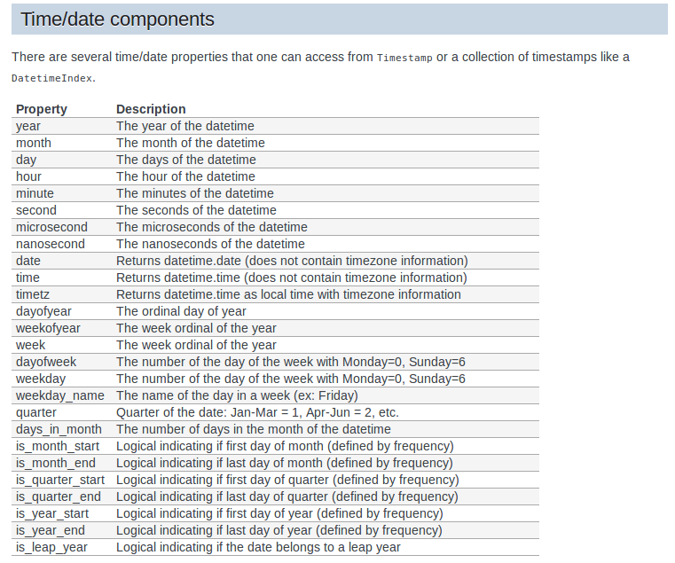
"""
df=pd.read_csv('../input/covidglobalcompetition/covid-global-forcast.csv',parse_dates=["Date"])
df["Province/State"]=df["Province/State"].fillna("")
df=df.sort_values(by=["Date","Country/Region","Province/State"])
df["Location"]=df["Country/Region"] +"/"+ df["Province/State"]
index=pd.MultiIndex.from_frame(df[["Location","Date"]])
df=df.set_index(index,drop=False)
df=df.drop(columns=["Country/Region","Province/State","Lat","Long"])
# Active Case = confirmed - deaths - recovered
df['Active'] = df['# ConfirmedCases'] - df['# Fatalities'] - df['# Recovered_cases']
df["Day"]=df["Date"].dt.day
df["Day of the week"]= df["Date"].dt.weekday
days =["Monday", "Tuesday", "Wednesday", "Thursday",
"Friday", "Saturday", "Sunday"]
days_dict={x:days[x] for x in range(len(days))}
df["Day of the week"]=df["Day of the week"].map(days_dict)
pandemic_date=datetime.datetime.strptime("11 March 2020","%d %B %Y")
df["Days after/before the pandemic"]=df["Date"] - pandemic_date
df.head(10)
"""
# Lag features
The simplest approach is to predict the value at the next time (t+1) given the value at the previous time (t-1). The supervised learning problem with shifted values looks as follows:
The Pandas library provides the shift() function to help create these shifted or lag features from a time series dataset. Shifting the dataset by 1 creates the t-1 column, adding a NaN (unknown) value for the first row. The time series dataset without a shift represents the t+1.
show exemples
Here, we were able to generate lag one feature for our series. But why lag one? Why not five or seven? To answer this let us understand it better below.
The lag value we choose will depend on the correlation of individual values with its past values.
If the series has a weekly trend, which means the value last Monday can be used to predict the value for this Monday, you should create lag features for seven days. Getting the drift?
"""
"""
## <a >Autocorrelation and Partial Autocorrelation</a>
* Autocorrelation - The autocorrelation function (ACF) measures how a series is correlated with itself at different lags.
* Partial Autocorrelation - The partial autocorrelation function can be interpreted as a regression of the series against its past lags. The terms can be interpreted the same way as a standard linear regression, that is the contribution of a change in that particular lag while holding others constant.
* As all lags are either close to 1 or at least greater than the confidence interval, they are statistically significant.
Source: [Quora](https://www.quora.com/What-is-the-difference-among-auto-correlation-partial-auto-correlation-and-inverse-auto-correlation-while-modelling-an-ARIMA-series)
"""
#https://machinelearningmastery.com/gentle-introduction-autocorrelation-partial-autocorrelation/
from statsmodels.graphics.tsaplots import plot_acf,plot_pacf
plot_acf(df["# Fatalities"], lags=10)
plot_pacf(df["# Fatalities"], lags=10)
plot_acf(df["# ConfirmedCases"], lags=10)
plot_pacf(df["# ConfirmedCases"], lags=10)
df["Lag_1_fatalities"]=df.groupby(level=0)["# Fatalities"].shift(1)
df["Lag_1_confirmed_cases"]=df.groupby(level=0)["# ConfirmedCases"].shift(1)
df=df.dropna()
from category_encoders.hashing import HashingEncoder
from sklearn.preprocessing import OneHotEncoder
from sklearn.compose import ColumnTransformer
y=df["# Fatalities"].values
df=df.drop(columns=["# Fatalities","Date"])
ce_hash=HashingEncoder(cols = ["Location"])
transformer = ColumnTransformer(transformers=[('cat', OneHotEncoder(), ["Day of the week"]),("label",ce_hash,["Location"])])
X=transformer.fit_transform(df)
from sklearn.model_selection import train_test_split
X_train, X_test, y_train, y_test = train_test_split(X, y, random_state=21)
def RMSLE(predictions,actual_values):
# root mean squared logarithmic error.
number_of_predictions=np.shape(predictions)[0]
predictions=np.log(predictions+1)
actual_values=np.log(actual_values+1)
squared_differences=np.power(np.subtract(predictions,actual_values),2)
total_sum=np.sum(squared_differences)
avg_squared_diff=total_sum/number_of_predictions
rmsle=np.sqrt(avg_squared_diff)
return rmsle
from sklearn.linear_model import Lasso,Ridge
from sklearn.tree import DecisionTreeRegressor
from sklearn.svm import SVR
from sklearn.ensemble import RandomForestRegressor
import matplotlib.pyplot as plt
from sklearn.metrics import *
models = []
models.append(('LASSO', Lasso()))
models.append(('DF', DecisionTreeRegressor()))
models.append(('RF', RandomForestRegressor())) # Ensemble method - collection of many decision trees
models.append(('SVR', SVR(gamma='auto'))) # kernel = linear
# Evaluate each model in turn
RMSLE_results = []
MAE_results=[]
MSE_results=[]
names = []
for name, model in models:
names.append(name)
model.fit(X_train,y_train)
predictions=model.predict(X_test)
RMSLE_results.append(RMSLE(predictions,y_test))
MAE_results.append(mean_absolute_error(predictions,y_test))
MSE_results.append(mean_squared_error(predictions,y_test))
print("Models Performance:")
for name,rsmle,mae,mse in zip(names,RMSLE_results,MAE_results,MSE_results):
print(f"Model Name:{name}\n RMSLE:{rmsle}\n MAE:{mae} \n MSE:{mse}\n")
"""
https://pyflux.readthedocs.io/en/latest/dyn_lin.html
https://alkaline-ml.com/pmdarima/auto_examples/index.html#id1
https://www.quora.com/What-is-the-most-useful-Python-library-for-time-series-and-forecasting
"""
"""

""" | {'source': 'AI4Code', 'id': '578c6c4a770d5c'} |
1494 | """
### Problem Description :
A retail company “ABC Private Limited” wants to understand the customer purchase behaviour(specifically, purchase amount)
against various products of different categories. They have shared purchase summary of various customers for selected
high volume products from last month.
The data set also contains customer demographics (age, gender, marital status, city_type, stay_in_current_city),
product details (product_id and product category) and Total purchase_amount from last month.
Now, they want to build a model to predict the purchase amount of customer against various products which will help
them to create personalized offer for customers against different products.
"""
"""
More data beats clever algorithms, but better data beats more data
-Peter Norvig
"""
"""
#### Goal
Our Goal is to predict the purchase amount a client is expected to spend on this day.
"""
import pandas as pd
import numpy as np
import matplotlib.pyplot as plt
import seaborn as sns
import warnings
warnings.filterwarnings(action="ignore")
train = pd.read_csv("/kaggle/input/black-friday-predictions/train.csv")
test = pd.read_csv("/kaggle/input/black-friday-predictions/test.csv")
print(train.shape)
print(test.shape)
train.head()
"""
#### Observations
- Occupation , Product_Category_1 , Product_Category_2, Product_Category_3 values are masked
- No information about stores
- Few information related to products which are product id and the product that falls under different product category
- We have some information related to the Customer such as Age,Gender,Occupation and Maritial_status
"""
"""
#### Assumptions
- We make some assumptions before start,We'll analyse the given features that influence amount spend by customer
- <b>Occupation</b> - People with higher income spend more
- <b>Marital_Status</b> - People who are single spend more
- <b>City_Category</b> - People from urban city or top tier city spend more because of their higher income level
- <b>Age</b> - People who are below 30 years spend more on gadgets and other electronics stuff
"""
sns.distplot(train['Purchase'])
print("Skewness : {}".format(train['Purchase'].skew()))
print("Kurtosis : {}".format(train.Purchase.kurt()))
# The distribution is moderately skewed
print(train['Purchase'].describe())
print(train[train['Purchase'] == train['Purchase'].min()].shape[0])
print(train[train['Purchase'] == train['Purchase'].max()].shape[0])
"""
Observations :
* Minimum price of the Item is 12 and max to 23961.
* Median value (8047) is lower than mean value (9263)
"""
"""
### Data Cleaning
"""
train.isnull().sum()
test.isnull().sum()
# Let's analyse the missing value
# Only this predictors Product_Category_2 & Product_Category_3 has missing values this might be due to that products did not fall under these two categories
train[train['Product_Category_2'].isnull()]['Product_ID'].value_counts()
# We analyse firt two top products
print(train[train['Product_ID']=='P00255842']['Product_Category_2'].value_counts(dropna=False))
print(train[train['Product_ID']=='P00278642']['Product_Category_2'].value_counts(dropna=False))
train[train['Product_Category_3'].isnull()]['Product_ID'].value_counts()
# We analyse firt two top products
print(train[train['Product_ID']=='P00265242']['Product_Category_3'].value_counts(dropna=False))
print(train[train['Product_ID']=='P00058042']['Product_Category_3'].value_counts(dropna=False))
# Our guess is correct that product doesn't fall under these categories, so it is safe to fill 0
train['Product_Category_2'].fillna(0,inplace=True)
test['Product_Category_2'].fillna(0,inplace=True)
train['Product_Category_3'].fillna(0,inplace=True)
test['Product_Category_3'].fillna(0,inplace=True)
# we remove '+' character
train['Stay_In_Current_City_Years'] = train['Stay_In_Current_City_Years'].replace("4+","4")
test['Stay_In_Current_City_Years'] = test['Stay_In_Current_City_Years'].replace("4+","4")
train['Age'] = train['Age'].replace('55+','56-100')
test['Age'] = test['Age'].replace('55+','56-100')
"""
#### Feature Transformation
"""
# Product ID has so many unique values that won't help us but there is a pattern on product formation. We will split first 4
# characters this might be some sellers name or for some identification they kept on it
train['Product_Name'] = train['Product_ID'].str.slice(0,4)
test['Product_Name'] = test['Product_ID'].str.slice(0,4)
sns.countplot(train['Product_Name'])
train.groupby('Product_Name')['Purchase'].describe().sort_values('count',ascending=False)
"""
#### Feature Creation
"""
"""
##### We'll check purchase of the items based on the available category. My assumption is that if an item available in all the category, there are very high chances that the item is more visible to the user. Let's analys this fact
"""
# Items which are only fall under Product_Category_1 list
pd_cat_1_purchase = train[(train['Product_Category_2'] == 0) & (train['Product_Category_3']==0)]['Purchase']
print("Total no. of Sold Items in Product_Category_1 {}".format(pd_cat_1_purchase.shape[0]))
print("Mean value {}".format(pd_cat_1_purchase.mean()))
print("Median value {}".format(pd_cat_1_purchase.median()))
# Items which are available in any two category
pd_cat_2_purchase = train[np.logical_xor(train['Product_Category_2'],train['Product_Category_3'])]['Purchase']
print("Total no. of Sold Items in Product_Category_1 & any one of the other two category {}".format(pd_cat_2_purchase.shape[0]))
print("Mean value is {}".format(pd_cat_2_purchase.mean()))
print("Median value is {}".format(pd_cat_2_purchase.median()))
# Items which are available in all category
pd_cat_all_purchase = train[(train['Product_Category_2'] != 0) & (train['Product_Category_3']!=0)]['Purchase']
print("Total no. of Sold Items in all Category {}".format(pd_cat_all_purchase.shape[0]))
print("Mean value is {}".format(pd_cat_all_purchase.mean()))
print("Median value is {}".format(pd_cat_all_purchase.median()))
"""
you can see that in all category split where the median is greater than mean. That means most of the richer people purchased the product which comes falls all category. So We'll create a new feature for category split and assign a weight to that.
"""
train['Category_Weight'] = 0
train.loc[pd_cat_1_purchase.index,'Category_Weight'] = 1
train.loc[pd_cat_2_purchase.index,'Category_Weight'] = 2
train.loc[pd_cat_all_purchase.index,'Category_Weight'] = 3
# Each user has purchased atleast 6 items.
# Based on the count we'll create a new variable called Frequent_Buyers which holds 1 for Users who purchased more than 100 items
# and 0 for less than 100 items
train['Frequent_Buyers'] = train.groupby('User_ID')['User_ID'].transform(lambda x : 1 if x.count() > 100 else 0)
test['Frequent_Buyers'] = test.groupby('User_ID')['User_ID'].transform(lambda x : 1 if x.count() > 100 else 0)
train.drop(['Product_ID','User_ID'],inplace=True,axis=1)
test.drop(['Product_ID','User_ID'],inplace=True,axis=1)
train['Age'].value_counts()
sns.barplot(train['Age'],train['Age'].value_counts().values)
"""
* teenagers or student shows more interest than other ages
* 72% of "0-17" doing the same occupation(probably they are student)
"""
# We'll create a new feature for Student
train['IsStudent'] = 1 * (train['Age']=='0-17')
test['IsStudent'] = 1 * (test['Age']=='0-17')
# Based on our income we spend more, so we'll order occupation by mean value of the purchase and we use the same order for test data also.
order_occupation_by_purchase = train.groupby('Occupation')['Purchase'].describe().sort_values('mean',ascending=False)['mean'].index
train['Occupation']
map_occupation = {k: v for v, k in enumerate(order_occupation_by_purchase)}
map_occupation
train['Occupation'] = train['Occupation'].apply(lambda x: map_occupation[x])
test['Occupation'] = test['Occupation'].apply(lambda x: map_occupation[x])
"""
#### Extraordinary Data Analysis
"""
corrIndex = train.corr().nlargest(10,'Purchase')['Purchase'].index
corr = train[corrIndex].corr()
plt.figure(figsize=(16,8))
ax = sns.heatmap(corr,annot=True,cmap="YlGnBu")
bottom, top = ax.get_ylim()
ax.set_ylim(bottom + 0.5, top - 0.5)
plt.show()
# There is no satisifactory correlation feature so we will avoid using Linear model.
f,ax = plt.subplots(1,2,figsize=(10,6))
sns.countplot(train['Gender'],ax=ax[0])
sns.barplot('Gender','Purchase',data=train,ax=ax[1])
"""
Men was the most shown interest on black friday sales. On plot 2, Eventhough women are less in count but they spent almost equal money spent by men
"""
f,ax = plt.subplots(1,2,figsize=(10,6))
sns.countplot(train['City_Category'],ax=ax[0])
sns.barplot('City_Category','Purchase',data=train,ax=ax[1])
# Customer from city B has purchased more items.
# Customer from city C has spent higher Amount Eventhough B has purchased more items. | {'source': 'AI4Code', 'id': '02c7e612bbc663'} |
126841 | # This Python 3 environment comes with many helpful analytics libraries installed
# It is defined by the kaggle/python Docker image: https://github.com/kaggle/docker-python
# For example, here's several helpful packages to load
import numpy as np # linear algebra
import pandas as pd # data processing, CSV file I/O (e.g. pd.read_csv)
# Input data files are available in the read-only "../input/" directory
# For example, running this (by clicking run or pressing Shift+Enter) will list all files under the input directory
import os
for dirname, _, filenames in os.walk('/kaggle/input'):
for filename in filenames:
print(os.path.join(dirname, filename))
# You can write up to 5GB to the current directory (/kaggle/working/) that gets preserved as output when you create a version using "Save & Run All"
# You can also write temporary files to /kaggle/temp/, but they won't be saved outside of the current session
"""
### Here we are going to do Deep learning for FashionMnist dataset with Pytorch.
## Let's import the required libraries
"""
import torch
import torchvision
from torchvision.utils import make_grid
import numpy as np
import matplotlib.pyplot as plt
from torchvision.datasets import FashionMNIST
from torch.utils.data.dataloader import DataLoader
from torch.utils.data import random_split
from torchvision.transforms import ToTensor
import torch.nn as nn
import torch.nn.functional as F
%matplotlib inline
"""
### Downloading dataset from torchvision API and transform it to pytorch tensor[](http://)
"""
dataset = FashionMNIST(root='data/', download=True, transform = ToTensor())
test = FashionMNIST(root='data/', train=False, transform = ToTensor())
print(len(dataset))
val_size = 10000
train_size = 50000
train_ds, valid_ds = random_split(dataset, [train_size, val_size])
print(len(train_ds), len(valid_ds))
"""
### Loading data for training using Dataloader and Also plotting the data using make_grid function and also using permute to rearrange the images shape. Because pytorch image shape is like(1, 28, 28) but for matplot lib it expects the shape to be (28,28,1)
"""
batch_size = 128
train_dl = DataLoader(train_ds, batch_size, shuffle=True, num_workers=4, pin_memory=True)
valid_dl = DataLoader(valid_ds, batch_size*2, shuffle=False, num_workers=4, pin_memory=True)
test_dl = DataLoader(test, batch_size*2, num_workers=4, pin_memory=True)
for images,_ in train_dl:
print("image_size: ", images.shape)
plt.figure(figsize=(16,8))
plt.axis('off')
plt.imshow(make_grid(images, nrow=16).permute(1,2,0))
break
"""
## Defining accuracy
"""
def accuracy(output, labels):
_, preds = torch.max(output, dim=1)
return torch.tensor(torch.sum(preds==labels).item()/ len(preds))
class MNISTModel(nn.Module):
def __init__(self, in_size, out_size):
super().__init__()
## Hidden Layer
self.linear1 = nn.Linear(in_size, 16)
self.linear2 = nn.Linear(16, 32)
self.linear3 = nn.Linear(32, out_size)
def forward(self, xb):
out = xb.view(xb.size(0), -1)
## First layer
out = self.linear1(out)
out = F.relu(out)
## Second Layer
out = self.linear2(out)
out = F.relu(out)
## Third Layer
out = self.linear3(out)
out = F.relu(out)
return out
def training_step(self, batch):
image, label = batch
out = self(image)
loss = F.cross_entropy(out, label)
return loss
def validation_step(self, batch):
image, label = batch
out = self(image)
loss = F.cross_entropy(out, label)
acc = accuracy(out, label)
return {'val_loss': loss, 'val_acc': acc}
def validation_epoch_end(self, outputs):
losses = [loss['val_loss'] for loss in outputs]
epoch_loss = torch.stack(losses).mean()
batch_accs = [x['val_acc'] for x in outputs]
epoch_acc = torch.stack(batch_accs).mean()
return {'val_loss': epoch_loss.item(), 'val_acc': epoch_acc.item()}
def epoch_end(self, epoch, result):
print("Epoch [{}], val_loss: {:.4f}, val_acc: {:.4f}".format(epoch, result['val_loss'], result['val_acc']))
"""
## Connecting to GPU
"""
torch.cuda.is_available()
def find_device():
if torch.cuda.is_available():
return torch.device('cuda')
else:
return torch.device('cpu')
device = find_device()
device
"""
Converting data to device
"""
def to_device(data, device):
if isinstance(data, (tuple, list)):
return [to_device(x, device) for x in data]
return data.to(device, non_blocking=True)
class DeviceLoader():
def __init__(self, dl, device):
self.dl = dl
self.device = device
def __iter__(self):
for b in self.dl:
yield to_device(b, self.device)
def __len__(self):
return len(self.dl)
train_loader = DeviceLoader(train_dl, device)
valid_loader = DeviceLoader(valid_dl, device)
test_loader = DeviceLoader(test_dl, device)
"""
## Train Model
"""
def evaluate(model, val_loader):
outputs = [model.validation_step(batch) for batch in val_loader]
return model.validation_epoch_end(outputs)
def fit(epochs, lr, model, train_loader, val_loader, opt_func=torch.optim.SGD):
history = []
optimizer = opt_func(model.parameters(), lr)
for epoch in range(epochs):
# Training Phase
for batch in train_loader:
loss = model.training_step(batch)
loss.backward()
optimizer.step()
optimizer.zero_grad()
# Validation phase
result = evaluate(model, val_loader)
model.epoch_end(epoch, result)
history.append(result)
return history
input_size = 784
num_classes = 10
model = MNISTModel(input_size, out_size=num_classes)
to_device(model, device)
history = [evaluate(model, valid_loader)]
history
"""
# Fitting model
"""
history += fit(5, 0.5, model, train_loader, valid_loader)
losses = [x['val_loss'] for x in history]
plt.plot(losses, '-x')
plt.xlabel('epoch')
plt.ylabel('loss')
plt.title('Loss vs. No. of epochs');
"""
# Prediction on Samples
"""
def predict_image(img, model):
xb = to_device(img.unsqueeze(0), device)
yb = model(xb)
_, preds = torch.max(yb, dim=1)
return preds[0].item()
img, label = test[0]
plt.imshow(img[0], cmap='gray')
print('Label:', dataset.classes[label], ', Predicted:', dataset.classes[predict_image(img, model)])
evaluate(model, test_loader)
saved_weights_fname='fashion-feedforward.pth'
torch.save(model.state_dict(), saved_weights_fname)
| {'source': 'AI4Code', 'id': 'e93dff927f55bc'} |
74395 | """
# About H2O
Machine Learning PLatform used in here is H2O, which is a Fast, Scalable, Open source application for machine/deep learning.
Big names such as PayPal, Booking.com, Cisco are using H2O as the ML platform.
The speciality of h2o is that it is using in-memory compression to handles billions of data rows in memory, even in a small cluster.
It is easy to use APIs with R, Python, Scala, Java, JSON as well as a built in web interface, Flow
You can find more information here: https://www.h2o.ai
"""
import h2o
from IPython import get_ipython
import jupyter
import matplotlib.pyplot as plt
from pylab import rcParams
import numpy as np # linear algebra
import pandas as pd # data processing, CSV file I/O (e.g. pd.read_csv)
import os
from h2o.estimators.deeplearning import H2OAutoEncoderEstimator, H2ODeepLearningEstimator
h2o.init(max_mem_size = 2) # initializing h2o server
h2o.remove_all()
"""
# Loading the Dataset
H2O also have a frame like pandas. So most of the data handling parts can be done using H2OFrame instead of DataFrame
"""
creditData = pd.read_csv("../input/creditcard.csv") # read data using pandas
# creditData_df = h2o.import_file(r"File_Path\creditcard.csv") # H2O method
creditData.describe()
"""
## About the Dataset
The Dataset contains 284,807 transactions in total. From that 492 are fraud transactions. So the data itself is highly imbalanced. It contains only numeric input variable. The traget variable is 'Class'
"""
print("Few Entries: ")
print(creditData.head())
print("Dataset Shape: ", creditData.shape)
print("Maximum Transaction Value: ", np.max(creditData.Amount))
print("Minimum Transaction Value: ", np.min(creditData.Amount))
# Turns python pandas frame into an H2OFrame
creditData_h2o = h2o.H2OFrame(creditData)
# check if there is any null values
# creditData.isnull().sum() # pandas method
creditData_h2o.na_omit() # h2o method
creditData_h2o.nacnt() # no missing values found
"""
# Data Visualization
"""
# Let's plot the Transaction class against the Frequency
labels = ['normal','fraud']
classes = pd.value_counts(creditData['Class'], sort = True)
classes.plot(kind = 'bar', rot=0)
plt.title("Transaction class distribution")
plt.xticks(range(2), labels)
plt.xlabel("Class")
plt.ylabel("Frequency")
fraud = creditData[creditData.Class == 1]
normal = creditData[creditData.Class == 0]
# Amount vs Class
f, (ax1, ax2) = plt.subplots(2,1,sharex=True)
f.suptitle('Amount per transaction by class')
ax1.hist(fraud.Amount, bins = 50)
ax1.set_title('Fraud List')
ax2.hist(normal.Amount, bins = 50)
ax2.set_title('Normal')
plt.xlabel('Amount')
plt.ylabel('Number of Transactions')
plt.xlim((0, 10000))
plt.yscale('log')
plt.show()
# time vs Amount
f, (ax1, ax2) = plt.subplots(2, 1, sharex=True)
f.suptitle('Time of transaction vs Amount by class')
ax1.scatter(fraud.Time, fraud.Amount)
ax1.set_title('Fraud List')
ax2.scatter(normal.Time, normal.Amount)
ax2.set_title('Normal')
plt.xlabel('Time (in seconds)')
plt.ylabel('Amount')
plt.show()
#plotting the dataset considering the class
color = {1:'red', 0:'yellow'}
fraudlist = creditData[creditData.Class == 1]
normal = creditData[creditData.Class == 0]
fig,axes = plt.subplots(1,2)
axes[0].scatter(list(range(1,fraudlist.shape[0] + 1)), fraudlist.Amount,color='red')
axes[1].scatter(list(range(1, normal.shape[0] + 1)), normal.Amount,color='yellow')
plt.show()
"""
The *Time* variable is not giving an impact on the model prediction,. This can be figure out from data visualization.
Before moving on to the trainig part, we need to figure out which variables are important and which are not.
So we can drop the unwanted variables.
"""
features= creditData_h2o.drop(['Time'], axis=1)
"""
# Split the Frame
"""
# 80% for the training set and 20% for the testing set
train, test = features.split_frame([0.8])
print(train.shape)
print(test.shape)
#train.describe()
#test.describe()
train_df = train.as_data_frame()
test_df = test.as_data_frame()
train_df = train_df[train_df['Class'] == 0]
train_df = train_df.drop(['Class'], axis=1)
Y_test_df = test_df['Class']
test_df = test_df.drop(['Class'], axis=1)
train_df.shape
train_h2o = h2o.H2OFrame(train_df) # converting to h2o frame
test_h2o = h2o.H2OFrame(test_df)
x = train_h2o.columns
"""
# Anomaly Detection
I used an anomaly detection technique for the dataset.
Anomaly detection is a technique to identify unusual patterns that do not confirm to the expected behaviors. Which is called outliers.
It has many applications in business from fraud detection in credit card transactions to fault detection in operating environments.
Machine learning approaches for Anomaly detection;
1. K-Nearest Neighbour
2. Autoencoders - Deep neural network
3. K-means
4. Support Vector Machine
5. Naive Bayes
"""
"""
# Autoencoders
So as the algorithm I chose **Autoencoders**, which is a deep learning, unsupervised ML algorithm.
"Autoencoding" is a data compression algorithm, which takes the input and going through a compressed representation and gives the reconstructed output.
"""
"""
when building the model,
4 fully connected hidden layers were chosen with, [14,7,7,14] number of nodes for each layer.
First two for the encoder and last two for the decoder.
"""
anomaly_model = H2ODeepLearningEstimator(activation = "Tanh",
hidden = [14,7,7,14],
epochs = 100,
standardize = True,
stopping_metric = 'MSE', # MSE for autoencoders
loss = 'automatic',
train_samples_per_iteration = 32,
shuffle_training_data = True,
autoencoder = True,
l1 = 10e-5)
anomaly_model.train(x=x, training_frame = train_h2o)
"""
## Variable Importance
In H2O there is a special way of analysing the variables which gave more impact on the model.
"""
anomaly_model._model_json['output']['variable_importances'].as_data_frame()
# plotting the variable importance
rcParams['figure.figsize'] = 14, 8
#plt.rcdefaults()
fig, ax = plt.subplots()
variables = anomaly_model._model_json['output']['variable_importances']['variable']
var = variables[0:15]
y_pos = np.arange(len(var))
scaled_importance = anomaly_model._model_json['output']['variable_importances']['scaled_importance']
sc = scaled_importance[0:15]
ax.barh(y_pos, sc, align='center', color='green', ecolor='black')
ax.set_yticks(y_pos)
ax.set_yticklabels(variables)
ax.invert_yaxis()
ax.set_xlabel('Scaled Importance')
ax.set_title('Variable Importance')
plt.show()
# plotting the loss
scoring_history = anomaly_model.score_history()
%matplotlib inline
rcParams['figure.figsize'] = 14, 8
plt.plot(scoring_history['training_mse'])
#plt.plot(scoring_history['validation_mse'])
plt.title('model loss')
plt.ylabel('loss')
plt.xlabel('epoch')
"""
## Evaluating the Testing set
Testing set has both normal and fraud transactions in it.
From this training method, The model will learn to identify the pattern of the input data.
If an anomalous test point does not match the learned pattern, the autoencoder will likely have a high error rate in reconstructing this data, indicating anomalous data.
So that we can identify the anomalies of the data.
To calculate the error, it uses **Mean Squared Error**(MSE)
"""
test_rec_error = anomaly_model.anomaly(test_h2o)
# anomaly is a H2O function which calculates the error for the dataset
test_rec_error_df = test_rec_error.as_data_frame() # converting to pandas dataframe
# plotting the testing dataset against the error
test_rec_error_df['id']=test_rec_error_df.index
rcParams['figure.figsize'] = 14, 8
test_rec_error_df.plot(kind="scatter", x='id', y="Reconstruction.MSE")
plt.show()
# predicting the class for the testing dataset
predictions = anomaly_model.predict(test_h2o)
error_df = pd.DataFrame({'reconstruction_error': test_rec_error_df['Reconstruction.MSE'],
'true_class': Y_test_df})
error_df.describe()
# reconstruction error for the normal transactions in the testing dataset
fig = plt.figure()
ax = fig.add_subplot(111)
rcParams['figure.figsize'] = 14, 8
normal_error_df = error_df[(error_df['true_class']== 0) & (error_df['reconstruction_error'] < 10)]
_ = ax.hist(normal_error_df.reconstruction_error.values, bins=10)
# reconstruction error for the fraud transactions in the testing dataset
fig = plt.figure()
ax = fig.add_subplot(111)
rcParams['figure.figsize'] = 14, 8
fraud_error_df = error_df[error_df['true_class'] == 1]
_ = ax.hist(fraud_error_df.reconstruction_error.values, bins=10)
"""
### ROC Curve
"""
from sklearn.metrics import (confusion_matrix, precision_recall_curve, auc,
roc_curve, recall_score, classification_report, f1_score,
precision_recall_fscore_support)
fpr, tpr, thresholds = roc_curve(error_df.true_class, error_df.reconstruction_error)
roc_auc = auc(fpr, tpr)
plt.title('Receiver Operating Characteristic')
plt.plot(fpr, tpr, label='AUC = %0.4f'% roc_auc)
plt.legend(loc='lower right')
plt.plot([0,1],[0,1],'r--')
plt.xlim([-0.001, 1])
plt.ylim([0, 1.001])
plt.ylabel('True Positive Rate')
plt.xlabel('False Positive Rate')
plt.show();
"""
### Precision and Recall
Since the data is highly unbalanced, it cannot be measured only by using accuracy.
Precision vs Recall was chosen as the matrix for the classification task.
**Precision**: Measuring the relevancy of obtained results.
[ True positives / (True positives + False positives)]
**Recall**: Measuring how many relevant results are returned.
[ True positives / (True positives + False negatives)]
"""
"""
**True Positives** - Number of actual frauds predicted as frauds
**False Positives** - Number of non-frauds predicted as frauds
**False Negatives** - Number of frauds predicted as non-frauds.
"""
precision, recall, th = precision_recall_curve(error_df.true_class, error_df.reconstruction_error)
plt.plot(recall, precision, 'b', label='Precision-Recall curve')
plt.title('Recall vs Precision')
plt.xlabel('Recall')
plt.ylabel('Precision')
plt.show()
"""
We need to find a better threshold that can seperate the anomalies from normals. This can be done by getting the intersection of the **Precision/Recall vs Threshold** graph
"""
plt.plot(th, precision[1:], label="Precision",linewidth=5)
plt.plot(th, recall[1:], label="Recall",linewidth=5)
plt.title('Precision and recall for different threshold values')
plt.xlabel('Threshold')
plt.ylabel('Precision/Recall')
plt.legend()
plt.show()
# plot the testing set with the threshold
threshold = 0.01
groups = error_df.groupby('true_class')
fig, ax = plt.subplots()
for name, group in groups:
ax.plot(group.index, group.reconstruction_error, marker='o', ms=3.5, linestyle='',
label= "Fraud" if name == 1 else "Normal")
ax.hlines(threshold, ax.get_xlim()[0], ax.get_xlim()[1], colors="r", zorder=100, label='Threshold')
ax.legend()
plt.title("Reconstruction error for different classes")
plt.ylabel("Reconstruction error")
plt.xlabel("Data point index")
plt.show();
"""
### Confusion Matrix
"""
import seaborn as sns
LABELS = ['Normal', 'Fraud']
y_pred = [1 if e > threshold else 0 for e in error_df.reconstruction_error.values]
conf_matrix = confusion_matrix(error_df.true_class, y_pred)
plt.figure(figsize=(12, 12))
sns.heatmap(conf_matrix, xticklabels=LABELS, yticklabels=LABELS, annot=True, fmt="d");
plt.title("Confusion matrix")
plt.ylabel('True class')
plt.xlabel('Predicted class')
plt.show()
"""
### Classification Report
"""
csr = classification_report(error_df.true_class, y_pred)
print(csr) | {'source': 'AI4Code', 'id': '88d612b5d09e0f'} |
39953 | """
# **Project Objective and Brief**
## *In this project, rule-based and Deep-Learning algorithms are used with an aim to first appropriately detect different type of emotions contained in a collection of Tweets and then accurately predict the overall emotions of the Tweets is done.*
"""
"""
## **Preprocessor is a preprocessing library used for tweet data written in Python.While building Machine Learning systems based on tweet data, a preprocessing is required. This library makes it easy to clean, parse or tokenize the tweets.The same is imported here.**
"""
!pip install tweet-preprocessor 2>/dev/null 1>/dev/null
"""
## **Importing Libraries**
"""
import preprocessor as pcr
import numpy as np
import pandas as pd
import emoji
import keras
from sklearn.model_selection import train_test_split
import tensorflow as tf
from keras.models import Sequential
from keras.layers.recurrent import LSTM
from keras.layers.core import Dense, Activation, Dropout
from keras.layers.embeddings import Embedding
from sklearn import preprocessing, model_selection
from keras.preprocessing import sequence, text
from sklearn.preprocessing import LabelEncoder,OneHotEncoder
import plotly.express as px
from tensorflow.keras.layers import Dense, Input
from tensorflow.keras.optimizers import Adam
from tensorflow.keras.models import Model
from tokenizers import Tokenizer, models
from tensorflow.keras.layers import SpatialDropout1D
"""
# **Data preparation**
"""
df_data_1 = pd.read_csv("../input/tweetscsv/Tweets.csv")
df_data_1.head()
df_data = df_data_1[["tweet_id","airline_sentiment","text"]]
df_data.head()
"""
# **Correcting Spelling of data**
"""
data_spell = pd.read_csv("../input/spelling/aspell.txt",sep=":",names=["correction","misspell"])
data_spell.misspell = data_spell.misspell.str.strip()
data_spell.misspell = data_spell.misspell.str.split(" ")
data_spell = data_spell.explode("misspell").reset_index(drop=True)
data_spell.drop_duplicates("misspell",inplace=True)
miss_corr = dict(zip(data_spell.misspell, data_spell.correction))
#Sample of the dict
{v:miss_corr[v] for v in [list(miss_corr.keys())[k] for k in range(20)]}
def correct_spell(v):
for a in v.split():
if a in miss_corr.keys():
v = v.replace(a, miss_corr[a])
return v
df_data["clean_content"] = df_data.text.apply(lambda a : correct_spell(a))
"""
# **Using a Python library for expanding and creating common English contractions in text**
"""
contract = pd.read_csv("../input/contractions/contractions.csv")
cont_dict = dict(zip(contract.Contraction, contract.Meaning))
def contract_to_meaning(v):
for a in v.split():
if a in cont_dict.keys():
v = v.replace(a, cont_dict[a])
return v
df_data.clean_content = df_data.clean_content.apply(lambda a : contract_to_meaning(a))
"""
# **Removal of URLs and Mentions from dataset**
"""
pcr.set_options(pcr.OPT.MENTION, pcr.OPT.URL)
pcr.clean("hello guys @alx #sport🔥 1245 https://github.com/s/preprocessor")
df_data["clean_content"]=df_data.text.apply(lambda a : pcr.clean(a))
"""
# **Removal of Punctuations and Emojis from dataset**
"""
def punct(v):
punct = '''()-[]{};:'"\,<>./@#$%^&_~'''
for a in v.lower():
if a in punct:
v = v.replace(a, " ")
return v
punct("test @ #ldfldlf??? !! ")
df_data.clean_content = df_data.clean_content.apply(lambda a : ' '.join(punct(emoji.demojize(a)).split()))
def text_cleaning(v):
v = correct_spell(v)
v = contract_to_meaning(v)
v = pcr.clean(v)
v = ' '.join(punct(emoji.demojize(v)).split())
return v
text_cleaning("isn't 💡 adultry @ttt good bad ... ! ? ")
"""
# **Removing empty comments from dataset**
"""
df_data = df_data[df_data.clean_content != ""]
df_data.airline_sentiment.value_counts()
"""
# **Data Modeling**
"""
"""
## **Encoding the data and train, test and split it**
"""
id_for_sentiment = {"neutral":0, "negative":1,"positive":2}
df_data["sentiment_id"] = df_data['airline_sentiment'].map(id_for_sentiment)
df_data.head()
encoding_label = LabelEncoder()
encoding_integer = encoding_label.fit_transform(df_data.sentiment_id)
encoding_onehot = OneHotEncoder(sparse=False)
encoding_integer = encoding_integer.reshape(len(encoding_integer), 1)
Y = encoding_onehot.fit_transform(encoding_integer)
X_train, X_test, y_train, y_test = train_test_split(df_data.clean_content,Y, random_state=1995, test_size=0.2, shuffle=True)
"""
# **LSTM: Long short-term memory**
### **It is an artificial recurrent neural network (RNN) architecture used in the field of deep learning.**
"""
# using keras tokenizer here
tkn = text.Tokenizer(num_words=None)
maximum_length = 160
Epoch = 15
tkn.fit_on_texts(list(X_train) + list(X_test))
X_train_pad = sequence.pad_sequences(tkn.texts_to_sequences(X_train), maxlen=maximum_length)
X_test_pad = sequence.pad_sequences(tkn.texts_to_sequences(X_test), maxlen=maximum_length)
t_idx = tkn.word_index
embedding_dimension = 160
lstm_out = 250
model_sql = Sequential()
model_sql.add(Embedding(len(t_idx) +1 , embedding_dimension,input_length = X_test_pad.shape[1]))
model_sql.add(SpatialDropout1D(0.2))
model_sql.add(LSTM(lstm_out, dropout=0.2, recurrent_dropout=0.2))
model_sql.add(keras.layers.core.Dense(3, activation='softmax'))
#adam rmsprop
model_sql.compile(loss = "categorical_crossentropy", optimizer='adam',metrics = ['accuracy'])
print(model_sql.summary())
size_of_batch = 32
"""
# **LSTM Model**
"""
model_sql.fit(X_train_pad, y_train, epochs = Epoch, batch_size=size_of_batch,validation_data=(X_test_pad, y_test))
def get_emotion(model_sql,text_1):
text_1 = text_cleaning(text_1)
#tokenize
tweet = tkn.texts_to_sequences([text_1])
tweet = sequence.pad_sequences(tweet, maxlen=maximum_length, dtype='int32')
emotion = model_sql.predict(tweet,batch_size=1,verbose = 2)
emo = np.round(np.dot(emotion,100).tolist(),0)[0]
rslt = pd.DataFrame([id_for_sentiment.keys(),emo]).T
rslt.columns = ["sentiment","percentage"]
rslt=rslt[rslt.percentage !=0]
return rslt
def result_plotting(df):
#colors=['#D50000','#000000','#008EF8','#F5B27B','#EDECEC','#D84A09','#019BBD','#FFD000','#7800A0','#098F45','#807C7C','#85DDE9','#F55E10']
#fig = go.Figure(data=[go.Pie(labels=df.sentiment,values=df.percentage, hole=.3,textinfo='percent',hoverinfo='percent+label',marker=dict(colors=colors, line=dict(color='#000000', width=2)))])
#fig.show()
clrs={'neutral':'rgb(213,0,0)','negative':'rgb(0,0,0)',
'positive':'rgb(0,142,248)'}
col={}
for i in rslt.sentiment.to_list():
col[i]=clrs[i]
figure = px.pie(df, values='percentage', names='sentiment',color='sentiment',color_discrete_map=col,hole=0.3)
figure.show()
"""
# **Result of LSTM**
"""
"""
### Paragraph-1
"""
rslt =get_emotion(model_sql,"Had an absolutely brilliant day 😠loved seeing an old friend and reminiscing")
result_plotting(rslt)
"""
# **Result of LSTM**
"""
"""
### Paragraph-2
"""
rslt =get_emotion(model_sql,"The pain my heart feels is just too much for it to bear. Nothing eases this pain. I can’t hold myself back. I really miss you")
result_plotting(rslt)
"""
# **Result of LSTM**
"""
"""
### Paragraph-3
"""
rslt =get_emotion(model_sql,"I hate this game so much,It make me angry all the time ")
result_plotting(rslt)
"""
# **LSTM with GloVe 6B 200d word embedding**
### **GloVe algorithm is an extension to the word2vec method for efficiently learning word vectors**
"""
def data_reading(file):
with open(file,'r') as z:
word_vocabulary = set()
word_vector = {}
for line in z:
line_1 = line.strip()
words_Vector = line_1.split()
word_vocabulary.add(words_Vector[0])
word_vector[words_Vector[0]] = np.array(words_Vector[1:],dtype=float)
print("Total Words in DataSet:",len(word_vocabulary))
return word_vocabulary,word_vector
vocabulary, word_to_index =data_reading("../input/glove-global-vectors-for-word-representation/glove.6B.200d.txt")
matrix_embedding = np.zeros((len(t_idx) + 1, 200))
for word, i in t_idx.items():
vector_embedding = word_to_index.get(word)
if vector_embedding is not None:
matrix_embedding[i] = vector_embedding
embedding_dimension = 200
lstm_out = 250
model_lstm = Sequential()
model_lstm.add(Embedding(len(t_idx) +1 , embedding_dimension,input_length = X_test_pad.shape[1],weights=[matrix_embedding],trainable=False))
model_lstm.add(SpatialDropout1D(0.2))
model_lstm.add(LSTM(lstm_out, dropout=0.2, recurrent_dropout=0.2))
model_lstm.add(keras.layers.core.Dense(3, activation='softmax'))
#adam rmsprop
model_lstm.compile(loss = "categorical_crossentropy", optimizer='adam',metrics = ['accuracy'])
print(model_lstm.summary())
size_of_batch = 32
"""
# **LSTM with GloVe Model**
"""
model_lstm.fit(X_train_pad, y_train, epochs = Epoch, batch_size=size_of_batch,validation_data=(X_test_pad, y_test))
"""
# **Result of LSTM GloVe**
"""
"""
### Paragraph-1
"""
rslt =get_emotion(model_lstm,"Had an absolutely brilliant day 😠loved seeing an old friend and reminiscing")
result_plotting(rslt)
"""
# **Result of LSTM GloVe**
"""
"""
### Paragraph-2
"""
rslt =get_emotion(model_lstm,"The pain my heart feels is just too much for it to bear. Nothing eases this pain. I can’t hold myself back. I really miss you")
result_plotting(rslt)
"""
# **Result of LSTM GloVe**
"""
"""
### Paragraph-3
"""
rslt =get_emotion(model_lstm,"I hate this game so much,It make me angry all the time ")
result_plotting(rslt)
"""
# **Conclusion**
"""
"""
**Algorithms used to detect different types of emotion from paragraph are**
**1- LSTM (Long Short Term Memory)**-It is an artificial recurrent neural network (RNN) architecture used in the field of deep learning.
**2- LSTM GloVe- GloVe algorithm is an extension to the word2vec method for efficiently learning word vectors.**
It has been concluded that using LSTM algorithm it is easier to classify the Tweets and a more accurate result is obtained.
""" | {'source': 'AI4Code', 'id': '4990ea5b1acd90'} |
2655 | """
**Some Cooking Ideas for Tonight**
* The idea is to create some new recipes when people are looking for something to eat at home
* Build some ingredients set for each cuisine and randomly choose the ingredients
"""
# This Python 3 environment comes with many helpful analytics libraries installed
# It is defined by the kaggle/python docker image: https://github.com/kaggle/docker-python
# For example, here's several helpful packages to load in
#Libraries import
import pandas as pd
import numpy as np
import csv as csv
import json
import re
import random #Used to randomly choose ingredients
import os
print(os.listdir("../input"))
# Any results you write to the current directory are saved as output.
with open('../input/train.json', 'r') as f:
train = json.load(f)
train_raw_df = pd.DataFrame(train)
with open('../input/test.json', 'r') as f:
test = json.load(f)
test_raw_df = pd.DataFrame(test)
"""
**Some Basic Data Cleaning**
"""
# Remove numbers and only keep words
# substitute the matched pattern
# update the ingredients
def sub_match(pattern, sub_pattern, ingredients):
for i in ingredients.index.values:
for j in range(len(ingredients[i])):
ingredients[i][j] = re.sub(pattern, sub_pattern, ingredients[i][j].strip())
ingredients[i][j] = ingredients[i][j].strip()
re.purge()
return ingredients
#remove units
p0 = re.compile(r'\s*(oz|ounc|ounce|pound|lb|inch|inches|kg|to)\s*[^a-z]')
train_raw_df['ingredients'] = sub_match(p0, ' ', train_raw_df['ingredients'])
# remove digits
p1 = re.compile(r'\d+')
train_raw_df['ingredients'] = sub_match(p1, ' ', train_raw_df['ingredients'])
# remove non-letter characters
p2 = re.compile('[^\w]')
train_raw_df['ingredients'] = sub_match(p2, ' ', train_raw_df['ingredients'])
y_train = train_raw_df['cuisine'].values
train_ingredients = train_raw_df['ingredients'].values
train_ingredients_update = list()
for item in train_ingredients:
item = [x.lower().replace(' ', '+') for x in item]
train_ingredients_update.append(item)
X_train = [' '.join(x) for x in train_ingredients_update]
# Create the dataframe for creating new recipes
food_df = pd.DataFrame({'cuisine':y_train
,'ingredients':train_ingredients_update})
"""
**Randomly choose ingredients for the desired cuisine**
"""
# the randomly picked function
def random_generate_recipe(raw_df, food_type, num_ingredients):
if food_type not in raw_df['cuisine'].values:
print('Food type is not existing here')
food_ingredients_lst = list()
[food_ingredients_lst.extend(recipe) for recipe in raw_df[raw_df['cuisine'] == food_type]['ingredients'].values]
i = 0
new_recipe, tmp = list(), list()
while i < num_ingredients:
item = random.choice(food_ingredients_lst)
if item not in tmp:
tmp.append(item)
new_recipe.append(item.replace('+', ' '))
i+=1
else:
continue
recipt_str = ', '.join(new_recipe)
print('The new recipte for %s can be: %s' %(food_type, recipt_str))
return new_recipe
#Say you want some chinese food and you want to only have 10 ingredients in it
random_generate_recipe(food_df, 'chinese', 10)
"""
*This more sounds like some Japanese food*
"""
#Say you want some indian food and you want to only have 12 ingredients in it
random_generate_recipe(food_df, 'indian', 12)
#Say you want some french food and you want to only have 8 ingredients in it
random_generate_recipe(food_df, 'french', 12) | {'source': 'AI4Code', 'id': '0511fc218c4b1c'} |
127502 | # This Python 3 environment comes with many helpful analytics libraries installed
# It is defined by the kaggle/python docker image: https://github.com/kaggle/docker-python
# For example, here's several helpful packages to load in
import numpy as np # linear algebra
import pandas as pd # data processing, CSV file I/O (e.g. pd.read_csv)
# Input data files are available in the "../input/" directory.
# For example, running this (by clicking run or pressing Shift+Enter) will list the files in the input directory
import os
print(os.listdir("../input"))
# Any results you write to the current directory are saved as output.
import numpy as np
import pandas as pd
import matplotlib.pyplot as plt
dataset = pd.read_csv('../input/Salary_Data.csv')
dataset.head()
dataset.info()
X = pd.DataFrame(dataset, index= range(30), columns=['YearsExperience'])
X.info()
X.head()
y = dataset.loc[: , 'Salary']
y.head()
plt.scatter(X , y , color = 'yellow')
"""
**THE ABOVE SCATTER PLOT IS SHOWING A LINEAR RELATIOSHOIP BETWEEN X AND y, SO HERE WE CAN APPLY SIMPLE LINEAR REGRESSION MODEL AS ONLY ONE INDEPENDENT VARIABLE IS THERE **
"""
##Splitting the dataset into train test
from sklearn.model_selection import train_test_split
X_train, X_test, y_train, y_test = train_test_split(X, y, test_size = (1/3), random_state = 0 )
X_train.info(), X_test.info()
##Fitting the regression model on the training set
from sklearn.linear_model import LinearRegression
regressor = LinearRegression()
regressor.fit(X_train, y_train)
##Predicting the y variables
y_predict = regressor.predict(X_test)
y_predict
##Visualising the training dataset
plt.scatter(X_train, y_train, color = 'orange')
plt.plot(X_train, regressor.predict(X_train), color = 'pink' )
plt.title('Training Dataset')
plt.xlabel('Experience')
plt.ylabel('Salary')
regressor.coef_
regressor.intercept_
##Visualising the test dataset
plt.scatter(X_test, y_test, color = 'green')
plt.plot(X_train, regressor.predict(X_train), color = 'red')
plt.title('Test Dataset')
plt.xlabel('Experience')
plt.ylabel('Salary')
plt.show() | {'source': 'AI4Code', 'id': 'ea83b6cd05caf6'} |
126651 | ! conda install -y hvplot=0.5.2 bokeh==1.4.0
! conda install -y -c conda-forge sklearn-contrib-py-earth
"""
# Global Surrogates Models
Many classes of models can be difficult to explain. For Tree Ensembles, while it may be easy to describe the rationale for a single trees outputs, it may be much harder to describe how the prediction of many trees are combined by fitting on on errors and weighting thousands of threes. Similarly for neural networks, while the final layer may be linear, it may difficult to convey to domain experts how features- in some easily understood units of measurement- are scaled then combined and projected to make a prediction. The challenge is that there may be a set of applications where we may benefit greatly from these styles of model but may look to or be required to explain our predictions to users based on regulations, a need for user feedback or for user buy-in.
I the case of neural network models, the motivations may be most evident. Neural network models can benefit from large distributed online training across petabytes of data. In the Federated Learning context, it may be the best-suited model for learning non-linear features for prediction as there is a well-understood body of research into how to train models in this complex environment. The challenge we far may then face is how to extract explanations from this largely black-box model.
Using Global Surrogates Models, we try to 'imitate' a black-box model with a highly explainable model to provide explanations. In some cases, these highly non-linear explainable models may not scale well to the data or the learning environment and may be poorly suited to robustly fit the noise in the data. We may also have deployed black-box models historically, which we are now looking to explain and so need a way of understanding what is taking place on the decision surface of the black-box model for the purpose of prototyping and data collections in order to replace the model. Using a Global Surrogates Model, we look to fit the predictions of the black-box model and analyze the properties of the explainable model to provide insight into the black-box model.
"""
"""
# Data
"""
"""
For our examples in this notebook, we are going to be looking at the Boston Housing Dataset, which is a simple, well-understood dataset provided by default in the Scikit-learn API. The goal here is not to find a good model, but to be able to describe any chosen class of model. For this reason, we will not be discussing why we choose a particular model or its hyperparameters, and we are not going to be looking into methods for cross-validation.
"""
from sklearn.base import BaseEstimator, TransformerMixin
import numpy as np
from toolz.curried import map, pipe, compose_left, partial
from typing import Union, Tuple, List, Dict
import tensorflow as tf
import tensorflow_probability as tfp
import warnings
from abc import ABCMeta
from itertools import chain
from operator import add
import holoviews as hv
import pandas as pd
import hvplot.pandas
from sklearn.datasets import load_digits, load_boston
import tensorflow as tf
from functools import reduce
hv.extension('bokeh')
data = load_boston()
print(data.DESCR)
"""
# Model
"""
"""
I have opted to make use of the Dense Feed-forward Neural Network (DNN) with four hidden neurons and a Selu activation function. The actual properties of this black-box model are not necessary, and in fact, we are going to look to overfit to the data slightly, to provide a slightly greater challenge in our trying to explain this model's decision surface.
"""
EPOCHS = 50
class FFNN(tf.keras.Model):
def __init__(self, layers = (4, )):
super(FFNN, self).__init__()
self.inputs = tf.keras.layers.InputLayer((3, 3))
self.dense = list(map(lambda units: tf.keras.layers.Dense(units, activation='selu'), layers))
self.final = tf.keras.layers.Dense(1, activation='linear')
def call(self, inputs):
return reduce(lambda x, f: f(x), [inputs, self.inputs, *self.dense, self.final])
@tf.function
def train_step(inputs, labels):
with tf.GradientTape() as tape:
predictions = model(inputs)
loss = tf.keras.losses.mse(predictions, label)
gradients = tape.gradient(loss, model.trainable_variables)
optimizer.apply_gradients(zip(gradients, model.trainable_variables))
"""
The only transformation I have opted to do is to take the log of our housing price target to make our assumption about our conditional distribution being symmetric, more realistic.
"""
pd.Series(data.target).hvplot.kde(xlabel='Log-Target Value')
train_ds = tf.data.Dataset.from_tensor_slices((tf.convert_to_tensor(data.data.astype('float32')),
tf.convert_to_tensor(np.log(data.target.astype('float32'))))).batch(32)
model = FFNN()
model.compile(loss='mse')
optimizer = tf.keras.optimizers.Adam()
for epoch in range(EPOCHS):
for sample in train_ds:
inputs, label = sample
gradients = train_step(inputs, label)
y_pred = model(data.data.astype('float32')).numpy()
model.summary()
"""
## Decision tree
"""
"""
While Decision Tree's maybe poor surrogate models for many classes of Black-box model, they are highly interpretable and intuitive for domain experts. Post-hoc explanations can often face a trade-off between interpretability, compute and faithfulness, forcing us to choose approaches which best mirror the tradeoffs we are willing to make. Many people have been exposed to similar, structured reasoning and while our decision tree may not approximate the reasoning process taken by our original model and be particularly faithful, the interpretability of our decision tree may form a good starting point in building trust with domain experts for complex black-box models.
"""
from sklearn import tree
import matplotlib.pyplot as plt
clf = tree.DecisionTreeRegressor(max_depth=4, min_weight_fraction_leaf=0.15)
clf = clf.fit(data.data, y_pred)
plt.figure(figsize=(30,7))
dot_data = tree.plot_tree(clf, max_depth=4, fontsize=12, feature_names=data.feature_names, filled=True, rounded=True)
"""
## 'non-linear' Linear Model
"""
"""
I have before written about my enthusiasm for Linear Models as an interpretable and flexible framework for modelling. What many people don't realize with linear models is that they can be super non-linear, you just need to be able to generate, select and constrain your feature-set in order to appropriately cope with the collinearity in your basis. Here, we can have tremendous control over the explanations we provide, and while I would recommend starting with an explainable model rather than trying to do Post-hox explanations, Generalized Additive Models and similar classes of model can provide excellent surrogate models for describing the decision-space learned by a black-box model.
Here I use a Multivariate Adaptive Regression Spline Model to learn features from the data which help describe the decision surface of my black-box DNN.
"""
from pyearth import Earth
earth = Earth(max_degree=2, allow_linear=True, feature_importance_type='gcv')
earth.fit(data.data, y_pred, xlabels=data.feature_names.tolist())
print(earth.summary())
"""
Here, I can get some notion of feature importances in approximating my model which may be valuable in data collections or feature engineering.
"""
print(earth.summary_feature_importances())
(pd.DataFrame([earth._feature_importances_dict['gcv']], columns=data.feature_names, index=['Features'])
.hvplot.bar(title="'Non-linear' Linear Model Global Approximation Feature Importances")
.opts(xrotation=45, ylabel='Importance'))
"""
The main application I may see this used in is scenario in which we believe we can benefit from stochastic optimization on a large noisy dataset using Deep Learning but would like to distill those insights using a subset of the data using our MARS model. One may opt, in some contexts, to improve stability of the fit using some spatial weighting matrix, to control for soem regions being poorly cpatured by the surrogate model due to mismatches in the learning capacity of particular surrogate models can cause entire regions of the decisions surface to have correlated errors.
"""
"""
# Conclusions
One advantage of Suggorate Models is that you can quite easily sample any additional data you may need to describe the black-box model. This can be useful for subsampling the data but may be dangerous in regions where there is poor data coverage as the model may provide degenerate predictions due to overfitting.
Global Surrogates are a blunt tool to model explainability, with some very specific use-cases. When using Global Surrogate models, it may be critical in planning a project to evaluate why a black-box model is being used at all if it can be well approximated by an explainable model. The quality of the approximation and the distributional assumptions made when fitting the model are critical and must be tracked closely. If you match poorly surrogates and black-box models, you may have very misleading results. That being said, this can be a fast and simple-to-implement heuristic to guide later methods.
""" | {'source': 'AI4Code', 'id': 'e8ebf31aa52f0e'} |
109814 | """
# **A/B TESTING**
**What is A/B Testing?**
The A/B test is a hypothesis test in which two-sample user experiences are tested. In other words, A/B testing is a way to compare two versions of a single variable, typically by testing a subject's response to variant A against variant B, and determining which of the two variants is more effective.
"""
from PIL import Image
Image.open("../input/ab-testing-pic/ab-testing-picc.png")
"""
**A/B Testing with Business Problem**
***Business Problem***
The company recently introduced a new bid type, average bidding,
as an alternative to the current type of bidding called maximum bidding.
One of our client decided to test this new feature and wants to do
an A/B test to see if average bidding brings more returns than maximum bidding.
***The Story of the Data Set***
There are two separate data sets, the Control and the Test group.
***Variables***
* Impression: Number of ad views
* Click: Number of clicks on the displayed ad
* Purchase: The number of products purchased after clicked ads
* Earning: Earnings after the purchased products
"""
"""
**Required Modules and Libraries**
"""
!pip install openpyxl
import itertools
import numpy as np
import pandas as pd
import matplotlib.pyplot as plt
import seaborn as sns
import statsmodels.stats.api as sms
from scipy.stats import ttest_1samp, shapiro, levene, ttest_ind
from statsmodels.stats.proportion import proportions_ztest
pd.set_option('display.max_columns', None)
pd.set_option('display.max_rows', 10)
pd.set_option('display.float_format', lambda x: '%.5f' % x)
df_c = pd.read_excel("../input/ab-testing/ab_testing.xlsx",sheet_name="Control Group")
df_t = pd.read_excel("../input/ab-testing/ab_testing.xlsx",sheet_name="Test Group")
"""
**Defining the hypothesis of the A/B test**
H0: There is no statistically significant difference the returns
of the Maximum Bidding (control) and Average Bidding (test) options.
H1: There is statistically significant difference the returns
of the Maximum Bidding (control) and Average Bidding (test) options.
After the hypotheses are defined, the normality assumption and variance
homogeneity are checked.In this direction,
the normality assumption control is performed first.
"""
df_c["Purchase"].mean() #Let's observe the purchase mean of control group.
df_t["Purchase"].mean() #Let's observe the purchase mean of test group.
data=[df_c["Purchase"],df_t["Purchase"]]
plt.boxplot(data); #Let's see the boxplot grafic of purchases mean.
#Let's see the histogram grafic of purchases for both control and test group.
plt.figure(figsize=[10,5])
n, bins, patches = plt.hist(x=df_c["Purchase"], bins=10, color='#5F9EA0')
plt.xlabel('Purchase',fontsize=15)
plt.ylabel('Frequency',fontsize=15)
plt.title('Purchase of Control Group',fontsize=15)
plt.show()
plt.figure(figsize=[10,5])
n, bins, patches = plt.hist(x=df_t["Purchase"], bins=10, color='#3D59AB')
plt.xlabel('Purchase',fontsize=15)
plt.ylabel('Frequency',fontsize=15)
plt.title('Purchase of Test Group',fontsize=15)
plt.show()
"""
**Normality Assumption Control**
H0: The assumption of normality is provided.
H1: The assumption of normality is not provided.
"""
test_stat, pvalue = shapiro(df_c["Purchase"])
print('Test Stat = %.4f, p-value = %.4f' % (test_stat, pvalue))
#Test Stat = 0.9773, p-value = 0.5891
test_stat, pvalue = shapiro(df_t["Purchase"])
print('Test Stat = %.4f, p-value = %.4f' % (test_stat, pvalue))
#TTest Stat = 0.9589, p-value = 0.1541
"""
p-value is less than 0.05, H0 is rejected.
p-value is not less than 0.05, H0 can not rejected.
So in this case, H0 can not rejected and the assumption of normality is provided.
"""
"""
**Variance Homogeneity Control**
H0: The variances are homogeneous.
H1: The variances are not homogeneous.
"""
test_stat, pvalue = levene(df_t["Purchase"],
df_c["Purchase"])
print('Test Stat = %.4f, p-value = %.4f' % (test_stat, pvalue))
#Test Stat = 2.6393, p-value = 0.1083
"""
So in this case, H0 can not rejected and the variances are homogeneous.
"""
"""
**Because of the assumptions provided, non parametric test called two-sample t-test will be used.**
"""
test_stat, pvalue = ttest_ind(df_t["Purchase"],
df_c["Purchase"],
equal_var=True)
print('Test Stat = %.4f, p-value = %.4f' % (test_stat, pvalue))
# Test Stat = 0.9416, p-value = 0.3493
"""
So at the end, H0 can not rejected. We can infer that there is no statistically
significant difference the returns of the Maximum Bidding (control) and
Average Bidding (test) options.
"""
"""
**Using Two-Sample Rate Test**
H0: There is no statistically significant difference between the maximum bidding click-through rate and the average
bidding click-through rate.
H1: There is statistically significant difference between the maximum bidding click-through rate and the average
bidding click-through rate
"""
Maks_succ_count=df_c["Click"].sum() #204026
Ave_succ_count=df_t["Click"].sum() #158701
Maks_rev_count=df_c["Impression"].sum() #4068457
Ave_rev_count=df_t["Impression"].sum() #4820496
test_stat, pvalue = proportions_ztest(count=[Maks_succ_count, Ave_succ_count],
nobs= [df_c["Impression"].sum(),
df_t["Impression"].sum()])
print('Test Stat = %.4f, p-value = %.4f' % (test_stat, pvalue))
"""
Test Stat = 129.3305, p-value = 0.0000
p-value is less than 0.05, H0 is rejected.According to Two-Sample Rate Test, There is statistically
significant difference between the maximum bidding click-through rate and the average bidding click-through rate
"""
"""
Consequently, two sample t-test were used primarily to see if there was a significant difference between the returns between the two groups. And it was concluded that there was no significant difference between the two groups. However, in this problem, two sample rate test were applied on request via ad viewing and click-through rates. As a result of the two sample rate test,there was a statistically significant difference between the click-through and ad viewing rates. So, we can say that different results can be obtained as a result of the tests used by considering different purposes and different variables.Therefore, it is necessary first of all to express the purpose in the best way and select the appropriate test methods.
""" | {'source': 'AI4Code', 'id': 'c9ce8f2cf6c544'} |
End of preview.
No dataset card yet
- Downloads last month
- 29